Introduction
This documentation applies to version 2.1.1
Kuwaiba sees an inventory system as a living entity, not growing only in terms of size, but also in structure and intelligence. The main reason being that business requirements change constantly and therefore, the application must be ready to respond to new scenarios. One of the key concepts that can help you unlock the potential of Kuwaiba is the data model. It provides a simplified representation of the network and the business from an operational point of view. It can be seen as the skeleton that supports the application, but a skeleton from which you can add, remove and change elements as you go. Later in this document you will be able to see what tools you can use to manage it. For now, just keep in mind that the better you design your data model and the more you get to know it, the more you will take advantage of the application.
Having said that, you will find four types of resources in a typical data model:
-
Physical: Equipment, pipes, cables, fiber optics, facilities, parts and in general every physical asset from a port to a building.
-
Logical: These are all the resources related to non-tangible technology assets. In this group fit timeslots, virtual circuits, VLANs, disk space, available bandwidth, etc. Other Non-physical: mostly software-related assets, such as licenses or virtual machines.
-
Administrative: These are all those related to administrative tasks, human resources or commercial management. Customers, their services SLAs (and related parameters like availability or throughput), sales and technical staff assigned to those services, vendors and states belong to this category.
The Kuwaiba web client is a set of views (trees, topologies, editors) that allows to put together these elements based on business rules and user-defined models. Kuwaiba extends the concept of CMDB (Configuration Management Database, a place where you store objects that can hold configuration information or be subject to configuration themselves - so called Configuration Items- and their relationships) and enables you to perform network design tasks, support capacity management and provisioning workflows and assist field and customer service teams to improve response times.
Kuwaiba helps you model your network according to your needs, no matter if you’re an ISP, a carrier or just a guy with a large (or small!) IT infrastructure to manage. It’s open source, under active development and new models are added every release. You can contribute to the project by providing technical insight on a particular technology, testing, translating or just sending your feedback through forums1 and mailing lists2.
-
Forums https://sourceforge.net/p/kuwaiba/discussion/ ↩
-
mailing lists https://sourceforge.net/p/kuwaiba/mailman/ ↩
Getting Started
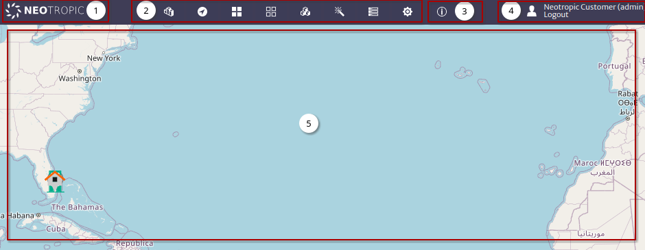
The login is the first view you have of the system Figure 1.
 |
|---|
| Figure 1. Login |
Information Use the user
adminand passwordkuwaiba.
Once the login is done, the system will be redirected to home Figure 2.
 |
|---|
| Figure 2. Home |
- It shows the company logo1 and is also used to return to home.
- Menu Items.
- Shows Kuwaiba information such as version, licenses, etc.
- Show user information and logout.
- Home dashboard2 shows a map with all the
GenericLocationthat has a geographic location set.
Menu Items
In kuwaiba, a module defines or groups system features, and the modules are grouped into categories.
| Icon | Category | Description |
|---|---|---|
 | Administration | Modules to manage the data model. |
 | Navigation | Modules that are used to explore, navigate and search inventory assets. |
 | Physical | Modules that allow to manipulate L1 assets, such as physical connections and outside plant infrastructure. |
 | Logical | Modules to manipulate L2/L3 assets, like MPLS, SDH, IP, ISDN, etc. |
 | Services | Modules to manage administrative aspects of the inventory such as services (as in billed services), customers, contracts. etc. |
 | Planning | Modules dedicated to network planning. |
 | Other | General system settings such as validators and configuration variables. |
 | Settings | Any module not fitting the categories above. |
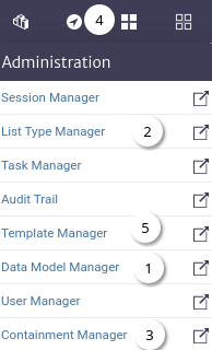
Essential Modules
The recommended order to start exploring the inventory system is shown in Figure 3, follow the links to get started.
 |
|---|
| Figure 3. Essential modules |
Note Depending on the restrictions that the system administrator has defined for the users in the User Manager, the options in each menu will change.
Data Model Manager
Kuwaiba is a powerful modeling tool (understanding a model as a simplified representation of the real world, in this case a telecommunications network and all its business aspects). One of the key features of Kuwaiba is its completely object-oriented dynamic data model. Each inventory asset (router, city, port) is called an Object, and these objects are in turn, a product of an abstraction of reality called Class.
Likewise, each attribute is a Field in a class. The set of classes, attributes and relationships between them is called Data Model. Kuwaiba comes with a default data model that contains support for the most popular technologies and business models, but you can customize it depending on your needs by adding, removing, and modifying classes. To achieve this, use the Data Model Manager module.
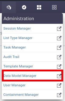
To open the Data Model Manager module, select Administration -> Data Model Manager from the options menu.
 |
|---|
| Figure 1. Data Model Manager module selection in the general menu |
The Class Tree
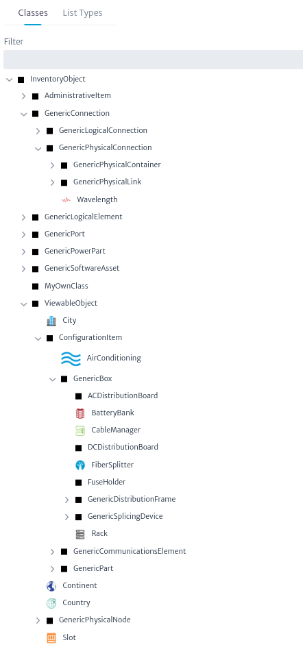
Kuwaiba's data model has a tree-like structure due to its hierarchical nature. Technically, this is known as a class hierarchy. At the top of this hierarchy is InventoryObject, the most general item type in the data model, its highest level of abstraction. Its subclasses represent all possible items that will be considered inventory assets.
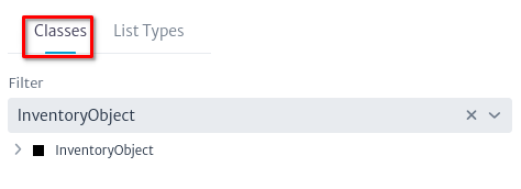 |
|---|
| Figure 2. Inventory object tree |
As you go deeper into the tree, classes become increasingly specialized and each level inherits the attributes of the classes above it (called superclasses). This structure serves two main purposes: first, it helps organize classes based on their common characteristics. Second, as will be seen later in this manual, it allows operations to be applied to top-level classes, which will be propagated to all subclasses.
 |
|---|
| Figure 3. Expanded class tree |
In this hierarchy, the most relevant and commonly used classes are:
InventoryObject: It is the root of the hierarchy.ViewableObject: This is the superclass of all objects that can have views, that is, graphical representations of a selected object that can be launched from the Views section of the object panel (the concept will be explained later, in the Navigation module).GenericCommunicationsElement: The superclass of all active communication devices, from multiplexers to routers or servers and workstations.GenericLocation: The superclass of all geolocated locations such as buildings, facilities, houses, poles or manholes.GenericPhysicalLink: It is the superclass of links (connections between ports) and allows subclasses to be created to expand the type of existing connections.GenericSplicingDevice: This is the superclass of objects used for splicing operations, such as splice boxes and fiber splitters.GenericDistributionFrame: It is the superclass of distribution frames, such as DDFs, ODFs or even AC/DC distribution panels.
Creating a New Class
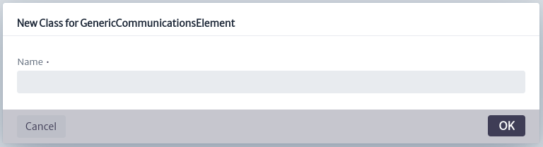
When selecting an item from the Class Tree, on the right side you can see two tabs. This section also allows you to Create a New Class that inherits from the selected class, through the action of the button  , which will launch the following dialog . In this example,
 GenericCommunicationsElement has been selected in the Class Tree.
 |
|---|
| Figure 5. Creating a new class |
The tabs that can be seen are:
-
Properties: The Properties window contains the intrinsic properties of the class, such as name, description, etc. These can contain any type of UTF-8 character without special characters or whitespace. In addition, it allows you to assign a specific icon that will be displayed in the inventory for said object. If the class is abstract (instances of abstract classes cannot be created, they are only used to provide consistency to the data model). The countable attribute is not currently used, but should be used to mark classes whose instances may have graphical representations, but are not actually part of the inventory, such as
Slots. inDesign is just a way to mark a class as part of an ongoing data model intervention, and therefore classes with that attribute marked true cannot be instantiated. The color is the color of the default square icon used to display the object in a tree or view. This icon will be used whenever the smallIcon attribute is null. smallIcon is the icon that will be used on the trees and its size cannot exceed 16x16 pixels. icon is the icon used in views and has a maximum size of 32x32 pixels. The breadcrumbs on top of the Properties tab allow you to explore the class hierarchy for the selected class.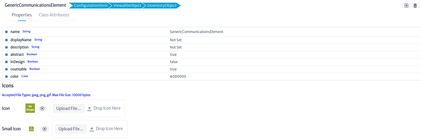
Figure 6. Properties of the selected object Important
- All user-created classes have inDesign status set to true by default. Objects cannot be created from these classes until they are changed to false. This is a preventive measure to facilitate testing of changes when creating multiple classes before moving to production.
- As a convention, all abstract classes are prefixed with Generic. However, some core classes (such as
InventoryObjectorAdministratorItem) are abstract and do not follow this convention. It is recommended to adhere to this rule whenever possible. Unless you have deep knowledge of the system, avoid renaming or deleting parent classes, especially abstract ones. - To name the classes and attributes, we follow the camel case convention. For class names, the first letter is capitalized, as in
MyNewClass. On the other hand, for attributes, the first letter is written in lowercase, as in myNewAttribute. This practice helps improve the readability of the code and maintain a consistent structure in the naming of elements within our program.
-
Class Attributes: This section contains the class fields (attributes). In the figure below, the GenericCommunicationsElement class includes common attributes, such as creationDate and name, as well as other attributes specific to the selected class.
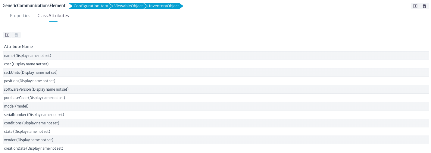
Figure 7. Attributes of the selected class Click the button next to the attribute name to customize it as shown in the figure below.
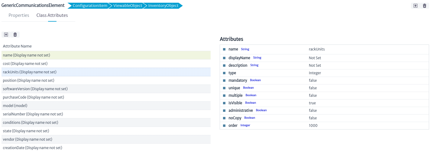
Figure 8. Properties of the selected attribute In this window, you can modify both common and specific class attributes. The most relevant common attributes are:
- name: Change the name of the attribute.
- displayName: Change how the name is displayed.
- description: Provide a description for the attribute.
- type: Select the type of the attribute (the drop-down list will show primitive types such as String, Integer, Float, Long, etc., and all available non-abstract list types). When the type of an attribute changes, all existing instances will be updated to reflect the change. This means that the values of the modified attribute will be converted to the new type if possible (for example, from integers to strings). If the conversion is not possible, the new value will be set to null.
You can also manage the following options for the attribute:
- mandatory: If you select this option, each object of this class must have a value for this attribute. If you enable this option and there are already created objects of this class without a non-null value for this attribute, an error will occur.
- unique: If checked, the value of this attribute cannot be repeated in all objects created of this class or its subclasses. Before you can set a class attribute as unique, you must verify that the value of this attribute on each object created from this class or its subclasses is unique.
- isVisible: Enables or disables the visibility of the attribute. If unchecked, the attribute will not be displayed in the property sheets of objects created from this class.
- administrative: Attributes marked "Administrative" will be displayed in a separate tab on the object's property sheet. This is useful for attributes that are used only for administrative purposes and that could confuse the end user if mixed with normal attributes.
- noCopy: You can choose which attributes should not be transferred from one object to another in a copy operation.
- order: Refers to the order in which this attribute will appear in the property sheet.
Important
- You may lose information when changing the type of an attribute. Make sure that conversion to the new type is possible before making the change.
- If attributes are added, removed, or renamed, the changes will only be reflected in the property sheets of previously opened inventory items once the page displaying the item is reloaded.
- It is strongly recommended to not rename core abstract classes, as some of them are used internally to support many functions. Renaming them can destabilize the system.
You can also create
and delete  attributes by clicking the corresponding buttons. When creating a new attribute, a dialog box like the one shown below will be displayed, where the attributes name, displayName and type will be requested.
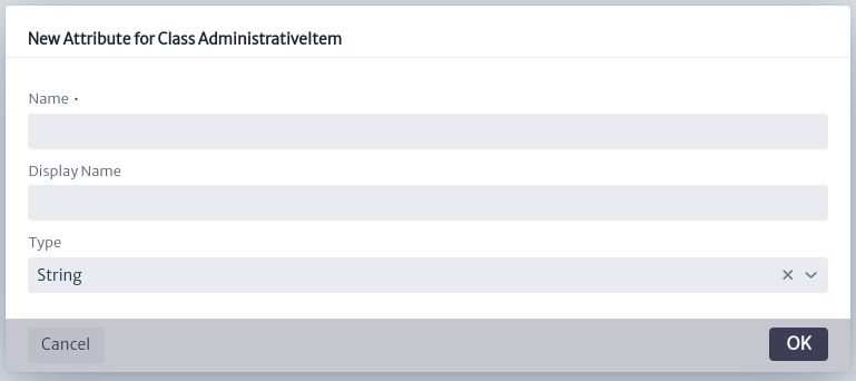
Figure 9. New attribute of the selected class
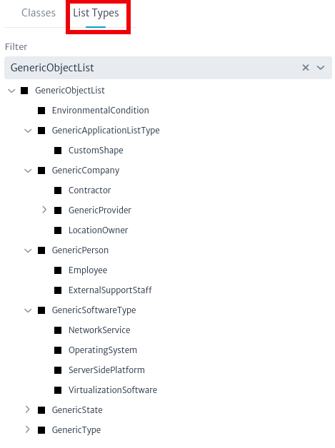
List Types
List types are attribute type whose value is an element within a list of items. Unlike most attributes, which are of primitive types such as String, Integer or Boolean, some are more complex, being separate objects in the database. For example the value of the attribute vendor in a device, can only be chosen from a predefined list of options (Huawei, Cisco, Nokia, etc), and each one of those entries contains more information (support lines, account managers, etc). Another example is state, which describes the current operational state of a given device (Working, Not Working, Stored, Planned, Reserved, etc). The state itself is an object since and can contain information about the next allowed states or about itself.
Many objects in the database will share the same provider, just as many others will share the same state. In relational database terms, this can be thought of as a many-to-one relationship.
Please note that this section shows how to create attribute types of the list kind, not their lists themselves, for that see the List Type Manager.
 |
|---|
| Figure 10. Class hierarchy for list types |
Creating a List Type
List types are subclasses of GenericObjectList or one of its utility subclasses. In most cases, your new list types will fit into one of the existing branches, so avoid creating abstract subclasses unless you know very well what you are doing, so you don't pollute the data model unnecessarily. List type creation works exactly like for any other class seen in the past sections. Just make sure you uncheck the inDesign option once you are ready to create list type items in the List Type Manager.
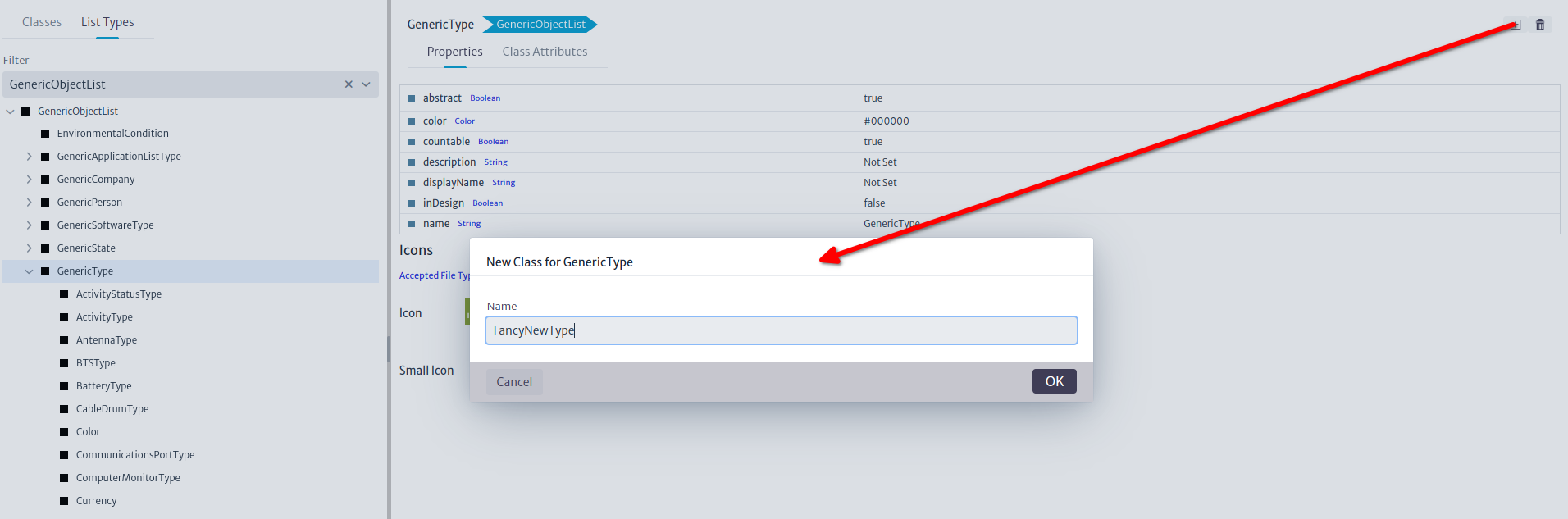 |
|---|
| Figure 11. Creating new list type |
Using a List Type
Once the new list type is created, you can tell other classes to use it by creating attributes of the new type. In the example below, we are making the class Router to have a new attribute called newListTypeAttribute of type FancyNewType.
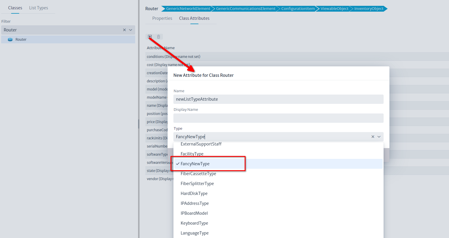 |
|---|
| Figure 12. Using the new list type |
Now our routers will have a new list type attribute whose value can be chosen from a list created in the List Type Manager
Important
List types support single or multiple selection. You will learn more about it in the List Type Manager.
List Type Manager
Most of the attributes are primitive types (String, Integer, Booleans, etc), however, there are some more complex that are actually another object in the database. This is the case of attributes such as vendor, which points to an object holding the information about the vendor of that equipment (support lines, account manager, etc) or state, that refers to the current operational state of the equipment (Working, Not Working, Stored, etc) and the state itself is an object, because it may hold information about what are the next allowed states.
Many objects in the database will have the same vendor, and many other will have the same state. In short, list types are those kind of attributes that point to an element in a limited set of objects. In terms of relational databases, you can see it as a many-to-one kind of relationship.
To manage the existing list types and its instances, use the Data Model Manager and the List Type Manager.
To access the module, click on the administration  category and select the List Type Manager Figure 1.
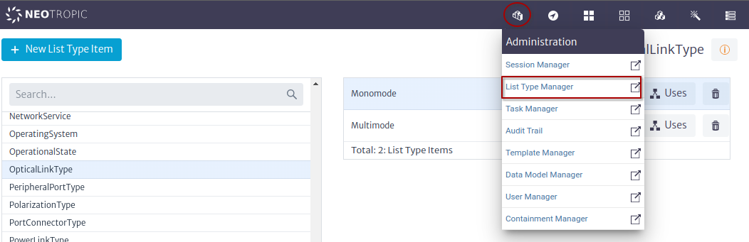 |
|---|
| Figure 1. List Type Manager Module |
There are two relevant concepts in this module List Type and List Type Item in the following sections we will address each of them.
List Type
A list type is a subclass of GenericObjectList or its subclasses and is managed using the Data Model Manager.
List Type Example
- Using the Data Model Manager create list type
MyOwnListTypeFigure 2. TheinDesignproperty is changed tofalseand the other properties and attributes are kept by default.
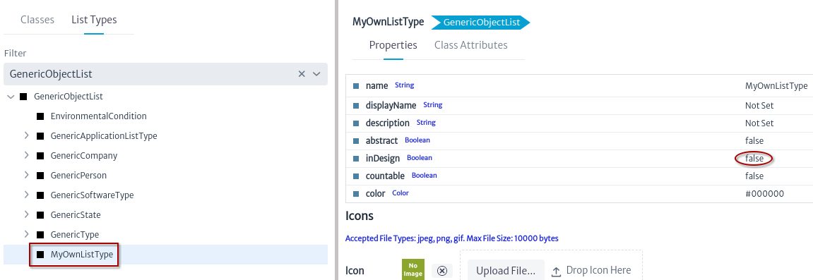 |
|---|
| Figure 2. MyOwnListType |
- Create the class
MyOwnClassand create an attribute with namenewListTypeAttributeof typeMyOwnListTypeFigure 3.
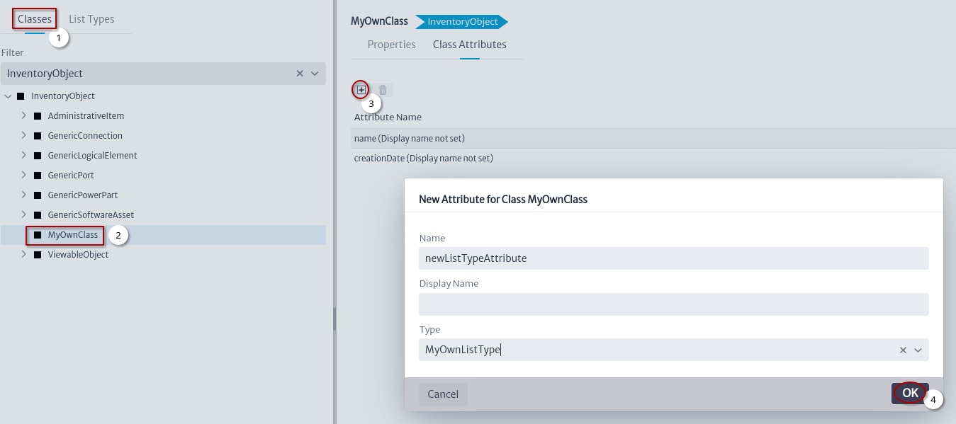 |
|---|
| Figure 3. newListTypeAttribute |
- Select the Classes tab.
- Create the class
MyOwnClassas a subclass ofInventoryObject. - Click on the new attribute button.
- Set the name and type of the attribute and click the OK button.
List Type Item
A list type item is one of the possible values that can be selected from the defined set, for example a list of models of a device, in terms of inventory is an instance of a class of list type.
List Type Item Example
In the previous section, the list type MyOwnListType was created; this class will be used to show how this module works.
-
Enter the List Type Manager module Figure 1.
-
Create a list type item Figure 4.
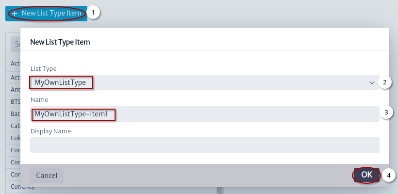 |
|---|
| Figure 4. New List Type Item Window |
- Click on the New List Type Item Button.
- Select the List Type.
- Set the name of the List Type Item.
- Click on the OK button.
- Select List Type Item.
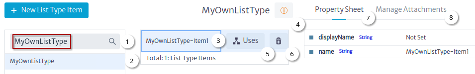 |
|---|
| Figure 4. Select List Type Item |
- Search List Type.
- Select the List Type.
- Select the List Type Item.
- Button to show more information Figure 5.
- Button to show the uses of the selected list type item.
- Button to delete the selected list type item.
- Manage properties of the selected list type item.
- Manage Attachments of the selected list type item.
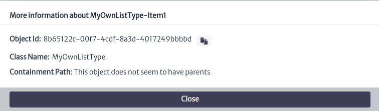 |
|---|
| Figure 5. More Information Window |
Uses
All objects that have a List Type attribute set use a List Type Item.
List Type Item Uses Example
- Using the pools module create a pool Figure 6.
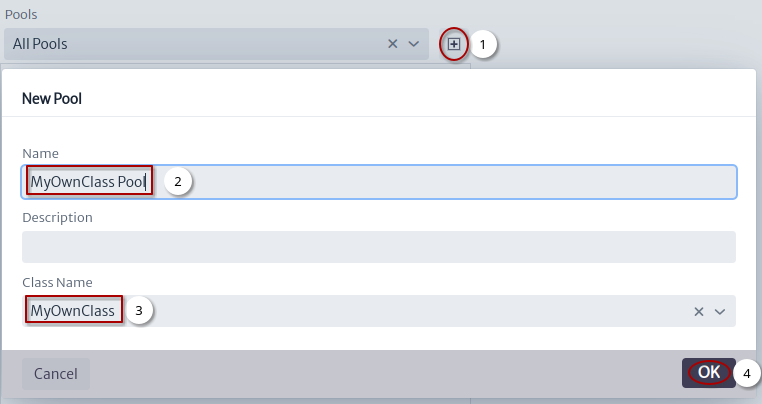 |
|---|
| Figure 6. New Pool Window |
- Click on the new pool button.
- Set the name.
- Set the class name.
- Click on the OK button
- Using the pools module create a pool item Figure 7.
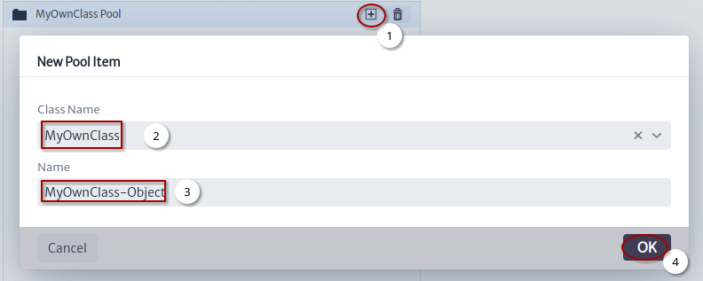 |
|---|
| Figure 7. New Pool Item Window |
- Click on the new pool item button.
- Set the class name.
- Set the name.
- Click on the OK button.
- Using the pools module set the list type attribute to the pool item Figure 8.
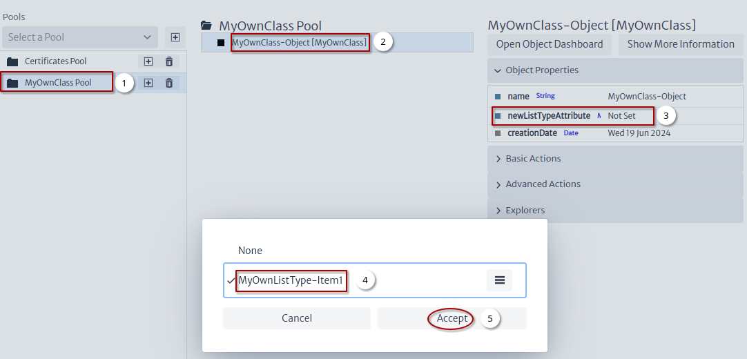 |
|---|
| Figure 8. Set attribute newListTypeAttribute |
- Select pool.
- Select pool item.
- Double click on the property.
- Select the list type item.
- Click on the Accept button.
-
Return to the List Type Manager module.
-
Find the list type item that was set in the attribute and click on the uses button.
Figure 9 shows all the uses or objects that have the selected list type item as the attribute value.
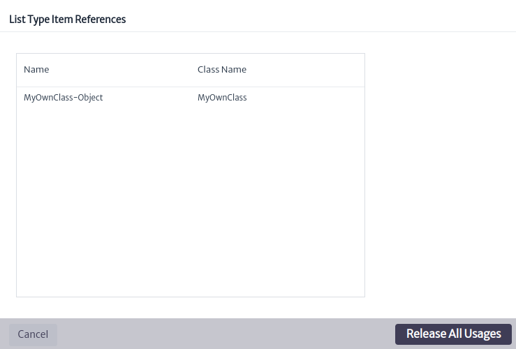 |
|---|
| Figure 9. List Type Item Uses |
Warning: The
Release all Usagesbutton sets the attribute of all objects that use the list type item to null, is used when you want to delete a list type item.
Attachments
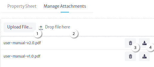
For some list type items it may be necessary add attachments for example for EquipmentModels to manage manuals, Figure 10 shows in more detail how it works.
 |
|---|
| Figure 10. Manage Attachments |
- Upload File button.
- Drag and drop file section.
- Delete attachment button.
- Download attachment button.
Containment Manager
Another key concept in Kuwaiba is containment. It consists of the ability to define what kind of objects can be created within others. For example, a Country can be inside a Continent, but can not be inside a Rack. A Port is usually within a Board, and not inside a City. These business rules can be defined using the Containment Manager.
To access the module, click on the administration  category and select the Containment Manager Figure 1.
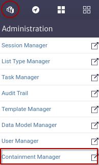 |
|---|
| Figure 1. Containment Manager |
There are two relevant concepts in this module Standard Containment Hierarchy and Special Containment Hierarchy in the following sections we will address each of them.
Standard Containment Hierarchy
This hierarchy is used to model physical containment, for example, OLTs contain OLT boards Figure 2.
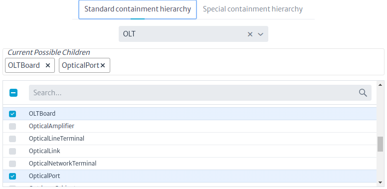 |
|---|
| Figure 2. OLT Standard Containment Hierarchy |
Figure 3 shows the workflow for configuring the containment hierarchy.
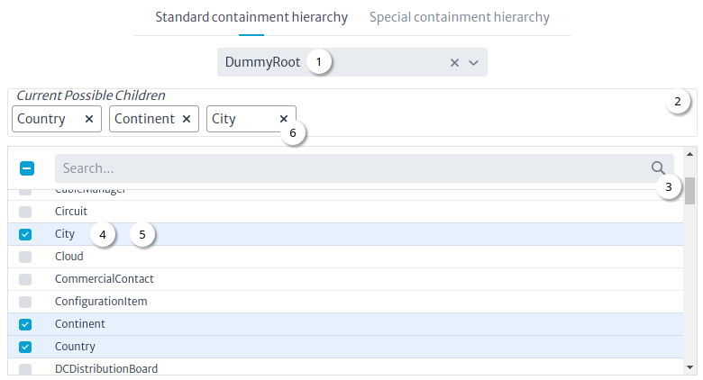 |
|---|
| Figure 3. Dummy Root Standard Containment Hierarchy |
Note: Figure 3 shows in the field to choose a class the
DummyRootthat is not a class but is used as the root of the entire standard containment hierarchy.
Workflow
- Choose a class.
- List of current possible children.
- The search field is used to find classes to be possible children of the chosen class.
- To add a class as a possible child, only check the class.
- To delete a class as a possible child, simply uncheck the class.
- It is also possible to delete a class from the possible children by clicking on the
xbutton.
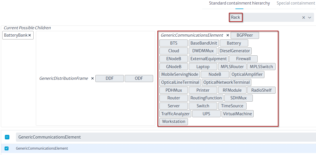
Note: To avoid adding one by one many classes to a parent, you can use the flexibility of the data model as a hierarchical structure. For example, a
Rackmay contain within many types of equipment (routers, DDFs, switches, battery banks, etc). Instead of adding each of these classes one by one, you can add a common super class and all of them will be added automatically. For this example a common super class for most of those classes could beGenericCommunicationsElementFigure 4.
Figure 4. Rack possible children
Special Containment Hierarchy
This hierarchy is used to model non-physical containment, for example the VLANs of an OLT. VLANs are not physical elements like the OLT boards, but they are part of it and it is for these scenarios that the special containment hierarchy exists Figure 5.
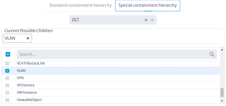 |
|---|
| Figure 5. OLT Special Containment Hierarchy |
The flow to configure the special containment hierarchy is the same as shown in Figure 3.
Template Manager
In many scenarios, there are containment structures (see Containment Manager for details) that are created repeatedly, such as Building → Floor → Room → Rack, or ODF/DDF with the same number of ports (24/12/36/48/72/96/144), or simply equipment with the same set of attributes. For example, all routers of a certain model: the provider, slots, etc., will always be the same. Creating these elements from scratch each time would be a tedious task. For this reason, Kuwaiba provides the template manager module, which allows the creation of object templates from real inventory elements.
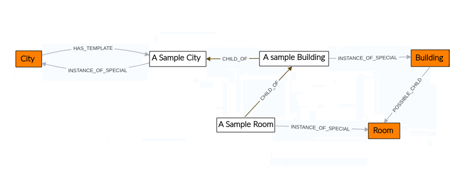
Figure 1 shows the structure of the module. In this example, a template is used to create cities that contain buildings, which in turn include rooms. For simplicity, only one city, building and one room are shown. When creating a template for a class, as demonstrated in the example with the A Sample City template, its association with the class is established through the HAS_TEMPLATE relationship. Additionally, the INSTANCE_OF_SPECIAL relationship is created to indicate that the template is a special instance of the class, since A Sample City will generate an instance of City.
Templates can contain other templates; in our example, we want a city to contain buildings. To achieve this, the CHILD_OF relationship is used to indicate that the A Sample Building template is a child, or is contained within, A Sample City. Similarly to the relationship between City and Building, the A Sample Room template is created to represent rooms within buildings. Thus, by using this template, this hierarchical structure will be generated in the inventory.
 |
|---|
| Figure 1. Template manager structure |
The template manager module, shown in Figure 2, belongs to the Administration category.
 |
|---|
| Figure 2. Template manager module |
Creating a Template
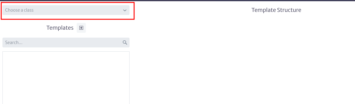
Once the module is open, to create a template, select the class for which you want to create the template in the selector located at the top left of the module's main window, as shown in Figure 3.
 |
|---|
| Figure 3. Template manager selecting class |
You can select any of the classes available in the application, except for abstract and list-type classes, as elements of these classes cannot be created.
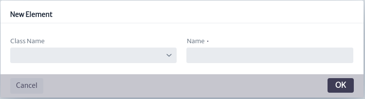
Once the class is chosen, proceed to create the template using the button  The template creation window shown in Figure 4 will open. You must select the class if you have not already done so and assign a name to the template. Use a descriptive name, as this will be the one you see in the list of available templates.
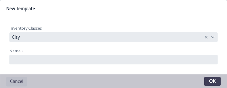 |
|---|
| Figure 4. Template creation window |
Once the template is created, it will appear in the list of templates created for the selected class along with its actions, as shown in Figure 5.
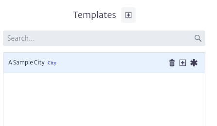 |
|---|
| Figure 5. Template list |
Template Actions
Deleting a Template
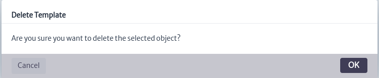
It is possible to delete templates created for a class. To do so, use the button  in the template actions shown in Figure 5. This will open the template deletion window shown in Figure 6. Click OK to delete it or CANCEL if you do not wish to proceed.
 |
|---|
| Figure 6. Template delete window |
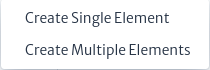
Adding Elements
You can add elements or special elements to templates. The elements that can be added are determined by the containment configuration of the class see Containment Manager for more details.
To add elements to the template, use the button in the template actions shown in Figure 5. If you want to add special elements, use the  button. This will display the menu shown in Figure 7, where you must select whether you want to create a single element or multiple elements. If the class does not have any elements or special elements assigned in its containment, you will not be able to add elements of this type to the template.
 |
|---|
| Figure 7. Elements options menu |
Creating a Single Element
If you select to create a single element from the menu in Figure 7, the single element creation window shown in Figure 8 will open. Here, you will need to assign a name to the element and choose the class of the element to add. The available classes depend on the containment configuration of the class to which you are creating the element.
 |
|---|
| Figure 8. Single element creation window |
Creating Multiple Elements
If you select to create multiple elements from the menu in Figure 7, the multiple elements creation window shown in Figure 9 will open.
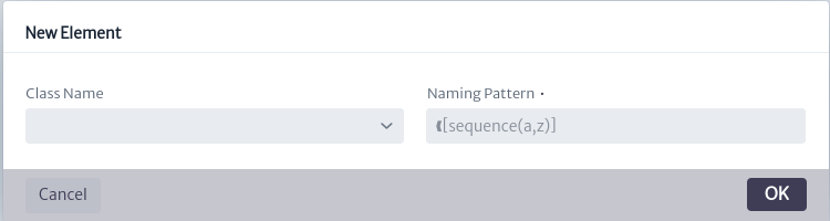 |
|---|
| Figure 9. Multiple elements creation window |
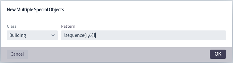
Where you must choose the class of the element to add. The available classes depend on the containment configuration of the class to which you are creating the element (see Containment Manager to more details about containment) and enter the naming pattern as detailed in Appendix A.
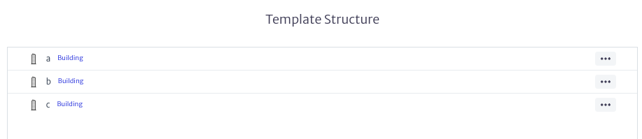
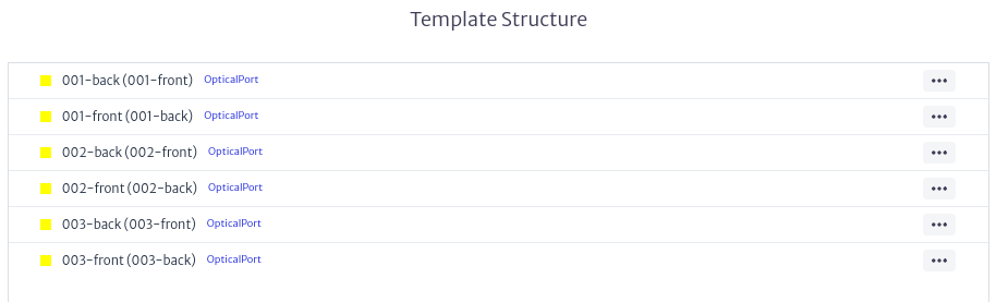
The result of using the naming pattern [sequence(a,c)], useful for creating multiple elements like buildings in the City class,[multiple-mirror(1,3)], useful for creating ports in the SpliceBox class and [mirror(1,3)]useful to create mirror ports in ODF,SpliceBox ** can be seen in Figures 10, 11 and 12 respectively.
 |
|---|
| Figure 10. Result of [sequence(a,c)] |
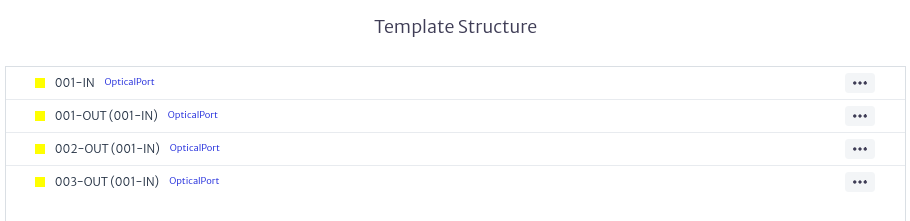 |
|---|
| Figure 11. Result of [multiple-mirror(1,3)] |
 |
|---|
| Figure 12. Result of [mirror(1,3)] |
Template Element Management
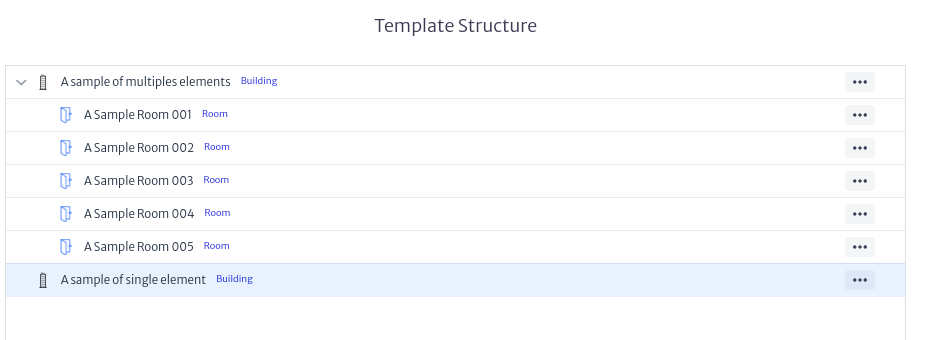
Once the template elements are created, they will be added to the template structure section of the main module window, as shown in Figure 13.
 |
|---|
| Figure 13. List of elements |
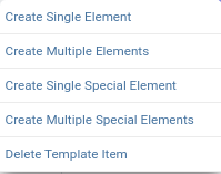
In this section, you can not only view the elements and the containment tree of the multiple elements, but also create new elements or special elements on existing ones or delete them using the button of the desired element, which will display the menu shown in Figure 14.
 |
|---|
| Figure 14. Manage elements menu |
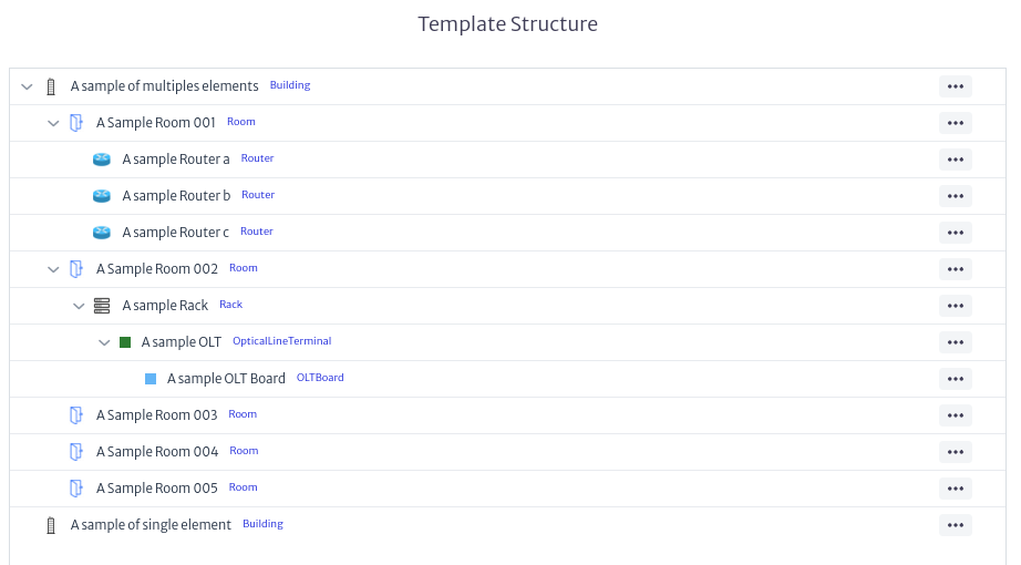
This allows you to create containment structures as complex as needed, following the containment configuration of the class for which the template is created, as shown in Figure 15.
 |
|---|
| Figure 15. Template Example |
Editing Properties of a Template or Elements
It is possible to edit the properties or elements of a template once they have been created. To do this, select the template or an element of the template you wish to edit. The properties sheet of the template, shown in Figure 16, or the properties of the template elements, shown in Figure 17, will appear on the right side of the main module window. Use this to edit the desired properties.
 |
|---|
| Figure 16. Example of template property sheet |
 |
|---|
| Figure 17. Example of element property sheet |
Using the Template
You can create objects using the templates created in the template manager from any Kuwaiba module that has the object options panel as shown in Figure 18, explained in detail in the section Object Options Panel in Navigation module. This functionality is available in modules such as navigation, pools, etc.
 |
|---|
| Figure 18. Object options panel |
In the Basic Options section of the Object Options Panel you will find the options New Object from Template and New Special Object from Template as shown in Figure 19.
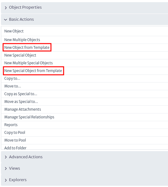 |
|---|
| Figure 19. Options to create objects from template |
When using them, the window for creating objects from a template, shown in Figure 20, will appear. The available classes depend on the containment configuration of the selected class.
 |
|---|
| Figure 20. Object creation window from template |
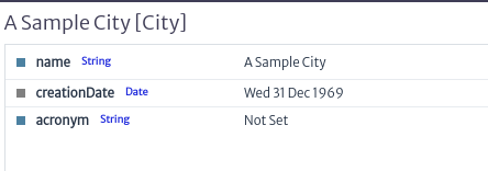
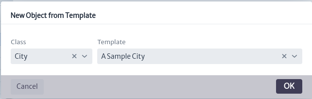
For example, we use the City class and the previously created template A sample city. As a result, we create an object following the template, as observed in Figure 21.
 |
|---|
| Figure 21. Sample object created from template |
Audit Trail
The audit trail module is capable of tracking changes made by users for audit purposes. Each time you make modifications to the application, including creating, modifying, deleting objects, and their relationships, entries will be created to store such changes.
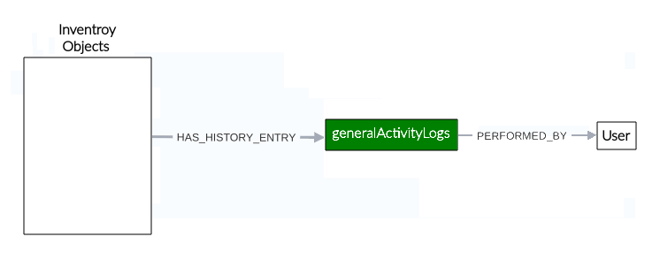
Figure 1 illustrates the module’s structure. As shown in the example, changes are stored as generalActivityLogs, which are associated with the user who made them through the PERFORMED_BY relationship. If the changes were made to inventory objects, the object will be linked to its changes via the HAS_HISTORY_ENTRY relationship, allowing you to view them from the Object-related events option, described in detail later in the Object-related events section.
 |
|---|
| Figure 1. Audit trail module structure |
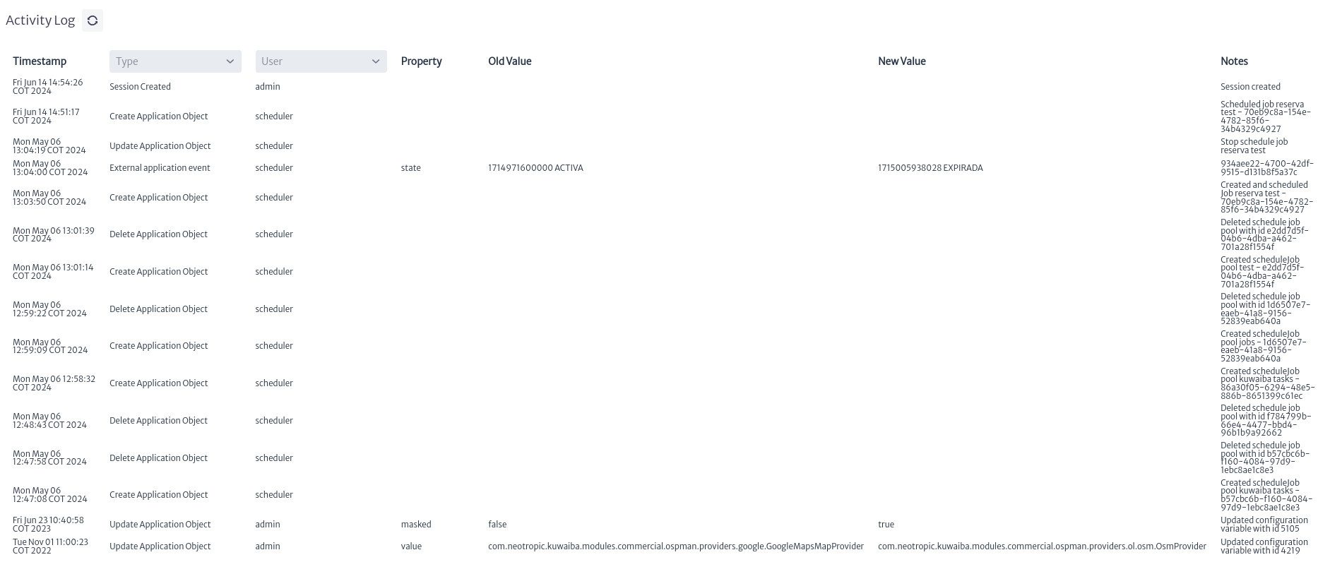
The Audit trail module in Figure 2 belongs to the Administration category and is capable of tracking the changes performed by the users in the database for audit purposes.
 |
|---|
| Figure 2. Audit trail module |
These changes can be made to inventory objects (equipment, locations, etc) or application objects (pools, tasks, user properties). There are two types of events that are logged: General events, that is, those that are not related to any object in particular, like new logins or creation of application objects. Object-related events, like property changes or move operations.
General events
Once the module is open, we can see the main window of General events as shown in Figure 3.
 |
|---|
| Figure 3. General events main window |
To refresh the changes made in the application since entering the module, you can use the refresh button located in the main window of the module, as shown in Figure 4.
 |
|---|
| Figure 4. Refresh button |
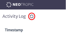
The module presents us with information divided into several columns, among which we find:
- Timestamp Field that contains the date when the record was made.
- Type Field that contains the type of action performed.
- User Field that contains the user who performed the action.
- Property When the event type is Object-related events, this field presents the name of the modified property of the object. Otherwise, it will be empty.
- Old Value When the event type is Object-related events, this field presents the old value previously set in the modified property of the object. Otherwise, it will be empty.
- New Value When the event type is Object-related events, this field presents the new value assigned to the modified property of the object. Otherwise, it will be empty.
- Note Field that contains additional Note about the action, if any.
Filters
The module offers filters to facilitate the search for information. These filters can be found as indicated in Figure 5. If no filter is selected, the default behavior is to show all records
 |
|---|
| Figure 5. Audit trail filters |
The types of filters are:
- Type Filter: Allows you to obtain records based on the type of action performed, such as the creation, updating, or deletion of objects, session start or end, among others.
- User Filter: Allows you to view only the records associated with actions performed by a user.
Pagination
The module presents the records in a paginated format, allowing you to navigate through the available records. The navigation controls are located at the bottom of the records, as shown in Figure 6.
 |
|---|
| Figure 6. Pagination |
Object-related events
The Object-related events can be found in any Kuwaiba module that has the object options panel as shown in Figure 7, explained in detail in the section Object Options Panel in Navigation module. This functionality is available in modules such as navigation, pool, etc.
 |
|---|
| Figure 7. Object options panel |
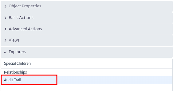
In the Explorers option section of the Object Options Panel you will find the options Audit Trail as shown in Figure 8.
 |
|---|
| Figure 8. Audit trail option |
When using, the Object-related window, shown in Figure 9, will appear.
 |
|---|
| Figure 9. Object-related window |
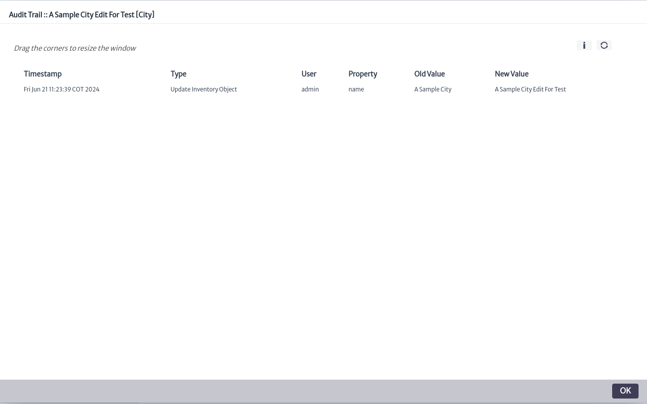
The information presented is the same as in General events except for the absence of the Note field. Additionally, it includes the  button, not present in General events which allows viewing more information about the selected object, as shown in Figure 10.
 |
|---|
| Figure 10. Information window |
Users Manager
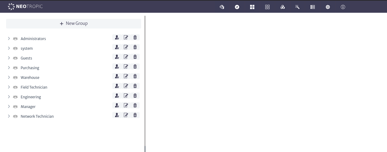
The User Manager is a module designed for managing users and groups within the application. Its features include creating new users and groups, associating or disassociating users with groups, and managing permissions for the different modules of the application.
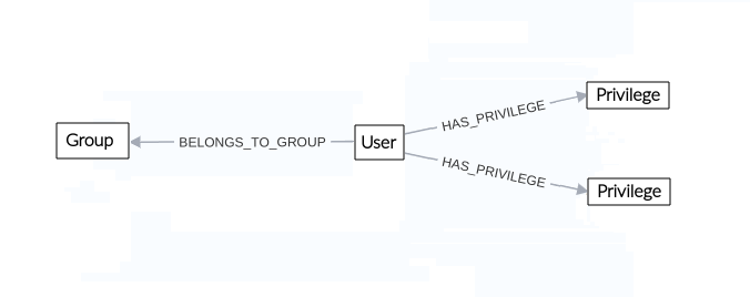
Figure 1 illustrates the module's structure. In the application, users are organized into Groups through the BELONGS_TO_GROUP relationship, the Groups are used to simplify the management and administration of users y can contain one or more users. Each user is assigned privileges for each module individually through the HAS_PRIVILEGE relationship, this relationship represents the permissions a user has for a module.
 |
|---|
| Figure 1. User manager structure |
This module is part of the Administration category, as shown in Figure 2.
 |
|---|
| Figure 2. User manager module |
Once opened, we will see the main window of the module, as shown in Figure 3. From here, we can view the groups currently created in the application.
 |
|---|
| Figure 3. User manager main window |
Groups
Groups allow for the aggregation of users to simplify their management and administration.
Groups Actions
Creating new groups
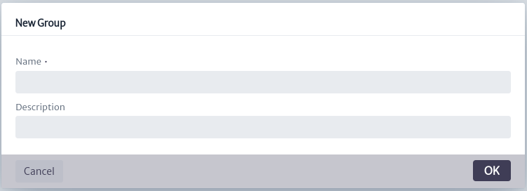
To create a new group, use the button in the main window of the module. This will open the group creation window, as shown in Figure 4. Here, you will need to enter the name and description of the group. It is advisable to use a descriptive name, as this will be the name displayed in the list of available groups.
 |
|---|
| Figure 4. Create group window |
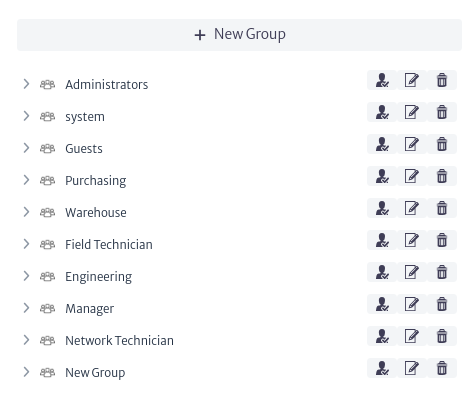
Once created, the group will appear in the list of available groups within the application, as shown in Figure 5. From here, you can also view the users assigned to each group by clicking on it, in addition to accessing group actions.
 |
|---|
| Figure 5. Group list |
Deleting groups
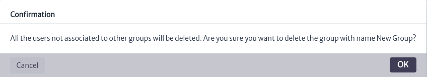
To delete a group, use the button found in the group actions as shown in Figure 4. This will open the group deletion window in Figure 6. Click OK to proceed with deletion or Cancel to abort.
Note Users assigned exclusively to the group being deleted will also be removed unless they are assigned to other groups.
 |
|---|
| Figure 6. Groups delete window |
Updating Groups
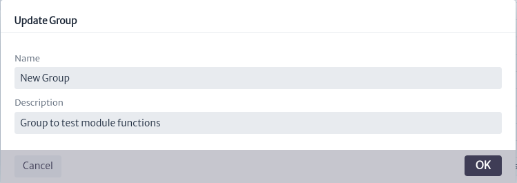
To edit the properties of a group, use the button found in the group actions as shown in Figure 5. This will open the edit window in Figure 7, where you can enter the new values. Click OK to update the group or Cancel if you decide not to proceed.
 |
|---|
| Figure 7. Groups update window |
Users
Users Actions
Creating Users
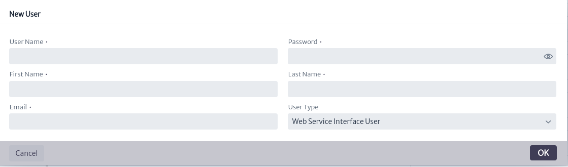
A user consists of the following properties:
| Property | Description |
|---|---|
| User Name | The unique identifier for the user within the application. |
| Password | The unique identifier for the user within the application. |
| First Name | The user's given name. |
| Last Name | The user's family name. |
| The user's email address. | |
| User Type | The user's type, the available types are described below |
| Privileges | Privileges a user in Kuwaiba. |
| Enabled | Flag to enable or disable the user. |
User Types
- GUI User: Users that will access the system via desktop client or web interface.
- Web Service Interface User: Users that will access the system via web service.
- Southbound Interface User: Users that will access the system via automated interfaces, such as southbound interfaces or scheduled tasks.
- System: users used by application modules to automate tasks.
- External application: Users that will make process in externals applications.
To create a new user, they must be assigned to a group. Use the button to create and assign the user to the desired group. This will open the user creation window shown in Figure 8. Fill in the fields and click OK to proceed or Cancel to abort.
 |
|---|
| Figure 8. Create user window |
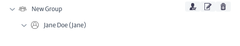
Once created, the user will be visible in the assigned users section of the group where they were created, as shown in Figure 9.
 |
|---|
| Figure 9. Example new user |
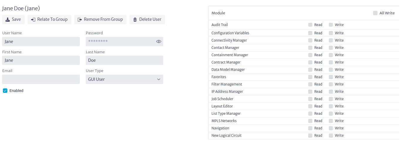
When selecting a user, the main module window will display the information, actions, and privileges related to the user, as shown in Figure 10.
 |
|---|
| Figure 10. User information |
Updating Users
To update user properties, modify them using the fields shown in Figure 10. Once the desired properties have been updated, use the button to save the changes.
Related User To Group
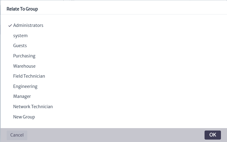
It is possible to relate a user with multiple groups simultaneously. To do this, use the button seen in Figure 10. This will open the user relate window shown in Figure 11. In this window, select the group you wish to relate with the user and click OK. If you do not wish to proceed, click Cancel.
 |
|---|
| Figure 11. Related user window |
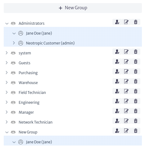
Once this action is completed, the user will be visible among the assigned users of the group, as seen in Figure 12.
 |
|---|
| Figure 12. User related to new group |
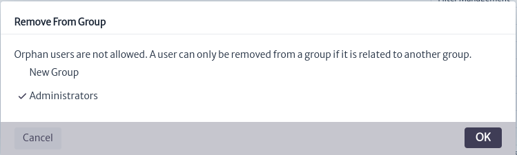
Remove User From Group
To remove users from a group, the user must be assigned to at least two groups, as users cannot exist without a group in the application. To perform this action, use the button seen in Figure 10. This will open the window to remove users from a group, as shown in Figure 13. In this window, you will see the groups to which the user is assigned. Select the group from which you want to remove the user and click OK. If you do not wish to proceed, click Cancel.
 |
|---|
| Figure 13. Remove user to group window |
Privileges
Privileges for each module assigned to the user can be viewed and managed on the right-hand side of the user information, as shown in Figure 10. When creating a new user, no privileges are assigned by default. To assign or remove privileges, check or uncheck the privilege type in the desired module. Note that the write privilege automatically includes the read privilege. Changes take effect immediately, as show in Figure 14.
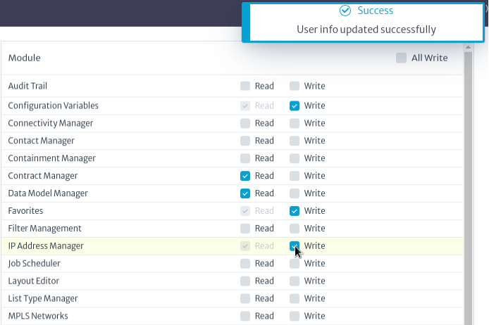 |
|---|
| Figure 14. Privileges |
To quickly assign write privileges to a user across all modules, check the All Write checkbox in Figure 15.
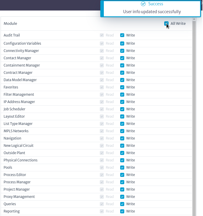 |
|---|
| Figure 15. All privileges |
Warning When assigning permissions to inexperienced users, exercise caution with the modules to which you grant privileges; improper use can potentially corrupt the database.
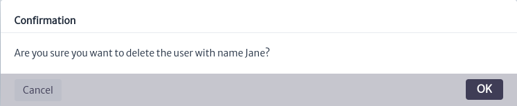
Deleting Users
To delete a user, use the button shown in Figure 10. This will open the confirmation window in Figure 16. In this window, click OK to delete the user. If you do not wish to proceed, click Cancel.
Note Deleting a user will also remove them from all assigned groups, so proceed with caution.
 |
|---|
| ***Figure 16.*Delete user confirm window |
Tasks Manager
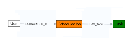
At times, it will be necessary to carry out certain repetitive procedures in the application, such as checking rack usage in the inventory or retrieving users from an OLT. To facilitate the execution of these recurring tasks, the application includes a Task Manager module. This module allows for the flexible creation and execution of tasks by defining scripts that can run under various conditions. Additionally, tasks created in this module can be scheduled for execution as needed by the user, using the Job Scheduler Module.
Figure 1 illustrates the module's structure. In the application, when creating a task, it can be linked to a Job through the HAS_TASK relationship, indicating that the task will be executed according to the schedule defined in the Job using the Job Scheduler module. Similarly, users can be assigned to the task, represented by the SUBSCRIBED_TO relationship. In the current version of the application, these users are for informational purposes only; however, their functionalities will be implemented in future versions of the application.
 |
|---|
| Figure 1. Task manager module |
This module is part of the Administration category, as shown in Figure 2.
 |
|---|
| Figure 2. Task manager module |
Once opened, we will see the main window of the module, as shown in Figure 3. From here, we can view the tasks currently created in the application.
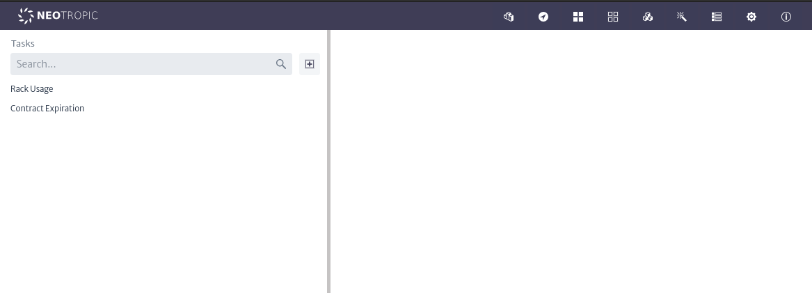 |
|---|
| Figure 3. Tasks manager main window |
Task
A task consists of the following properties:
| Property | Description |
|---|---|
| Name | Name of the task |
| Description | Description of the task |
| Enable | Flag to enable or disable the execution of the task |
| CommitOnExecute | Flag to enable or disable if this task commit the changes in data base (if any) after its execution |
| Script | The Groovy script to be executed by this task. |
| Parameters | List of parameters as a set of parameter name/value pairs used in the script |
| StartTime | The exact time and date the task should be executed.(Optional) |
| EveryXMinutes | Interval should this task be executed.(Optional) |
| ExecutionType | How the task should be executed.(Optional) |
| The email of the person or group that will receive the notification (Optional). | |
| NotificationType | What type of notification should the subscribed.(Optional) |
Tasks Action
Create Tasks
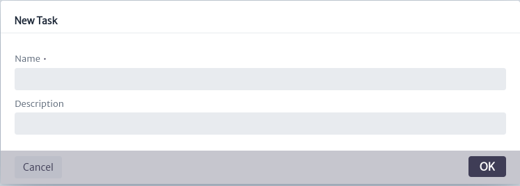
To create a task, use the button in the main window of the module. The task creation window shown in Figure 4 will open. You will need to enter the name and description of the task. It is advisable to use a descriptive name, as this will be the name displayed in the list of available task. Click OK to create the task or CANCEL if you do not wish to proceed.
 |
|---|
| Figure 4. Create task window |
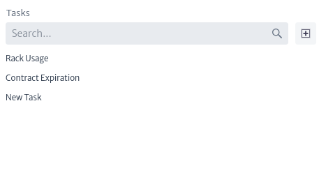
Once created, the task will appear in the list of available tasks within the application, here you can also search task by name as shown in Figure 5.
 |
|---|
| Figure 5. Group list |
When selecting a task the main module window will display the information and buttons actions as shown in Figure 6.
 |
|---|
| Figure 6. Task information |
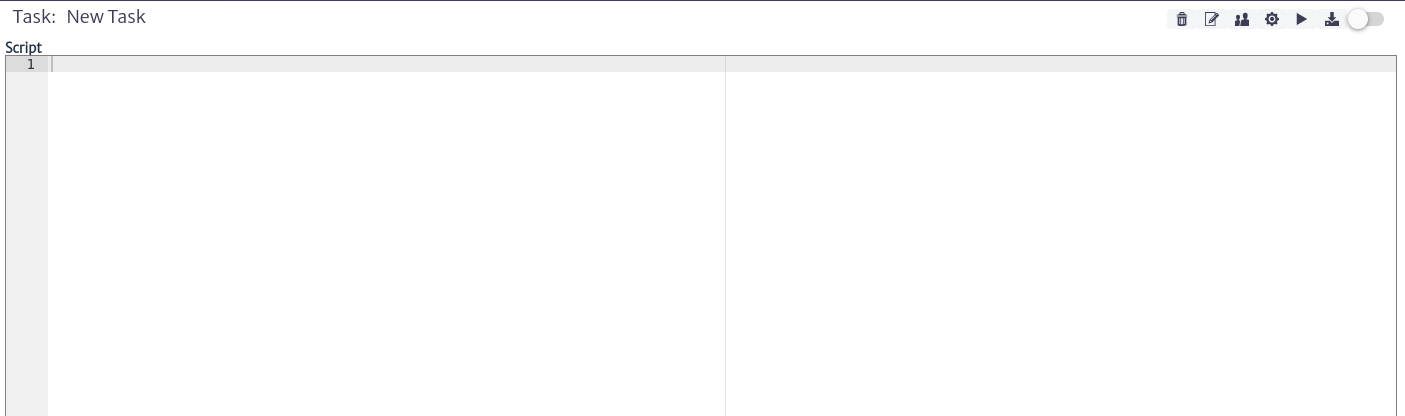
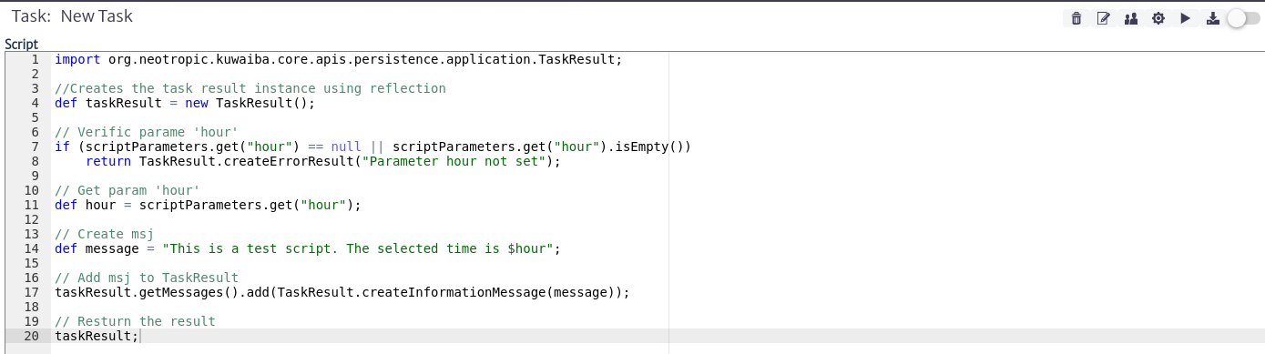
Script
In the script section shown in Figure 6, you can define your own scripts, which can range from custom inventory queries to the perform complex actions.
Information It is out of the scope of this document to teach how to code scripts, however, you can find more detail and examples in the scripts available in this repository.
Script Parameters
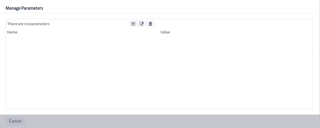
It is important to note that most scripts will require input parameters. These parameters can be easily added to the task so that the user can fill them in before executing the task. To manage the parameters, click on the button. The parameter management window shown in Figure 7 will open, allowing you to create, edit, and delete parameters.
 |
|---|
| Figure 7. Manage parameters window |
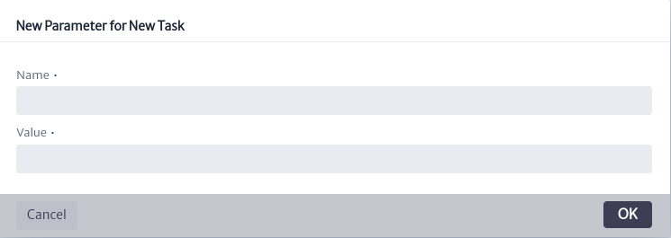
To create a parameter, use thebutton in the main parameter management window. The window to add a new parameter, shown in Figure 8, will open. Enter the name of the parameter to be used in the script and its value. Click OK to create it or Cancel if you decide not to proceed.
 |
|---|
| Figure 8. New parameters window |
Once created, the parameter will be visible in the parameter management window, as shown in the example in Figure 8. You can edit its properties using the button or delete it with the
 button seen in Figure 9.
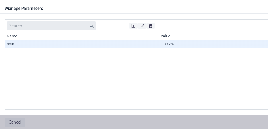 |
|---|
| Figure 9. Parameter example |
Save And Execute Script
Once the script and its parameters have been created, as shown in the example in Figure 10, you can save the script changes using the button seen in Figure 5.
 |
|---|
| Figure 10. Basic example of script and parameters |
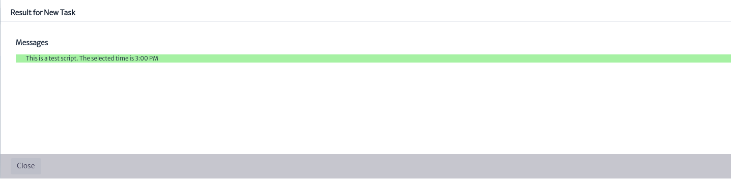
Or use the button seen in Figure 5 to save the script changes and execute your script.The execution result will be displayed in the popup window, si la ejecución fue exitosa el resaltado sera resaltado en color verde como se muestra en la Figura 11.
 |
|---|
| Figure 11. Script execution |
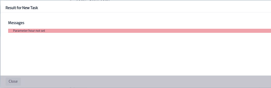
If errors occur during the script execution, the result will be highlighted in red, as shown in Figure 12.
 |
|---|
| Figure 12. Failed script execution |
Commit On Execute
If you want the changes made by the script to be saved in the database after it is executed, enable CommitOnExecute by toggling the switch seen in Figure 6. from disabled to enabled
Warning The changes made by tasks in the database can break things if your code is wrong. Ensure that the script execution was successful before enabling this feature. By default, CommitOnExecute is set to false.
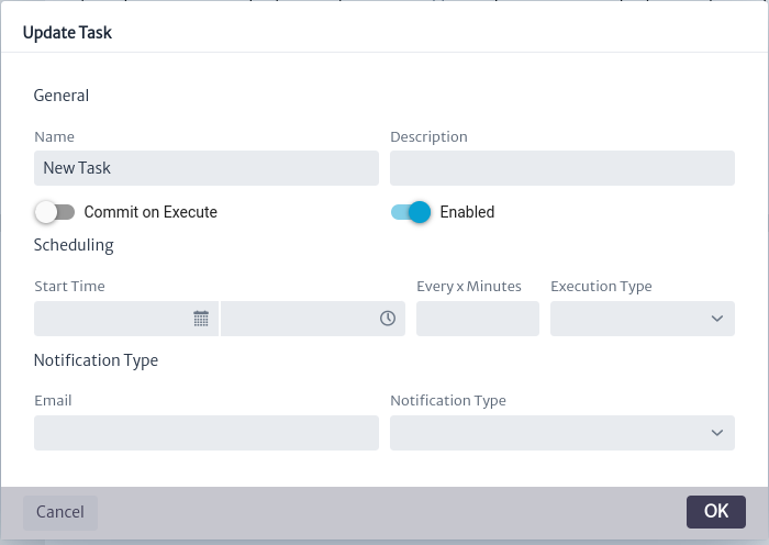
Update Task Properties
To edit the properties of a task, use thebutton seen in Figure 6. The task update window shown in Figure 13 will open. Edit the desired properties and click OK to update them or CANCEL if you do not wish to proceed.
 |
|---|
| Figure 13. Update task properties window |
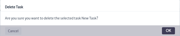
Delete Task
To delete a task, use thebutton seen in Figure 6. The confirmation window shown in Figure 14 will open. Click OK to delete it or Cancel if you decide not to proceed.
 |
|---|
| Figure 14. Delete task confirmation window |
Schedule Task
It is possible to schedule task execution using the scheduling module, explained in detail in the Scheduling module section.
Session Manager
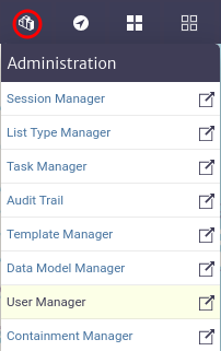
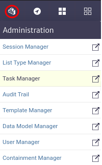
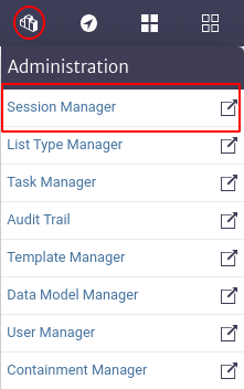
Provides users with the ability to view and manage active sessions in the application. To access this module, go to the top menu of the screen and click on the icon  . This will display a vertical menu where you can select the
 Session Manager option.
Warning This functionality is essential for administrators to monitor and control active sessions, thus ensuring security and efficiency in the use of the application. Therefore, it is recommended that access to this module be restricted to users with administrative permissions only.
 |
|---|
| Figure 1. Access to the session manager module. |
 |
|---|
| Figure 2. Session manager module. |
When accessing the module, an interface like the one shown in Figure 2 appears, with a list of all active sessions. The columns and actions available in this interface are described below:
- User. This column shows the user's name.
- Email. This column shows the e-mail address associated with each user if it has been defined by the user.
- Session Type. Indicates the type of session started.
- Login Time. Displays the date and time the session was started.
- Actions. This column provides options for managing the session. In the image, a button labeled
Terminate Sessionis shown, which allows the administrator to terminate the active session of the corresponding user.
It is not possible for a user to end his own session using the Session Manager module. Instead, the user must logout by clicking the Logout button.
Job Scheduler
The scheduling module allows users to schedule tasks that have been previously registered in Kuwaiba through the Task Manager module (refer to the Task manager documentation). Scheduling module allows you to schedule tasks precisely using cron expressions. You can configure tasks to run every n seconds, minutes, or hours, or at a specific day and time. For example, you can execute a task every 2 hours. It's also possible to schedule tasks to run on a specific day and time, such as August 15th at 12:00 PM, or on the 1st of every month at 6:00 AM. Additionally, you can set tasks to execute on a specific day of the week, like every Monday at 8:00 AM. This module offers flexibility in scheduling tasks as needed.
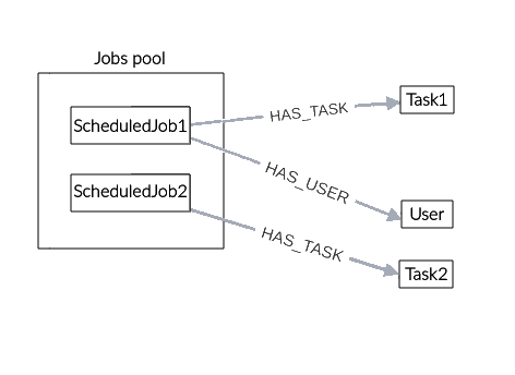
Figure 1 shows the structure of the module, where all jobs are organized into a pool. Pools are groupings of similar objects in this case, jobs and can contain one or more elements. The jobs are related to one or more users using the HAS_USER relationship. Similarly, a job can only be related to a single task through the HAS_TASK relationship, which indicates the task that the job will execute when its schedule is met.
 |
|---|
| Figure 1. Scheduling module structure |
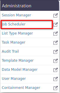
The scheduling module belongs to the Administration category as shown in Figure 2.
 |
|---|
| Figure 2. Scheduling module |
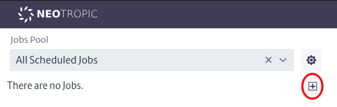
Scheduled Job Pool
Once the scheduling module is open, you need to create a job pool, which will allow you to create and manage jobs in an organized manner. To do this, locate the pool management button represented by a gear icon as shown in Figure 3.
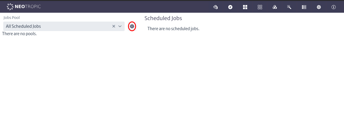 |
|---|
| Figure 3. Manage pools button |
Once clicked, the pool management window will open, as shown in Figure 4.
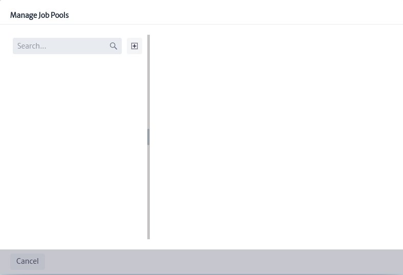 |
|---|
| Figure 4. Manage pools window |
In this window, you can search, create, and delete job pools. Next, create a new job pool using the button seen in Figure 4. The pool creation window shown in Figure 5 will open, where you must enter the name and description and click the OK button.
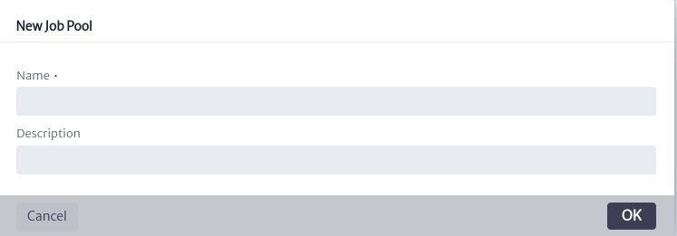 |
|---|
| Figure 5. Pool creation window |
Al crear el pool de job, se pueden visualizar las jobs que tiene asignados, eliminar el pool usando el botón  y editar sus propiedades utilizando la hoja de propiedades de la Figura 5.
When creating the job pool, you can view the jobs assigned to it, delete the pool using the buttonand edit its properties using the properties sheet shown in Figure 6.
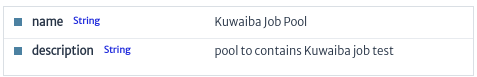 |
|---|
| Figure 6. Pool property sheet |
Scheduled Job
A job consists of the following properties:
| Property | Description |
|---|---|
| Job pools | Pool to which the job will be assigned |
| Name | Name of the job |
| Description | Description of the job |
| Users | Users assigned to the job |
| Task | Task assigned to the job that will be executed |
| CronExpression | Expression that designates the time at which the job should be executed |
| Enable | Flag to enable or disable the execution of the job |
| LogResults | Flag to enable or disable logging of execution results in the console |
Once the job pool is created, the button to add jobswill be enabled in the main menu of the module, as seen in Figure 7.
 |
|---|
| Figure 7. Create jobs button |
Pressing it will open the job creation window shown in Figure 8.
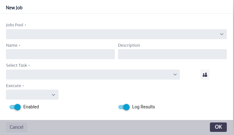 |
|---|
| Figure 8. Jobs creation window |
To create the job, follow these instructions:
-
Select a pool in Jobs Pool combo box allows you to assign the new job to the desired pool.
-
Fill in the text fields for Name and Description.
-
Select a tasks in Select Task combo box allows you to assign the task to be executed by the job. This task must have been previously registered in Kuwaiba through the Task Manager module.
-
Use the button
 allows you to assign users available in Kuwaiba to the job. These users will be notified of the task execution result (this feature will be added in the future and is not yet available).
 -
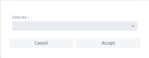
Fill Execute, this combo box allows you to select the job execution (CronExpression). The scheduling options include the following:
- Every: Enables the execution of the job at short intervals, ranging from seconds to hours.
- Daily: Allows daily execution of the job at the selected time of day.
- Weekly: Enables weekly execution of the job. You must select the desired day of the week and time.
- Monthly: Enables monthly execution of the job. You must select the desired day of the month and time. (If you select the 30th of each month, execution will be skipped in months with fewer than 30 days).
If all mandatory properties marked with * are filled in correctly, the OK button in the job creation window from Figure 8 will be enabled.
Note Before creating or scheduling a job, ensure that the scheduler user is created in the application. If not, create it in group system with the name scheduler and type System. For more details on how to create users, refer to the User Manger, which explains this in detail.
When a new job is created, it will be scheduled and queued to be executed according to the assigned execution interval. It can be viewed in the main window of the module as seen in Figure 9. Upon creating a job, it will automatically be scheduled every time the application starts. If for any reason you do not want it to be executed, you can disable its execution by setting the Enable property to False or by deleting the job.
Once the job is executed, the result of its execution will be logged in the general events of the AuditTrail using the user scheduler. You can refer to AuditTrail for more details.
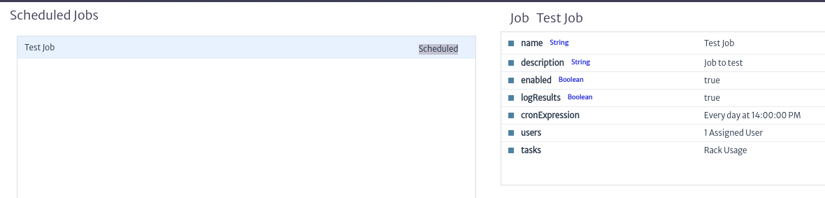 |
|---|
| Figure 9. Jobs scheduled |
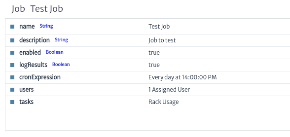
When left-clicking on a job, the property sheet shown in Figure 10 will appear. This property sheet allows you to edit the properties of the job after it has been created.
 |
|---|
| Figure 10. Job property sheet |
All properties of a job seen previously can be edited by double-clicking the desired property on the property sheet.
To edit the cronExpression property, double-click on it. This will prompt the cronExpression editing popup window shown in Figure 11, which behaves similarly to when creating and assigning the execution of a new job. Once you've chosen the new job execution, click OK to edit, or Cancel if you don't wish to edit this property.
 |
|---|
| Figure 11. Edit cronExpression property window |
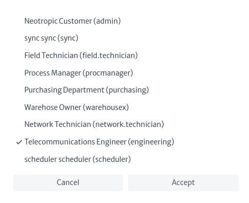
Similarly, to edit the users assigned to the job, double-click on the users property. This will display the selection list of available users in Kuwaiba, as shown in Figure 12. Add or remove the users you want to assign or unassign from the job, then click OK to edit or Cancel if you don't wish to edit this property.
 |
|---|
| Figure 12. Edit users property window |
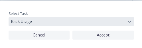
Finally, to edit the task that the job should execute, double-click on the tasks property. This will open the task editing window shown in Figure 13, where you can choose any task registered in the Task Manager. Once you've selected the task, click OK to edit or Cancel if you don't wish to edit this property.
 |
|---|
| Figure 13. Edit tasks property window |
Jobs have four possible states, which inform the user about the execution status of the jobs that have been scheduled. The status can be viewed in the central part of the main window of the module. The available states are:
- Scheduled: Indicates that the job has been scheduled correctly and is waiting to be executed.
- Running: Indicates that the job is currently running (it cannot be edited during this time).
- Executed: Indicates that the job executed successfully in its last execution.
- Error: Indicates that an error occurred in the last execution of the job.


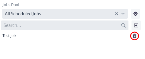
Finally, it's possible to view the list of jobs associated with a pool or all created jobs using the pool selector located on the left side of the main window. It's also possible to filter the results by job name. Additionally, this list allows you to delete a job using the buttonas shown in Figure 14.
 |
|---|
| Figure 14. List of jobs |
Navigation
This module is the main navigation tool of the application, as it presents the physical objects of the inventory organized in a hierarchical containment structure explained in the Containment Manager chapter.
To access the navigation module in the top bar of the screen, locate the compass symbol shown in Figure 1. Then go to the Navigation section.
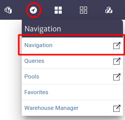 |
|---|
| Figure 1. Navigation module. |
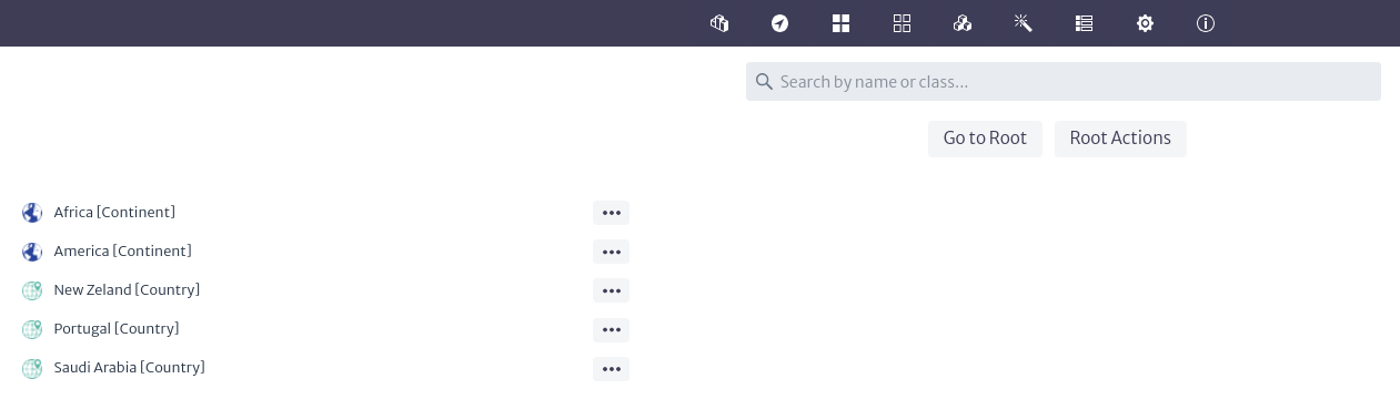
All physical layer objects created start from the same root called Dummy Root which is the first level of containment. The image below shows the main view of the navigation module. The objects observed when clicking on the Go To Root button are the direct children of Root. That is, the objects created at the top of the hierarchy.
 |
|---|
| Figure 2. Navigation module interface. |
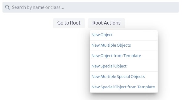
Clicking on the Root Actions button displays a menu with the available options for object creation. As shown below. These options are explained in detail in the Object Options Panel section.
 |
|---|
| Figure 3. Root actions. |
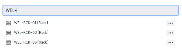
The top bar that appears in the Navigation module allows you to perform a search to find inventory objects more easily. You can search for an object by its name, displayName or by the class it belongs to. For example, to search for a Rack, you can search by the Rack class or by the Rack name. Before clicking to return the complete search results, the application provides 5 suggestions grouped by type of item to facilitate the search. Search results are paginated, with a maximum of 20 results per page.
 |
|---|
| Figure 4. Search objects by className. |
Next to each object that appears as a search result, the  button is displayed, allowing quick access to the most frequently used actions in the inventory.
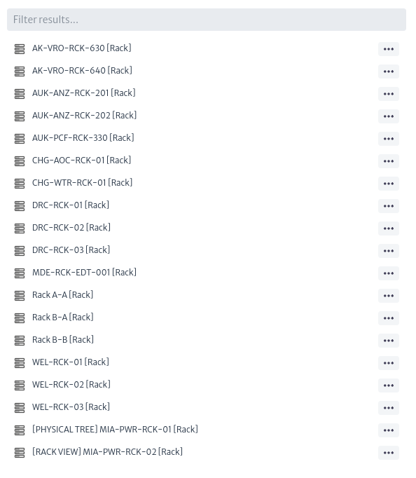
After performing the search, a second search bar appears with which you can filter according to the results found, as shown below.
button is displayed, allowing quick access to the most frequently used actions in the inventory.
After performing the search, a second search bar appears with which you can filter according to the results found, as shown below.
 |
|---|
| Figure 5. Filter. |
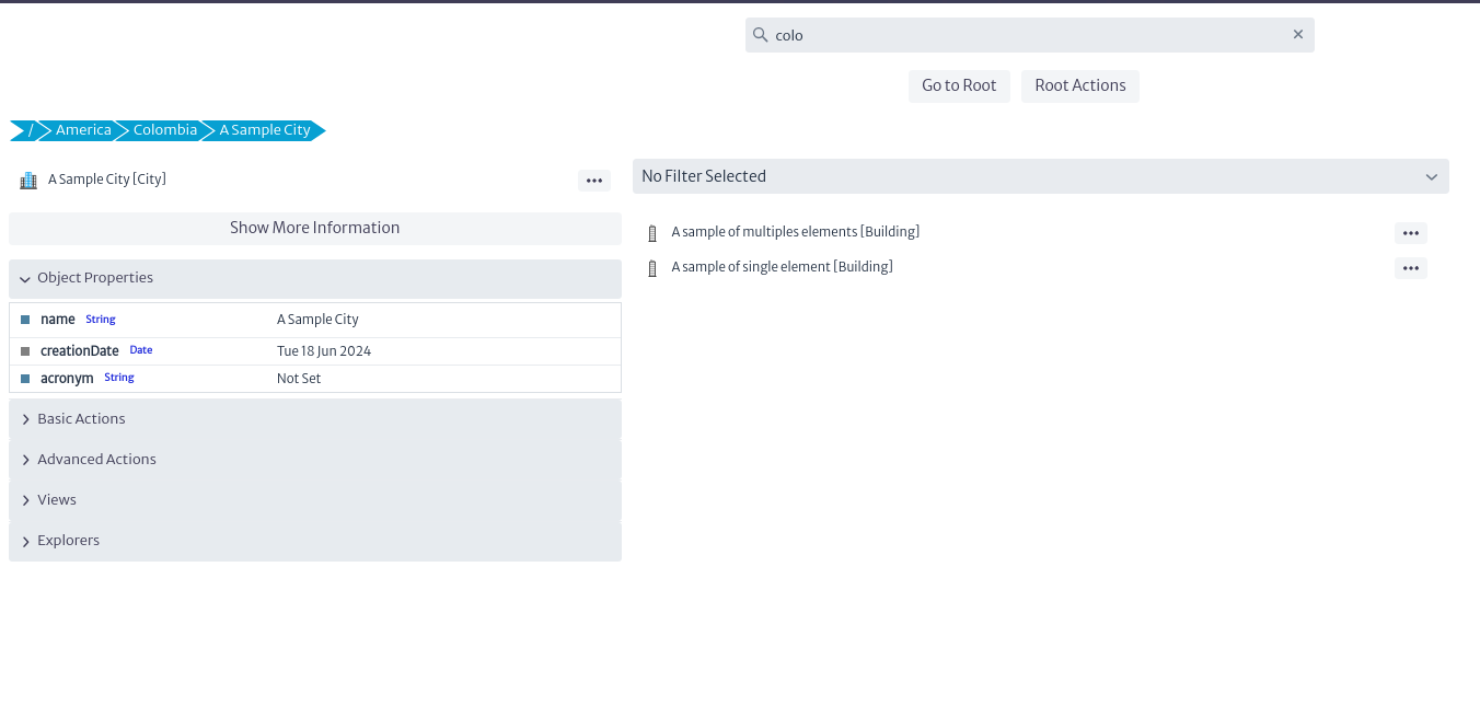
By accessing any physical object in the inventory, you can view information specific to the selected object. As shown in Figure 6.
 |
|---|
| Figure 6. Inventory object navigation. |
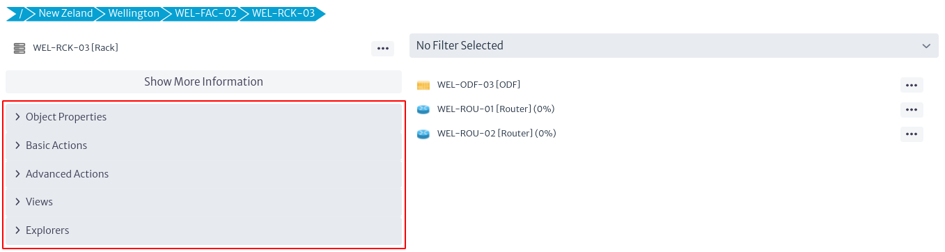
In Figure 6, the section marked in red corresponds to the Object Options Panel, explained in detail in the section Object Options Panel.
In the upper part of Figure 6 (detailed in Figure 7) the path or containment hierarchy of the selected object is shown. This means that the New Zeland object contains the Wellington object, which in turn contains the WEL-FAC-02 object, which contains the object of interest: the selected Rack (WEL-RCK-03).
The hierarchy shown in Figure 7 is interactive. By selecting any of the elements within the containment hierarchy, you will be redirected to the detailed information of that object.
 |
|---|
| Figure 7. Object containment hierarchy. |
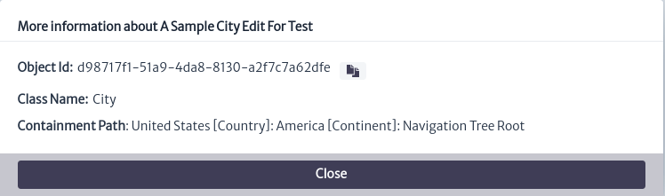
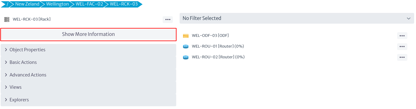
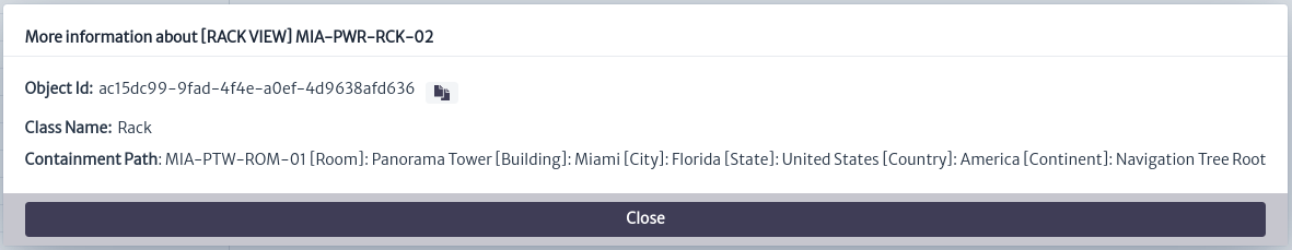
Clicking on the Show More Information button shown at the top of Figure 8 opens a pop-up window like the one shown in Figure 9, which contains basic information about the selected inventory object.
- Object Id. It is the identifier of the object in the database. It is useful for troubleshooting. It is often used in the Query Manager to create queries.
- Class Name. The class to which the inventory object belongs.
- Containment Path. Indicates the complete containment structure of the object.
 |
|---|
| Figure 8. Object Information. |
 |
|---|
| Figure 9. Object Information. |
On the right side of Figure 6, shown in more detail in Figure 10, there is a filter bar at the top. This bar is used if the Rack has filters associated with it. Filters, as the name implies, filter the children of an object according to the conditions evaluated in the filter. For more information, see the Filters section. Below the filter field, the descending hierarchy of the class of interest is displayed, i.e. the inventory objects contained in the selected Rack. When selecting any of the objects in Figure 10, the interface will display similar content as in Figure 6, but with the information of the newly selected object. Next to some objects shown in Figure 8, some percentages are observed. These represent the results of the validators associated with the object class. For more information, see chapter Validator Definition.
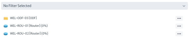 |
|---|
| Figure 10. Children of the selected object. |
Object Options Panel
The Object Options Panel is a central component that manages the functionality of the objects in the inventory. It can be accessed from several areas such as the navigation module, pools and when executing queries, among other access points, as opposed to being limited to a specific module.
 |
|---|
| Figure 11. Object Options Panel. |
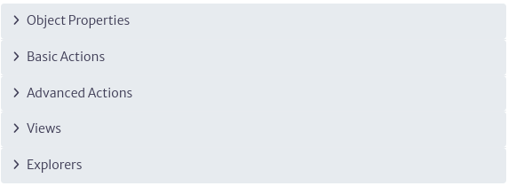
Figure 11 shows the components that make up the Object Options Panel. Each of them will be explained in detail below.
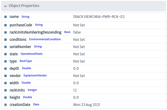
Object Properties
Displays the values of the attributes of an inventory object. These attributes match the visible attributes defined in the Containment Manager. All changes are automatically entered into the database when the Enter key is pressed.
The F2 key on your keyboard allows you to quickly change the name of the selected object.
 |
|---|
| Figure 12. Object Properties. |
There are different types of attributes.
-
Read Only. These are attributes that cannot be modified. In Figure 12, you can see that the creationDate attribute is grayed out, indicating that its value is not modifiable.
-
Unique. These are attributes whose value must be unique in the inventory and are indicated with purple color.

Figure 13. Unique attribute. -
Mandatory. These are attributes whose value must be defined as mandatory. Mandatory attributes are indicated in red, as shown in the figure below.

Figure 14. Mandatory attribute. -
List Type Items. These are attributes whose value must be selected from a specific list of particular object types. For more details see chapter List Type Manager. In Figure 15 you can see, when you select an attribute of a specific list type, it opens an editor containing the list of possible values that can be defined. If you do not want to select any, use the first option from the list (
None).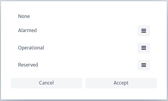
Figure 15. List type items.
Basic Actions
The basic actions of each inventory object are shown in Figure 16 and are described below.
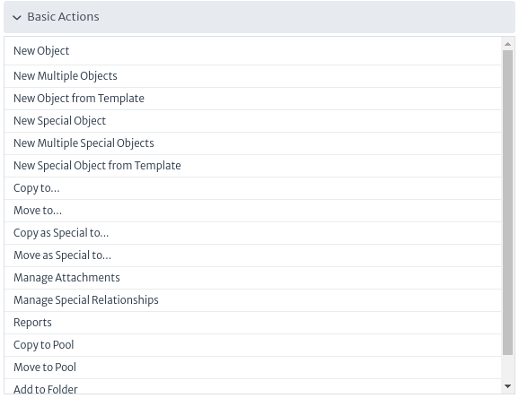 |
|---|
| Figure 16. Basic Actions. |
New Object
Creates a single object as a child of Root using the standard containment hierarchy.
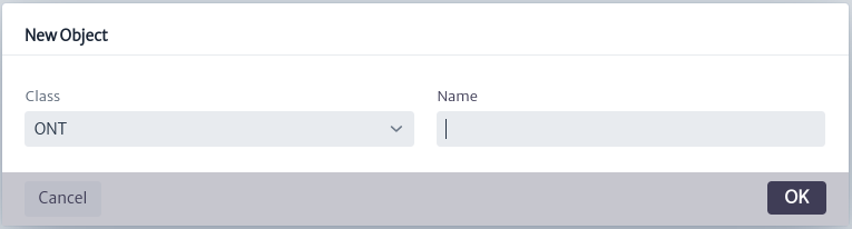 |
|---|
| Figure 17. Create Object. |
New Multiple Objects
Creates a defined number of objects at a time using a given naming pattern.
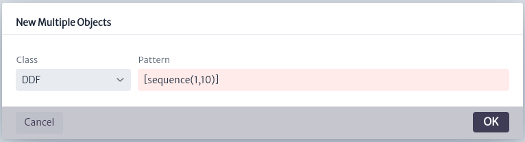 |
|---|
| Figure 18. Create Multiple Objects. |
New Object from Template
Creates an object (and possibly a complex containment structure under it) from a previously defined template. See more details in chapter Template Manager.
New Special Object
Creates an object in the Special Containment Hierarchy (see Containment Manager).
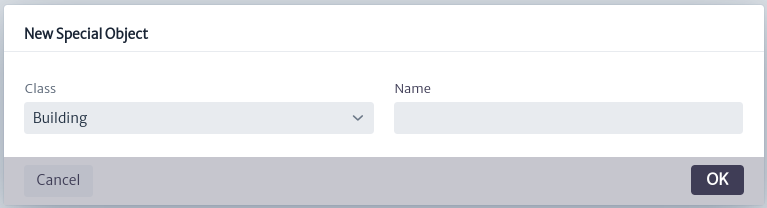 |
|---|
| Figure 19. Create Special Object. |
New Multiple Special Objects
Creates several objects of the special containment hierarchy using a pattern.
 |
|---|
| Figure 20. Create multiple special objects. |
New Special Object from Template
Creates a special containment hierarchy object from a Template defined in the Template Manager.
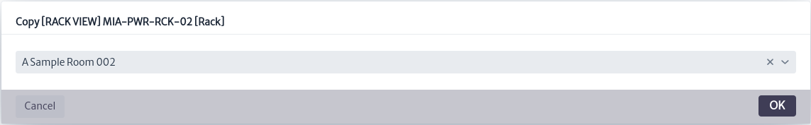
Copy to
A plain copy operation.
 |
|---|
| Figure 21. Copy object to another object. |
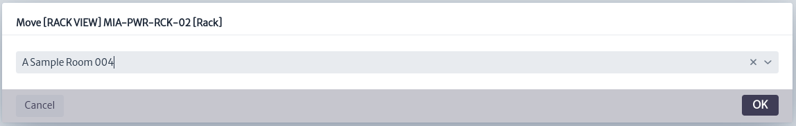
Move to
Moves the object respecting the containment hierarchy.
 |
|---|
| Figure 22. Move object to another object. |
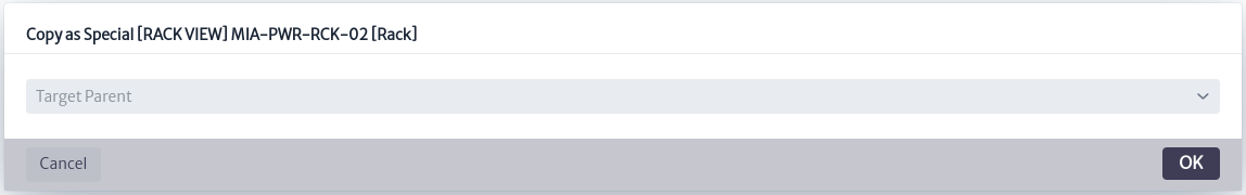
Copy as Special to
Copies the object respecting the special containment hierarchy.
 |
|---|
| Figure 23. Copy as special object to another object. |
Move as Special to
Moves the object respecting the special containment hierarchy.
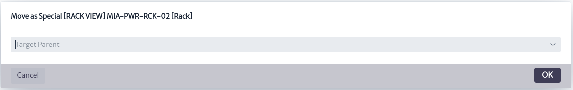 |
|---|
| Figure 24. Move as special object to another object. |
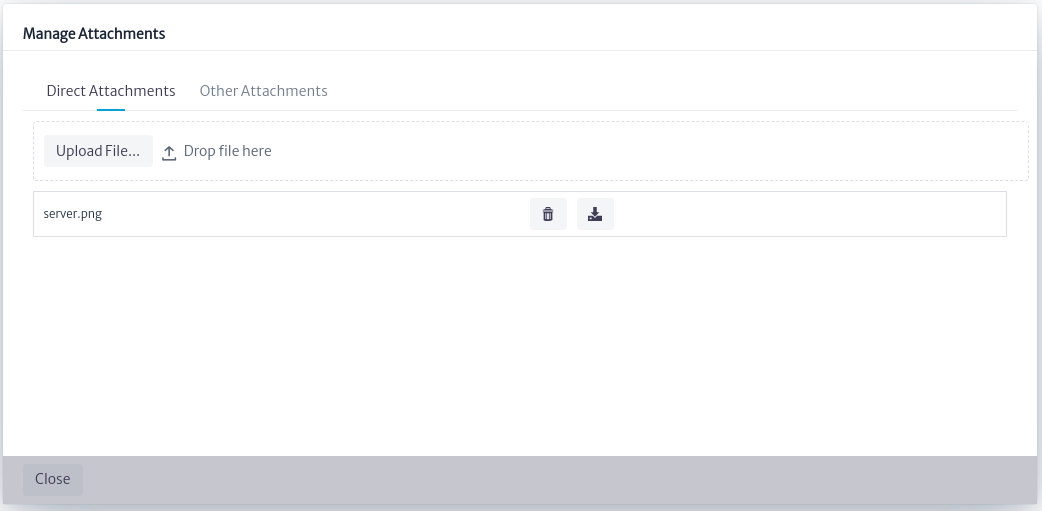
Manage Attachments
Handles attachments directly related to the object, as well as attachments associated with list-type items linked to the object. Figure 25 shows how attachments directly related to the object can be viewed, added, deleted or downloaded. In this case, an MPLS Router has an attachment directly related to the object.
 |
|---|
| Figure 25. Manage direct attachments. |
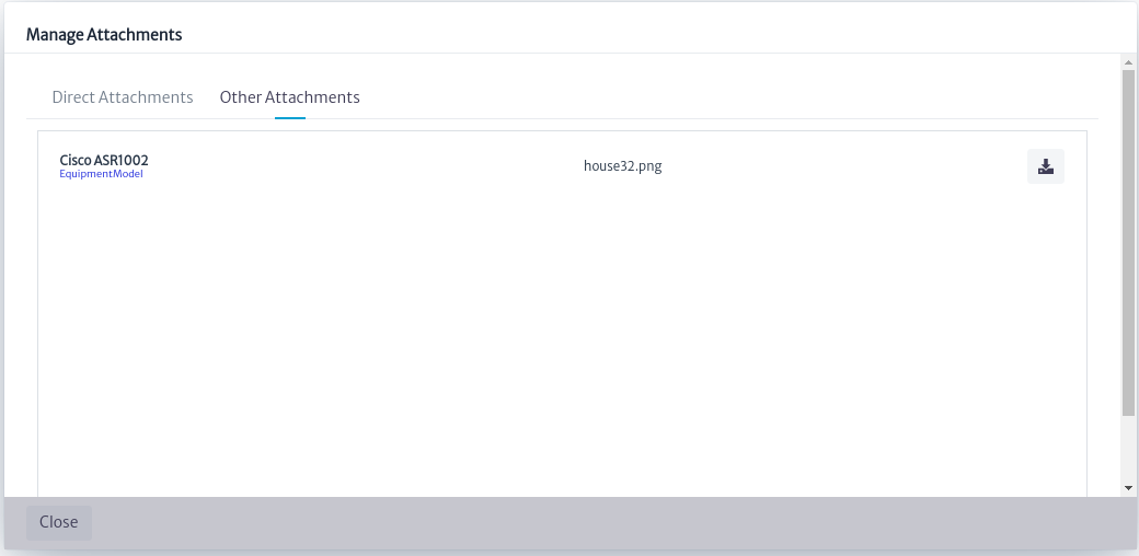
On the other hand, in Figure 26, it is observed that the attachments indirectly related to the object can only be viewed and downloaded, but not modified. In this case, the MPLS Router has an attachment indirectly related to the object.
 |
|---|
| Figure 26. Manage other attachments. |
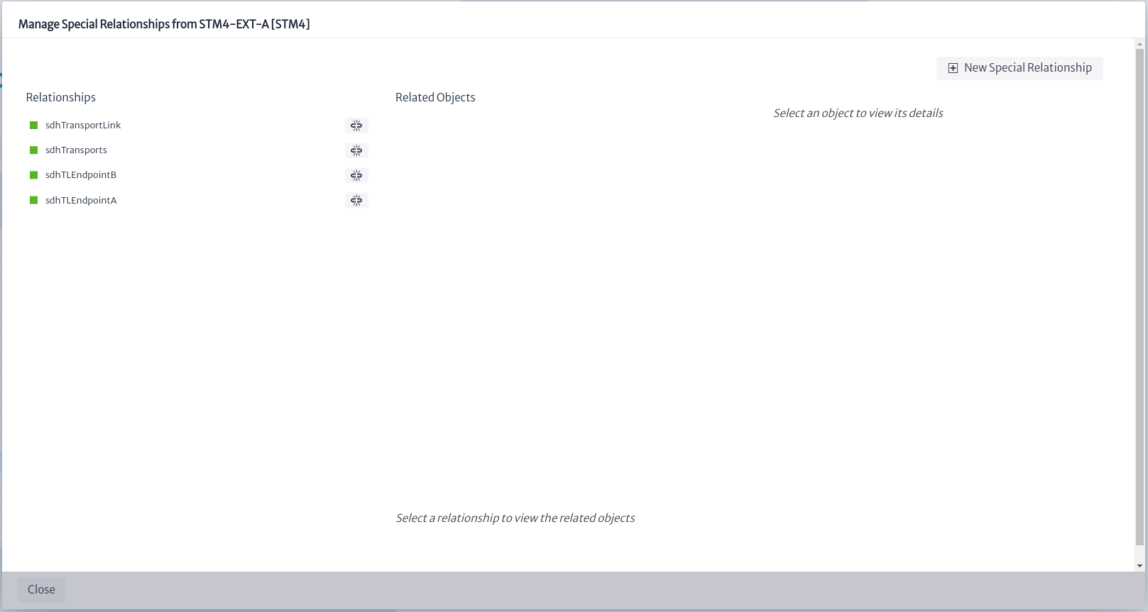
Manage Special Relationships
Allows you to create arbitrary relationships between objects.
Warning This action should be handled with extreme caution, as it may cause damage to the model.
Figure 27 shows the pop-up window that displays the special relationships that an object has. The  button allows you to delete a relationship.
 |
|---|
| Figure 27. Manage special relationships. |
To create a new special relationship, select the New Special Relationship button. This will open a new window where you can define the name of the relationship and specify the object with which this special relationship will be established.
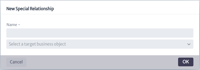 |
|---|
| Figure 28. Manage special relationships. |
Reports
Displays the reports associated to the objects of this class. In this case, Rack has three associated reports, as shown in Figure 29. Selecting a specific report opens a new HTML window with the result of the report execution. This section is explained in detail in the Reports chapter.
Note: It is necessary to enable popups in the browser so that the report can be executed.
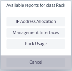 |
|---|
| Figure 29. Reports. |
Copy to Pool
Copy the inventory object to a pool containing elements of the same type as the object to be copied. See more details in Pools.
Move to Pool
Move the inventory object to a pool containing elements of the same type as the object of interest. For more details see Pools chapter.
Add to Folder
All inventory objects can be added to an existing Favorites Folder. See more details in Favorites chapter.
Delete Object
Deletes the object. This will fail if the object has an incoming relationship, for example, a Port connected to a cable.
Advanced Actions
The advanced actions of the inventory objects differ from the type of object of interest. They are injected by other modules where they will be detailed.
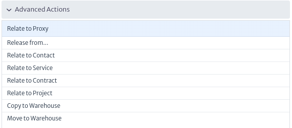 |
|---|
| Figure 30. Advanced actions. |
Views
A view is a graphical representation of a selected object that can be displayed from different perspectives by different modules.
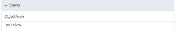 |
|---|
| Figure 31. Views. |
Object View
Applies to objects of the
ViewableObjectsubclasses
A view is a graphical representation of what is inside an object. All instances (objects) of subclasses of ViewableObject have an ObjectView that shows the direct children of the selected node.
Most objects, except for logical and administrative assets and a few physical ones such as slots and ports, are subclasses of ViewableObject.
An example of the object view is shown in Figure 32, where the selected object is a country and in the object view are the cities and states that are direct children of the selected country.
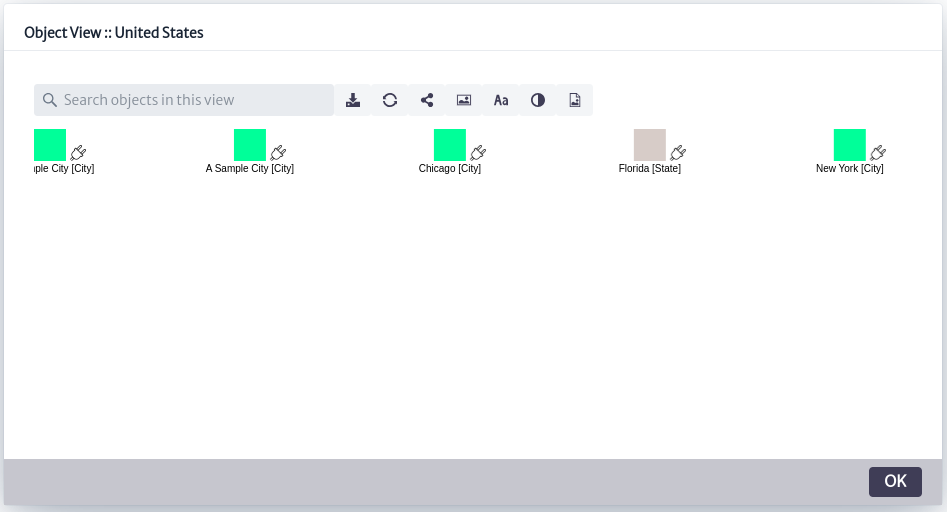 |
|---|
| Figure 32. Object view. |
Figure 33 shows the toolbar at the top of Figure 32.
 |
|---|
| Figure 33. Object view toolbar. |
In the upper left part of Figure 33 a search box appears, where you can search for a specific object that is a direct child of the selected object.
| Icon | Description |
|---|---|
 | Save view |
 | Update view |
 | Connect two nodes (See Physical Connections for more details on how to use it) |
 | Add a background image |
 | Hide/show the labels next to the connections |
 | Change labels color |
 | Export as image |
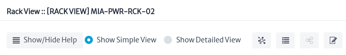
Rack View
Applies to objects of class or subclass
Rack
This view only works with objects of the Rack class or its subclasses. It shows how the elements contained in the selected object are organized, according to their position and the number of rack units used.
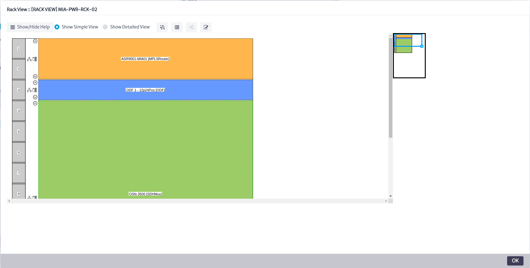 |
|---|
| Figure 34. Rack view. |
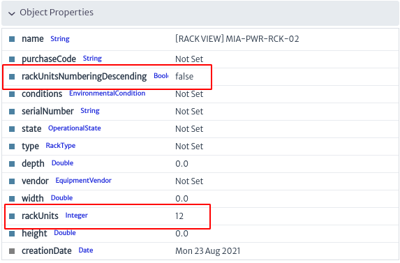
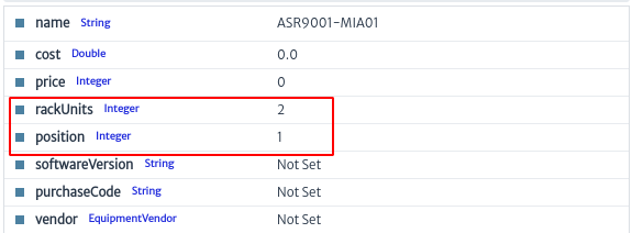
To build this view correctly, three conditions must be met:
- The rack must have its
rackUnitsattribute set to a valid integer value. This attribute stores the total number of rack units supported by the rack. Typical values are 20, 28, 34, 40 or 45.- The
rackUnitsNumberingDescendingattribute must exist, if the order of the rack units has not been set, ascending numbering is assumed. This attribute instructs the view to display the rack units in ascending (if false) or descending (if true) order.- The
rackUnitsandpositionattributes must exist and have valid values on the contained elements within the rack.rackUnitsin this case, refers to the number of rack units occupied by the contained element, whilepositionis the starting position of the contained element, based on 1, numbered from top to bottom. This value is usually provided by your equipment supplier. If the value ofrackUnitsis 0, the element will not be displayed in the view.
 |
|---|
| Figure 35. Rack properties. |
 |
|---|
| Figure 36. Rack children properties. |
A menu is shown at the top of Figure 34.
 |
|---|
| Figure 37. Rack view menu. |
-
The
Show/Hide Helpbutton provides the user with a short guide to the use of the tool, as shown in Figure 38.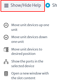
Figure 38. Rack view help. -
The tool offers a more detailed view of the rack and its components, by clicking on the
Show Detailed Viewoption as shown below.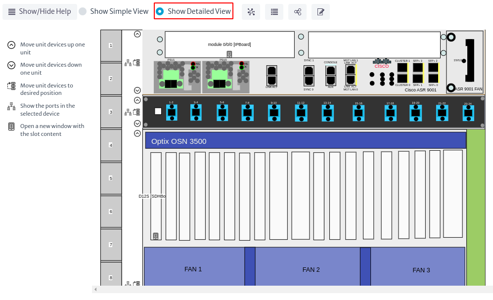
Figure 39. Detailed rack view. -
The icon
 opens a new window with the connected devices and their status, as shown in Figure 40.
Figure 40. Device summary. -
The icon
 opens a window with the connections between the devices, as shown in Figure 41.
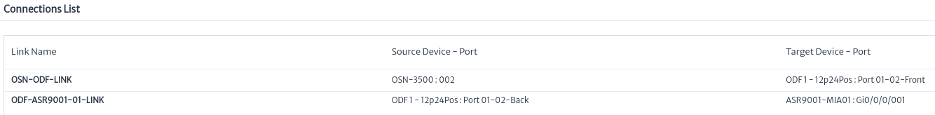
Figure 41. Connection list. -
The icon
 is used to edit the attributes of the selected rack, as shown in Figure 42.
Figure 42. Rack properties.
Finally, in Figure 34, on the left side of the view, there are two options that appear next to each of the devices:
-
The icon
 opens a new window with the port information for each device, as shown in Figure 43.
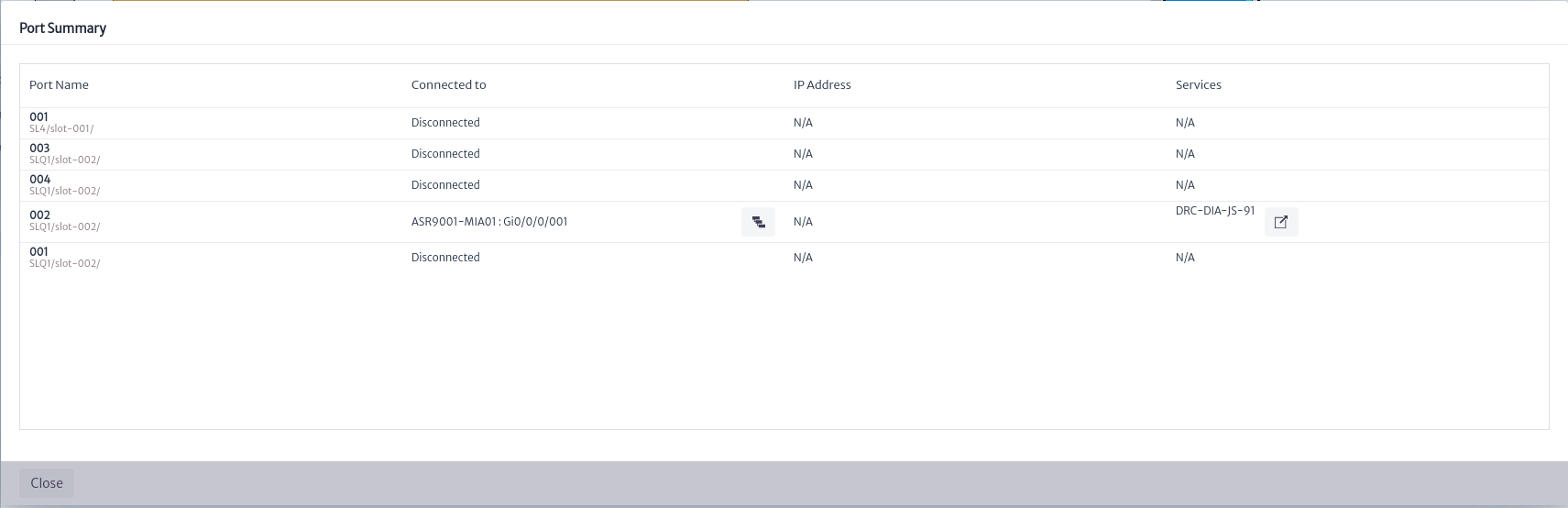
Figure 43. Port summary by device. -
The icon
 allows you to move the device to a different position within the rack.
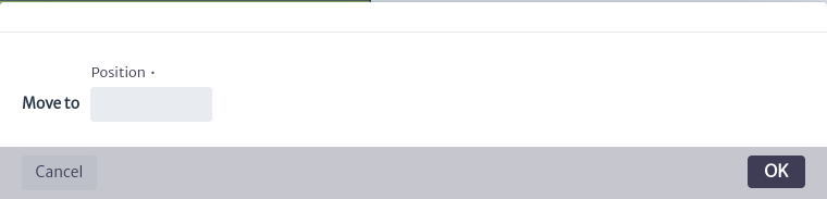
Figure 44. Move device in the rack.
Splice Box View
Applies to objects of class or subclass
SpliceBox
This view represents the splices made by a splice box, using the mirror, endpointA and endpointB relationships. In the example in Figure 45, a splice box with 4 input ports (IN-001, IN-002, IN-003 and IN-004) and 4 output ports (OUT-001, OUT-002, OUT-003 and OUT-004) is shown, where each input port is connected to a corresponding output port using a mirror relationship. Also visible is a fiber path labeled 001 (related to the splice box ports via the endpointA and endpointB relationships), which enters the splice box through port IN-001 and exits through output port OUT-001. The figure also shows the organization of the connections and the internal structure of the splice box, highlighting the splices currently in use (marked in blue) versus those available (marked in gray).
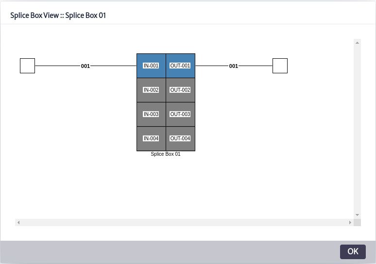 |
|---|
| Figure 45. Splice box view. |
Fiber Splitter View
Applies to objects of class or subclass
FiberSplitter
It shows the operation of a fiber splitter, illustrating how a single fiber signal is distributed to multiple outputs. The fiber splitter view is based on the multipleMirror, endpointA and endpointB relationships.
The endpointA and endpointB relationships identify the ports where the fiber path enters and exits, while the multipleMirror relationship is the relationship between the single fiber splitter input port and the N output ports.
In the view presented in Figure 46, a fiber splitter called 1x16 Secondary Splitter was selected, which has 16 output ports (001-OUT to 016-OUT) connected to the splitter's input port (IN-001) where the fiber optic cable enters.
The splitter has only one of the occupied outputs (001-OUT), which connects to another device. In the figure, this connected output is shown in blue, while the other 15 output ports, which are not yet in use, are shown in gray.
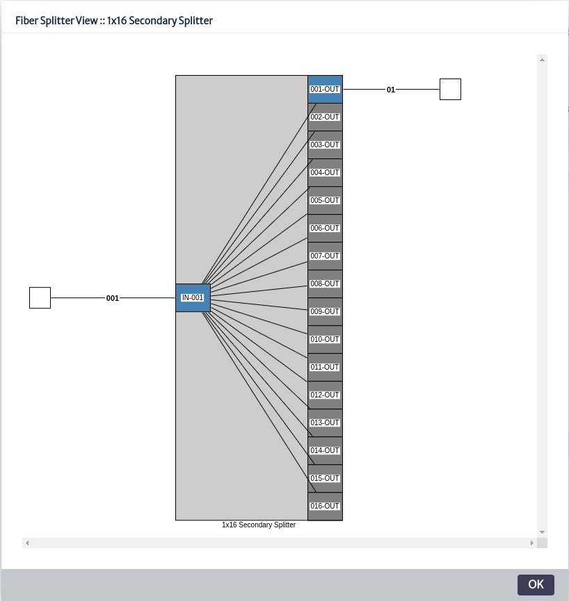 |
|---|
| Figure 46. Fiber splitter view. |
Physical Path View
Applies to objects of the
GenericPortsubclasses
Calculates and plots the longest path from a source port to another port, considering mirror, mirrorMultiple, endpointA and endpointB relationships. This view represents hierarchically the components that are part of the route, showing clearly their interconnections and the order in which they are arranged. See more in Outside Plant Management.
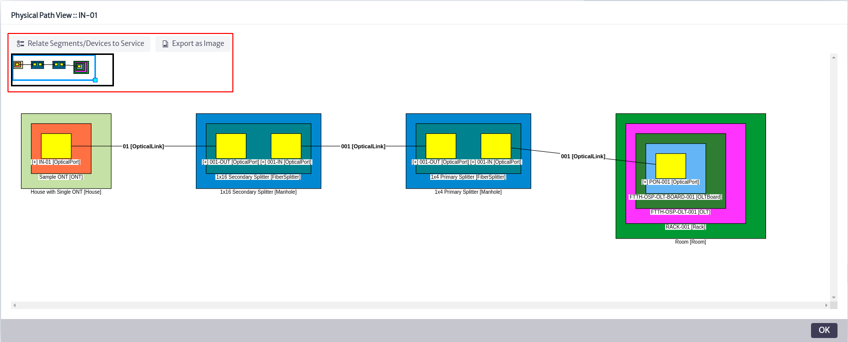 |
|---|
| Figure 47. Physical path view. |
The example in Figure 47 shows the connection of an optical fiber from a port of a selected ONT to an OLT, passing through two intermediate fiber splitters.
The port of the selected ONT is IN-01, and the OLT port where the connection terminates is PON-001.
This representation allows to visualize and understand the exact path of the optical signal, facilitating the tasks of diagnosis, maintenance and network planning.
Figure 48 illustrates clearly the options presented by this view, shown in Figure 47 in the red box.
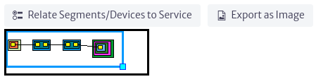 |
|---|
| Figure 48. Physical path options. |
Selecting the option Relate Segments/Devices to Service, as shown in Figure 47, opens a new pop-up window as seen in Figure 49. In this window, the user can relate a service to the elements that are part of the selected network.
At the top of Figure 49, there is a search box that allows the user to select the service to which the device or network segment is to be associated. To finalize the process and create the relationship, choose the Relate Selection to Service option.
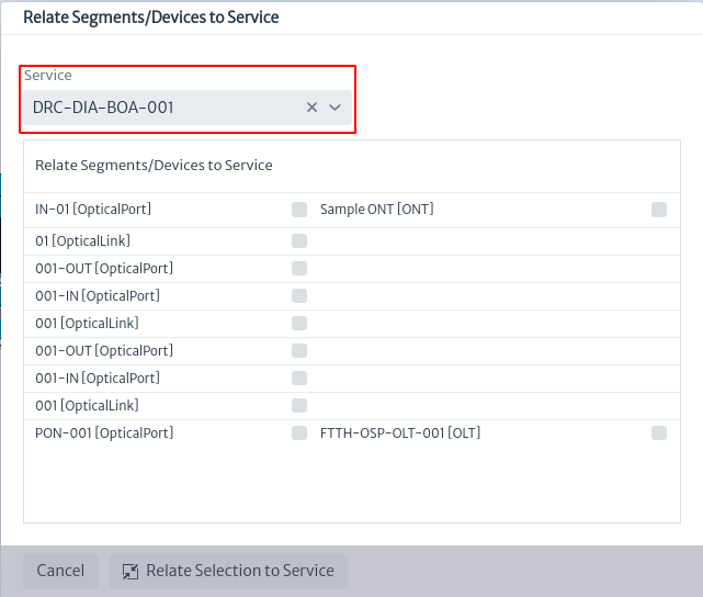 |
|---|
| Figure 49. Relate device to service. |
The view can be downloaded as a jpg image by selecting the Export as Image option listed in Figure 48.
The box at the bottom of Figure 48 allows the user to move more easily through the view in case its size is considerably large.
Physical Tree View
Applies to objects of the
GenericPortsubclasses.
Using the endpointA, endpointB, mirror and mirrorMultiple relationships from a source port, all paths to other ports are calculated and plotted in the view. In the example illustrated in Figure 50, port PON-001 of an OLT has been selected. The view shows all physical connections associated with this port (in this case, a single connection) and the devices that are part of these routes. See more in Outside Plant Management.
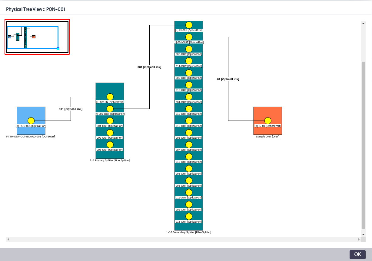 |
|---|
| Figure 50. Physical tree view. |
The red box shown in Figure 50 allows the user to adjust the size of the graph in case the diagram is too large.
Explorers
This component, as its name suggests, explores the structures of a model, including relationships, attachments and containment hierarchies. In the navigation module, there are three subcomponents, which are explained below.
 |
|---|
| Figure 51. Explorers. |
Special Children
Special children are elements that, while following the concept of containment hierarchy, are used in domain-specific models. This gives them a particular behavior depending on the situation. They cannot be treated as simple objects in the navigation tree since, for example, their removal may require additional tasks beyond simply deleting them from the database, because they are part of a complex workflow. These children respect the special containment hierarchy detailed in the Special Containment Hierarchy chapter. As shown in Figure 52, selecting an object displays a pop-up window with its special children. If any of these special children are selected, its own special children, if any, will be displayed. When selecting any special child, the corresponding object information appears in the Object Options Panel on the right side of the screen.
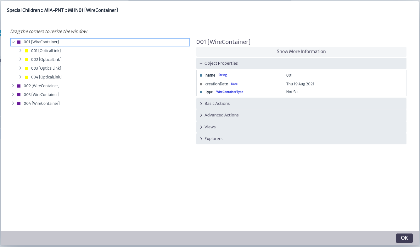 |
|---|
| Figure 52. Special children explorer. |
Relationships
Allows you to view the special relationships of the selected object. When an object is part of a specific domain model (such as SDH, Physical Connections, MPLS, Services, etc.), there are special links to other objects called relationships. These relationships, with documented names according to the model, can be displayed using this explorer.
Figure 53 shows the relationships of an Optical Link, where three types of relationships are observed. The parent relationship, which is common to all inventory objects and is used to navigate upwards in the containment structure, and the endpointA and endpointB relationships, which are used in the Physical Connections model. Selecting either of the latter two relationships expands the displayed tree, indicating the object with which the relationship exists and, in turn, displaying the relationships of that object.
On the right side of Figure 53 is the Object Options Panel, which displays information and actions related to the specific object selected.
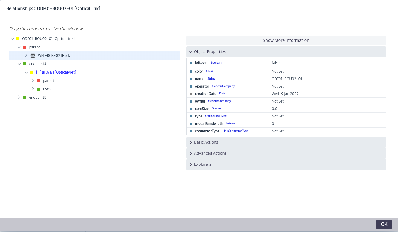 |
|---|
| Figure 53. Relationships explorer. |
Audit Trail
It is a sequence of records that documents changes in inventory objects. For more details, see chapter Audit Trail.
Queries Manager
The Query Manager is a module designed for performing advanced searches based on nodes using the graphical interface. The search criteria can range from properties to relationships.
Figure 1 illustrates the module's structure. In the application, queries are stored and organized into Pools through the CHILD_OF_SPECIAL relationship, the Pools are groups of similar objects in this case, queries and can contain one or more elements. These queries, written as Groovy scripts, facilitate low-level queries within the application. Each query may include parameters that allow necessary values to be sent in the queries. The parameters are associated with the query through the HAS_PARAMETER relationship, indicating that the query has been assigned a parameter and will require it at the time of execution.
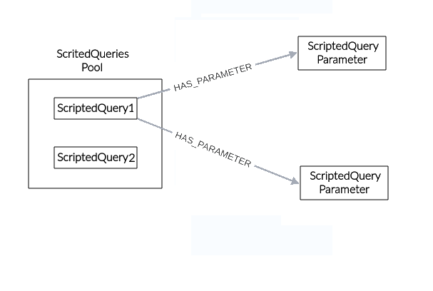 |
|---|
| Figure 1. Queries manager Structure |
This module is part of the Navigation category, as shown in Figure 2.
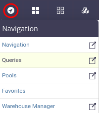 |
|---|
| Figure 2. Queries manager module |
Once opened, we will see the main window of the module, as shown in Figure 3. From here you can create your queries and scripts to make queries.
 |
|---|
| Figure 3. Queries manager main window |
The module allows us to perform queries in two ways: by creating a query through the graphical interface in Query Builder or through scripts in Scripted Queries.
Using Query builder
This option allows us to create queries using the module's graphical interface. To start, locate Query Builder in the main window of the module, as shown in Figure 4. This option is selected by default when entering the module.
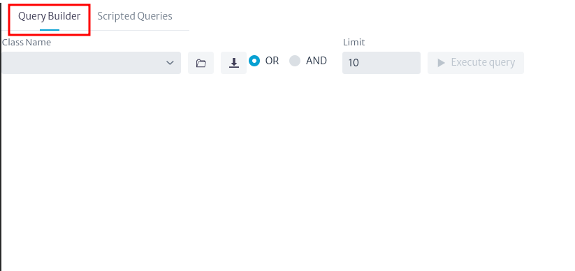 |
|---|
| Figure 4. Query builder |
To create a query, search for and select the class of the element you want to find, as shown in Figure 5. Abstract classes are supported.
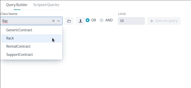 |
|---|
| Figure 5. Select class |
Once the class is chosen, a graphical representation of it will be placed on the canvas, as seen in Figure 6. This search box is a representation of the class node and contains each attribute of the selected class.
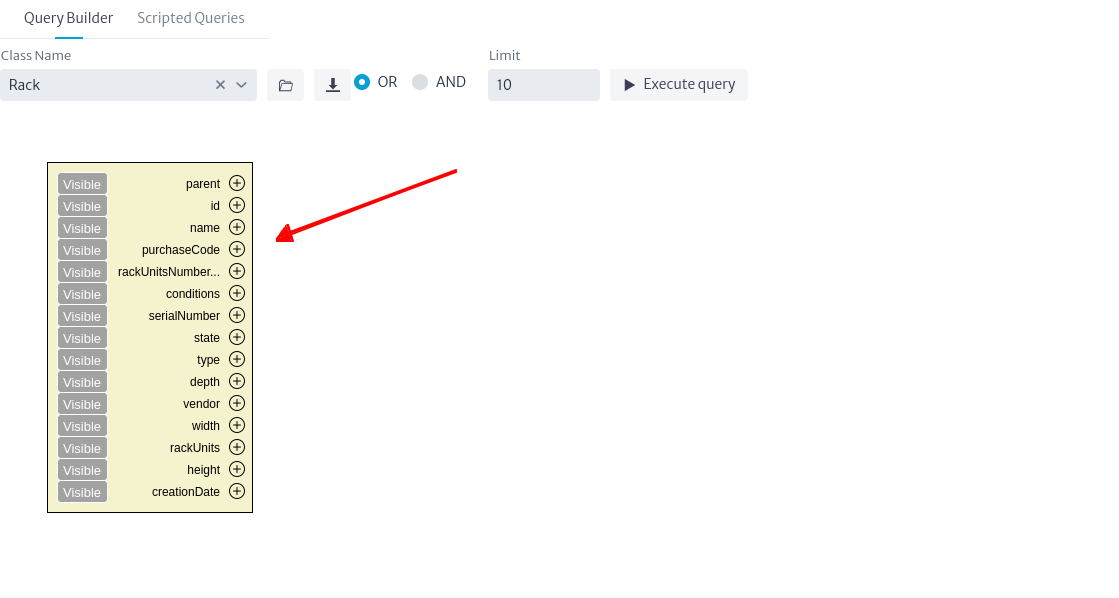 |
|---|
| Figure 6. Class selected |
You can search for a wider range of elements by selecting an abstract class (often called GenericSomething). In the previous example, it will search for all Racks in the database, but if you choose GenericPhysicalNode, it will search for all physical nodes, that is, all objects that can be connected via a container (see the Physical Connections chapter for more information about containers). This includes: buildings, rooms, floors, towers, shelters, and facilities.
Important
- If you want to see all objects in the database (at least all relevant to the inventory) search for InventoryObject, which is the root of all classes related to the inventory. To see the complete hierarchy see related chapter Data Model Manager
When you select a class, the Execute Query button will be enabled, allowing you to run the query. If you run it at this moment, the system will return all elements of the selected class, paginated in sets of 10 results, showing only the object's name, as seen in Figure 7.
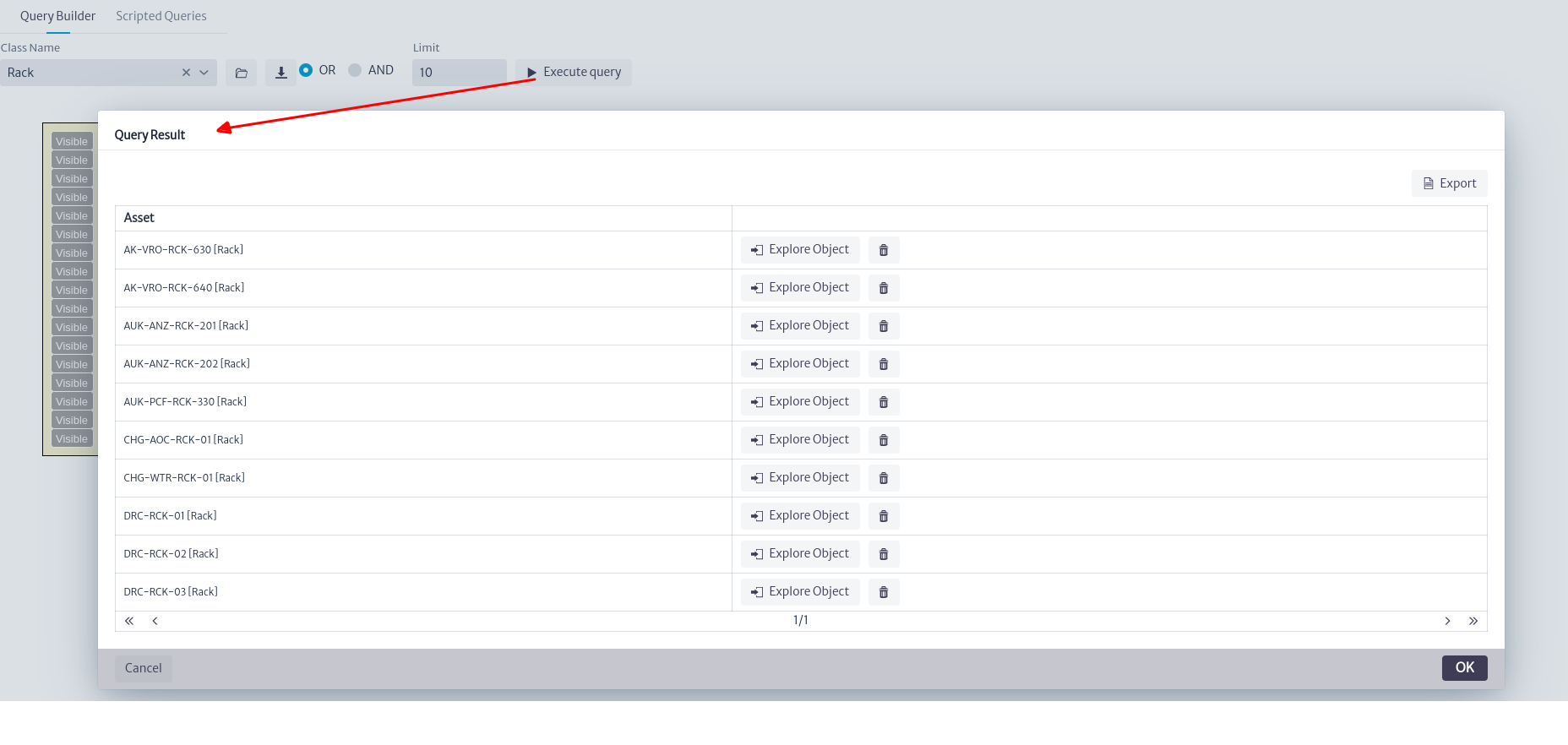 |
|---|
| Figure 7. Executed query |
Pressing the Explore Object button will open a pop-up with the object's basic data as seen in Figure 8.
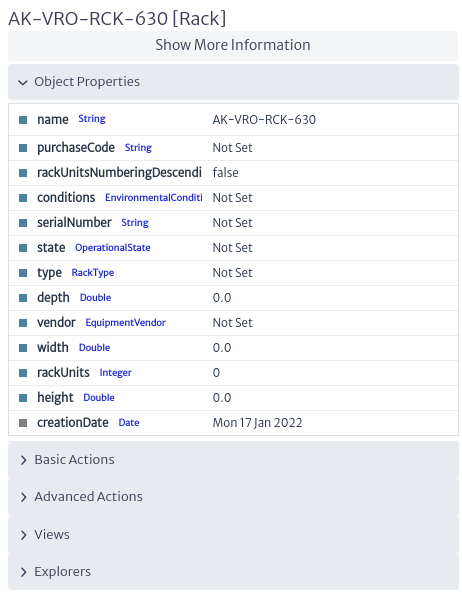 |
|---|
| Figure 8. Object properties |
Setting other attributes in the search box as visible will result in those fields being displayed in the results window, as shown in Figure 9.
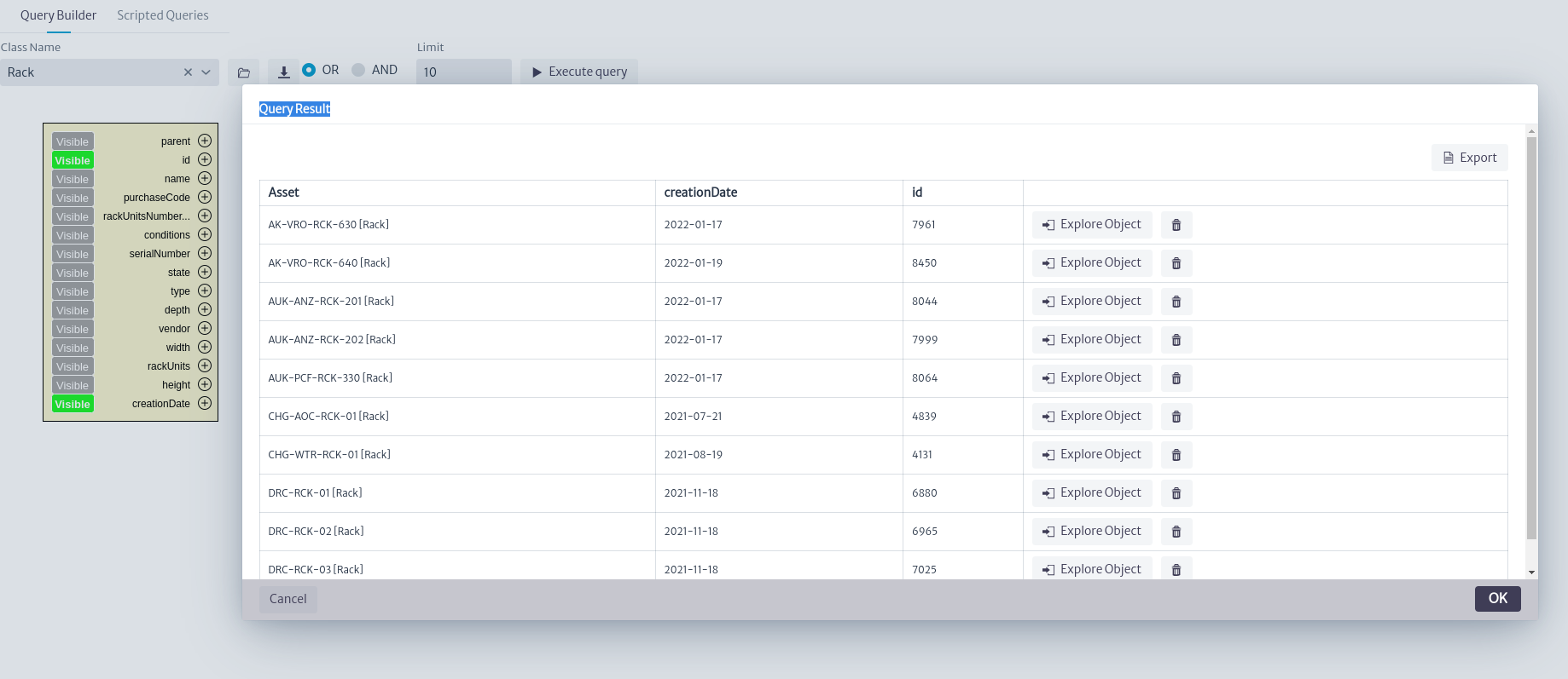 |
|---|
| Figure 9. Visible properties |
Adding conditions
To perform more complex queries, you can add search conditions for any of the class attributes using the  button. There are two types of attributes: those stored directly in the class node, such as name, id, creationDate, etc. Called simple attributes, and attributes whose information is stored in a separate node, called list type attributes (See list type attributes for details).
Clicking on the button for a class attribute will open the window shown in Figure 10. Enter a filter type and the desired value, then click OK.
 |
|---|
| Figure 10. Window to add attribute |
The available filter types depend on the data type of the attribute (String, Integer, etc.), as seen in the example in Figure 11 for String type attributes like name, or in Figure 12 for Integer type attributes like rackUnits.
 |
|---|
| Figure 11. Available string filters |
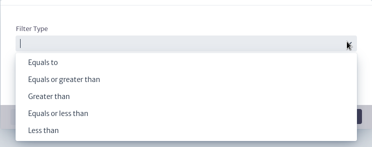 |
|---|
| Figure 12. Available int filters |
For our example, we will search for Racks in the inventory that contain "01" in their name using the Contains filter from Figure 11 on the name attribute, and that have a capacity of 24 units using the Equals to filter from Figure 12 on the rackUnits attribute. By setting these conditions for the query, you can see their graphical representation next to the corresponding attribute in the search box, as shown in Figure 13. You can edit the filters using  or remove them using
  .
.
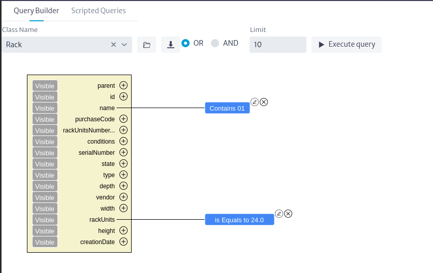 |
|---|
| Figure 13. Filters selected |
If we execute the query at this moment, we will not get the desired result as shown in Figure 14 because we need to consider how filters are applied in queries. This is similar to how it's handled in a conventional SQL statement. When we have more than two filters, we must select how they will be used in the query. We have logical operators OR and AND, which are equivalent to those used in SQL.
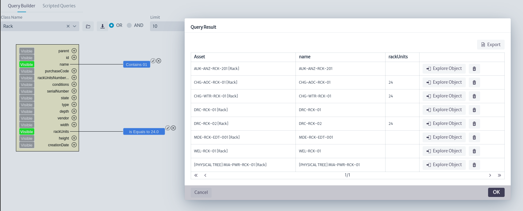 |
|---|
| Figure 14. Query incomplete result |
To adjust the behavior of the filters, we have the tools shown in Figure 15. From here, you can adjust the logical operator to use in the filters and the number of results the query will display.
 |
|---|
| Figure 15. Query filters |
By default, the selected logical operator is OR, and the record limit is 10. In the case of our example, we select the logical operator AND and execute the query. The expected result can be seen in Figure 16.
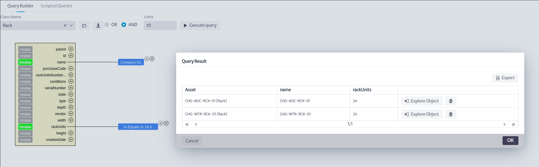 |
|---|
| Figure 16. Result filters |
For list type attributes, when you click on the button, the window shown in Figure 17 will open. For this example, we will use the Router class, which has list attributes such as software version, model, state,vendor. We will search for routers with the vendor Huawei.
 |
|---|
| Figure 17. List type attribute filter |
For list type attributes, we have two filter options, Select List Type Item and Advanced Search. By default, Select List Type Item is selected. In this filter, we need to choose from the attribute's list types, as shown in Figure 18. For the vendor attribute, we select Huawei, and its result can be seen in Figure 19.
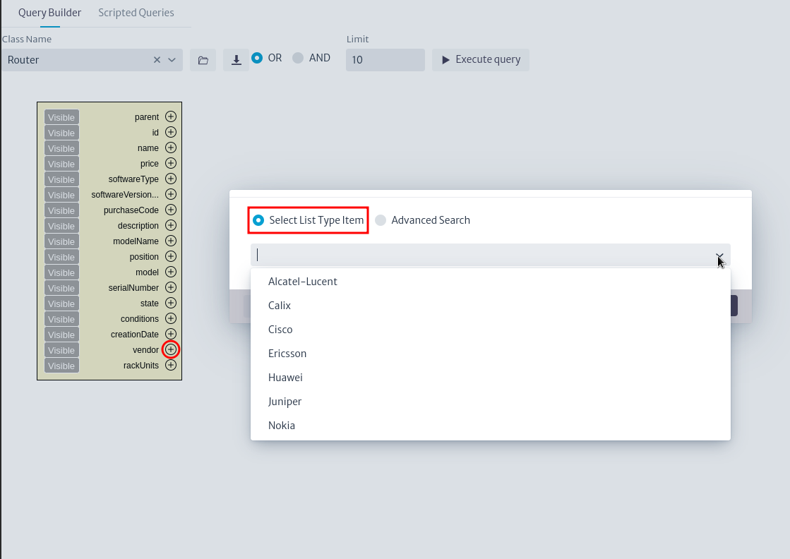 |
|---|
| Figure 18. Available list types |
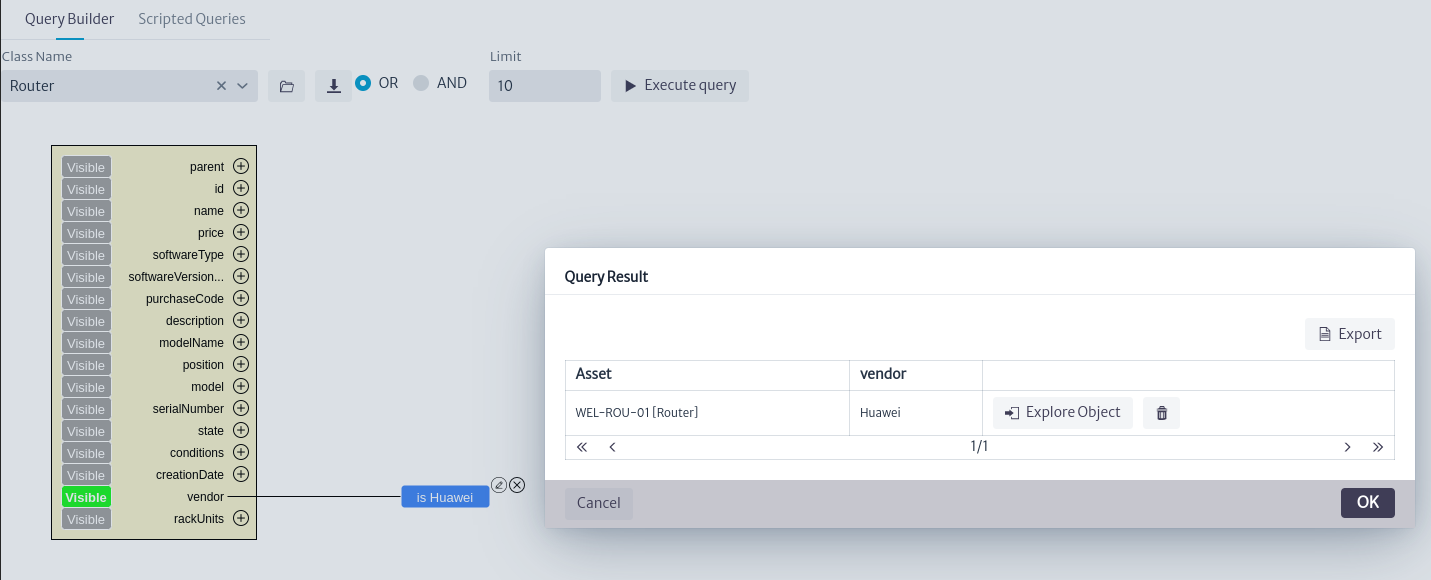 |
|---|
| Figure 19. List type Search result |
If we select the Advanced Search filter, it will not be possible to select from the attribute's list types, as shown in Figure 20. Instead, we click the OK button.
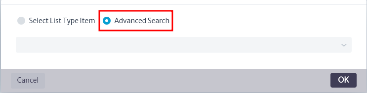 |
|---|
| Figure 20. Advanced search window |
We will see that a graphical representation is immediately placed on the canvas, as shown in Figure 21. This search box represents the list type node and contains each of its attributes, similar to the search box for the selected class. As with the class, it is possible to add additional filters to the list type attributes, allowing for the creation of complex queries tailored to different scenarios.
 |
|---|
| Figure 21. Advanced search filter |
Finally, when using the button for the parent attribute, the window shown in Figure 22 will appear. This allows for a search considering the containment of the class. Refer to the containment manager for more details.
 |
|---|
| Figure 22. Select parent filter window |
As an example, we will search for all Routers contained in the ANZ Center building, with the vendor Cisco, and whose serial number matches NZV06. To start, in the Router class, the containment classes Building, Facility, Floor, Room, and Zone are available according to its containment configuration. We choose the Building class as shown in Figure 23.
 |
|---|
| Figure 23. Select parent filter |
We set the filters to Contains for both the building name and serial number, with the values ANZ Center and NZV06, respectively. For the vendor, we select Cisco and choose AND as the logical connector, as shown in Figure 24.
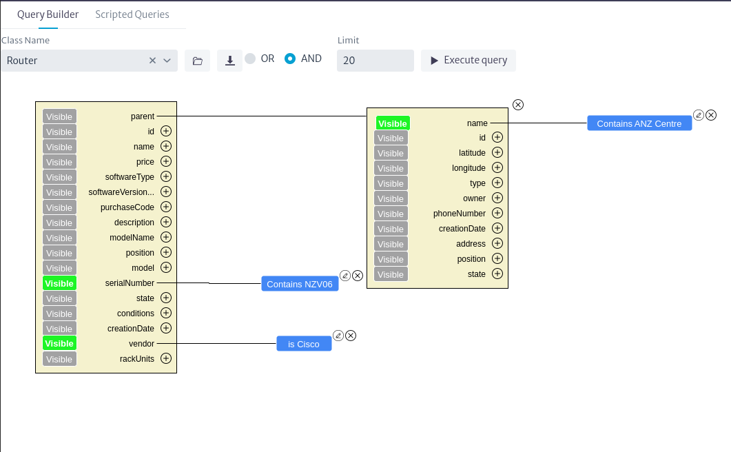 |
|---|
| Figure 24. Advance query |
When we execute the query, we obtain the desired routers as shown in Figure 25.
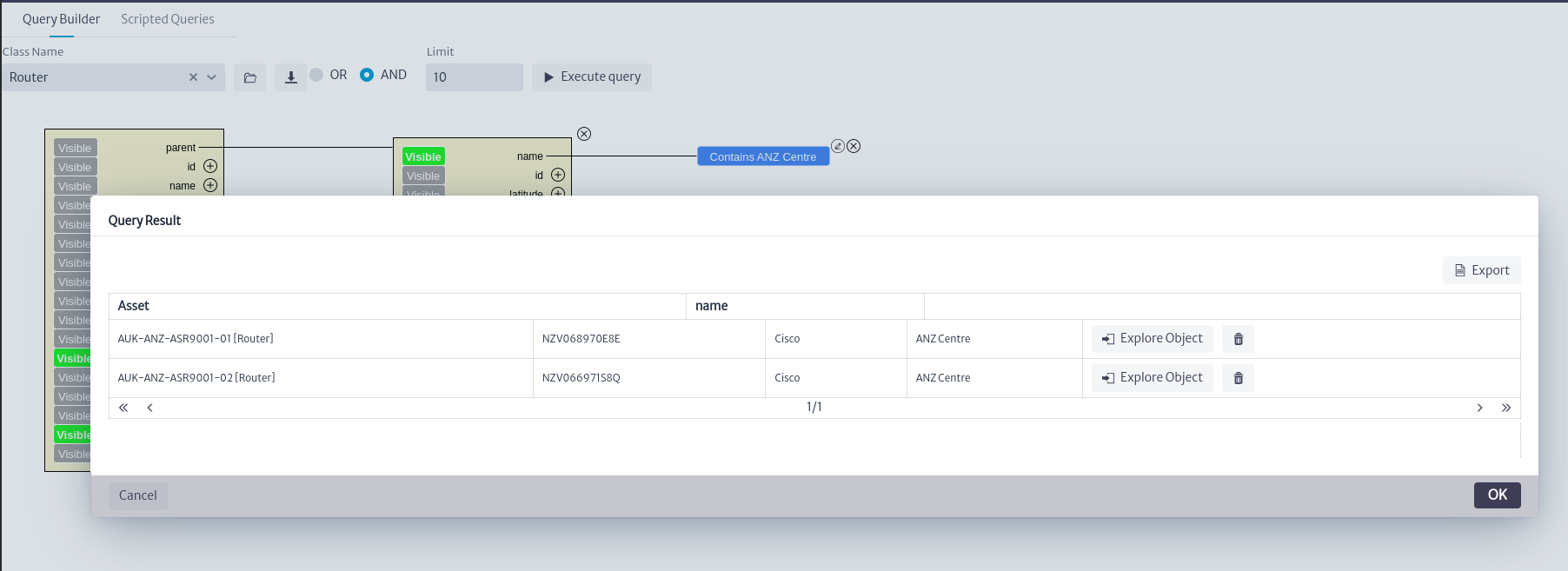 |
|---|
| Figure 25. Advance query result |
Using Scripted Queries
This option allows us to create queries using Groovy scripts. The queries created with these scripts have low-level access to the application's database. Thanks to the use of scripts, it is possible to reuse these scripted queries in other modules of the application outside the queries module, allowing precise data retrieval and manipulation.
For example, the queries created in the ospman.geo pool as seen in Figure 26 are used to perform geographical queries. Refer to the Outside Plant Management for more details.
Warning The changes made by scripted queries in the database can break things if your code is wrong. Proceed with caution.
To start, locate Scripted Builder in the main window of the module, as shown in Figure 26.
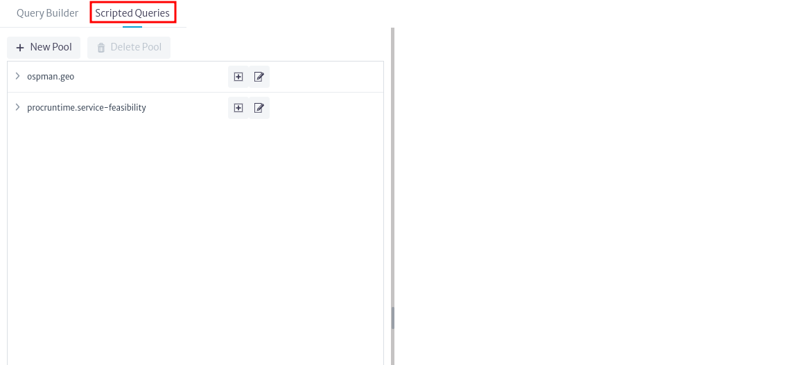 |
|---|
| Figure 26. Query builder |
Manage scripted query pools
Upon entering this option, you will see the available scripts grouped into pools. To begin, create a pool using the button. The window shown in Figure 27 will open; enter a name, description, and click OK.
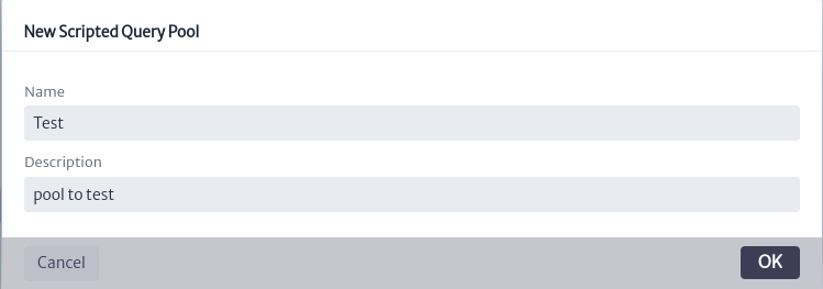 |
|---|
| Figure 27. Add pool window |
Once the pool is created, it will appear in the list of available pools, as shown in Figure 28. Conversely, if you wish to delete a pool, select it and use the button to delete it.
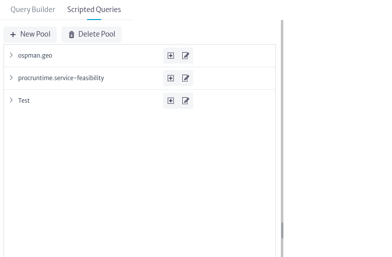 |
|---|
| Figure 28. Pool lists |
To edit the properties of a pool, use the button. The window shown in Figure 29 will appear, where you can edit the properties by double-clicking on the desired property.
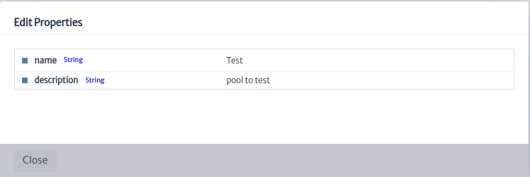 |
|---|
| Figure 29. Edit pool properties window |
Manage scripted query
To add a script, locate the desired pool and use the button. This will open the window shown in Figure 30. Enter a name, description, and click OK.
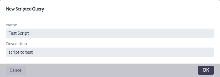 |
|---|
| Figure 30. Add script window |
Once the script is created, use the button to display the scripts associated with a pool, as shown in Figure 31.
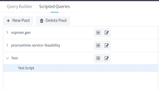 |
|---|
| Figure 31. Scripts in pool |
Clicking on the script will display the editor and actions associated with the script, as shown in Figure 32.
 |
|---|
| Figure 32. Script editor |
Information the creation of scripted query is beyond the scope of this document; however, you can find more detail and examples in the scripts available in this repository.
once the script is created you can save the changes using the  button seen in Figure 33.
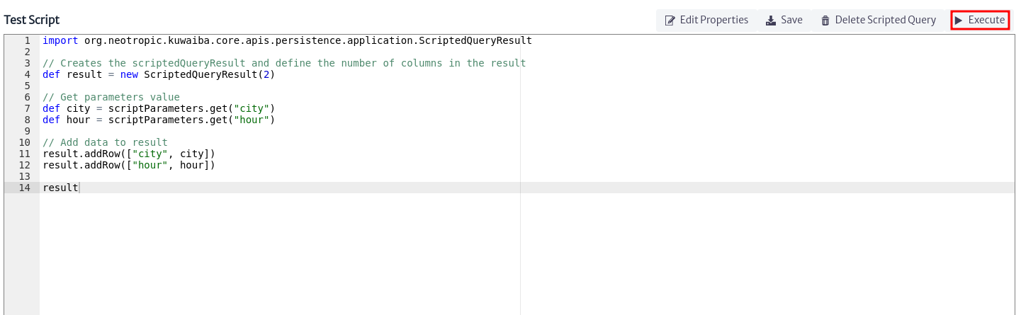 |
|---|
| Figure 33. Script example |
Similarly, use the button to save the changes to the script and open the script execution window, as shown in Figure 34.
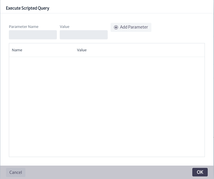 |
|---|
| Figure 34. Execute scripted query window |
It's important to note that most scripts will require input parameters. As seen in Figure 34, you can add parameters before executing the script. To do this, enter the parameter name and value, then click  . Once you've added the necessary parameters, click OK to execute the script, as shown in Figure 35.
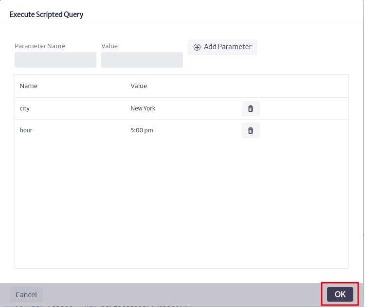 |
|---|
| Figure 35. Execute script |
The result of the script execution will appear in the pop-up window as seen in Figure 36.
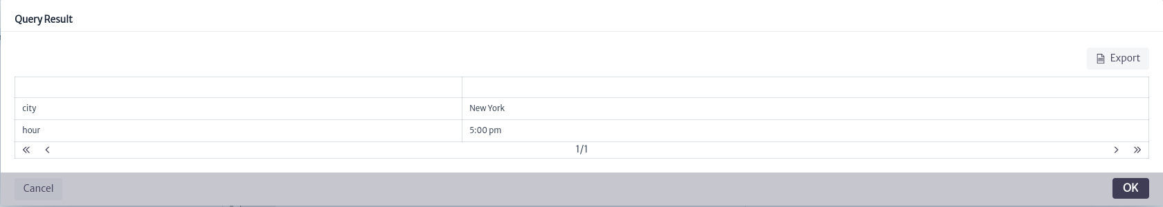 |
|---|
| Figure 36. Script result |
To edit the properties of a script after it has been created, use the button seen in Figure 33. This will open the window shown in Figure 37, where you can edit the properties by double-clicking on the desired property.
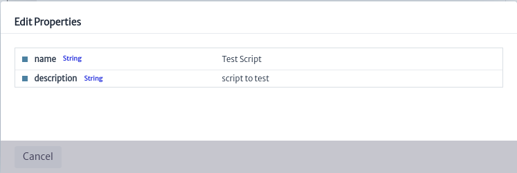 |
|---|
| Figure 37. Edit script properties window |
To delete a script, use the button. This will open the confirmation window shown in Figure 38. Click OK to proceed with the deletion or Cancel if you do not wish to delete it.
 |
|---|
| Figure 38. Delete script confirmation window |
Pools
The Pools module refers to a group of resources managed collectively to optimize their use and availability. In simple terms, a "pool" is a shared repository of similar resources that can be used by different parties or processes within a system and that cannot be placed in the standard navigation tree. Most of these resources are logical or administrative elements, such as VLANs or VPNs. You can imagine a pool as a bag where resources that do not have a specific place in the inventory structure are placed.
To open the Pools module, I selected Options -> Pools in the options menu.
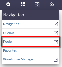 |
|---|
| Figure 1. Pools module selection in the general menu |
Once the Pools module is opened, a new pool can be added. To do so, locate the New Pool button represented by the add symbol  , as shown in the figure below.
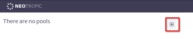 |
|---|
| Figure 2. Creation of a new pool |
Once activated, the window will open to create a new pool. In the dialog box, you will be asked to enter the name of the new pool, its description, and the type of objects you want to store inside it. If you choose, for example, "Router", you can only store Router instances. However, if you select an abstract class (anything that begins with "Generic" or one of the parent classes such as InventoryObject or ViewableObject), you will be able to place instances of any of its subclasses.
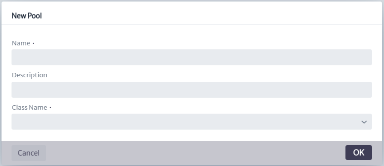 |
|---|
| Figure 3. Dialog for creating a new pool |
Once created, you can edit the name and description of the pool attributes in the property sheet.
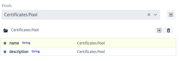 |
|---|
| Figure 4. Pool attributes |
To manage the new pool, use the buttons next to the pool name.
You can delete it with the  button or add a new item by clicking the add icon , as shown in the figure next.
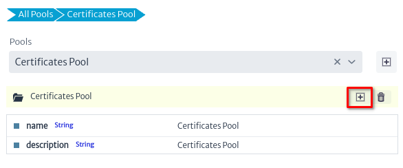 |
|---|
| Figure 5. Creating a new element within a pool |
Once activated, the window will open to create a new item in a pool. In the dialog box, you will be asked to enter the name of the new item and select the type of object it represents.
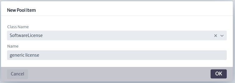 |
|---|
| Figure 6. Dialog for creating a new pool item |
The new created item will appear on the right side of the screen as shown in the figure below
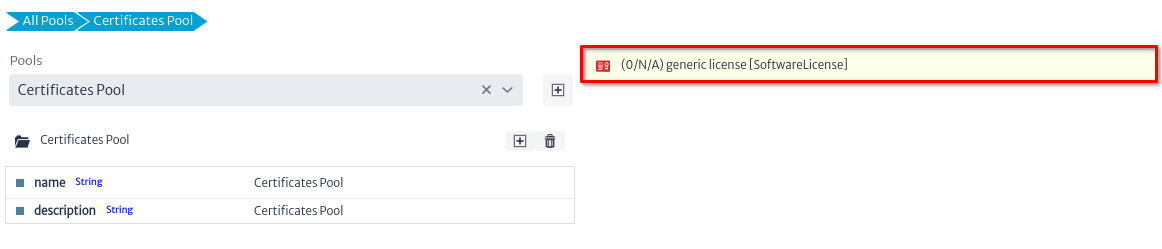 |
|---|
| Figure 7. New item created |
To modify the properties of the new item, click on its name. Its attributes will be displayed, as well as the associated actions and explorers, as shown in the figure below.
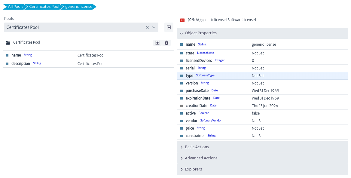 |
|---|
| Figure 8. New item properties |
Basic actions, such as delete to delete the selected item, advanced and explorers are described in the chapter Object Options Panel. However, the actions shown in the image below are specific to this module and are described below.
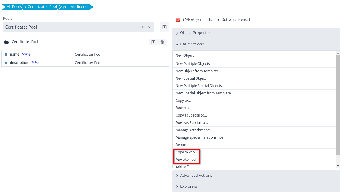 |
|---|
| Figure 9. New item created |
| Action | Description |
|---|---|
| Copy to Pool | Copy the selected item to a new pool |
| Move to Pool | Move the selected item to a new pool |
Favorites
The Favorites module allows you to easily organize frequently accessed items without having to navigate deeply between objects. To access this module, go to the Navigation section, identified by the symbol  at the top of the screen, and then select the
 Favorites option.
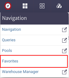 |
|---|
| Figure 1. Access to favorites module. |
A pop-up window as shown in Figure 2 appears.
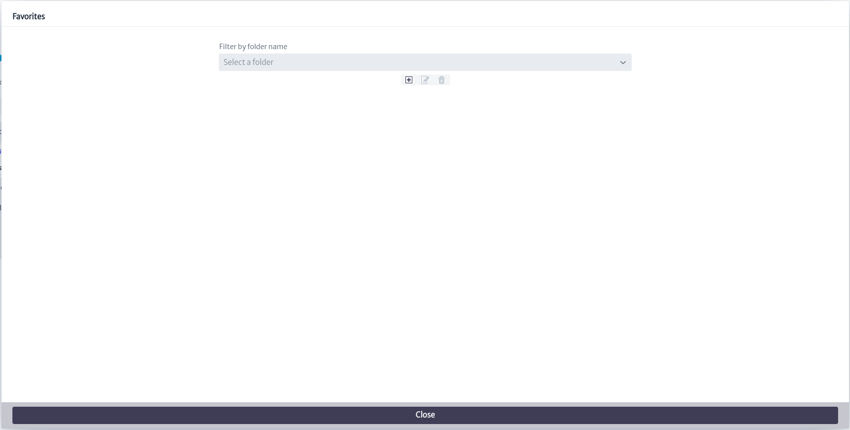 |
|---|
| Figure 2. Favorites module. |
You can select an existing folder or create a new one. To select an existing one, use the search bar marked Filter by Folder Name, where you can enter the desired folder name. Alternatively, you can click on the icon  to display a list of existing folders, as illustrated in Figure 3.
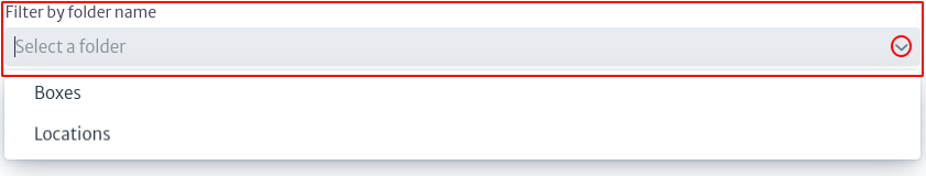 |
|---|
| Figure 3. Folder search. |
When you select an existing folder, the objects belonging to that folder are displayed along with their hierarchical structure, as indicated in Figure 4. When you click on a specific object, the Object Options Panel appears with the object's information, located on the right side of the screen and explained in detail in the Navigation chapter. In addition, you will find the Release From Folder option, which allows you to delete the object from the selected folder.
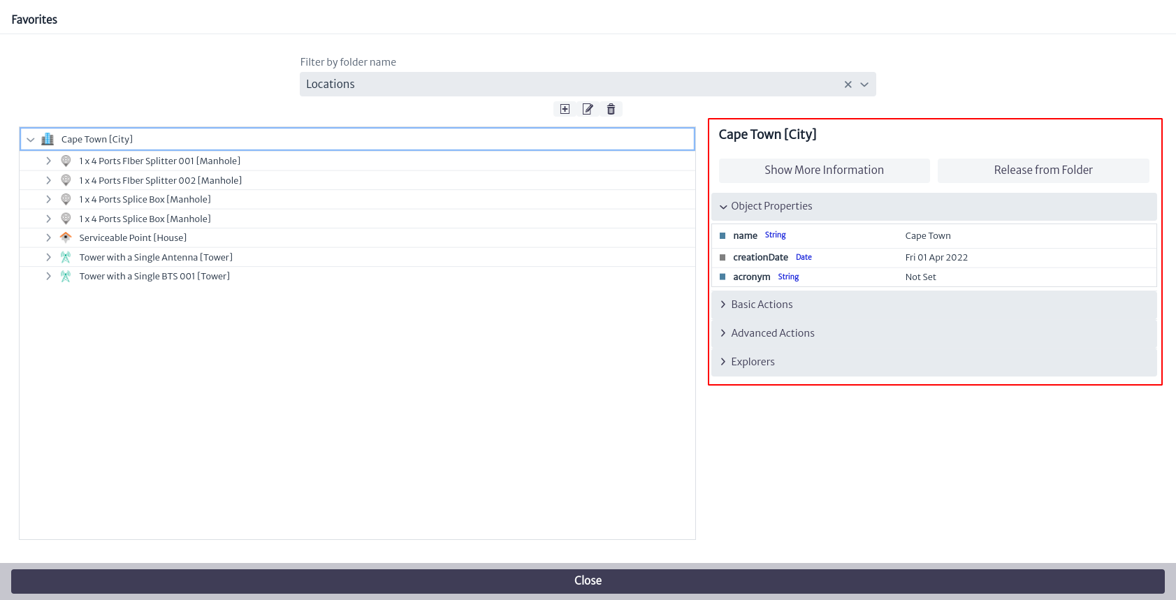 |
|---|
| Figure 4. Selected folder display. |
You can create a new folder by selecting the  button where a new window appears requesting the name of the new Folder, as shown below.
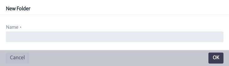 |
|---|
| Figure 5. Create new folder. |
You can edit the name of a folder by selecting it from the filter shown in Figure 3 and then clicking on the icon  . This will display a window similar to the one shown in Figure 6, where you can enter the new folder name. Similarly, you can delete a folder by selecting the icon
  . It is important to note that these buttons to edit and delete a folder will only be available after selecting a specific folder; otherwise, they will remain disabled.
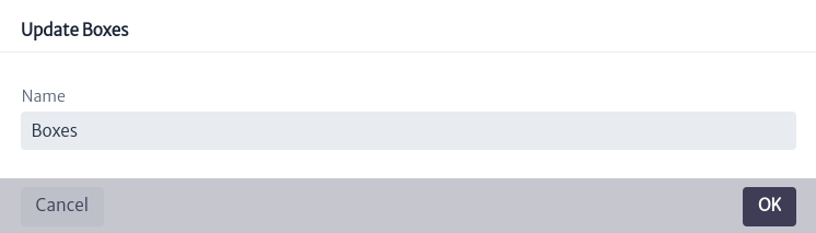 |
|---|
| Figure 6. Edit folder. |
To add an object to a favorite folder, go to the Object Options Panel (explained in the Navigation chapter) and find the Add to Folder option under Basic Actions. Then, select the folder where you want to add the object, as shown in Figure 8.
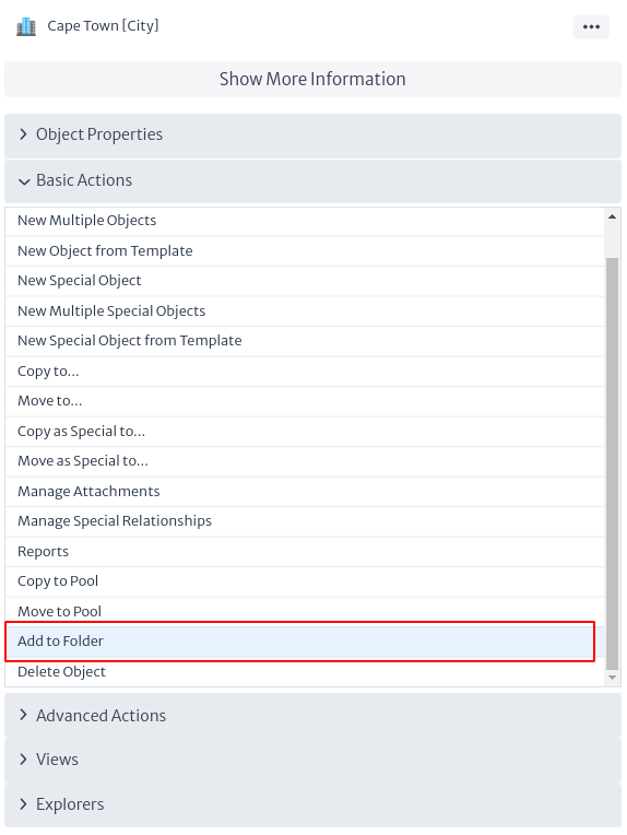 |
|---|
| Figure 7. Option to add to favorites. |
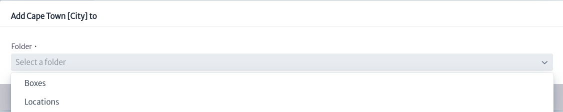 |
|---|
| Figure 8. Add object to favorites. |
Warehouse Manager
The warehouse module allows for the management and organization of equipment and items that are not currently in use within the network. This module not only enables the representation of physical inventory objects but also their states, such as equipment under maintenance, awaiting installation, or in transit.
Figure 1 shows the structure of the module, where all warehouses are organized into a pool. Pools are groupings of similar objects in this case, warehouses and can contain one or more elements. The warehouses, which are inventory objects, are related to one or more pools using the CHILD_OF_SPECIAL relationship. This allows for the grouping of similar items within the warehouse, such as bags of screws, loose screws, etc. The creation of pools facilitates the organization and management of inventory by allowing items to be grouped and sorted according to specific criteria, such as brand, type, or any other relevant attribute.
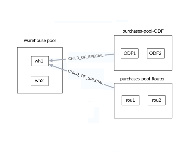 |
|---|
| Figure 1. Warehouse manager structure |
This module is part of the Navigation category, as shown in Figure 2.
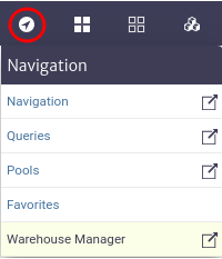 |
|---|
| Figure 2. Warehouse manager |
Once opened we will see the main window of the module, as shown in Figure 3. From here we can see the warehouses currently created in the application.
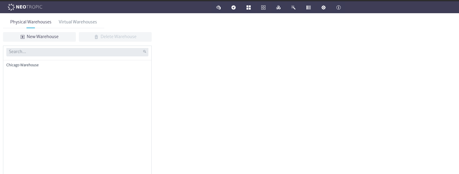 |
|---|
| Figure 3. Warehouse manager main window |
Physical Warehouses
Physical warehouses are mechanisms for representing inventory objects that are not currently in use within the network, such as equipment awaiting installation, tools, etc. To create a physical warehouse, select its tab; your selection will be indicated by a horizontal blue line, as shown in Figure 4.
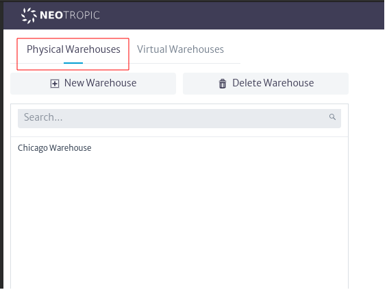 |
|---|
| Figure 4. Physical warehouse |
Once the tab is selected, use the button. The window to create physical warehouses will open, as shown in Figure 5. Enter a name and click OK.
 |
|---|
| Figure 5. New physical warehouse window |
When a new warehouse is created, it will appear in the list of physical warehouses currently created in the application, as highlighted in Figure 6.
 |
|---|
| Figure 6. List physical warehouses |
As mentioned in the module's structure, warehouses can contain various types of inventory items, which are organized into pools to facilitate their management. This organization allows for the simulation of drawers, shelves, etc, in a real warehouse, accurately reflecting the state of the inventory. To create pools within a warehouse, select it, and you will see the warehouse's property sheet, where you can edit its properties by double-clicking on the property to update and pressing enter. You will also see the pool search bar and the actions to manage pools, as shown in Figure 7.
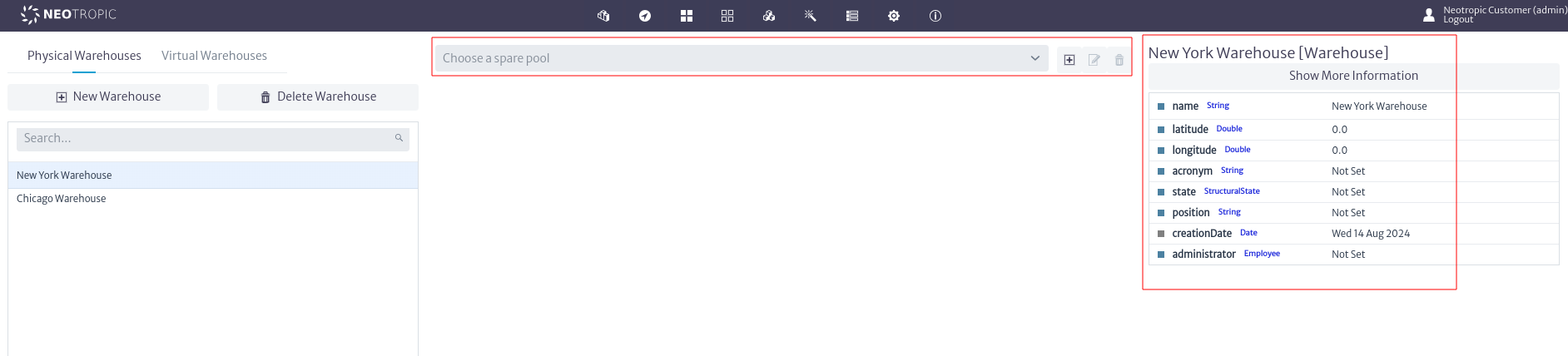 |
|---|
| Figure 7. Warehouses pools actions |
Next, use the button, which will open the window to create pools, as seen in Figure 8. In this window, you must select the inventory class from which you want to create objects to be stored in the pool. Note that you can only store objects of that type; for our example, we'll use Rack. Enter the name and description, ensuring that the name is descriptive, which will help you quickly identify the type of objects stored in the pool. Click OK to create the pool or Cancel if you do not wish to proceed.
Note If you wish to create multiple types of objects in a pool to represent a specific situation in your warehouses, use the available superclasses. Refer to the Containment section for more details on superclasses.
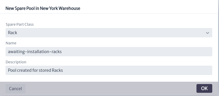 |
|---|
| Figure 8. Add pools window |
Once the pool is created, it can be selected in the pool search bar, as shown in Figure 9. When a pool is selected, the options to update its information and delete it, as well as the option to add objects to the pool, will be enabled, as shown in Figure 10.
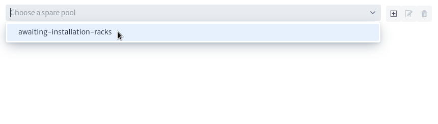 |
|---|
| Figure 9. Select pool |
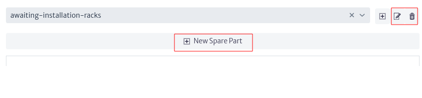 |
|---|
| Figure 10. Pool options |
To update the information of a pool, use the button, which will open the window to update pools, as shown in Figure 11. Edit the properties and click OK or Cancel if you do not wish to continue. Note that it is not possible to change the type of objects stored in the pool. For example, if you have a pool with 100 objects of the type Router and you change the pool type, these objects cannot be stored in the new pool. If you need to change the pool type for any reason, create a new pool with the desired type and move the objects to it; this action is detailed in the Move Objects section.
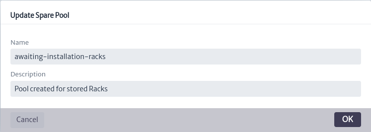 |
|---|
| Figure 11. Update pool window |
Similarly, you can delete the pool using the button or delete the warehouse by selecting it and clicking the
 button. In both cases, a confirmation window will open, as shown in Figure 12.
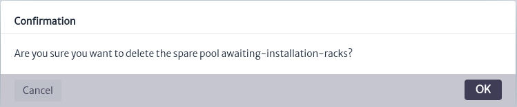 |
|---|
| Figure 12. Delete pool window |
Note Proceed with caution when removing a warehouse or pool, as the items inside will also be removed from inventory. This action is irreversible.
To add objects to the pool use the button which will open the window to add objects in the pool seen in Figure 13, enter name and description and press OK.
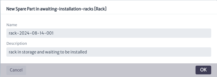 |
|---|
| Figure 13. Add parts window |
By doing so, an object of the type assigned to the pool will be created in the application's inventory and assigned to the pool. For our example, this will be a pool representing the storage room for racks awaiting installation. Once the object is created, it will appear in the list of objects in the pool, as shown in Figure 14.
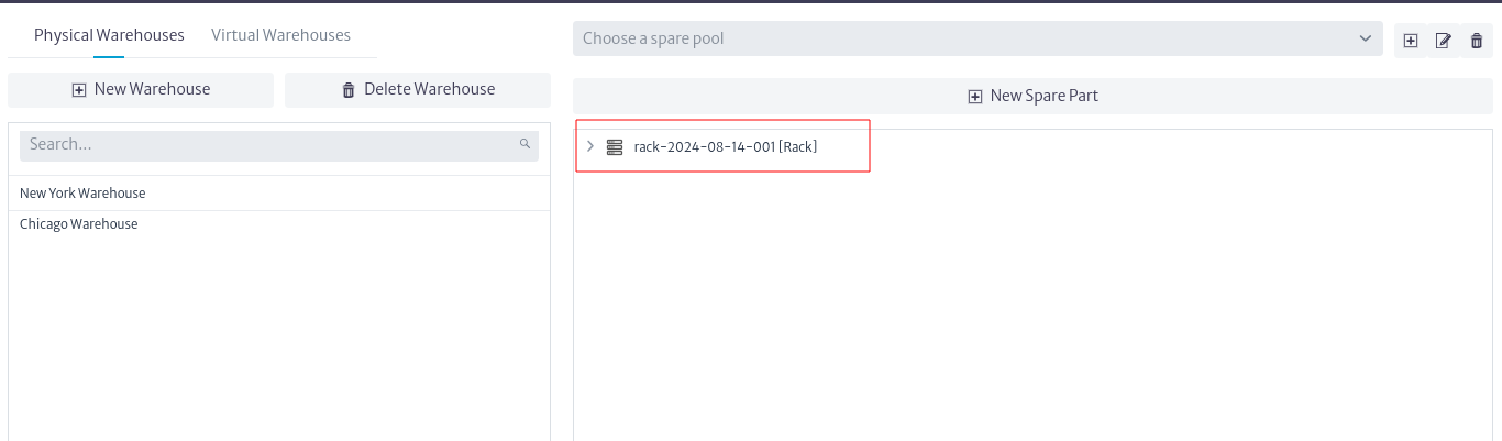 |
|---|
| Figure 14. New object |
When selecting the rack, the Object Options Panel will appear, as shown in Figure 15. All its options and menus are explained in detail in the Object Options Panel section of the Navigation module.
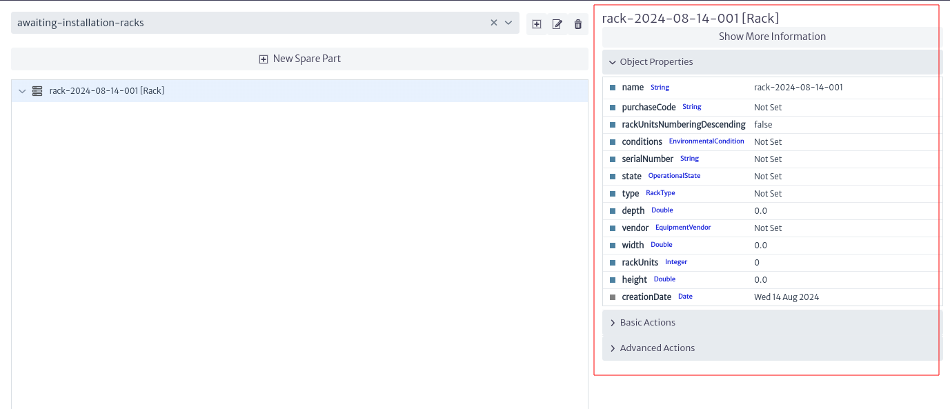 |
|---|
| Figure 15. Object available actions |
Suppose one of the racks you have stored contains a battery in one of its slots. You can represent these situations by creating such objects in the rack. To do this, use the New Object option from the Basic Actions menu. After creating these objects, you can view them by clicking the button. This will display all the objects created in the rack, as shown in Figure 16. This way, you can detail the situation of your warehouses.
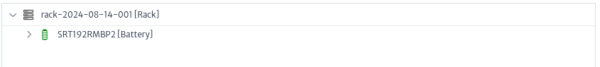 |
|---|
| Figure 16. Rack child |
Logical Warehouses
As mentioned earlier, warehouses not only represent physical inventory objects but also their states. Virtual warehouses represent the states or stages of equipment. For example, a batch of equipment purchased but currently in transit can be represented by a virtual warehouse. These warehouses allow you to model the flow of objects within a process, such as the purchase, maintenance, or installation of equipment.
The steps to create warehouses, pools, and objects are the same as those previously described for physical warehouses. However, in this case, select the tab corresponding to Virtual Warehouses, as shown in Figure 17.
 |
|---|
| Figure 17. Virtual warehouse |
Repeat the previous steps to create a warehouse that will contain the elements of your inventory waiting for some process. For the example, we will create a pool for items undergoing maintenance within that warehouse, as shown in Figure 18.
 |
|---|
| Figure 18. New pool |
As previously mentioned, we will use the superclass GenericCommunicationElement, which will allow us to store objects from its hierarchy in the pool. This enables us to represent multiple types of communication objects, such as UPS, printers, etc, as shown in Figure 19. The containment and hierarchy are explained in detail in the Containment section.
 |
|---|
| Figure 19. Objects example |
Warehouses Operations
Move Objects
Suppose one of the items has completed the maintenance process and is being transported back to its operational site. You can move objects housed in one pool to another pool in any warehouse that accepts the same type of items. For this example, we will move the printer that has completed its maintenance and is in transport to its usage location, to the default In Transport warehouse available in the application. To do this, select the object and in the Object Options Panel, use the Move To Warehouse option from the Advanced Actions menu. This will open the window for moving objects, as shown in Figure 20.
 |
|---|
| Figure 20. Move object window |
When selecting a warehouse, the field to choose the destination pool will appear, as shown in Figure 21. By clicking OK, the object will be moved to the selected warehouse and pool. If you attempt to move the object to a warehouse that does not have a pool with the type of object you want to move, you will be notified, as shown in Figure 22.
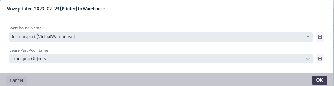 |
|---|
| Figure 21. Select pool to move object |
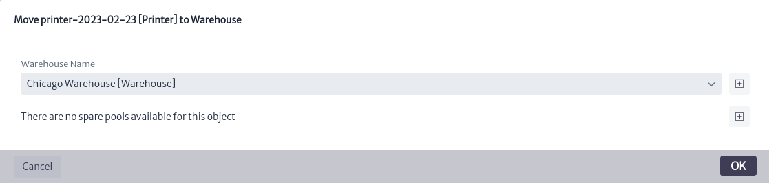 |
|---|
| Figure 22. Invalid pools to move object |
You can move objects from the warehouses to any other object in the application where they can be contained, repeat the previous steps in order to represent the removal of an object from your inventory.
Delete Objects
If you want to delete an object from the warehouse, you can do so from the Object Options Panel by using the Delete Object option located in the Basic Actions menu. A confirmation window will appear; click OK to proceed or Cancel if you do not wish to continue.
Explore Objects
As mentioned earlier, when creating an object, it can also be accessed through the application’s inventory. To do this, go to the Navigation module and search by name or class, in this case Rack, as shown in Figure 23.
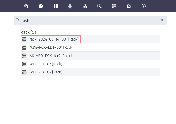 |
|---|
| Figure 23. New rack |
From here, and through the Object Options Panel, you can perform any of the available options explained in detail in the Object Options Panel section of the Navigation module.
Integration with External Tools
The previously mentioned steps can be tedious when you need to register a large number of items in your warehouses. To simplify this process, the warehouse module can be integrated with external tools and leverage the Kuwaiba API, allowing for task automation. Thanks to this orchestration capability with other systems built on top of Kuwaiba, warehouse movements can be recorded without manual intervention. This not only optimizes inventory management but also facilitates information flow and record updating, acting as an efficient and accurate data repository for your purposes.
Physical Connections Module
The physical connections module registers basic actions, advanced actions and views that allow the creation of physical connections (optical, wireless, electrical and power-related) using the Object Options Panel. In this chapter the following topics will be addressed:
Physical Connections
The Physical Connections toolkit is tightly integrated to the Physical Connections module. With Kuwaiba you can create physical layer connections using cables, fiber optics or radio links very easily, navigate through the connections and inspect the resources in use.
Before presenting the tools provided by the application, let’s first clarify and introduce some concepts. This module deals solely with L1 topologies. It’s only about cables, ports, etc. The data model provides four types of entities to represent physical layer elements:
- Links: These are all physical connections that connect two ports. In the current data model, there are three types of connections:
ElectricalLink(for electrical connections like coaxial, twisted pairs and the like),OpticalLink(for fiber optics),RadioLink(for radio links -Microwave links, mostly-) andPowerLink(for electrical power connections AC/DC). You can create new types by adding subclasses to the abstract classGenericPhysicalLinkFigure 1. See Data Model Manager.
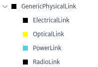 |
|---|
| Figure 1. Links in data model |
- Containers: All objects that can be used to contain, wrap and protect links (understanding Link as defined above). There are two types of containers:
WireContainer(used to contain all kind of cables -wires and fibers-, like pipes, conduits, ditches, etc) andWirelessContainer(used to contain radio channels or carriers). You can create new types by adding subclasses to the abstract classGenericPhysicalContainerFigure 2.
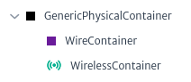 |
|---|
| Figure 2. Containers in data model |
- Nodes: These objects are endpoints to Containers. In the default data model you will find classes like:
Tower,Facility,Shelter,Building,FloorandRoom, but in general, any inventory object can be a Node Figure 3.
Note: In versions prior to 1.5, only subclasses of
GenericPhysicalNodecould be nodes.
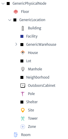 |
|---|
| Figure 3. Nodes in data model |
- Endpoints: These objects are endpoints to Links. In practice, they’re always some kind of Port (in the data model context, this means all subclasses of GenericPort) Figure 4.
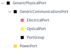 |
|---|
| Figure 4. Endpoints in data model |
In summary, you can only connect Nodes using Containers and Endpoints using Links. To create new connections, open the Object View of an element and try to connect the desired nodes. For example, Figure 5 shows two nodes objects of the class Manhole and a container object of the class WireContainer.
 |
|---|
| Figure 5. Manholes connected by a pipe |
On the left side of Figure 6 shows the interior of the pipe from Figure 5 that contains containers and links where the orange containers are tube bundle, the red containers the tubes and inside the tubes the cables. The right side of Figure 6 shows an enlarged view of the cable that contains the loose tubes that in turn contain the fibers.
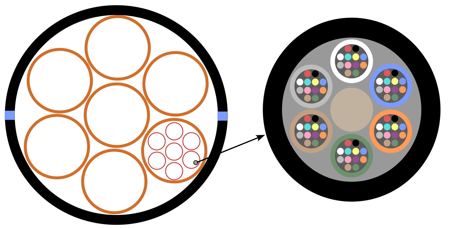 |
|---|
| Figure 6. Pipe |
Figure 5 and Figure 6 show three of the four elements of a physical connection.
There are three options to create physical connections in the inventory:
- Outside Plant module
- Connectivity Manager module
- Using the basic actions, advanced actions and views that allow the creation of physical connections (optical, electrical and power-related) using the Object Options Panel.
For this example, the tools enabled by this module will be used. Using the navigation module, a city and two manholes are created, which will store splice box each.
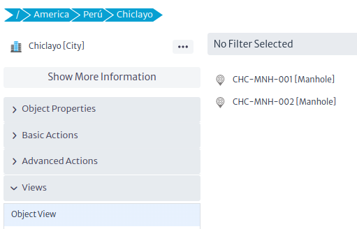 |
|---|
| Figure 7. New city |
Using the object view the pipe will be created between the two manholes using the connect tool  .
.
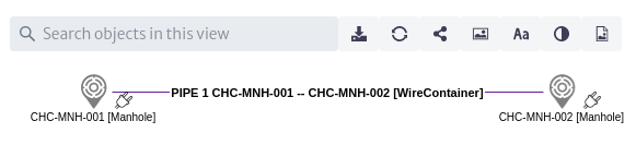 |
|---|
| Figure 8. New pipe |
Select the pipe in the object view, using the object options panel create a tube bundle as a special child, open the special children explorer and create the necessary containers and fibers Figure 9.
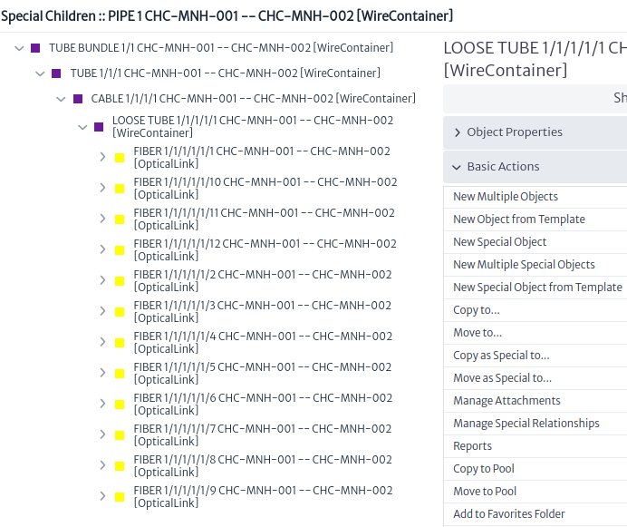 |
|---|
| Figure 9. New pipe special children |
Select the pipe in the object view and use the edit connections action in the object options panel to connect fibers to endpoints Figure 10.
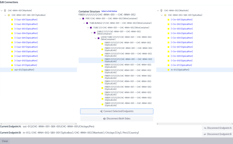 |
|---|
| Figure 10. Connecting endpoints |
Using the navigation module will mirror the ports in the splice box Figure 11 using the manage port mirroring action.
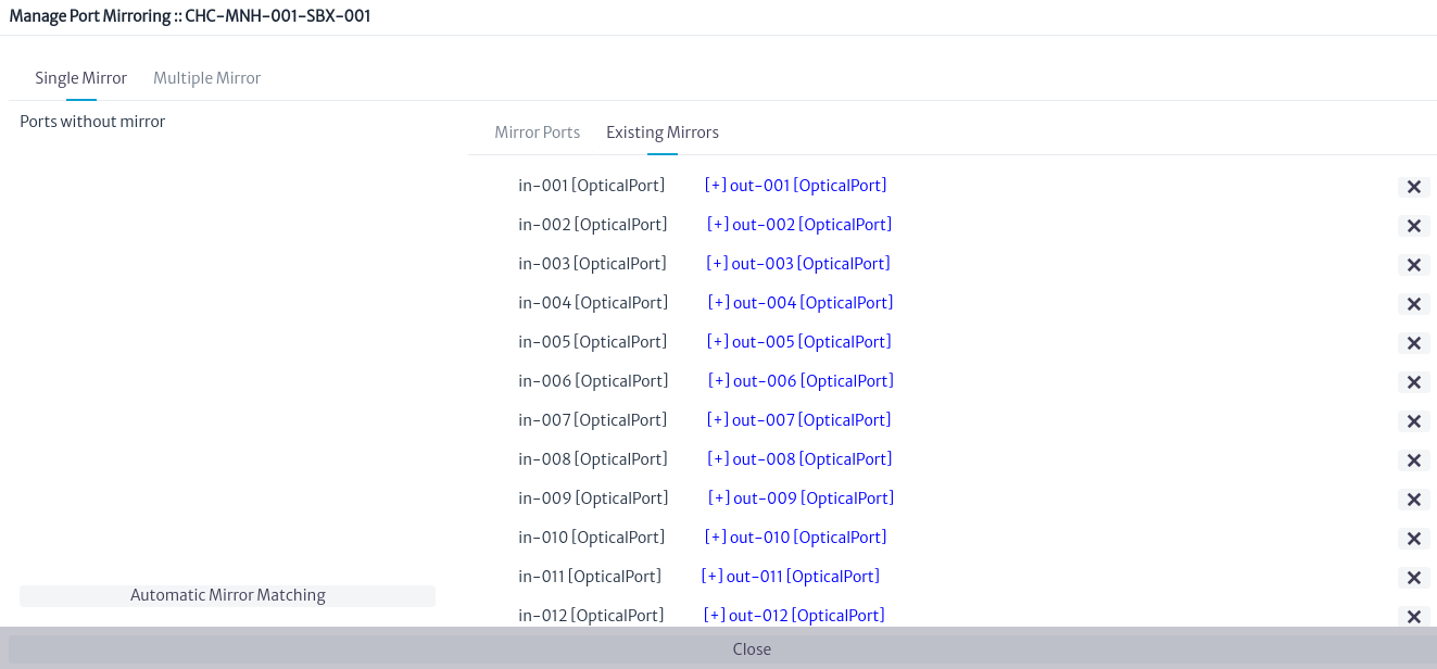 |
|---|
| Figure 11. Mirroring |
Using the splice box view we can see the connected fibers Figure 12
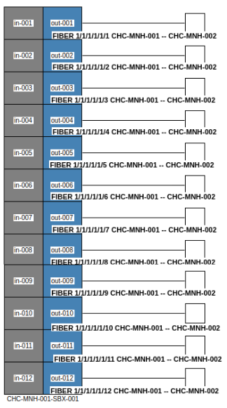 |
|---|
| Figure 12. Splice box view |
To view more details of the connection, select one of the splice box ports in the navigation module and open the physical path view Figure 13.
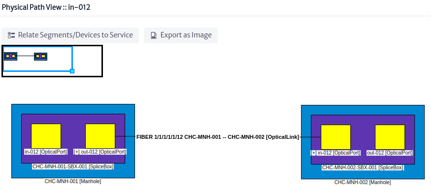 |
|---|
| Figure 13. Physical path view |
Once the port connections are made, we have all the elements of a physical connection: the links (OpticalLinks), containers (WireContainers -pipes, tube bundle, tubes, cables, loose tubes-), the endpoints (OpticalPorts) and the nodes (Manholes).
Basic Actions
Delete Physical Container
Applies to objects of class or subclass
GenericPhysicalContainer
A physical container from the perspective of an FTTH network could be an indoor, outdoor or drop cable, in the Data Model Manager Figure 14 it is represented as a WireContainer, for a wireless network a WirelessContainer contains a set of radio links.
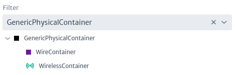 |
|---|
| Figure 14. Subclasses GenericPhysicalContainer |
The delete physical containers action is only available for subclass instances of GenericPhysicalContainer as shown in Figure 15.
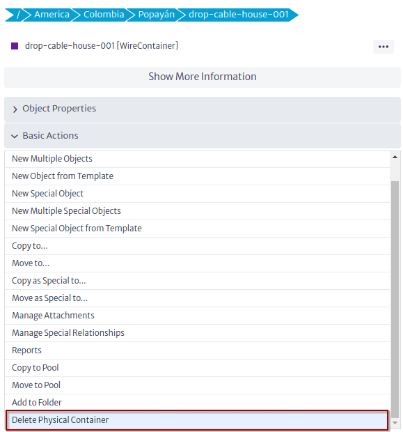 |
|---|
| Figure 15. Delete physical container action |
To delete a physical container click on the action and click on the OK button Figure 16.
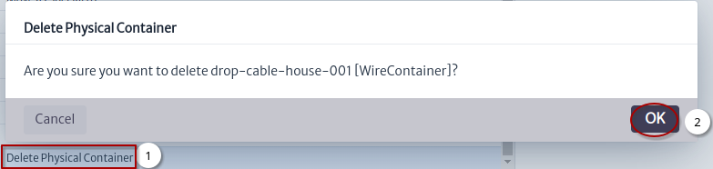 |
|---|
| Figure 16. Delete physical container |
Delete Physical Link
Applies to objects of class or subclass
GenericPhysicalLink
A physical link from an FTTH perspective is the fiber in the Data Model Manager is represented by the OpticalLink class Figure 17, for wireless networks the RadioLink class is used.
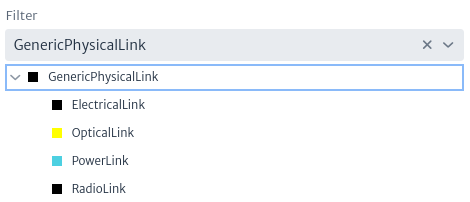 |
|---|
| Figure 17. Subclasses GenericPhysicalLink |
The delete physical link action is only available for subclass instances of GenericPhysicalLink as shown in Figure 18.
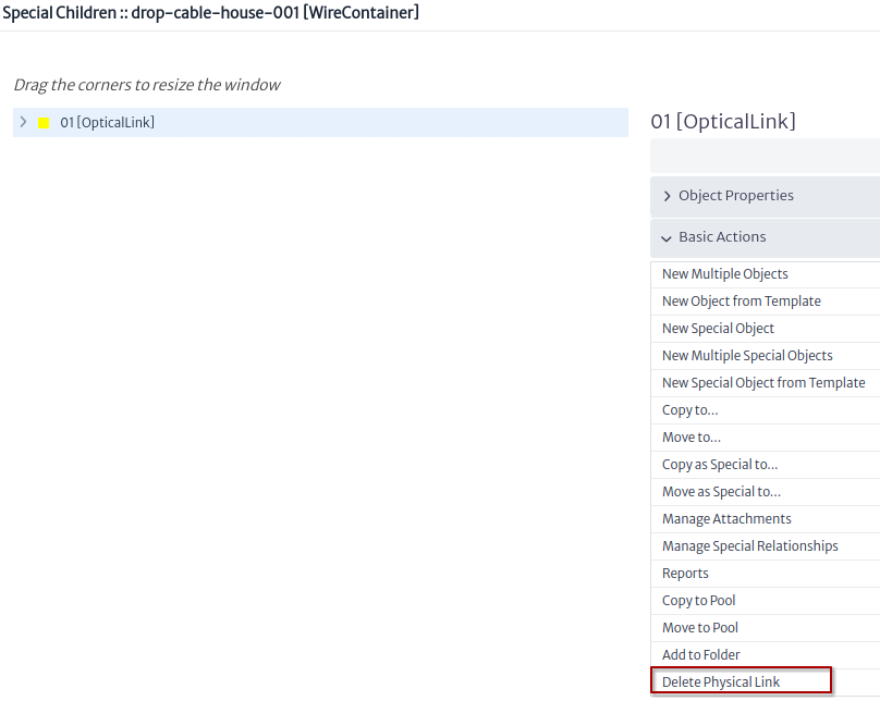 |
|---|
| Figure 18. Delete physical link action |
To delete a physical link click on the action and click on the OK button Figure 19.
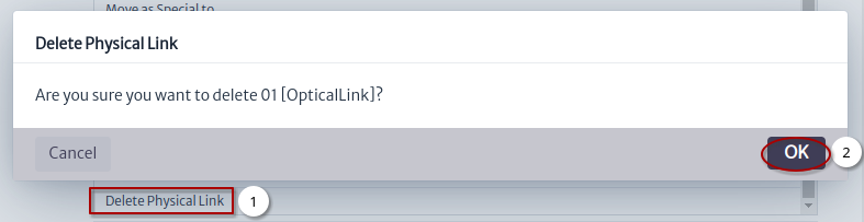 |
|---|
| Figure 19. Delete physical link |
Advanced Actions
Manage Port Mirroring
Applies to objects of class or subclass
GenericPort,GenericDistributionFrame,GenericSplicingDevice,Antenna
Mirroring in Kuwaiba means creating mirror or mirrorMultiple relationships between ports, below are some uses of this action for different classes:
- When we execute this action from one of the subclasses of
GenericPortFigure 20 only amirrorormirrorMultiplerelationship will be created from one port to another port.
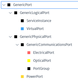 |
|---|
| Figure 20. Subclasses GenericPort |
Figure 21 shows the flow to mirror an OpticalPort
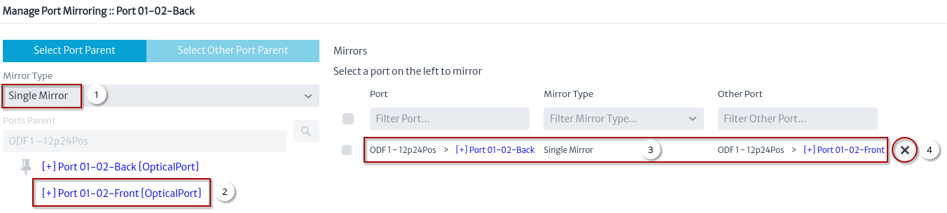 |
|---|
| Figure 21. Manage port mirroring OpticalPort |
- Select the type of single mirror or multiple mirror.
- Select the other port.
- Once the other port is selected it should appear in the mirrors.
- Used to remove the mirror.
- When we execute this action from one of the subclasses of
GenericDistributionFrameFigure 22 createmirrorormirrorMultiplerelationships.
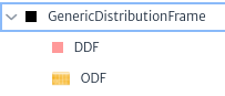 |
|---|
| Figure 22. Subclasses GenericDistributionFrame |
Figure 23 shows the flow to mirror an ODF
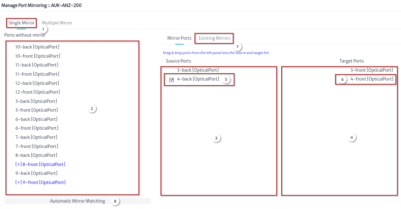 |
|---|
| Figure 23. Manage port mirroring ODF |
- Select the type of mirror.
- Drag a port.
- Drop on source ports.
- Drag other port and drop on target ports.
- Select a source port.
- Select a target port.
- Click on existing mirror Figure 24.
- Automatic mirror matching Figure 25.
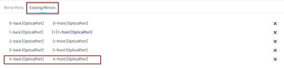 |
|---|
| Figure 24. Existing mirrors ODF |
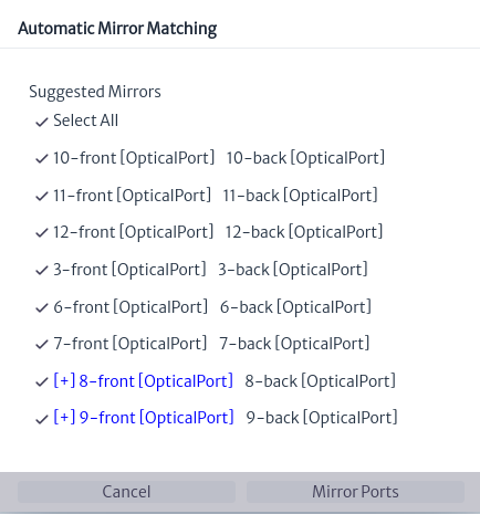 |
|---|
| Figure 25. Automatic mirror matching ODF |
Port Summary
Applies to objects of class or subclass
GenericCommunicationsElement,GenericDistributionFrame,GenericSplicingDevice
Shows how the ports are connected within the device, the IP address and assigned services if they exist. Figure 26 shows the flow to execute the action.
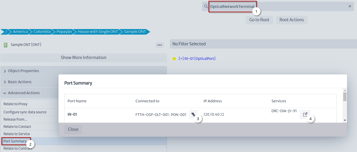 |
|---|
| Figure 26. Port summary ONT |
- Search for an
OpticalLineTerminalor any of the classes in which this action can be applied. - Click on the Port Summary action.
- Physical Path ONT port Figure 27.
- Object dashboard ONT port service Figure 28.
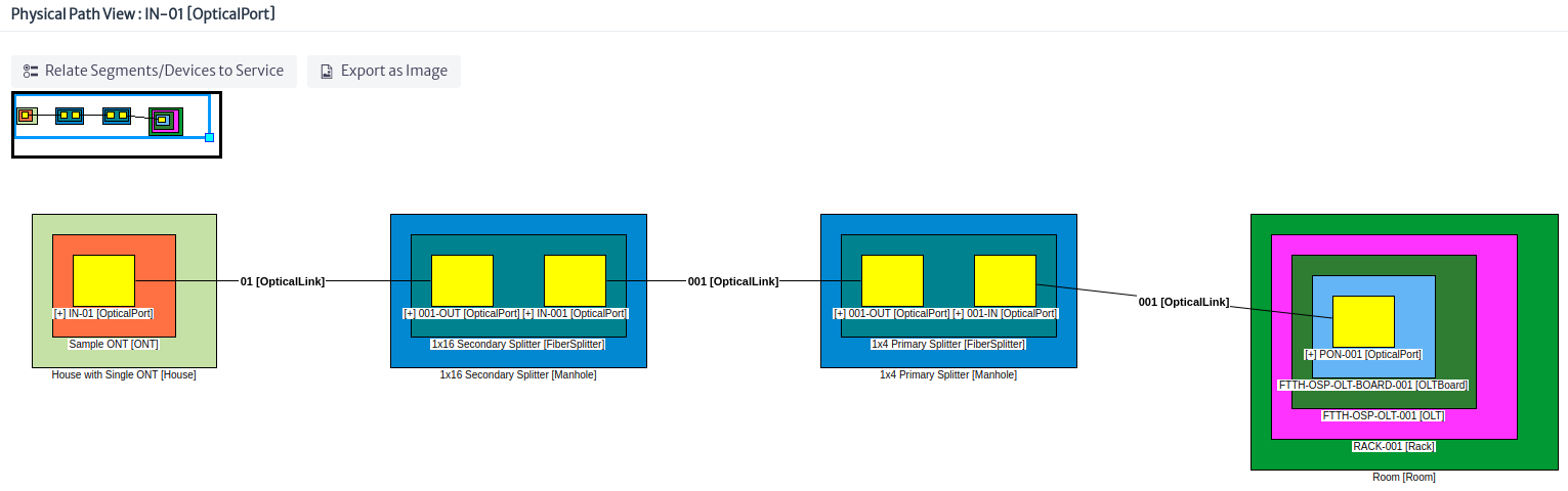 |
|---|
| Figure 27. Physical path ONT port |
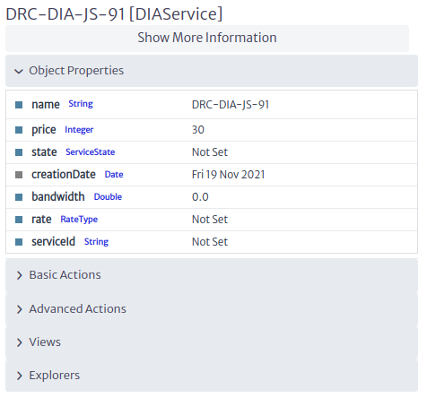 |
|---|
| Figure 28. Object dashboard ONT port service |
Edit Connections
Applies to objects of class or subclass
GenericPhysicalConnectionFigure 29
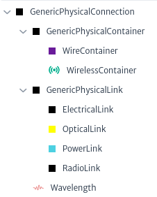 |
|---|
| Figure 29. Subclasses GenericPhysicalConnection |
To execute the action, look for an object that is a subclass GenericPhysicalConnection select it and click on the action Edit Connections Figure 30.
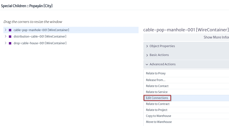 |
|---|
| Figure 30. Edit connections action |
A window appears, the flow to edit a connection is shown in Figure 31.
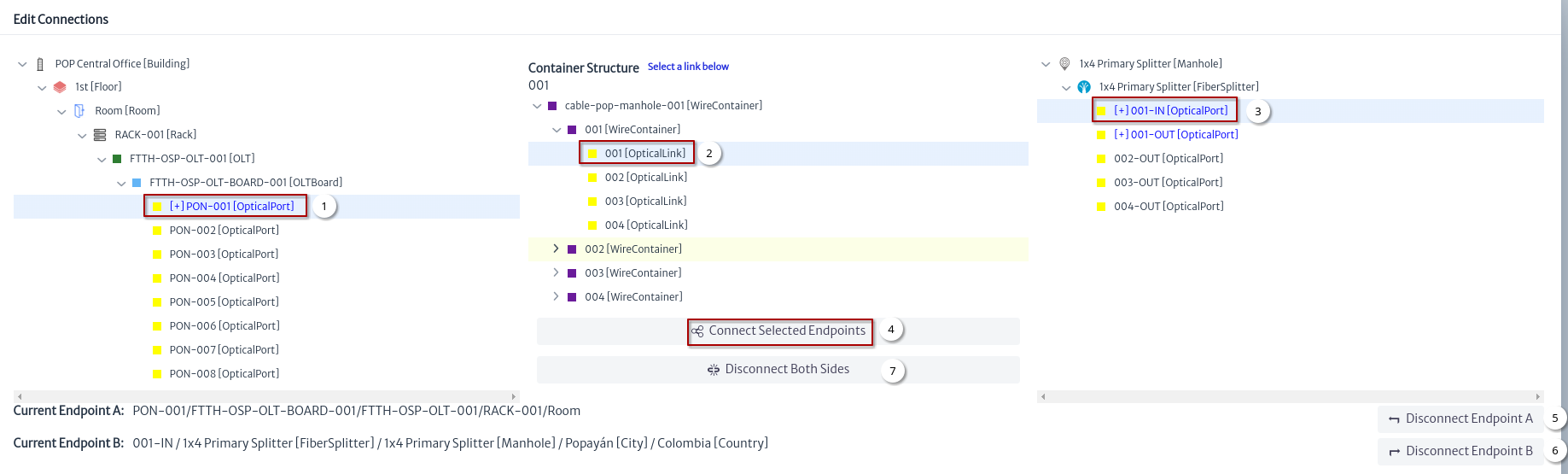 |
|---|
| Figure 31. Edit connections window |
- Select the endpoint A.
- Select a link.
- Select the endpoint B.
- Click on the button Connect Selected Endpoints to the link.
- Disconnect only the endpoint A of the link.
- Disconnect only the endpoint B of the link.
- Disconnect the endpoint A and the endpoint B of the link.
Connect Using a Link
Applies to objects of class or subclass
GenericPortFigure 32.
|
|---|
| Figure 32. Subclasses GenericPort |
To execute the action, look for an object that is a subclass GenericPort select it and click on the action Connect to... Figure 33.
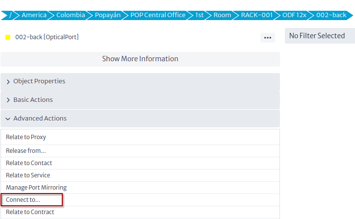 |
|---|
| Figure 33. Connect using link action |
In this example we will connect the port of an ODF with a port of an OLT, for this we must select the target port Figure 34.
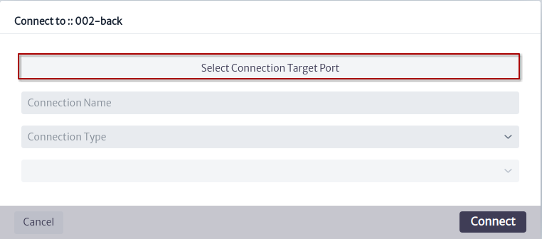 |
|---|
| Figure 34. Connect using link new window |
Figure 35 shows the steps to find the OLT port to connect.
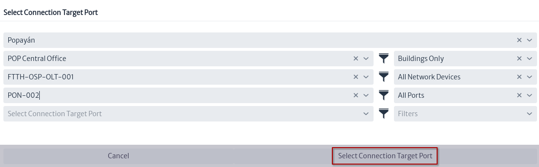 |
|---|
| Figure 35. Select connection target port window |
Once the target port is selected, we use the suggested connection name and click on the Connect button.
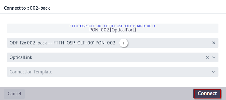 |
|---|
| Figure 36. Connect using link window |
- Suggested connection name.
Figure 37 shows the new link using the physical path view for the ODF port.
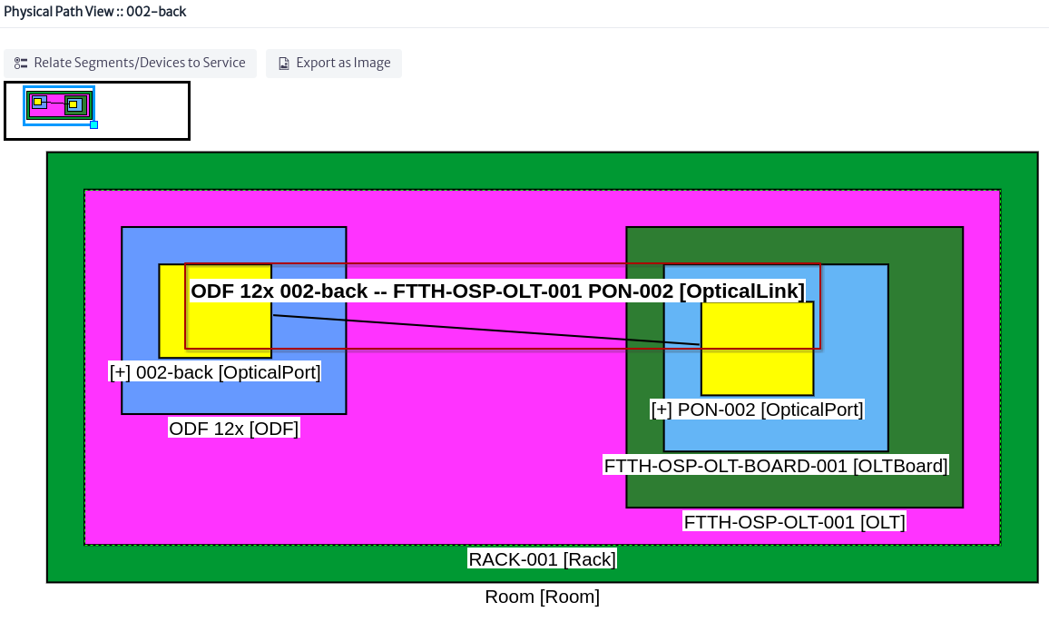 |
|---|
| Figure 37. New link in physical path |
Connect Using a Container
Applies to objects of class or subclass
GenericLocationFigure 38,GenericDistributionFrameorGenericSplicingDevice
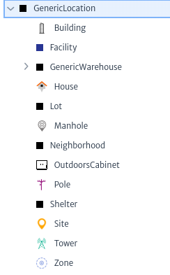 |
|---|
| Figure 38. Subclasses GenericLocation |
To execute the action, look for an object that is a subclass GenericLocation, GenericDistributionFrame orGenericSplicingDevice select it and click on the action Connect to... Figure 39.
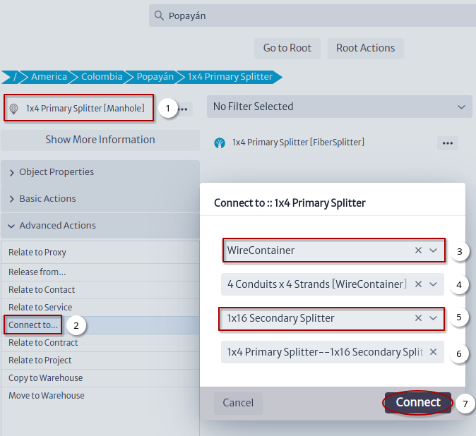 |
|---|
| Figure 39. Connect using container action |
- Select an object.
- Click on the
Connect to...action. - Select connection type.
- Optional select a template for the connection.
- Select the other end of the connection.
- Suggested connection name.
- Click on the
Connectbutton that will create the connection and open the window in Figure 40.
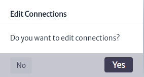 |
|---|
| Figure 40. Edit connections new container window |
If you click on the OK button, the window to edit connections will open Figure 41.
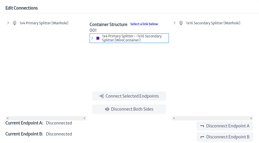 |
|---|
| Figure 41. New container in edit connection window |
Views
All views registered by this module were detailed in the navigation module:
Connectivity Manager
The connectivity manager module helps with the creation of physical and logical circuits. The access method is shown in Figure 1.
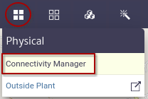 |
|---|
| Figure 1. Connectivity manager module |
Clicking on the module will open a window Figure 2.
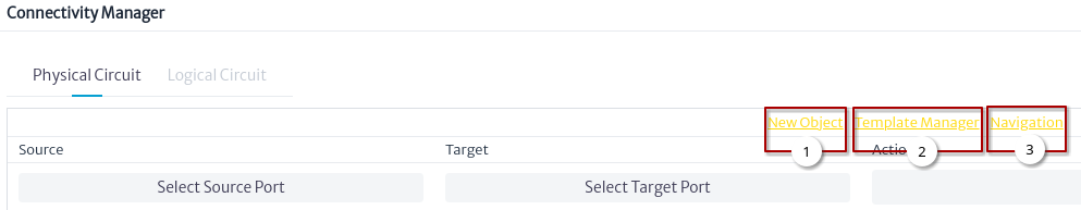 |
|---|
| Figure 2. Connectivity manager window |
- Link to create a New Object Figure 3.
- Link to Template Manager module.
- Link to Navigation module
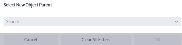 |
|---|
| Figure 3. Select new object parent |
Figure 3 shows the window that appears after clicking on the New Object link, in which a parent is selected for the new object and then an action is chosen for the creation Figure 4.
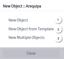 |
|---|
| Figure 4. New object window |
Figure 4 shows the basic actions to create an object:
Creating a Physical Circuit
The goal of this section is to create a physical circuit between two routers that are located in two data centers (DC) Figure 5.
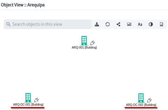 |
|---|
| Figure 5. Initial object view |
The Building objects are within a City object and each one has a Rack object Figure 6, Figure 7 and Figure 8.
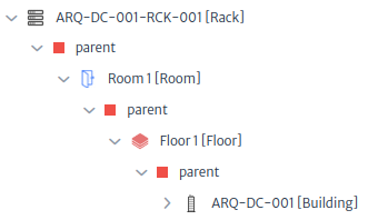 |
|---|
| Figure 6. Parents of Rack in Data Center 001 |
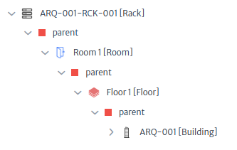 |
|---|
| Figure 7. Parents of Rack in Building 001 |
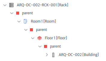 |
|---|
| Figure 8. Parents of Rack in Data Center 002 |
Each Rack object inside the Building object contains the equipment to be connected. Below are simple rack views of the racks that will be used:
- The
Rackobject in data center 001 contains anODFobject and aMPLSRouterobject of which one of its ports will be used as the start of the physical circuit Figure 9.
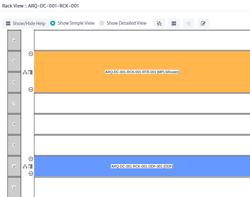 |
|---|
| Figure 9. Simple Rack View of Rack in Data Center 001 |
- The
Rackobject in building 001 contains twoODFobjects used simply to reach data center 002 Figure 10.
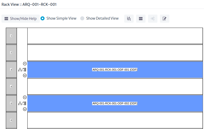 |
|---|
| Figure 10. Simple Rack View of Rack in Building 001 |
- The
Rackobject in data center 002 contains aODFobject and aMPLSRouterobject of which one of the ports will be used as the end of the physical circuit Figure 11.
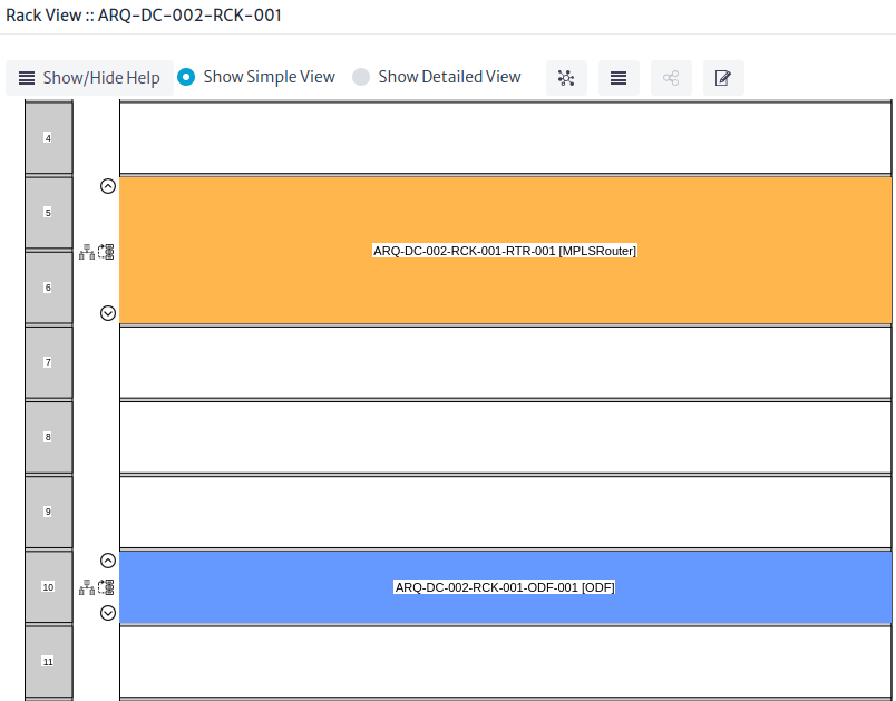 |
|---|
| Figure 11. Simple Rack View of Rack in Data Center 002 |
New Connection
Before creating the physical circuit using the object view, a connection will be created between data center 001 and building 001.
Figure 12 shows how the creation starts.
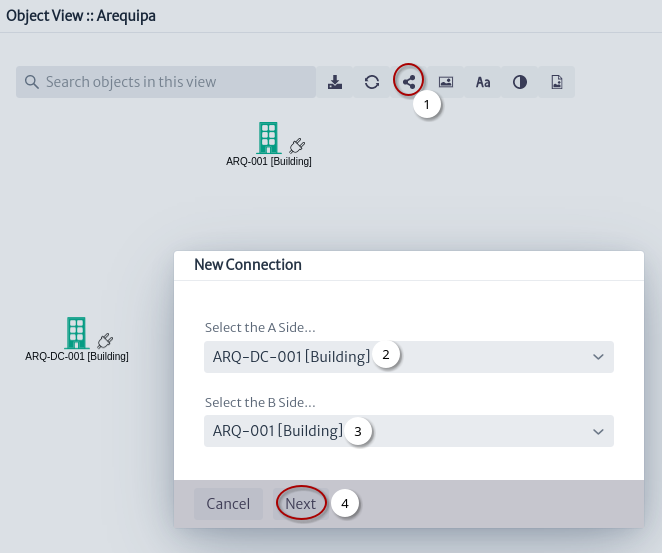 |
|---|
| Figure 12. New connection window |
- Click on the
Connectbutton. - Select side A of the connection.
- Select side B of the connection.
- Click on the
Nextbutton.
Figure 13 shows the definition of the characteristics of the new connection.
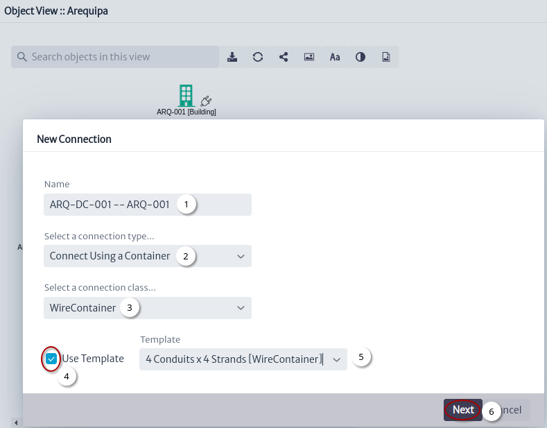 |
|---|
| Figure 13. Details of new connection |
- Set connection name 1.
- A cable will be used to connect the two buildings.
- Set the connection class.
- Check to use a cable template. See the Template Manager module.
- Select a template.
- Click on the
Nextbutton.
Figure 14 shows the selection of the connection endpoints.
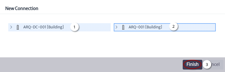 |
|---|
| Figure 14. New connection endpoints |
- Select the endpoint A of the connection.
- Select the endpoint B of the connection.
- Click on the
Finishbutton.
Figure 15 shows the new connection.
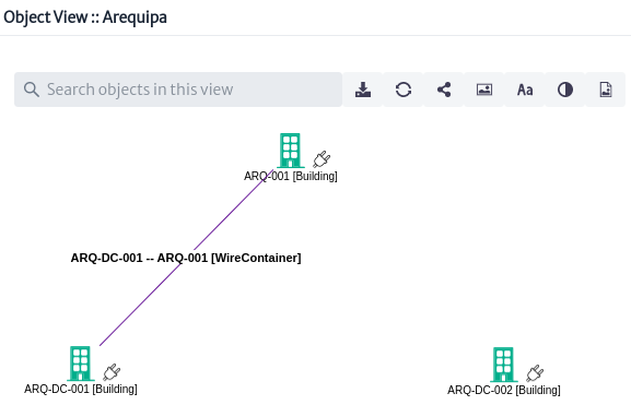 |
|---|
| Figure 15. Object view with new connection |
Connectivity Manager Window
Once the initial state of the network that will be used is known, we begin with the creation of the physical circuit Figure 16.
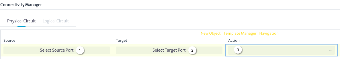 |
|---|
| Figure 16. Connectivity Manager window |
- Button to select the source port Figure 17.
- Button to select the source port Figure 18.
- Type of action to execute between ports Figure 19 and Figure 20.
- Figure 17 shows the selection of the port from where the physical circuit starts.
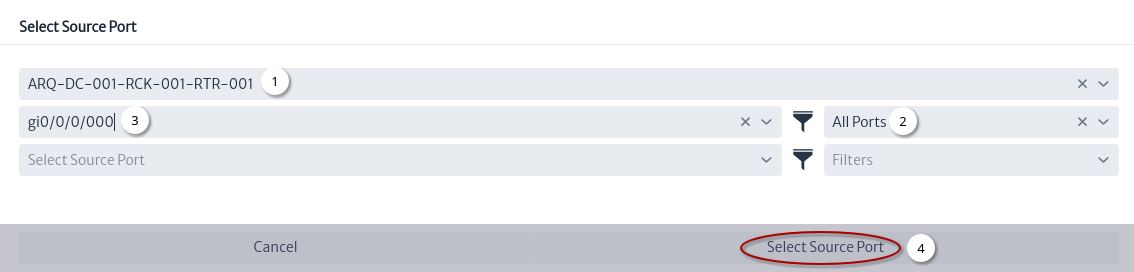 |
|---|
| Figure 17. Select source port |
- The
MPLSRouterobject is searched using its name. - Using filters, all ports within the Router are listed. See Filters module.
- Select one of the ports.
- Click the button.
- Figure 18 shows the selection of the target port.
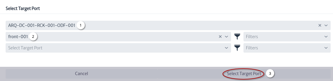 |
|---|
| Figure 18. Select target port |
- The
ODFobject is searched using its name. - Select one of the ports.
- Click the button.
- Figure 19 shows the actions that will be taken between the ports.
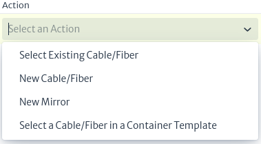 |
|---|
| Figure 19. Connectivity manager actions |
Actions
New Cable/Fiber
- Figure 20 shows the action that will be taken between the ports.
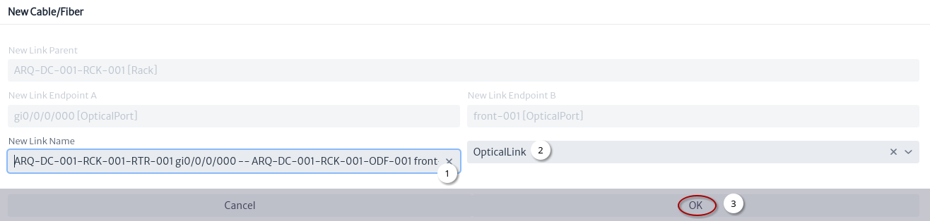 |
|---|
| Figure 20. New fiber window |
- Automatically generated name1.
- Select link type.
- Click the button.
Figure 21 shows the first connection.
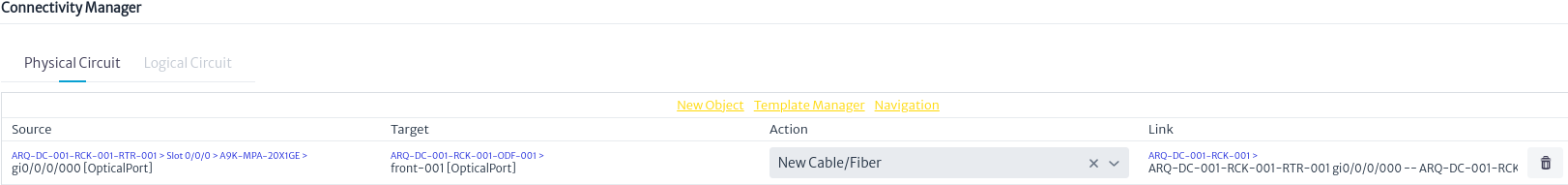 |
|---|
| Figure 21. First connection |
New Mirror
Figure 22 shows the steps to execute the action of a new mirror between two ports of a ODF.
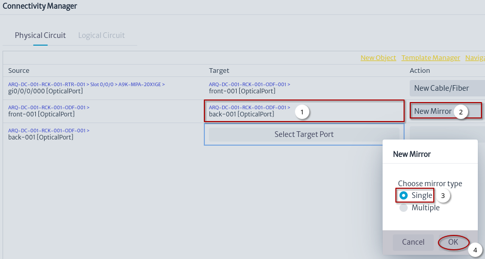 |
|---|
| Figure 22. New mirror |
- Select target port.
- Select
New Mirroraction. - Choose mirror type.
- Click the button.
Select Existing Cable/Fiber
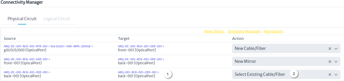 |
|---|
| Figure 23. Select existing cable action |
- Select target port.
- Select Existing Cable/Fiber action.
Figure 24 shows the action to use an existing cable, the cable that was created in the New Connection section will be used.
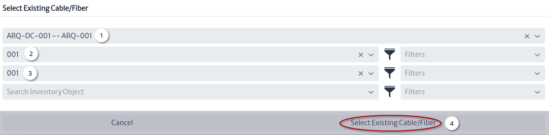 |
|---|
| Figure 24. Select existing cable window |
- Select the cable.
- Select the tube.
- Select fiber.
- Click the button.
Select a Cable/Fiber in a Container Template
Before creating a cable using templates, some mirrors and links were created Figure 25.
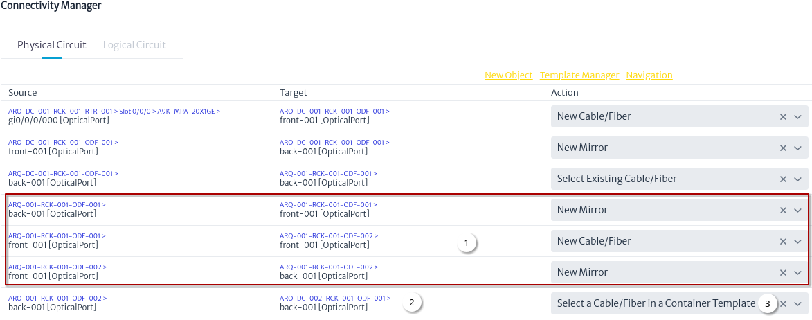 |
|---|
| Figure 25. Select a Cable/Fiber in a Container Template action |
- New mirrors and links added. See New Mirror and New Cable/Fiber actions.
- Select target port.
- Select a Cable/Fiber in a Container Template action.
Figure 26 shows the creation of a cable between building 001 and data center 002 using templates. See Template Manager
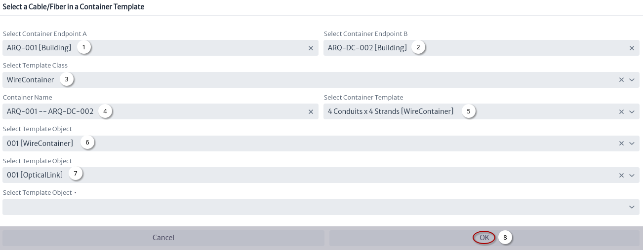 |
|---|
| Figure 26. Select a Cable/Fiber in a Container Template window |
- Select endpoint A of the cable.
- Select endpoint B of the cable.
- Select the class.
- Set the cable name1.
- Select cable template.
- Select a tube.
- Select a fiber.
- Click the button.
Physical Circuit
Figure 27 shows the physical circuit from one port of a MPLSRouter in data center 001 to the other port in a MPLSRouter in data center 002.
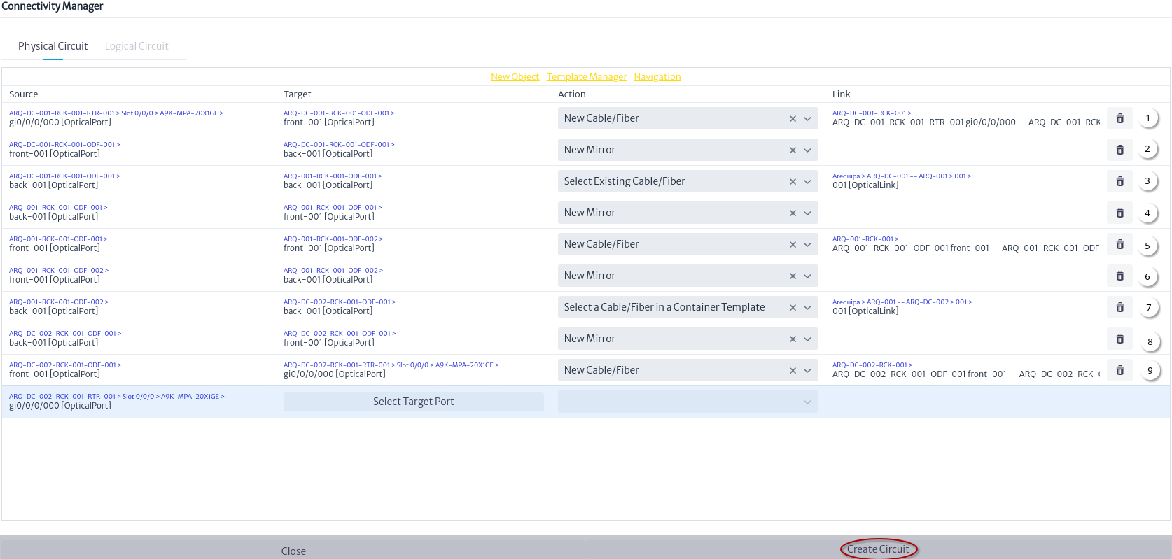 |
|---|
| Figure 27. Physical circuit |
Once the physical circuit has been created, you can see the physical path of the MPLSRouter port in the data center 001 Figure 28.
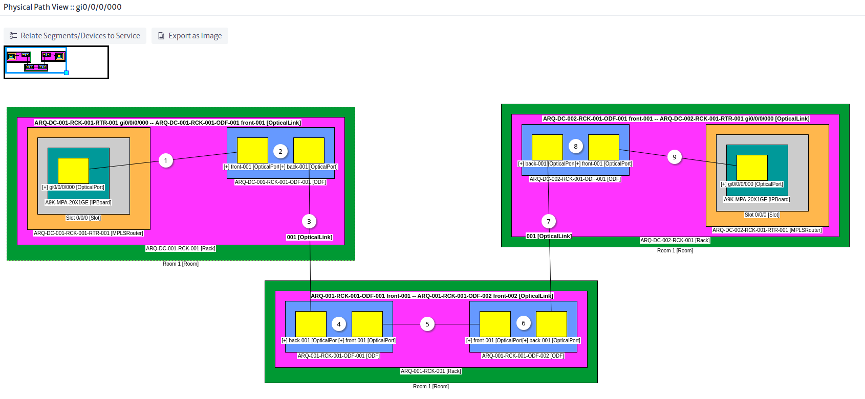 |
|---|
| Figure 28. Physical circuit |
Note The numbering in Figures 27 and 28 is used to show different perspectives of the same physical circuit. For example (1) is the fiber connected from a MPLSRouter port to an ODF port.
Creating a Logical Circuit
A logical circuit is a point-to-point connection and is used to represent last mile OSP circuits.
Note To create other types of logic circuits see the New Logic Circuit module.
New Service
Before creating the logical circuit, the service to which it will be associated will be created. Figure 29 shows the step by step to create a service using the Service Manager module.
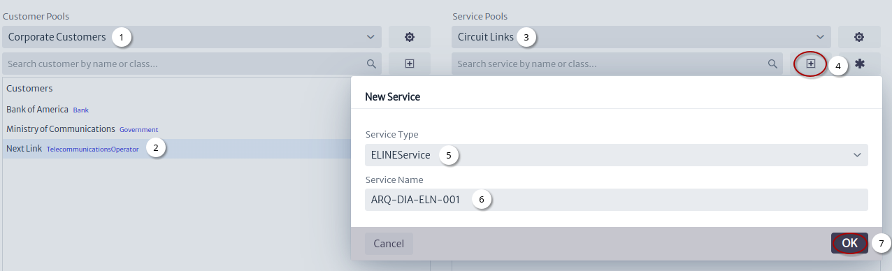 |
|---|
| Figure 29. New Service |
- Select the customer pool.
- Select the customer.
- Select the service pool.
- Click on the
New Servicebutton. - Choose the type of service.
- Set the service name1.
- Click on the
OKbutton.
Create Logical Connection
Logical connection are used to represent point-to-point connections like those used in modules SDH and MPLS.
The logical connection created in this module are similar to MPLS Figure 30.
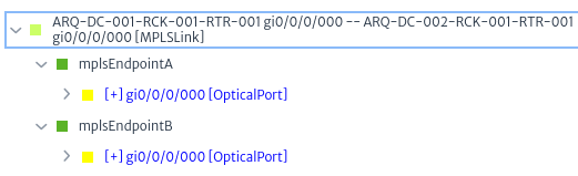 |
|---|
| Figure 30. MPLS relationships |
The difference with MPS is the objects and relationships used Figure 31.
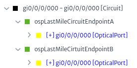 |
|---|
| Figure 31. Last mile circuit relationships |
The types of logical connections are the subclasses of GenericLastMileCircuit to add more options that adapt to your needs, just create subclasses using the Data Model Manager, for example MetroEthernet.
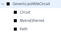 |
|---|
| Figure 32. Custom GenericLastMileCircuit subclasses |
Note
- Logical connections were designed for last mile services, however currently they are used interchangeably to represent logical circuits.
- It is possible that the model will be simplified in the future, it is recommended to use
Circuitto facilitate the migration.
Figure 33 shows the step by step to create a logical connection.
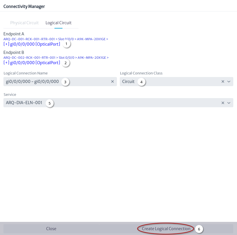 |
|---|
| Figure 33. Create Logical Connection |
- Select source port.
- Select target port.
- Automatically generated name1.
- Select logical connection class.
- Search service by name or class.
- Click on the
Create Logical Connectionbutton.
Using the Navigation module you can search for the new logical connection the Figure 34 shows the relationships explorer for the created logical connection.
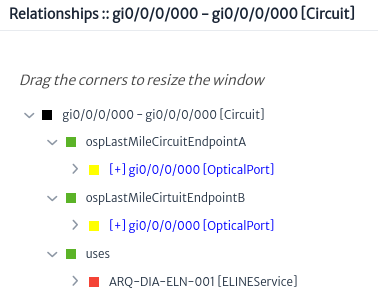 |
|---|
| Figure 34. Logical connection relationships |
-
Object names in Kuwaiba should use a naming convention to facilitate their management. ↩ ↩2 ↩3 ↩4 ↩5
Outside Plant Management
The outside plant module manages the OSP views which are composed of nodes and connections and are used to represent a network.
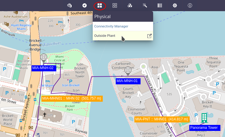 |
|---|
| Figure 1. Outside plant module |
In this chapter the following topics will be addressed:
- Creating an FTTH OSP view
- Node Tools
- Connection Tools
- Map Tools
- OSP View Tools
- Geographical Queries
- View Content Tool
- Splicing Tool
- Customize the Map
Creating an FTTH OSP view
To build the osp view we are going to use as a reference the diagram in Figure 2 in which we have a central office where the OLT will be located, a primary splitter and a secondary splitter, to which the client's ONT will be connected.
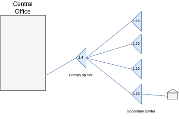 |
|---|
| Figure 2. FTTH Diagram |
- Click on the create an osp view button
 , in the window Figure 3 enter the name and description and click on the OK button.
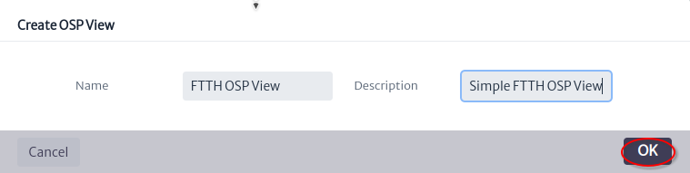 |
|---|
| Figure 3. Create OSP view window |
- Click on the open properties panel button
 to see the view properties Figure 4.
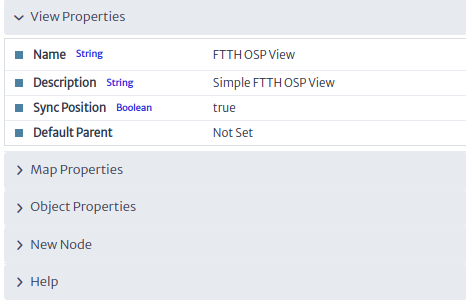 |
|---|
| Figure 4. View properties |
- Center the map where the network will be located. Figure 5 shows the updated map properties.
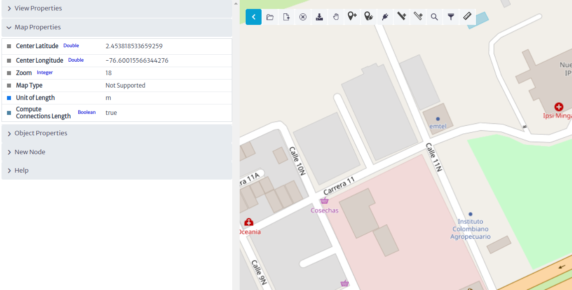 |
|---|
| Figure 5. Map Properties |
Adding Nodes
- Select the new panel node as shown in Figure 6.
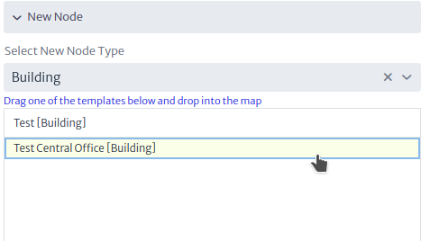 |
|---|
| Figure 6. New Node Panel |
- Drag and drop to map the
Test Central Officebuilding template then the window shown in Figure 7 will appear, select the parent of the node and click the next button.
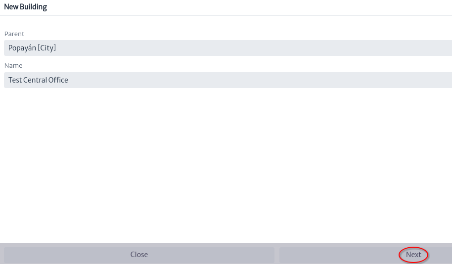 |
|---|
| Figure 7. New Building |
- Using the object properties rename
Test Central OfficeasPOP Central OfficeFigure 8.
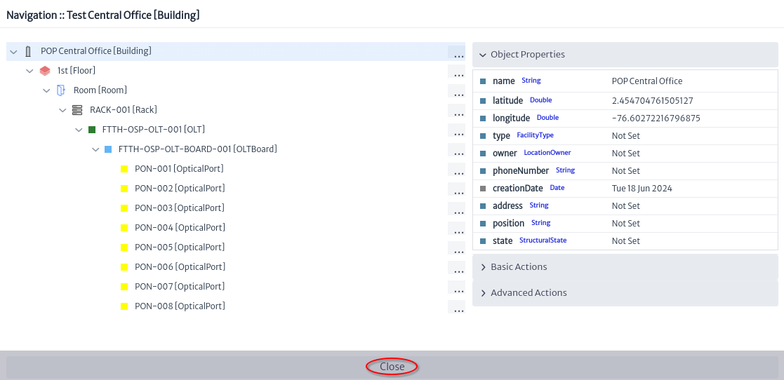 |
|---|
| Figure 8. Navigation Central Office |
- The two previous steps are repeated to add the first and second level splitters Figure 9, and to add a house Figure 10.
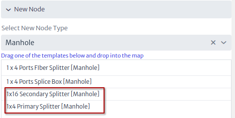 |
|---|
| Figure 9. New splitters |
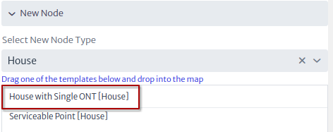 |
|---|
| Figure 10. New house |
The OSP view should be similar to that shown in Figure 11.
 |
|---|
| Figure 11. OSP view nodes only |
Adding Connections
Once the view nodes are created, they are connected using the connection tools.
- Selecting the connection tool
 creates a cable between the
 POP Central Officeand the manhole that contains the1x4 Primary SplitterFigure 12. Then a window will appear to define the name and type of the new cable Figure 13. Click on the OK button
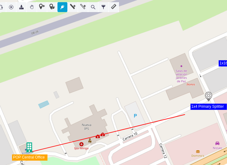 |
|---|
| Figure 12. New cable |
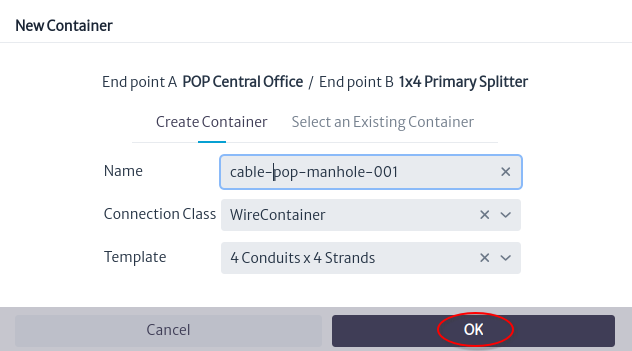 |
|---|
| Figure 13. New container window |
- In the window that asks whether to edit connections, click the Yes button Figure 14.
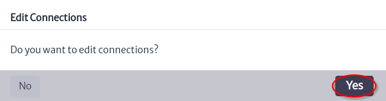 |
|---|
| Figure 14. Do you want edit connections? window |
- A window will appear to edit the connections, it will be used to create the connection between the OLT port and the primary splitter as shown in Figure 15.
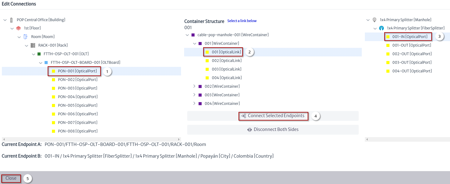 |
|---|
| Figure 15. Edit connections window |
- Select OLT port.
- Select fiber.
- Select IN port in primary splitter.
- Click the button Connect Selected Endpoints.
- Close edit connection window.
- Once the connections have been edited the OSP view looks as shown in Figure 16
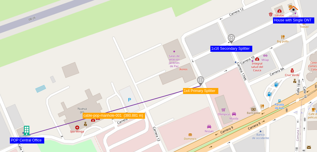 |
|---|
| Figure 16. OSP view with one connection |
- Repeat the steps to create the connection between the primary splitter and the secondary splitter, and between the secondary splitter and the house Figure 17.
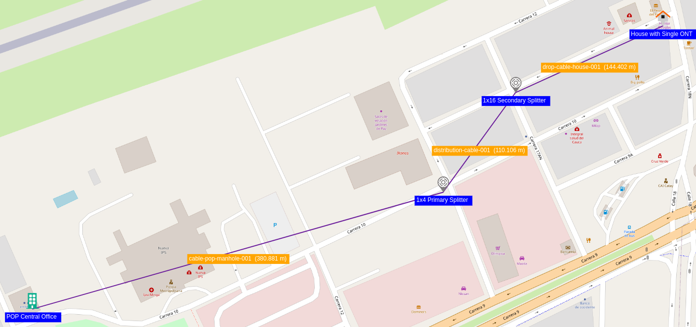 |
|---|
| Figure 17. Simple OSP View |
For more details on the connections edition see Edit Connections.
Node Tools
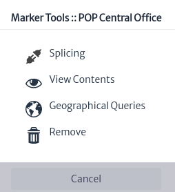 |
|---|
| Figure 19. Node tools |
Figure 19 shows the node tools window that appears when you right click on a node.
| Tool | Description |
|---|---|
 | This tool is used to do fiber optic splicing of the cables that reach the selected node. See splicing tool |
 | Used to view the devices within the node, you can list all or use filters. See view content tool |
 | Using the node coordinates, geographical queries filter the network elements within a search radius. |
 | Remove the node from the view only, to remove the node from the inventory it is necessary to do so from the navigation module |
Connection Tools
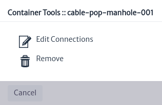 |
|---|
| Figure 20. Connections tools |
Figure 20 shows the connection tools window that appears when you right click on a connection.
| Tool | Description |
|---|---|
 | The edit connection tool was covered in the adding connections section Figure 15. |
| Remove the node from the view only, to remove the node from the inventory it is necessary to do so through the navigation module |
Map Tools
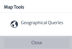 |
|---|
| Figure 18. Map tools |
Figure 18 shows the map tools window that appears when you right click on map.
| Tool | Description |
|---|---|
| Using the coordinates where you right clicked on the map, geographical queries filter the network elements within a search radius. |
OSP View Tools
 |
|---|
| Figure 19. Osp View tools |
Figure 19 shows the tools to manage the OSP views.
| Tool | Description | Keyboard Shortcut |
|---|---|---|
| Open properties panel | |
 | Open an existing OSP View | Alt-O |
| Create an OSP View | Alt-N |
 | Delete OSP View | Alt-D |
 | Save OSP View | Alt-U |
 | Select a node or connection | Alt-H |
 | Add node | Alt-M |
 | Add connections between two nodes using the existing containers | |
| Connect two nodes using a container | Alt-E |
 | Run a container through a single or multiple containers | Alt-C |
 | Run a link through a single or multiple containers | Alt-L |
 | Searches for a node or connection within the view | Alt-S |
 | Filter the nodes by class | Alt-F |
 | Measure distance |
Geographical Queries
A geographic query is a scripted query from the ospman.geo pool Figure 20, this query must have the parameters latitude, longitude, viewNodes and radius plus other additional parameters that the query may require.
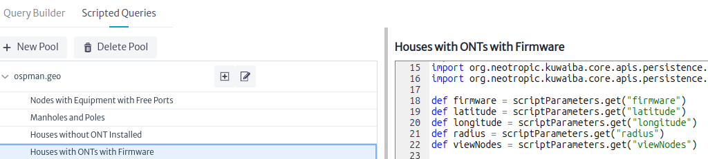 |
|---|
| Figure 20. Geographical Query Pool |
The latitude, longitude and viewNodes parameters are set when the query is selected Figure 21. If the action was launched from a node (see Node Tools) the latitude and longitude will be equal to that of the node. But if the action is launched from the map (see Map Tools) the values are set by calculating the latitude and longitude where the right click was made. The viewNodes parameter is the list of nodes in the view.
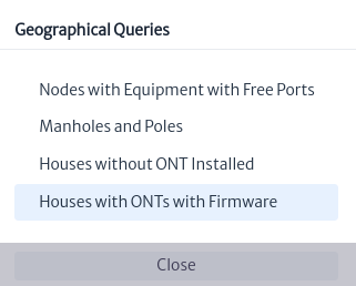 |
|---|
| Figure 21. Geographical Queries |
The radius parameter is a positive number in meters of a circle with center in latitude and longitude, and must be set by the user before executing the query Figure 22 as well as the additional parameters to those already mentioned.
Note
The Outside Plant module lists and executes the scripted queries Figure 21 created in the Queries module Figure 20
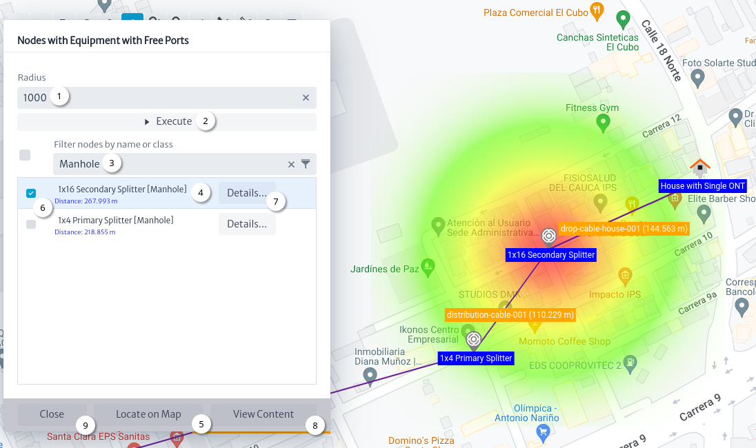 |
|---|
| Figure 22. Geographical Query |
Figure 22 shows the flow to execute a geographic query:
- Set the radius in meters and other parameters if they exist.
- Click on the
Executebutton. - Filter nodes by name or class name.
- Select the node.
- Click on the
Locate on Mapbutton to center the view on the selected node. - Check nodes to create a heat map.
- Click the
Details...button to open an Object Options Panel Figure 23. - Click on the
View Contentbutton. - Click the
Closebutton.
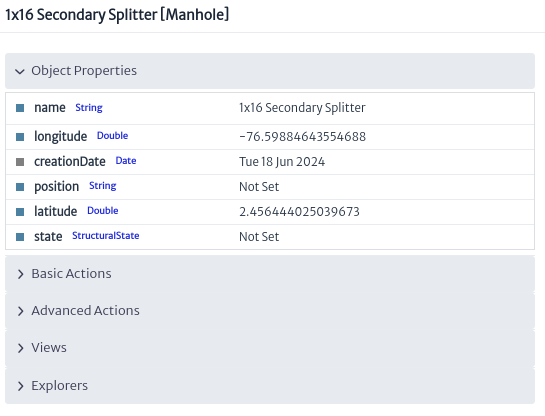 |
|---|
| Figure 23. 1x16 Secondary Splitter details |
View Content Tool
The view content tool helps you navigate the children of devices and physical connections Figure 24.
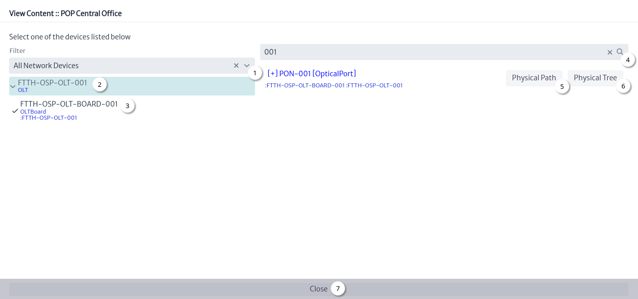 |
|---|
| Figure 24. View content window |
- Select filter. See Filters.
- Select device.
- Select any of the children of the device that contains ports.
- Search for a port.
- Click the
Physical Pathbutton Figure 25. - Click the
Physical Treebutton Figure 26. - Click the
Closebutton.
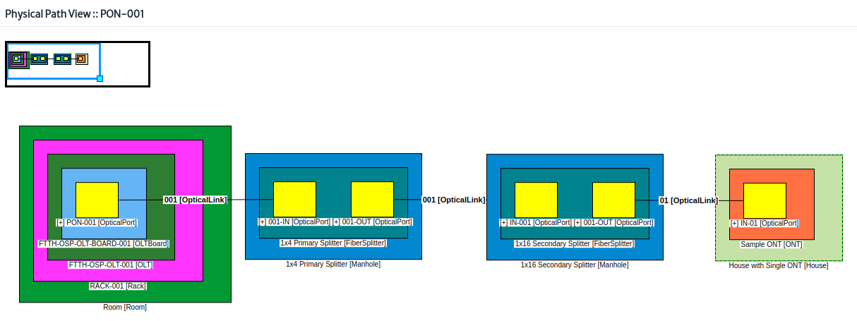 |
|---|
| Figure 25. Physical path view |
For more details on the physical path view see the navigation module.
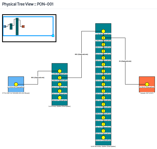 |
|---|
| Figure 26. Physical tree view |
For more details on the physical tree view see the navigation module.
Filters
Note This is a brief introduction to filters, for more details see the Filters module.
Figure 24 shows the content of a building. The filters that appear in the filter selector are the filters defined for the Building class. Figure 27 shows the extensions for the Building class. See the data model manager.
 |
|---|
| Figure 27. Extensions for the Building class |
Figure 28 shows all the filters that apply to the Building class. In general, the filters of a class are the filters of the same class and the classes that it extends.
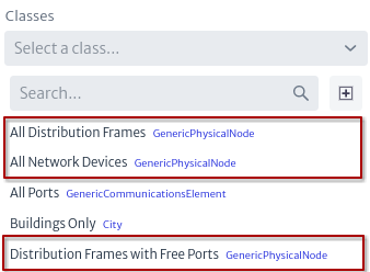 |
|---|
| Figure 28. Filters |
Splicing Tool
For Kuwaiba, splicing a fiber is creating the relationship endpointA or endpointB. For example using manholes that contain the primary splitter, splicing of the fibers that are not yet connected to the splitter will be done.
In Figure 29 there are three fields that must be set: the location, the cable, and a device. In the field to select the location, all the nodes in the view are listed; the value that appears by default is that of the node that opened the tool.
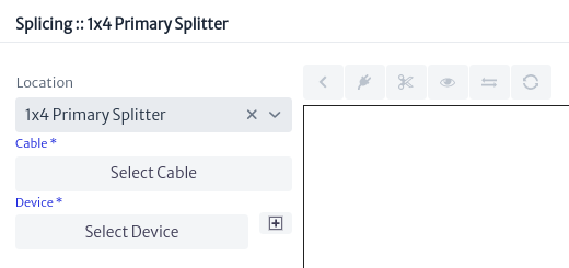 |
|---|
| Figure 29. Splicing window |
Click on the Select Cable button, Figure 29, a window will open that lists the cables that enter and leave the node, select the cable and then one of the tubes on which the splice will be made Figure 30.
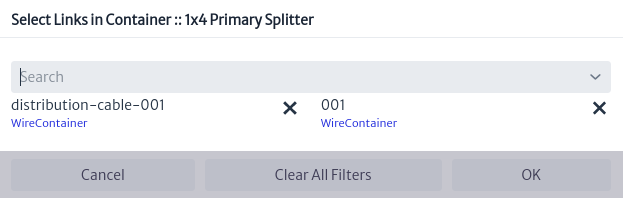 |
|---|
| Figure 30. Select cable |
Click on the Select Device button, Figure 29, a window appears and will list the devices in the node, select the device on which the splice will be made Figure 31.
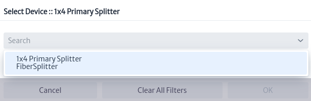 |
|---|
| Figure 31. Select device |
Once the cable and device are selected, the location view is loaded Figure 32.
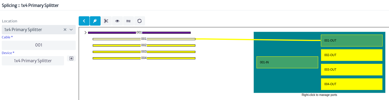 |
|---|
| Figure 32. Location view |
The location of the device can be changed using the button  Figure 33
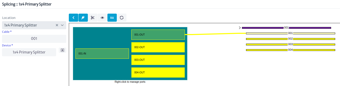 |
|---|
| Figure 33. Changed location view |
The location view have some tools for management to access them, right click on the port or fiber.
Figure 34 shows the port tools, most of them have already been explained in other chapters, the links are listed below:
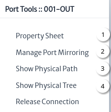 |
|---|
| Figure 34. Port tools |
Figure 35 shows the fiber tools, all have been covered in other chapters, the list of links is shown below:
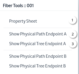 |
|---|
| Figure 35. Fiber tools |
Figure 36 shows an example of using the fiber property sheet tool to set its color.
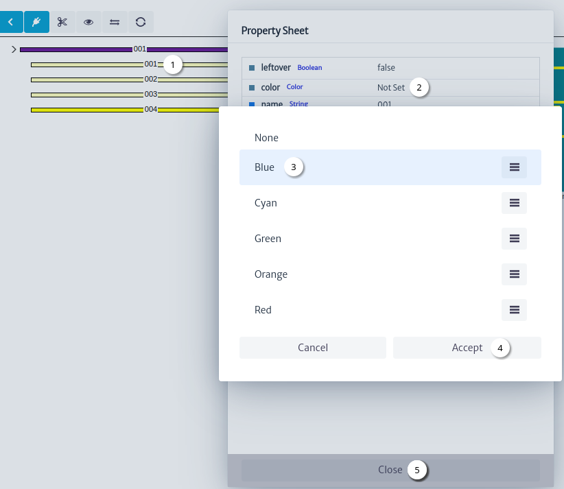 |
|---|
| Figure 36. Set fiber color |
- Right click on the fiber, click on the property sheet tool.
- Double click on the value of the
colorproperty. - Select fiber color.
- Click on the
Acceptbutton. - Click on the
Closebutton.
To update the fiber color in the location view click the refresh button  Figure 37.
Note: following fiber optic cable color codes1 define the colors for the other fibers.
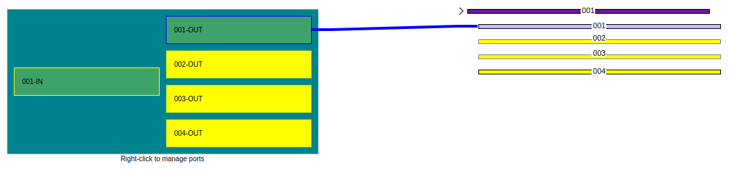 |
|---|
| Figure 37. Location view refreshed |
There are two ways to splice from a port to fiber Figure 38 or from fiber to port Figure 39.
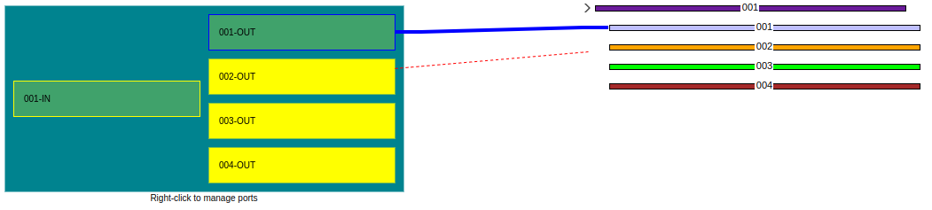 |
|---|
| Figure 38. Splicing from port to fiber |
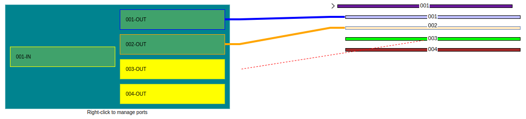 |
|---|
| Figure 39. Splicing from fiber to port |
Figure 40 shows the splicing of fibers 2, 3 and 4.
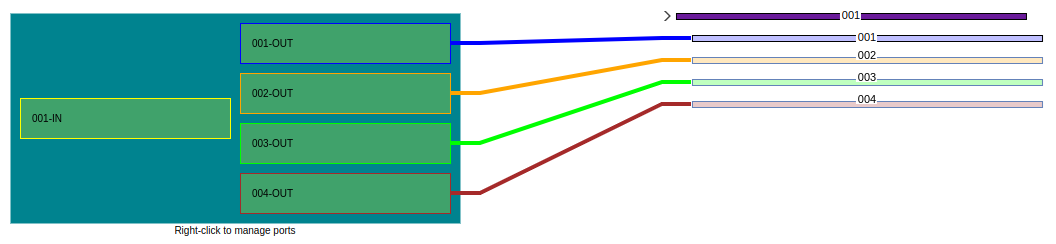 |
|---|
| Figure 40. Fiber splicing |
Figure 41 shows the relationships explorer for fiber 2.
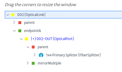 |
|---|
| Figure 41. Fiber relationships |
Customize the Map
Some characteristics of the map can be changed using the configuration variables below are the changes enabled for the user.
Note: the default values are listed in the configuration variables module.
Map Provider
By default the map is displayed using OpenLayers and the Open Street Map (OSM) tiled layer, to use a different map provider you must update the value of the configuration variable general.maps.provider to one of the following allowed values:
com.neotropic.kuwaiba.modules.commercial.ospman.providers.ol.osm.OsmProvidercom.neotropic.kuwaiba.modules.commercial.ospman.providers.ol.bmaps.BmapsProvidercom.neotropic.kuwaiba.modules.commercial.ospman.providers.google.GoogleMapsMapProvider
Note
com.neotropic.kuwaiba.modules.commercial.ospman.providers.google.GoogleMapsMapProviderrequire the value of the configuration variablegeneral.maps.apiKeyto be set.com.neotropic.kuwaiba.modules.commercial.ospman.providers.ol.bmaps.BmapsProviderrequire the value of the configuration variablesgeneral.maps.apiKeyandgeneral.maps.provider.bmaps.imagerySetthe possible values of the last one are:
AerialAerialWithLabelsAerialWithLabelsOnDemandStreetsideBirdsEyeBirdsEyeWithLabelsRoadCanvasDarkCanvasLightCanvasGray
In addition to the listed providers, it is possible to extend the functionality of this module to use other providers such as Leaflet.
Map Center and Zoom
When you enter the module, the map has a center and zoom by default, this behavior can be changed by updating the configuration variables:
widgets.simplemap.centerLatitudeThe default center latitude.widgets.simplemap.centerLongitudeThe default center longitude.widgets.simplemap.zoomThe default map zoom.
Map Labels
To change the color or fill color of the labels of the nodes or edges, the following configuration variables are used:
module.ospman.colorForLabelsThe color for the map labels.module.ospman.fillColorForEdgeLabelsThe fill color for the map edge labels.module.ospman.fillColorForNodeLabelsThe fill color for the map node labels.module.ospman.fillColorForSelectedEdgeLabelsThe fill color for the map selected edge labels.module.ospman.fillColorForSelectedNodeLabelsThe fill color for the map selected node labels.module.ospman.fontSizeForLabelsThe font size for the map labels.module.ospman.minZoomForLabelsThe minimum zoom level for the map when displaying.
IP Address Manager
The IP Address Manager is a tool designed to manage IP addresses efficiently. It allows storing both individual IP addresses and entire subnets along with their associated IP addresses. Through this tool, users can easily view which IP addresses are busy and which are available on a given network. In summary, the IP Address Manager facilitates the organization and control of the assignment of IP addresses, contributing to more effective management of the network infrastructure.
To open the IP Address Manager module, select Options -> IP Address Manager from the options menu.
 |
|---|
| Figure 1. IP Address Manager module selection in the general menu |
Once the IP Address Manager module is opened you can distinguish:
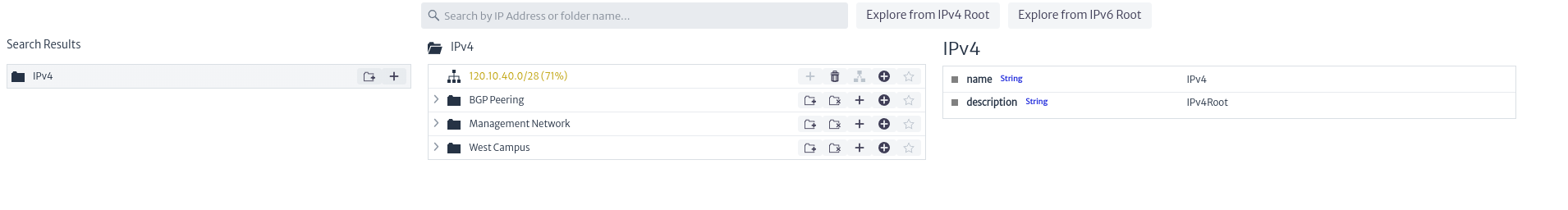 |
|---|
| Figure 2. Overview of the IP Address Manager |
- Explore from IPv4 Root: Explorer for IPv4 address management.
 |
|---|
| Figure 3. Explorer button for IPv4 address management |
- Explore from IPv6 Root: Explorer for IPv6 address management.
 |
|---|
| Figure 4. Explorer button for IPv6 address management |
- Search Bar: In the central part of the screen, there is a search bar that allows you to search for a specific IP address or folder within the IPv4 and IPv6 collections.
 |
|---|
| Figure 5. Search Bar |
- IP Address Management: Allows you to create new subnets or collections of subnets.
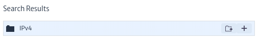 |
|---|
| Figure 6. IP Address Management |
- IP Address Explorer: Allows you to view the elements related to a collection of IP addresses, including subnets and other collections of subnets.
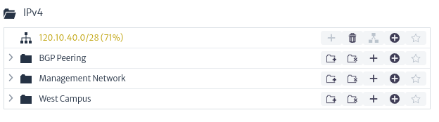 |
|---|
| Figure 7. IP Address Explorer |
- Properties of the Selected Element: Allows you to view the properties or characteristics of the selected element. By default, the image below is displayed.
 |
|---|
| Figure 8. Selected Element Properties |
Create a New Folder of Subnets
In the IP Address Management section, select the button shown in the image below to add a new folder of subnets.
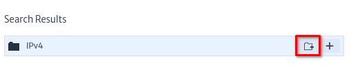 |
|---|
| Figure 9. IP Address Management |
This action will open the dialog box shown below, where the name of the new folder (collection) and a description of it are requested. The new added item will appear in the IP Address Explorer section.
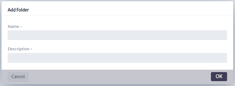 |
|---|
| Figure 10. Dialog for Creating a New Folder of Subnets |
Create a New Subnet
In the IP Address Management section, select the button shown in the image below to add a new subnet.
 |
|---|
| Figure 11. IP Address Management |
This action will open the dialog box shown below, where the subnet base address and subnet prefix in CIDR format will be requested, along with a brief description. The same dialog will provide a description of the items to be configured, including the broadcast address, network address, number of hosts, and subnet mask, as shown in the dialog below. The new added item will appear in the IP Address Explorer section.
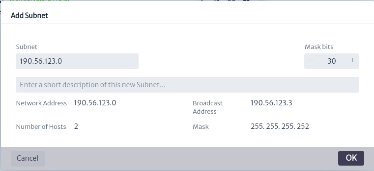 |
|---|
| Figure 12. Dialog for Creating a New Subnet |
IP Address Explorer
In this section we can manipulate both the collections of subnets and the added subnets. The available options are described below:
-
Options for Subnet Folder
 :
:- Add a New Subnet Folder
 : Creates a new subnet folder within the current folder.
 - Remove Subnet Folder
 : Remove the folder.
 - Add a New Subnet Folder
 : Creates a new subnet within the folder.
 - Add a New IP Address
 : Create an IP address within a subnet. This will open a dialog like the one shown in the figure below, where the IP address to enter and a description are requested.
Figure 13. New IP Address - Add to Favorites
 :This functionality will be available in future versions.
- Add a New Subnet Folder
-
Options for Subnet
 :
:- Add a New Subnet : Create a new subnet within the current subnet, example shown in Figure 12.
- Delete Subnet
 : Delete the subnet.
 - Split a Subnet
 : Split a subnet based on the network prefix as shown below.
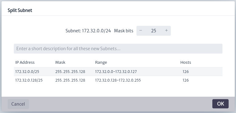
Figure 14. Split a Subnet - Add a New IP Address : Create an IP address within a subnet. This will open a dialog like the one shown in Figure 15, where the IP address to enter and a description are requested.
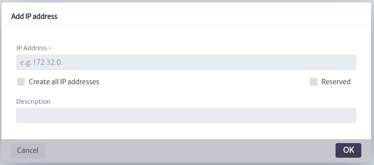
Figure 15. Create non-reserved IP address - Create Non-reserved IP Address: As shown below, an IP address is created and it will be not reserved. After running this command successfully, the Divide a Subnet option will be disabled.
- Create All IP Addresses: As shown in Figure 16 the possible IP addresses are created for the selected subnet, all the IP addresses created will be not reserved.
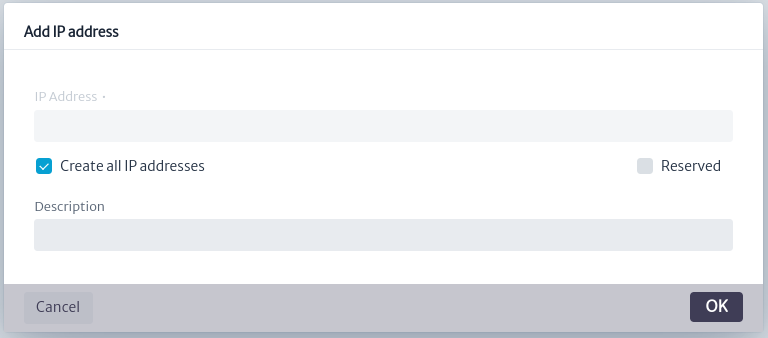
Figure 16. Create All IP Addresses - Create Reserved IP address: As shown below, an IP address is created and it will be reserved. After executing this command successfully, the Divide a Subnet option will be disabled.
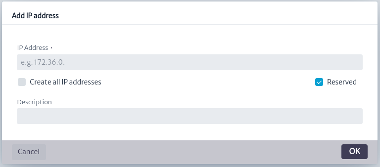
Figure 17. Create Reserved IP address - Add to Favorites : This functionality will be available in future versions.
- Add a New Subnet
Properties of the Selected Element
The default image changes depending on the selected element, providing detailed information about it.
-
Selected Subnet Collection: The figure below shows the subnets and IP addresses created in the collection. You can also see if these addresses are free, indicated with the icon
 , and the reserved ones with
  . Basic information such as name and description is presented.
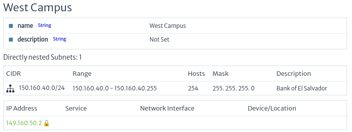
Figure 18. Properties of a Collection of Subnets -
Selected Subnet: The figure below shows the subnet with the created IP addresses. You can also see if these addresses are linked to any network element, indicated with the
 icon. Free IP addresses are distinguished with the icon , and reserved ones with . Other icons correspond to the validator logic used for the module. In addition, basic information is presented such as the name, creation date and quantitative data, such as the percentage of occupancy of the subnet.
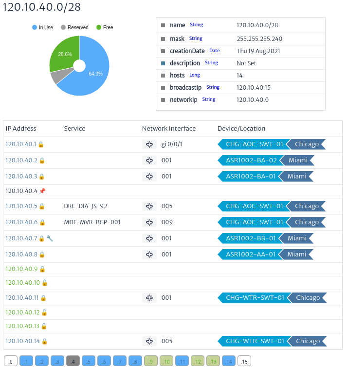
Figure 19. Properties of a subnets
Relate a Network Interface to an IP
In the IP Address Manager module, it is possible to relate a network interface to a specific IP address. This functionality is found in the action available for the ports of the Navigation Tree module (Navigation Tree).
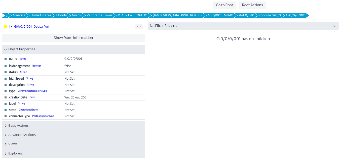 |
|---|
| Figure 20. Optical Port Navigation Tree |
To map a network interface to an IP address, navigate to the desired port in the navigation tree. In the Advanced Actions menu, select the Relate to IP Address action.
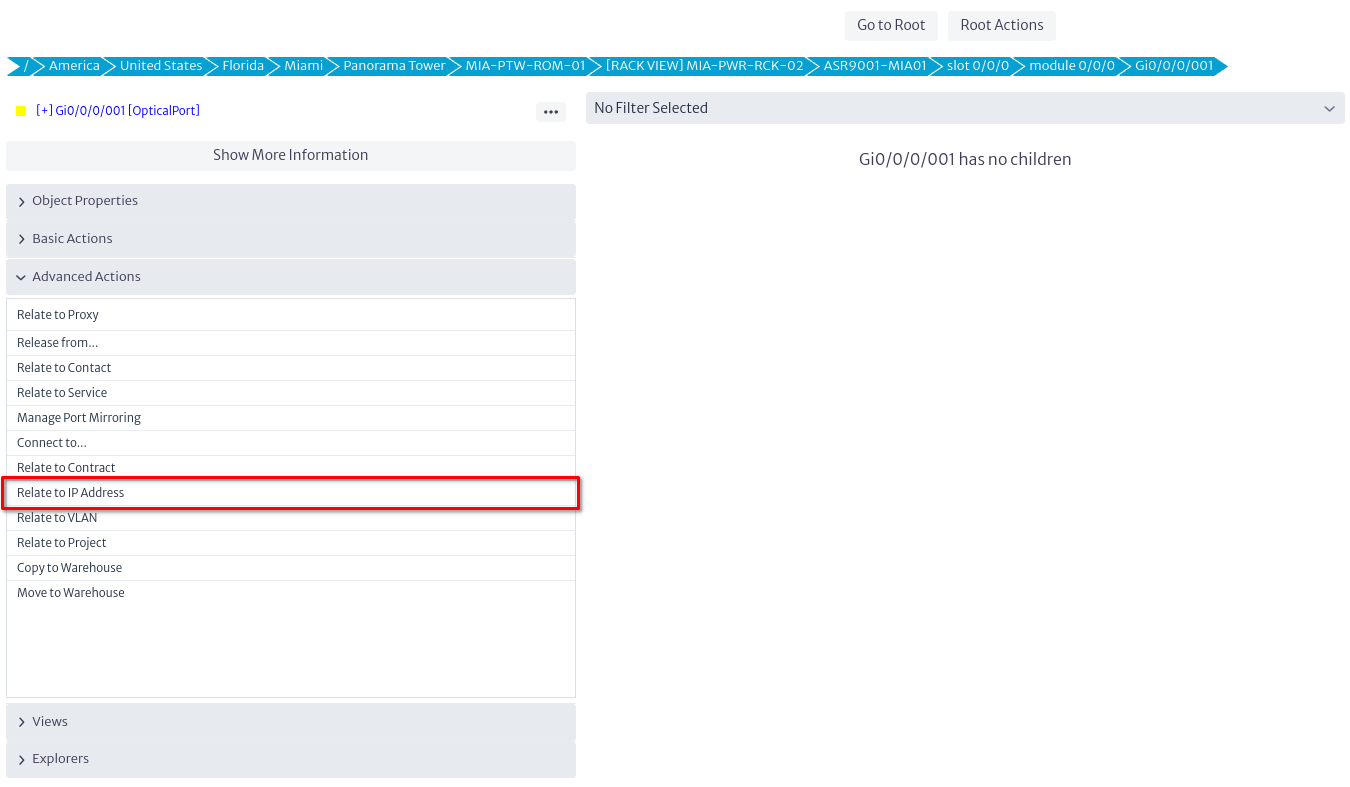 |
|---|
| Figure 21. Action in the Navigation Tree to Relate Network Interface to IP Address |
In the dialog box, select the IP address you want to associate.
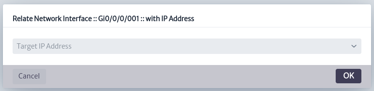 |
|---|
| Figure 22. Relate Network Interface to IP Dialog |
Colors and Icons
The colors and icons used in the IP Address Manager come from a validator in the configuration module. These help to quickly view the status of IP addresses.
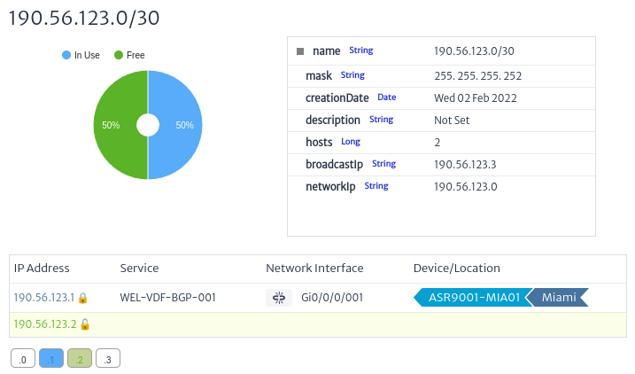 |
|---|
| Figure 23. Validation Colors and Icons |
Icons
- Free IP icon: Indicates that the IP is free.
- Reserved IP icon: Indicates that the IP is reserved.
- IP Related Icon: Indicates that the IP is associated with a network element.
Colors
The colors shown in the IP addresses will be similar to those presented in the graph. In this example, green is used for free addresses, blue for used addresses, and gray for reserved addresses.
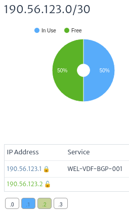 |
|---|
| Figure 24. IP Address Colors |
Relationship between Network Element and IP Addresses
Each IP address can be associated with different services on the network. By viewing the properties of an IP, you can see the associated services and their statuses.
 |
|---|
| Figure 25. Relationship between Network Element and IP Addresses |
- IP Address: IP Address.
- Service (Service): Related service.
- Network Interface (Network): Network interface related to the IP address. Clicking the icon will immediately unlink the IP from the item.
- Device/Location: Indicates that the IP address is associated with a network element.
isManagementInterface
The isManagementInterface field indicates whether a port is a management interface for a device (such as a router). This designation is crucial to identify the port through which the device is managed, rather than used for regular communications traffic.
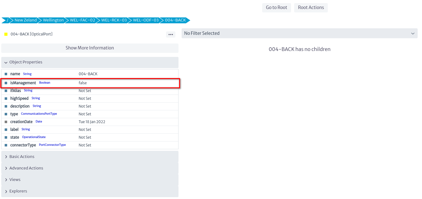 |
|---|
| Figure 26. isManagementInterface attribute |
- Purpose: Indicate that this is the router's management port and not a communications port.
- Importance: Ensures that an IP address is always assigned to the management interface in order to access and manage the device.
New Logical Circuit
Creates new logic circuits given the type and the endpoints. The access method is shown in Figure 1.
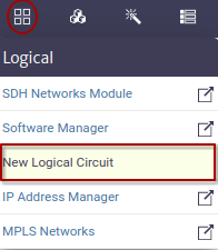 |
|---|
| Figure 1. New Logical Circuit module |
Figure 2 shows the step by step to configure the new logical circuit. For this example, the physical circuit Figure 3 built in the chapter of the Connectivity Manager module will be used.
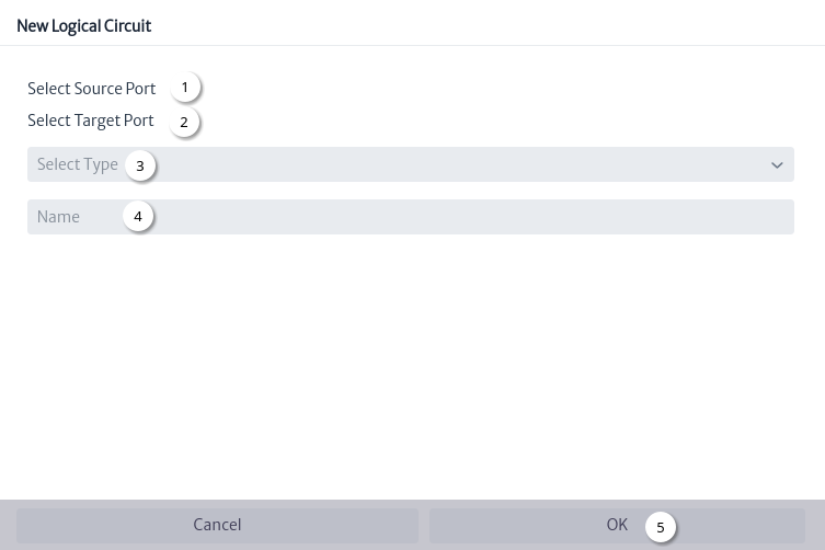 |
|---|
| Figure 2. New logical circuit window |
- Select source port Figure 4.
- Select target port Figure 5.
- Select logical circuit type Figure 6.
- Automatically generated name Figure 6.
- Click on the
OKbutton.
Using the Navigation module you can search for the new logical circuit the Figure 7 shows the relationships explorer.
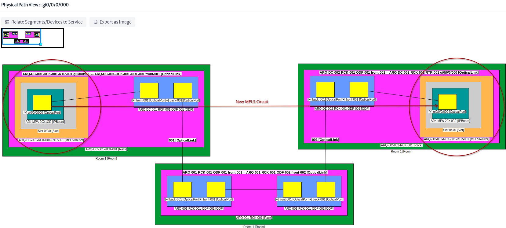 |
|---|
| Figure 3. Physical circuit |
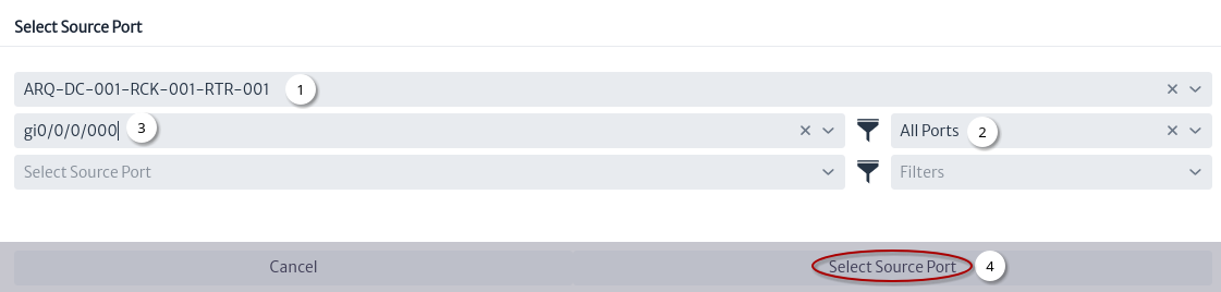 |
|---|
| Figure 4. Select source port |
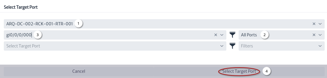 |
|---|
| Figure 5. Select target port |
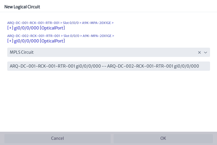 |
|---|
| Figure 6. Configuration of the new logical circuit |
 |
|---|
| Figure 7. New logical circuit relationships |
MPLS Networks
Create MPLS (Multiprotocol Label Switching) topologies and create virtual circuits between network interfaces.
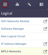 |
|---|
| Figure 1. MPLS Module |
Figure 2 shows an example MPLS view.
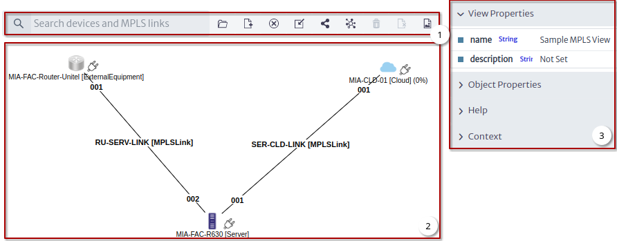 |
|---|
| Figure 2. Example MPLS View |
- Tools.
- Canvas.
- View Options Panel and Object Options Panel.
Tools
 |
|---|
| Figure 3. Tools |
Figure 3 shows the tools to manage the MPLS views.
| Tool | Description |
|---|---|
 | Open view |
 | New view |
 | Remove view |
 | Add existing devices and MPLS links to the view |
 | New MPLS link |
 | Detect MPLS link between nodes |
 | Remove from database and view |
 | Remove from view |
 | Export as image |
Creating a View
To create a new view click on the New MPLS view tool Figure 4.
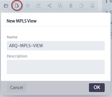 |
|---|
| Figure 4. New MPLS view window |
Once the view is created, two routers will be added Figure 5, these are the ones that were used in the physical circuit that was built in the connectivity manager chapter.
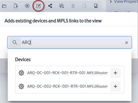 |
|---|
| Figure 5. Add existing devices |
Figure 6 shows the view with the two MPLS routers.
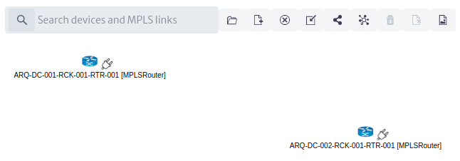 |
|---|
| Figure 6. View with two MPLSRouters |
In the chapter about New Logical Circuit, an MPLS Link Figure 7 was created that we will add to this view.
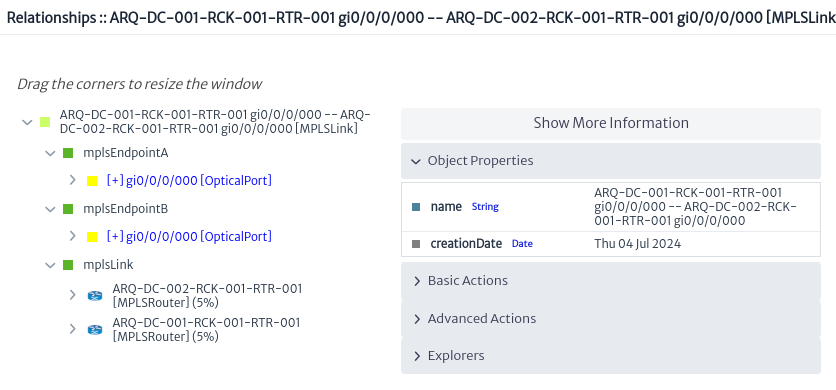 |
|---|
| Figure 7. Existing MPLS Link |
Using the MPLS link detection tool between nodes Figure 8.
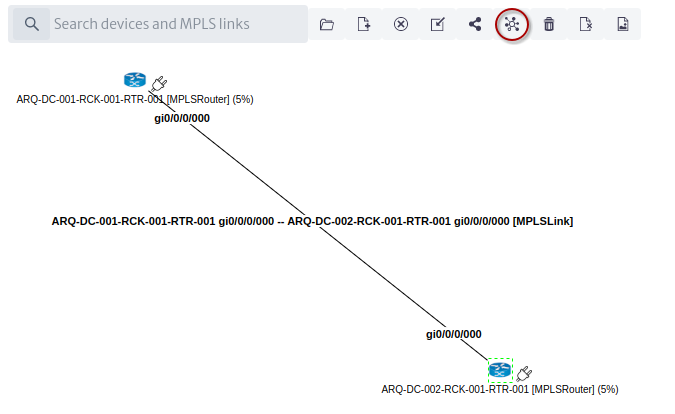 |
|---|
| Figure 8. View with MPLSLink |
Module Actions
Delete MPLS Link
Applies to object instances of
MPLSLinksubclasses.
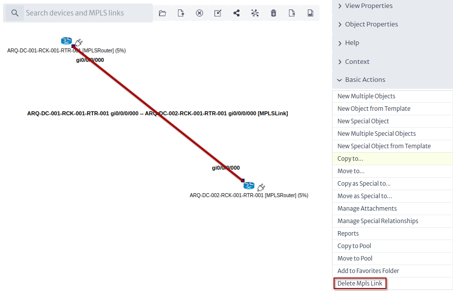 |
|---|
| Figure 9. Delete MPLS Link |
Relate to VLAN
Applies to object instances of
GenericPortsubclasses.
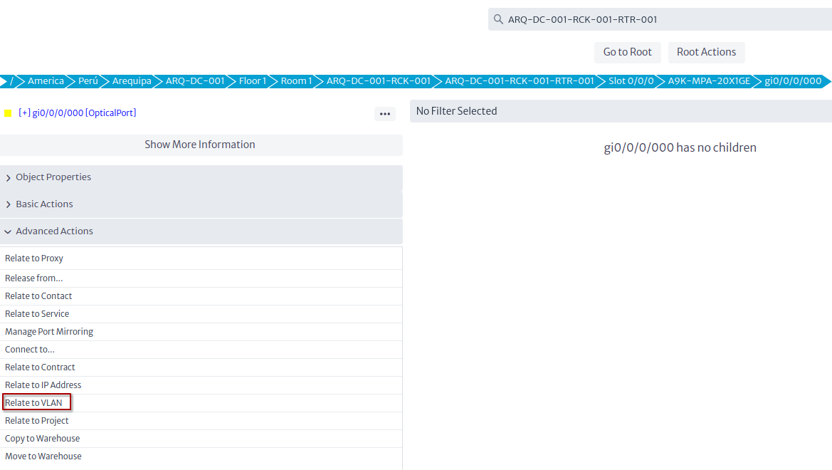 |
|---|
| Figure 10. Relate to VLAN |
SDH Networks
This module allows to create end-to-end virtual circuits and all other logical entities required by the SDH protocol1. Let’s introduce some concepts first. See Figure 1 for sample connection that illustrate the following terms.
TransportLinkA point-to-point logical connection that represents a single STMX. By default, the TransportLinks included in Kuwaiba areSMT1,STM4,STM16,STM64andSTM256.ContainerLinkIt’s a logical connection that may or may not have multiple hops and connects ports within the boundaries of the transport network. AContainerLinkends where at least oneTransportLinksends, but in its path, theContainerLinkmay have used many TransportLinks. In simple terms, aContainerLinkis an SDH virtual circuit. By default there are 5 types of ContainerLinks defined:VC12,VC3,VC4,VC4-04andVC4-16. The latter two provide support for concatenation.TributaryLinkObjects of this type are not circuits themselves, they rather use actual virtual circuits (ContainerLinks) and end in the ports where the SDH service is delivered to the customer (usually tributary ports).
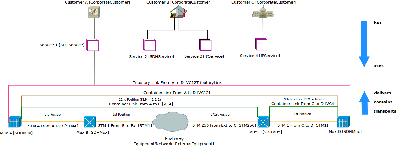 |
|---|
| Figure 1. Sample multi-hop SDH circuit and its relationships with services, customers and physical resources |
In short, Transport and ContainerLinks provide the foundations for the hierarchy, while the TributaryLinks provide information about where the circuits are delivered (that is, what are the endpoints of the connections).
Creating an SDH view
To create an SDH topology, go to the menu option Figure 2.
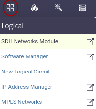 |
|---|
| Figure 2. SDH Module |
This will open an empty canvas similar to the Topology Designer.
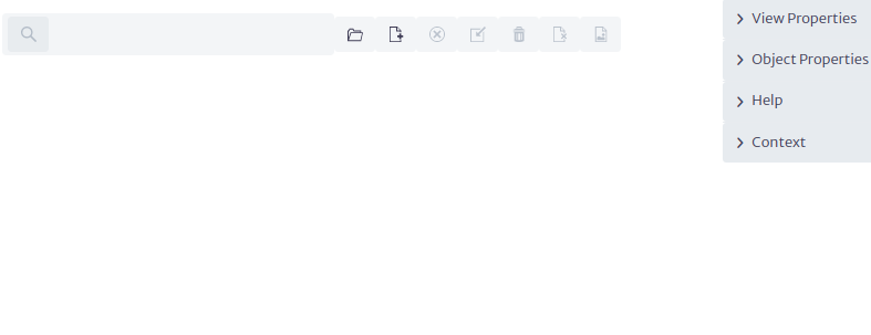 |
|---|
| Figure 3. SDH canvas |
The table below lists the tools and their description:
| Tool | Description |
|---|---|
 | Open SDH view |
 | New SDH view |
 | Remove view |
 | Add devices |
 | Remove from database and view |
 | Remove from view |
 | Export as image |
 | Connect |
Using the tool to add devices add the equipment you need Figure 4.
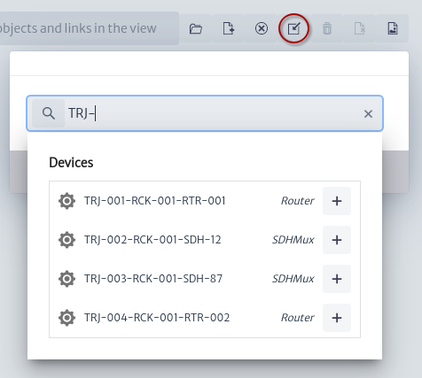 |
|---|
| Figure 4. Add devices window |
Let’s consider this 4 equipment topology Figure 5.
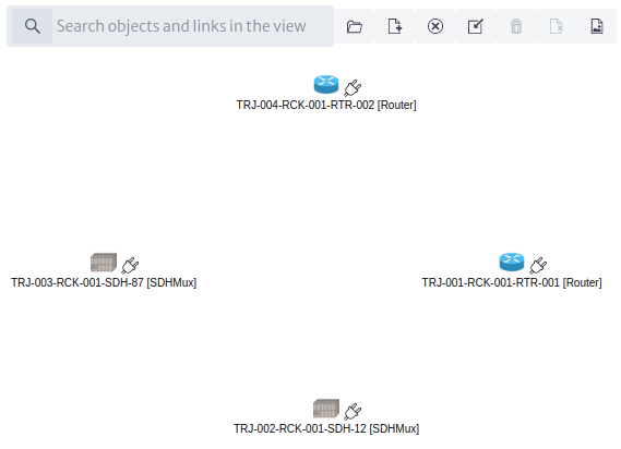 |
|---|
| Figure 5. Some routers and multiplexers in an SDH topology |
What we are going to do is to create a ring using STM-4 on one branch and SMT-1 on the other. We will create a VC12 between SDH-87 and Router 1. Each equipment has the same board/port layout: Two boards Figure 6, a tributary and an aggregate one, with two ports each Figure 7.
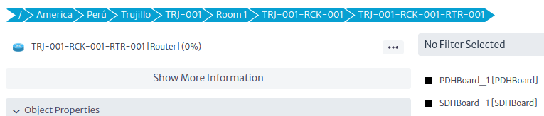 |
|---|
| Figure 6. Board layout |
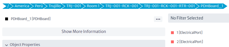 |
|---|
| Figure 7. Port layout |
Creating TransportLinks
First, we have to create the most basic support, that is the TransportLinks (STMX). Use the connect tool and drag a line from one equipment to the other. That will start a wizard Figure 8.
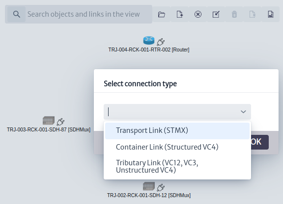 |
|---|
| Figure 8. Select connection type window |
The first step of the wizard will request for the basic information: name and type Figure 9
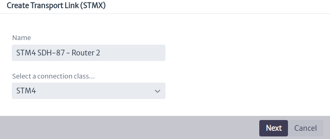 |
|---|
| Figure 9. Creating a TransporLink, step 1 |
The second will request the connection endpoints, which will always be aggregate ports.
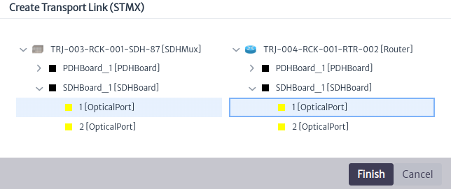 |
|---|
| Figure 10. Creating a TransporLink, step 2 |
After repeating the procedure three more times, the ring will be finished. In the Figure 11
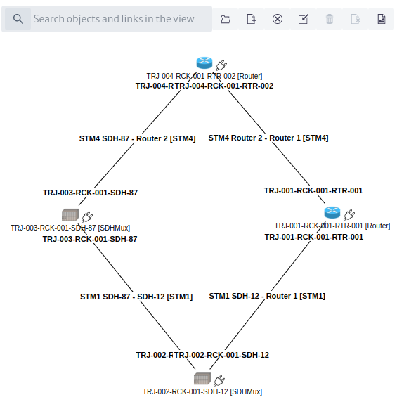 |
|---|
| Figure 11. SDH ring |
Creating ContainerLinks
The next level in the hierarchy is the set of structured high-order circuits (VC4) that will contain the E1s that we will add later. We will create three VC4: A long one, from SDH-87 to Router 1, a short one, from SDH-87 to Router 2, and finally another short one between Router 2 and Router 1. This will provide two paths to route the E1s later on. To create the VC4 connections (a.k.a. ContainerLinks). To create the first ContainerLink using the Connection tool , let’s drag a line between the SDH-87 and the Router 1. That will start a wizard.
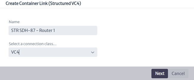 |
|---|
| Figure 12. New ContainerLink, step 1 |
Again, the first step is about basic information: Container name and type. We will create a simple VC4. The next step is about routes. You will find two routes. In the center panel, the detail of the chosen route will be displayed.
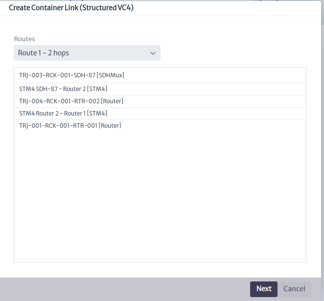 |
|---|
| Figure 13. New ContainerLink, step 2 |
The next step will ask you to define what timeslots you will use from each TransportLink in the route Figure 14. To select the timeslot from the list. This list will be populated with the available timeslots, but it will also inform you what timelots are already in use and who’s using them.
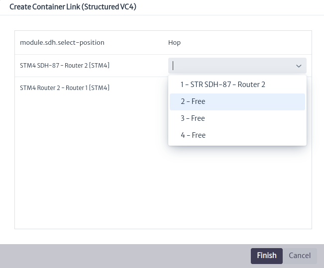 |
|---|
| Figure 14. New ContainerLink, step 3 |
It’s not necessary to select any endpoint ports, since they’re taken from the underlying TransportLinks. Once created, you won’t see anything different in the view, since the only connections to be displayed are the TransportLinks.
Creating TributaryLinks
The last step is to create a TributaryLink, that is, the actual E1 to be delivered. For that, we have to press the connection tool . As usual, drag a line between the end equipment, in this case, SDH-87 and Router 1. This will open another wizard.
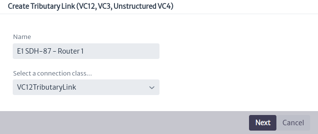 |
|---|
| Figure 15. New TributaryLink, step 1 |
In the next step, you will be requested to pick a route. Note that the STM4-based route won’t be offered, as it doesn’t have ContainerLinks to transport the TributaryLink.
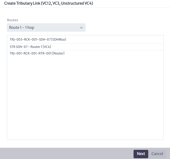 |
|---|
| Figure 16. New TributaryLink, step 2 |
The third step consists of choosing the timeslot in the ContainerLink (VC4)
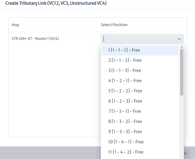 |
|---|
| Figure 17. New TributaryLink, step 3 |
The next step is choosing the endpoints. For this example, we’re going to end the SDH connection in a tributary port of a PDHBoard. It could, of course, end in any port of any board, however this is the most common scenario.
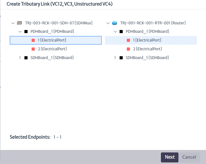 |
|---|
| Figure 18. Choosing the endpoints |
Finally, as an option, you can associate the newly created TributaryLink to a service instance. Note that this list will be populated only with objects of subclasses of GenericSDHService previously created in the Service Manager, as seen in the Figure 19.
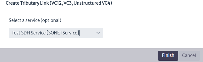 |
|---|
| Figure 19. Optionally, relating the circuit to a service |
Important
As an exercise for the reader, create Container and TributaryLinks using the alternate STM4-based route.
Module Actions
Delete Transport Link
Applies to object instances of
GenericSDHTransportLinksubclasses.
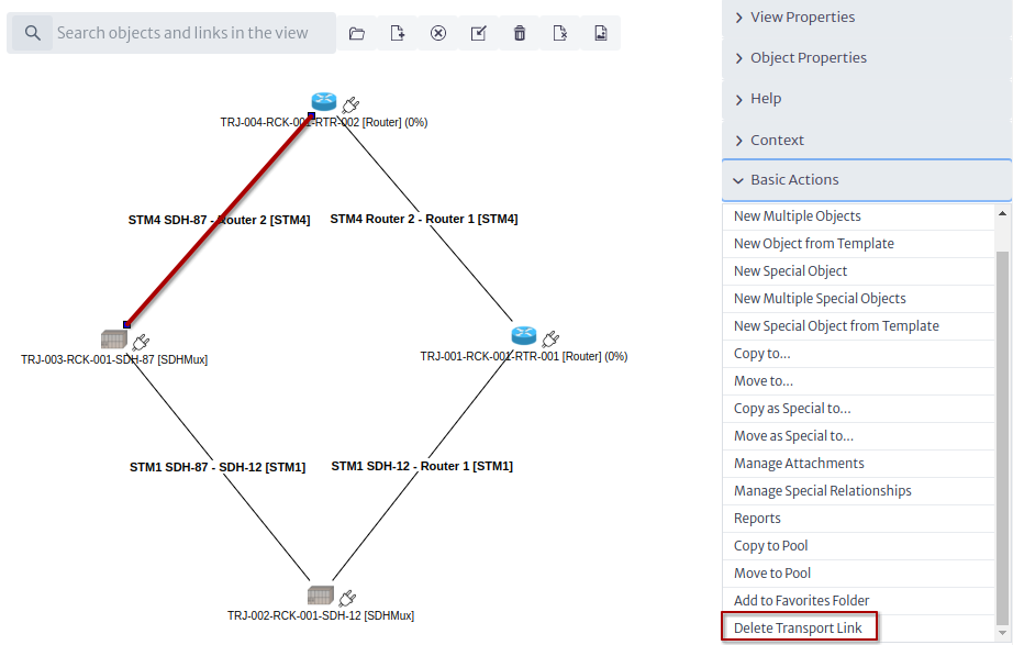 |
|---|
| Figure 20. Delete Transport Link |
Delete Container Link
Applies to object instances of
GenericSDHContainerLinksubclasses.
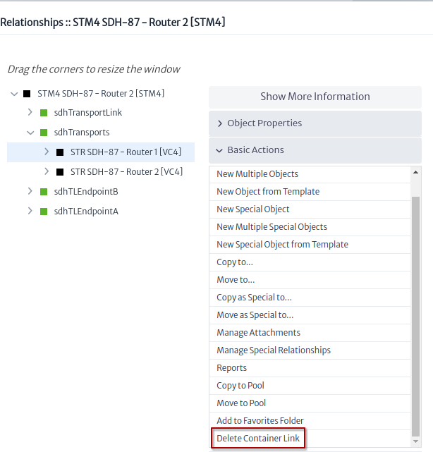 |
|---|
| Figure 21. Delete Container Link |
Delete Tributary Link
Applies to object instances of
GenericSDHTributaryLinksubclasses.
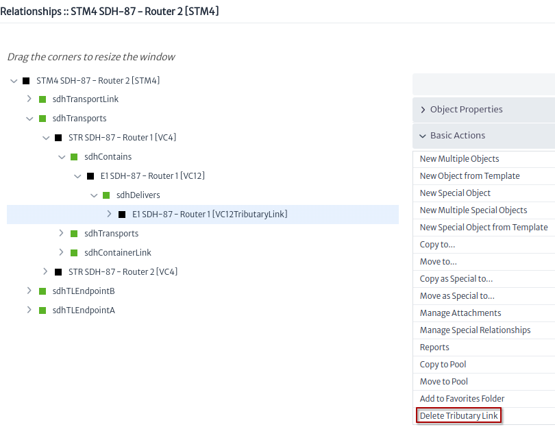 |
|---|
| Figure 22. Delete Tributary Link |
Software Manager
This module manages software licenses and associates them to existing inventory objects or keeps them in a temporary location until they are actually used. A software license can only be associated with instances of subclasses of the GenericApplicationElement class.
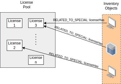 |
|---|
| Figure 1. Software manager structure. |
The graph in Figure 1 shows the structure of this module. First, licenses are grouped into license pools. That is, a pool stores or groups licenses. The licenses belonging to such a pool have a special relationship (RELATED_TO_SPECIAL) called licenseHas with inventory objects.
To access this module locate in the menu at the top the logic section, marked with the icon  , when you select it a vertical menu is displayed, where you must select the
 Software Manager option.
 |
|---|
| Figure 2. Access to the module. |
Subsequently, the selected module will open in a window, as illustrated in Figure 3.
 |
|---|
| Figure 3. Software manager module. |
Figure 3 presents a Manage Licenses button and a search engine.
-
By selecting the
Manage Licensesbutton, a pop-up window similar to the one displayed in Figure 4 opens, in which the existing license pools can be viewed. In addition, it is possible to add new pools by selecting theNew License Poolbutton, which will open a new window requesting the necessary information for the creation of the new license pool (see Figure 5).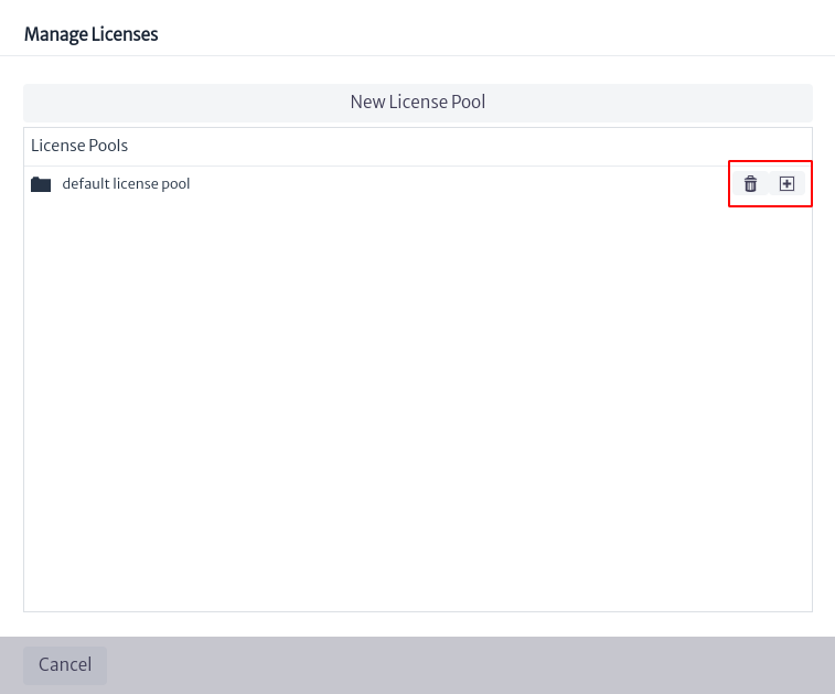
Figure 4. Manage licenses. 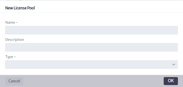
Figure 5. Create license pool. The data requested for pool creation includes the pool name, a description and the type of pool to create, which can be:
SoftwareLicense,USBTokenLicenseor a third type calledGenericSoftwareAssetwhich encompasses the two types mentioned above.The list of pools in Figure 6 contains the pool created earlier and a default pool called
default license pool, the latter belonging to theGenericSoftwareAssettype.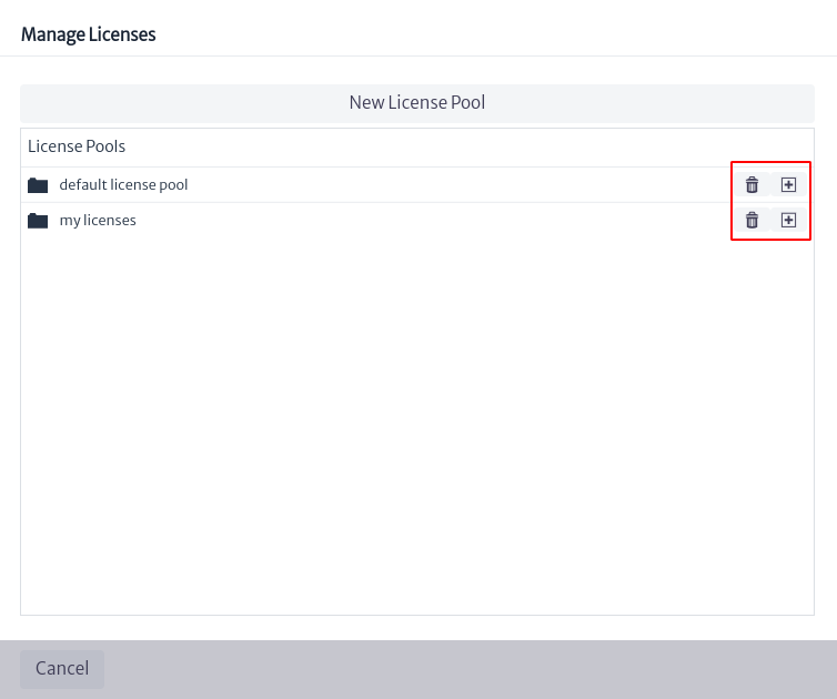
Figure 6. List of pools. The two options shown in Figure 6 will be available in front of each pool created. The
 button deletes the selected pool, while the
  button allows you to create a license within the pool, as shown in Figures 7 and 8.
If the license pool where a new license is going to be created is of the
GenericSoftwareAssettype, the license creation will allow to choose between theSoftwareLicenseandUSBTokenLicenselicense types (see Figure 7). On the other hand, if the pool type is not generic, the license type will already be defined and cannot be modified (see Figure 8).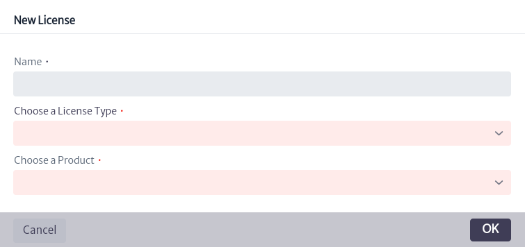
Figure 7. Creation of license in pool of type GenericSoftwareAsset. 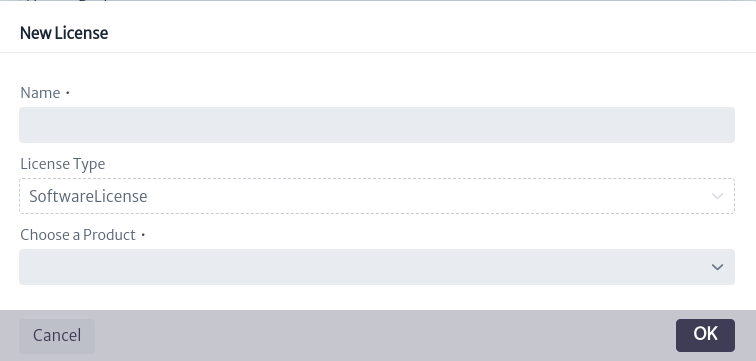
Figure 8. Creation of license in pool of non-generic type. If in Figure 6 you select a pool of interest, all the licenses contained in that pool will be displayed, along with detailed information about the pool, as indicated in Figure 9.
Figure 9. Licenses contained in the selected pool. Note The licenses shown in different colors, as well as the prefixes observed in each, as indicated in the blue box in Figure 9, are validators associated with the licenses. For more information, please refer to the Validators chapter.
To obtain more information about each license, select one of interest in Figure 9. On the right side of the screen, information related to the selected license will appear, as shown in Figure 10. These properties can be modified by double-clicking on the value of the property you wish to change; then, enter the new value and press the Enter key.
Figure 10. Selected license information. Below is a brief explanation of the license attributes:
-
name. License name.
-
state License status. ListType attribute (for more information, see chapter List Type Manager).
-
licensedDevices. Number of devices that can be licensed.
-
serial. license serial.
-
type. Type of license.
-
version. License version.
-
purchaseDate. Date of license purchase.
-
expirationDate. Expiration date of the license.
-
creationDate. Date of creation of the license in the inventory.
-
active. Indicates if the license is active or not.
-
vendor. License provider.
-
price. Cost of the license.
-
constraints. Restrictions.
In front of each license is the button
that deletes the license and the button  that deletes the relationship between the license and all inventory objects that use the license.
-
-
In the search engine shown in Figure 3, you can search for licenses by product name, by object or by license name, as shown in Figure 11.
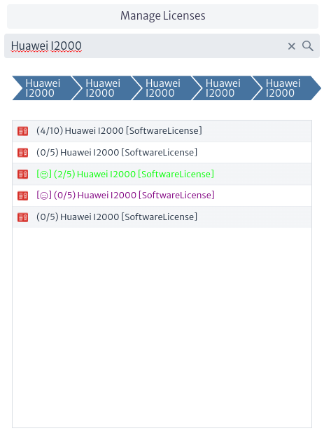
Figure 11. Search for license. To get more details on a specific license, select it. In the central part of the screen, the inventory objects that use the license will appear, along with some options that will be explained below.
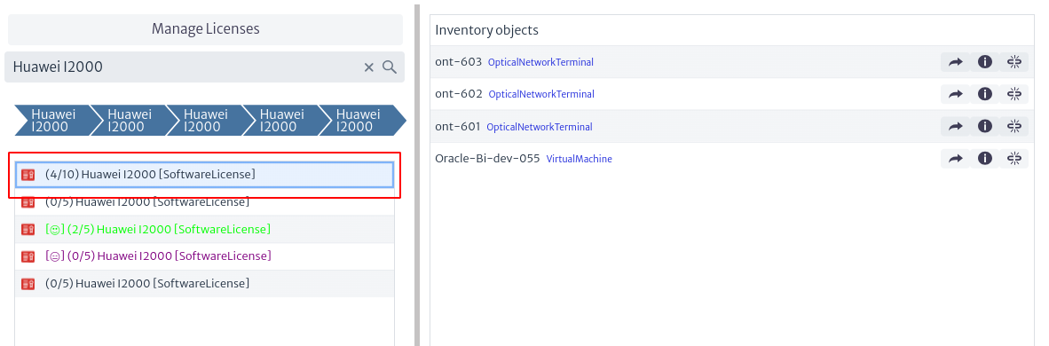
Figure 12. Inventory objects related to a license. -
If you select one of the inventory objects listed in the figure above, the licenses to which the selected object is related will be displayed.
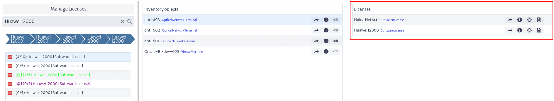
Figure 13. Licenses related to an inventory object. The options presented in Figure 13 are detailed below:

Figure 14. License options related to an inventory object. -
To view the Object Options Panel of a specific license, select
 , this will open a new tab with the Object Options Panel of the selected license. For more information, see the Navigation chapter.
 -
The
 button displays additional license information.
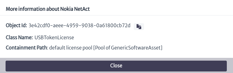
Figure 15. Additional license information. -
To remove the existing relationship between the inventory object and the license, I selected the button
. -
You can view existing reports related to a license through the icon
 (See more in Reports chapter).
-
-
You can open the Object Options Panel of the selected inventory object, through the button
 presented in Figure 12.
 -
To view additional information about the inventory object, select
, which opens a window similar to the one shown in Figure 15, indicating the object's identifier, the class it belongs to and the path to its containment. -
The button
removes the existing relationship between the inventory object and the license selected in Figure 11.
-
To relate an inventory object to an existing license, locate the Object Options Panel of the inventory object (you can access it through the Navigation module) and go to the advanced actions of the object, where you will find an action named Relate to License.
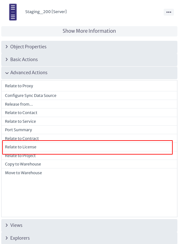 |
|---|
| Figure 16. Advanced object actions. |
Subsequently, a window will open where you can select the license pool to which the license you are interested in belongs and then choose the specific license. When you click on the OK button, the license will be linked to the object.
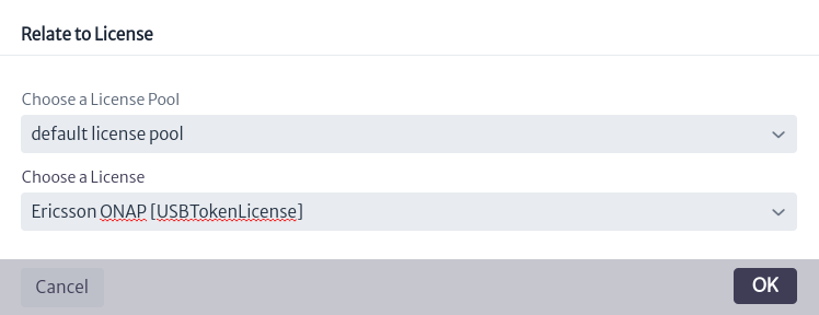 |
|---|
| Figure 17. Related license to inventory object. |
Service Manager
The Service Manager allows you to organize all the services in pools. These pools of services belong to customers, these customers are at the same time organized in pools. To open the Services Manager look at the menu Figure 1.
 |
|---|
| Figure 1. Service manager module |
To start using the Service Manager you must create a pool of customers Figure 2; depending on the loaded data model you can create pools of any subclass of GenericCustomer (see Data Model Manager if you need to create a different kind of customers).
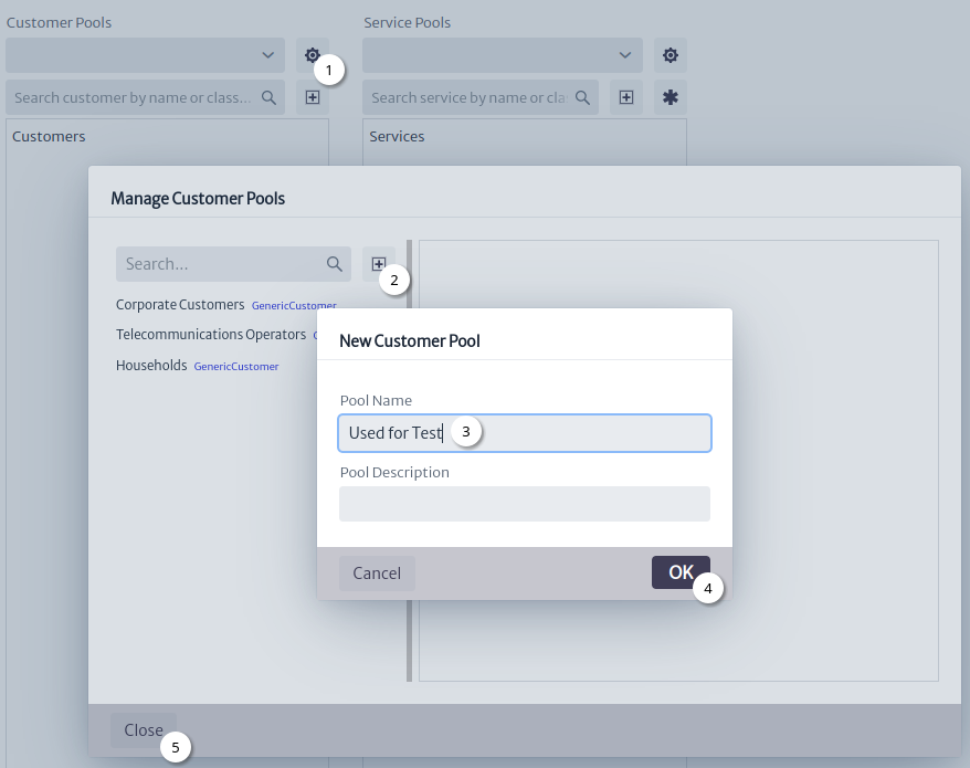 |
|---|
| Figure 2. New customer pool |
- Click the
Manage Customer Poolsbutton. - Click the
New Customer Poolbutton. - Set the name.
- Click the
OKbutton. - Click the
Closebutton.
Once you create your pool of customers you can create new customers, delete the created pool or show its id or search; as you can see in the Figure 3 you are able to create new customers with type any subclass of GenericCustomer.
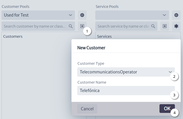 |
|---|
| Figure 3. New customer |
- Click the
New Customerbutton. - Set the type.
- Set the name.
- Click the
OKbutton.
Why can we create new customers of the class TelecomunicationsOperator if the class of objects of the pool we created was GenericCustomer? Well, we can create customers of that class because TelecomunicationsOperator is a subclass of GenericCorporateCustomer and GenericCorporateCustomer is a subclass of GenericCustomer - this is defined in the data model Figure 4, (see Data Model Manager if you need to adjust the model to your needs).
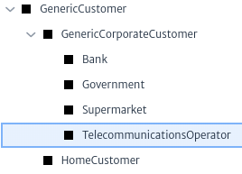 |
|---|
| Figure 4. GenericCustomer subclasses |
Now you can create a pool of services inside a customer Figure 5 or delete the customer or show its id or search.
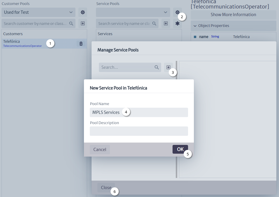 |
|---|
| Figure 5. New service pool |
- Select customer.
- Click the
Manage Service Poolsbutton. - Click the
New Service Poolbutton. - Set the name.
- Click the
OKbutton. - Click the
Closebutton.
Every pool of service has a name and a description, these properties could be changed later in the property sheet Figure 6, just selecting the pool of services and editing the values of its attributes.
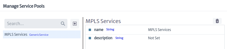 |
|---|
| Figure 6. Service pool property sheet |
Once the pool of services has been created your are able to create services in it, just select the pool and select the kind of service you want to add Figure 7.
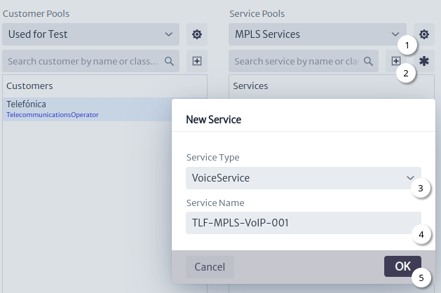 |
|---|
| Figure 7. New service |
- Select service pool.
- Click the
New Servicebutton. - Set the type.
- Set the name.
- Click the
OKbutton.
Note
Services can also be created using templates
in which you can define the characteristics of the services such as price, bandwidth and all the common elements for the services for example in a service catalog. See the Template Manager.
As mentioned before, if you need a new kind of service that is not listed, just add it to your data model Figure 8 (see Data Model Manager).
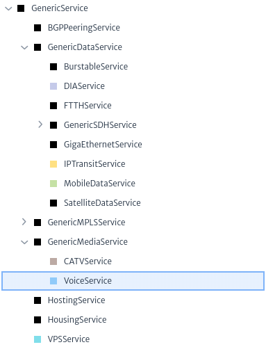 |
|---|
| Figure 8. GenericService subclasses |
After you finish creating and organizing all of your customers and services in pools, you can go to the Navigation Tree or to the IP Address Manager, and relate objects to a service, as you can see in Figure 9. Just select the object and select the action Relate to Service in the Object Option Panel.
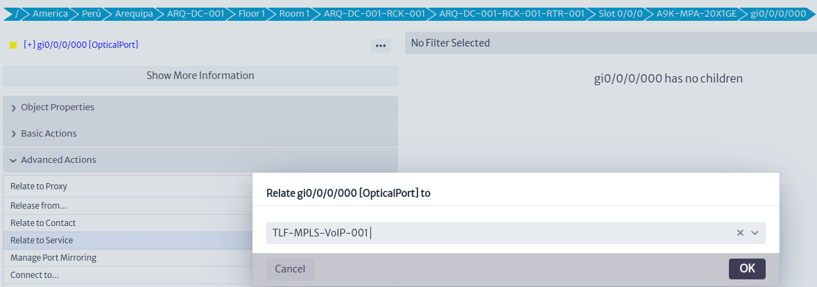 |
|---|
| Figure 9. Relate to service |
Using the Service Manager you can also relate objects to services using the Relate to Network Resource action Figure 10.
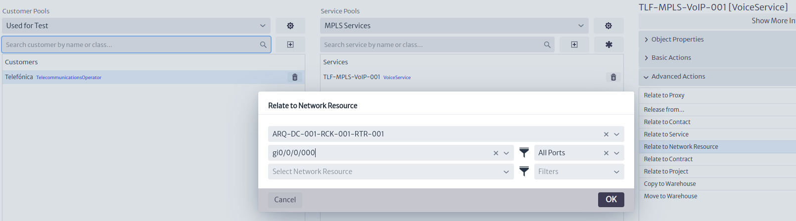 |
|---|
| Figure 10. Relate to network resource |
To view objects related to a service, use the Network Resources Explorer Figure 11 in the Object Options Panel.
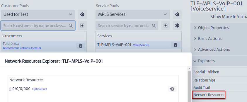 |
|---|
| Figure 11. Network resources explorer |
Of course you are also able to release an object from a service. After associating an object to a service, if you want to release that relationship you need select the object an select Release from.. action Figure 12 in the Object Options Panel.
Note
To release from service you can also use the Network resources explorer Figure 11 using the
Release from Servicebutton.
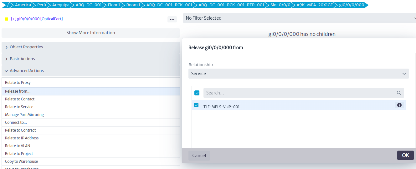 |
|---|
| Figure 12. Release from service |
Important
You are not able to delete an object if the object is associated to a service; if you want to delete that object you should first release the relationship with the service.
Delete Actions
To delete customer pool, customers, service pool and services use the delete button  in the service manager.
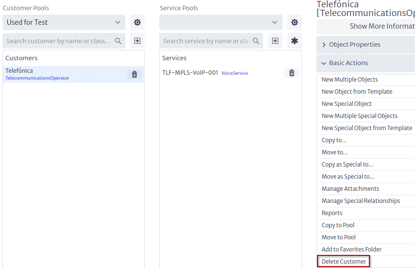 |
|---|
| Figure 13. Delete customer |
Customers Figure 13 and services Figure 14 can also be deleted using the delete action in the Object Options Panel.
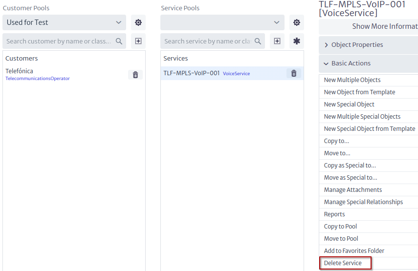 |
|---|
| Figure 14. Delete service |
Show Object Id
To obtain information about customer or services such as the id, select the object and click on the Show More Information button Figure 15.
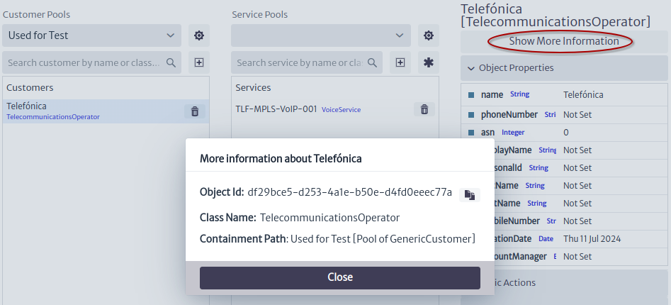 |
|---|
| Figure 15. Show more information |
Search
To search for a pool of customers, customers, pool of services and services, the search fields are used Figure 16.The customer and service pools are filtered only by name and the customers and services are filtered by name and type.
 |
|---|
| Figure 16. Search field |
Contract Manager
This module allows you to organize your contracts in pools and keep track of due dates and service providers.
Figure 1 shows the structure of the module in an example. Contracts are grouped into pools, where each pool can contain one or more contracts. Each contract, in turn, can be related to one or more inventory objects through the RELATED_TO_SPECIAL relationship, called contractHas, as illustrated in Figure.
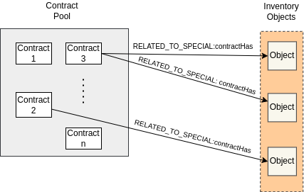 |
|---|
| Figure 1. Contract management structure. |
To access the module, click on the icon  located at the top of the screen. This will bring up a vertical menu where you can select the
 Contract Manager option, as illustrated in Figure 2.
 |
|---|
| Figure 2. Access to the contracts module. |
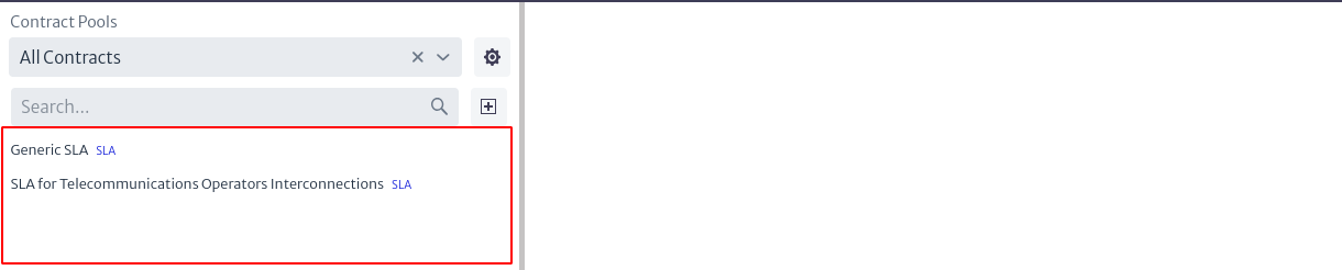 |
|---|
| Figure 3. Contracts module. |
To manage the existing pools, select the icon  . This will open a pop-up window similar to the one presented in Figure 4, where on the left side there is a list of all the available contract pools. When selecting one of them, the information corresponding to the pool will be displayed on the right side.
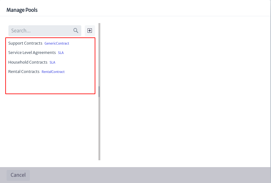 |
|---|
| Figure 4. Contract pool management. |
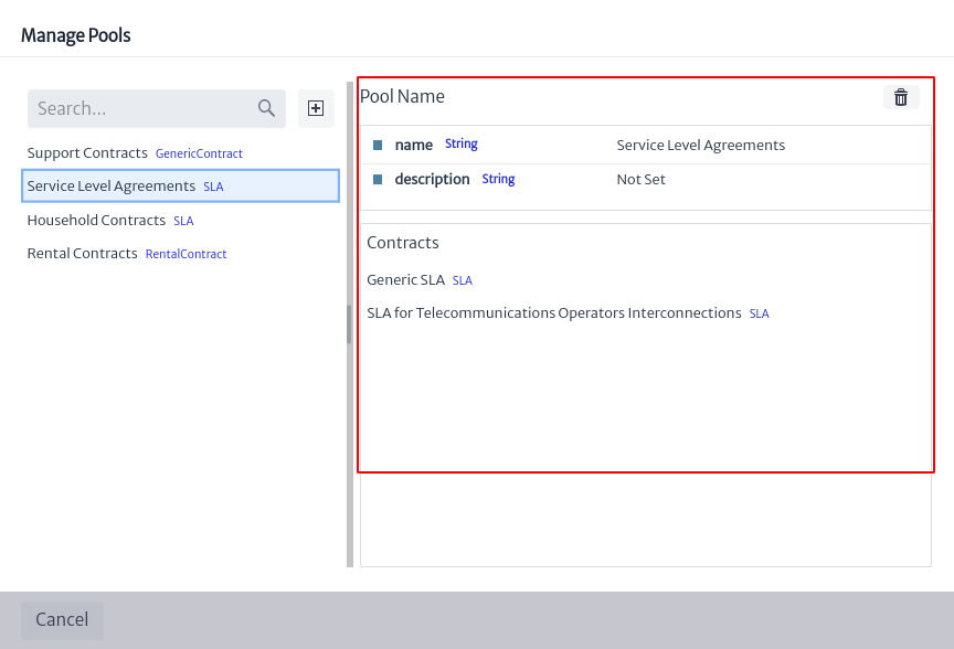 |
|---|
| Figure 5. Information from a contract pool. |
To create a contract pool, I selected the button  displayed in Figure 4, where a new window appears requesting the name, a description of the new pool and the type of pool as shown in Figure 6.
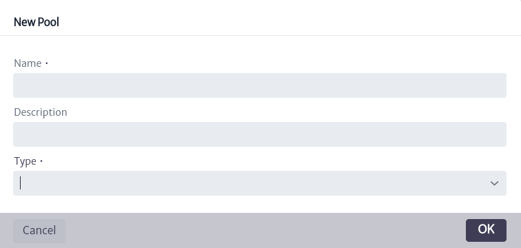 |
|---|
| Figure 6. Create new contract pool. |
Note Currently there are 4 types of contract pools in the database:
RentalContract,SLA,SupportContractandGenericContractwhich encompasses the three mentioned above. If you want to add a new one, modify the database model (see more in chapter Data Model Manager).
In the box depicted in Figure 3, the list of all existing contracts is initially displayed. You can filter the results using the search boxes located at the top of the box. The first search box allows you to filter the displayed contracts by the pool they belong to, the All Contracts option will list all contracts. You can type the name of the pool and the options will appear in a drop-down list or, you can extend the list by using the icon  , where all existing pools will appear for you to select one.
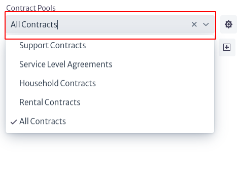 |
|---|
| Figure 7. Contract search by contract pool. |
The second search box, highlighted in Figure 8, allows you to filter the contracts in the current list by name.
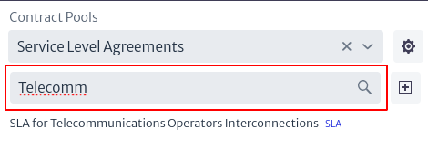 |
|---|
| Figure 8. Search for contracts by name. |
To create a new contract, select the icon located in the main view of the module (Figure 3). When doing so, a window will appear asking for the new contract information, such as the pool it will belong to, the type, the contract name and a description.
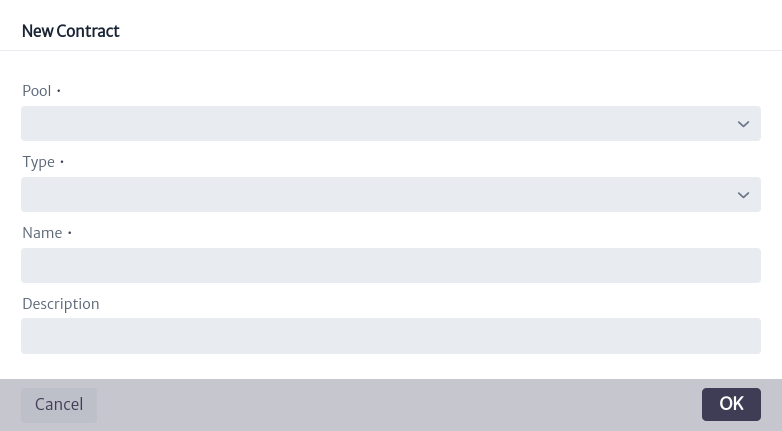 |
|---|
| Figure 9. Creation of new contract. |
Note The contract type in Figure 9 can be selected only if the pool to which the new contract will belong is of type
GenericContract, otherwise its value will be fixed and is equivalent to the same type to which the pool belongs.
To view the information of a contract, select the contract of interest in the list of contracts shown in Figure 3. The corresponding information will appear on the right side of the screen, as presented in Figure 10.
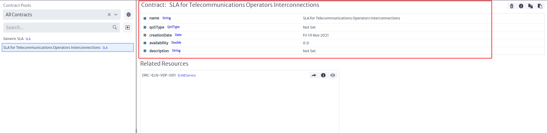 |
|---|
| Figure 10. Contract information. |
The general information of the contract is shown in Figure 10, where the name, the creation date of the contract and its attributes can be found. These values can be modified by double clicking on the value of the property to be modified and then press enter to save the changes.
Additionally, in the upper right part there are some actions, which are detailed below:
 |
|---|
| Figure 11. Actions associated with a contract. |
-
To delete a contract, I selected the button
 .
. -
By selecting the icon
 you will get additional information about the contract, such as its identifier, the class it belongs to and the containment path, as seen in Figure 12.
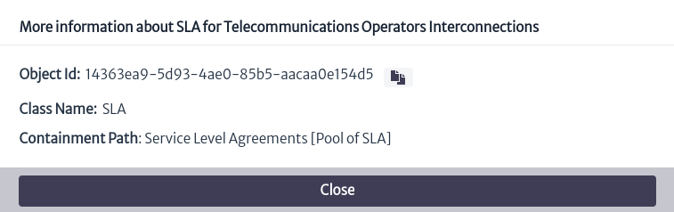
Figure 12. Additional contract information. -
To copy the contract to another contract pool, select
 where you can choose in which contract pool you want to generate a copy of the current contract.
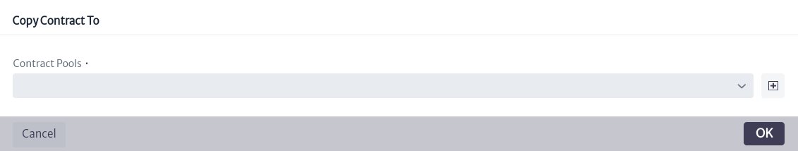
Figure 13. Copy contract. -
The button
 allows to move the contract to another existing contract pool.
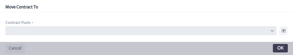
Figure 14. Move contract.
In the lower part of Figure 10, the inventory objects related to the selected contract are listed. In front of each object, three options are presented.
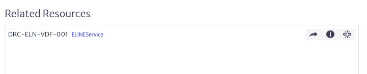 |
|---|
| Figure 15. Inventory objects related to the contract. |
- The icon
 opens a new tab showing the Object Options Panel related to the inventory object (See more in Object Options Panel).
 - To view additional information about the inventory object, select the button which displays a window similar to the one presented in Figure 12 with the object information.
- The icon
 removes the relationship between the current contract and the object.
To relate an inventory object to an existing contract, locate the object's Object Options Panel (which you can access through the Navigation module) and select the advanced action named Relate to Contract, as indicated in Figure 16. A window will then open in which you can search for the contract of interest. By clicking on the OK button, the contract will be linked to the object.
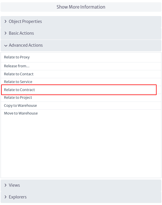 |
|---|
| Figure 16. Relate to contract advanced action. |
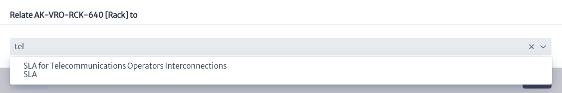 |
|---|
| Figure 17. Relate object to a contract. |
Topology Designer
The topology designer is an integrated tool in Kuwaiba that allows you to sketch networks using the elements created in the application's inventory.
The topology designer module, shown in Figure 1, belongs to the Planning category.
 |
|---|
| Figure 1. Topology designer module |
Once opened, we will see the main window of the module, as shown in Figure 2. From here we can see the canvas to design topologies.
 |
|---|
| Figure 2. Tasks manager main window |
To design topologies, the module offers various tools, which can be found in the toolbar located at the top of the canvas, as shown in Figure 3.
 |
|---|
| Figure 3. Topology designer tools |
You will also find the properties panel on the right side of the canvas, which allows you to interact with the topology objects, as shown in Figure 4.
 |
|---|
| Figure 4. Properties panel |
Creating A Topology
To create a topology, we will use a simplified GPON network as a reference, as shown in Figure 5. In this network, we have a central office where the OLT will be located, a primary splitter, and a secondary splitter, to which the client's ONT and internal network will be connected.
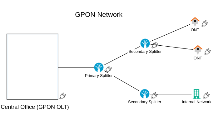 |
|---|
| Figure 5. Topology view diagram |
To start, you must create a topology view using the  button. The window shown in Figure 6 will open. Enter the name and description, then click OK.
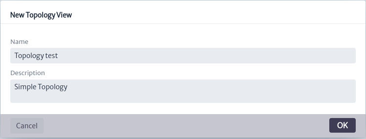 |
|---|
| Figure 6. Window create topology view |
When you create a view, you can see and edit its properties in the properties panel, as shown in Figure 7.
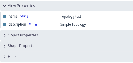 |
|---|
| Figure 7. View properties |
Use the  button to add inventory elements to the canvas, as shown in Figure 8.
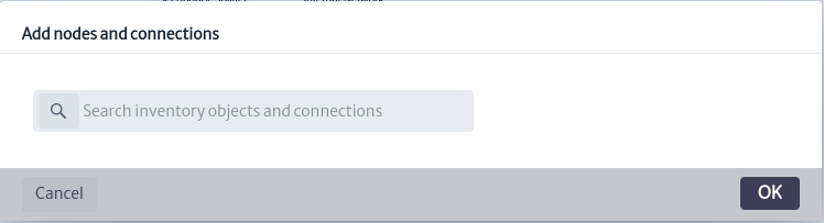 |
|---|
| Figure 8. Add nodes window |
Enter the name or type of the elements you want to add to the view. The inventory elements that match your search will be displayed. In this case, we will start by searching for fiber splitters seen in the diagram in Figure 5, as shown in Figure 9.
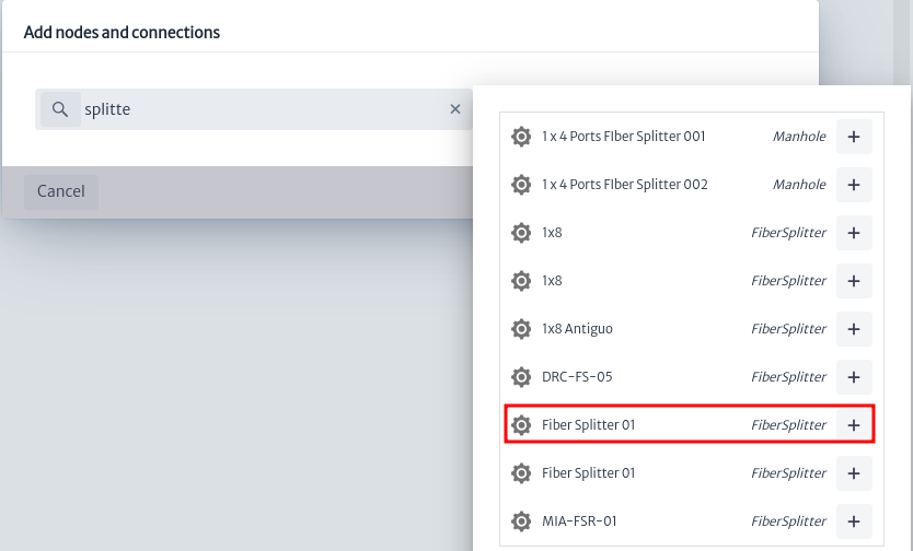 |
|---|
| Figure 9. Search elements |
Click on  to add the element to the canvas, as shown in Figure 10.
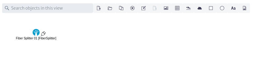 |
|---|
| Figure 10. New element |
When you hover over the element, it will change as shown in Figure 11. By clicking and dragging, you can position the element anywhere on the canvas you desire.
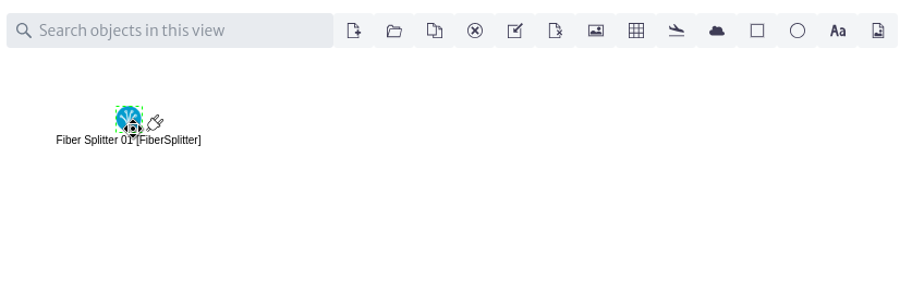 |
|---|
| Figure 11. Cursor action |
Similarly, when you click on the element, the available actions will be displayed in the properties panel, as shown in Figure 12.
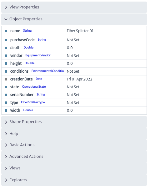 |
|---|
| Figure 12. Element actions |
Continuing with the diagram, we add two fiber splitters. It is not possible to add elements that have already been added, which are represented in red, as shown in Figure 13.
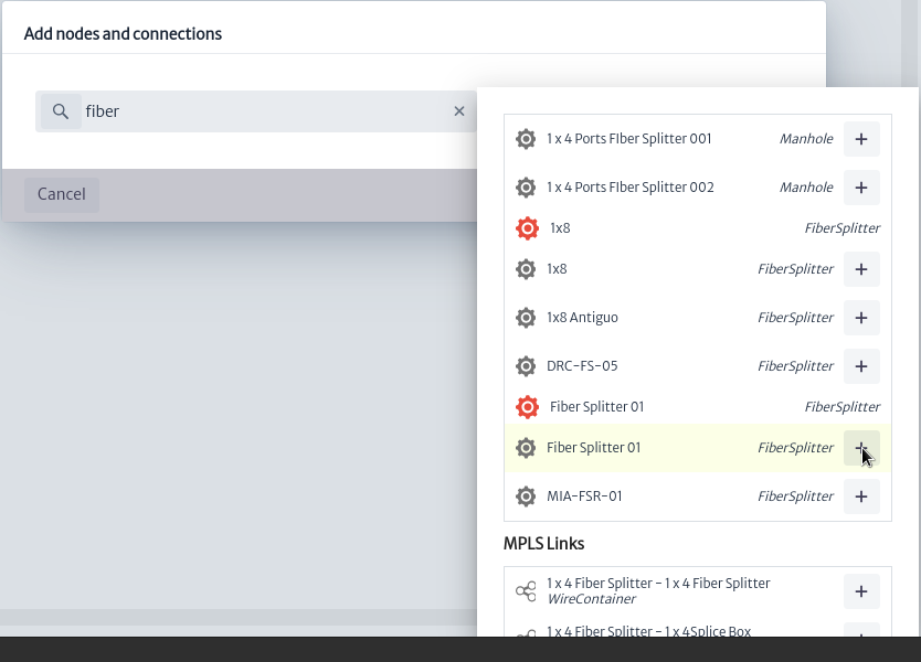 |
|---|
| Figure 13. Invalid element |
Now we add the network users from the diagram, represented by houses and the building, searching for House and Building just as we did earlier with the fiber splitters, as shown in Figure 14.
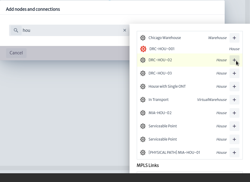 |
|---|
| Figure 14. Add new elements |
Once all inventory elements are added, we position them on the canvas as seen in Figure 15.
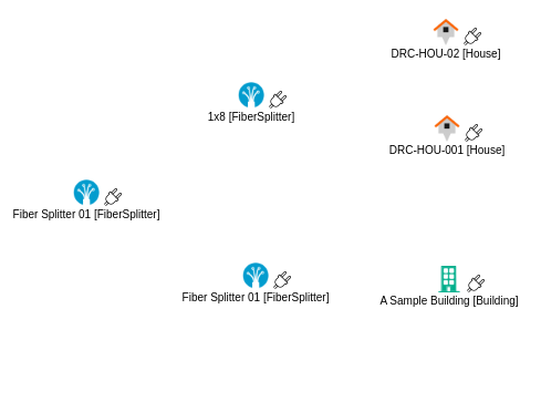 |
|---|
| Figure 15. Inventory elements |
If you want to remove any element from the topology, select the element and click on the  button to remove it from the canvas.
Next, to represent the central office in the diagram, we use the shapes provided by the module, as shown in Figure 16. There are options such as clouds, ellipses, and rectangles that are useful for representing network elements. For our case, we add a rectangle using  , as seen in Figure 17.
 |
|---|
| Figure 16. Add shapes actions |
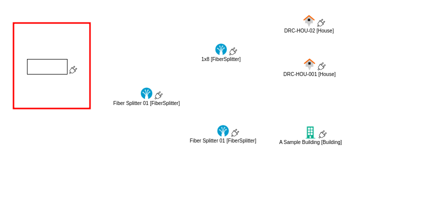 |
|---|
| Figure 17. Add shape |
By clicking on the shape we added, the properties panel will display available actions to customize the properties of the shapes according to our needs. Among these actions, you can modify the background color, outline color, thickness, type of outline, and more, as shown in Figure 18.
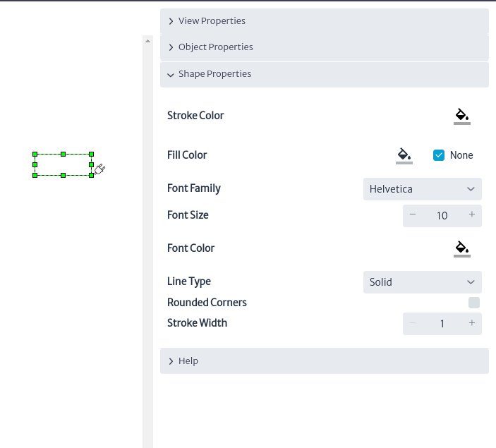 |
|---|
| Figure 18. Shape properties |
In addition to this, you can see guides appear to change the dimensions of the shape. When you hover over the element, it will change as shown in Figure 19. Click and drag to adjust it to the desired size.
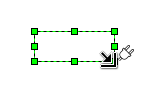 |
|---|
| Figure 19. Change shape size |
To continue, we proceed to make connections between the elements. To do this, hold down and drag the cursor from the desired element's  icon. You will see a guide appear to make connections, as shown in Figure 20.
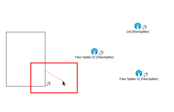 |
|---|
| Figure 20. Connection guide |
Drag the guide to the element to which you want to make the connection. The guide will change to indicate that the connection will be made, as shown in Figure 21. Release the cursor, and the connection will be complete.
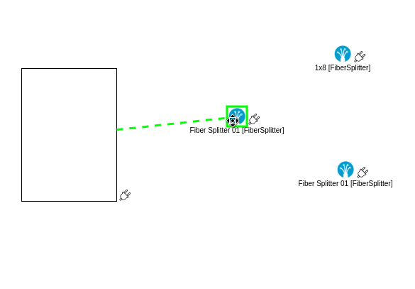 |
|---|
| Figure 21. Add connection |
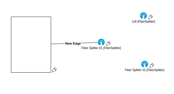 |
|---|
| Figure 22. Connection done |
By clicking on the connection, three guides will appear as shown in Figure 23. You can use the blue guides to change the connected elements or the yellow guide to relocate the label.
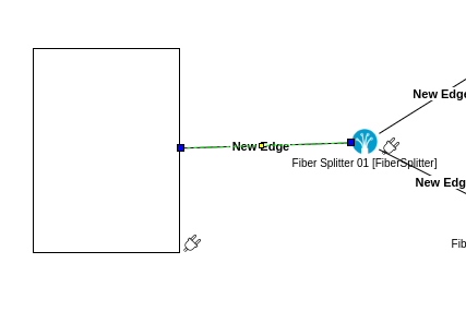 |
|---|
| Figure 23. Connection Actions |
Repeat the procedure above to make all the connections as shown in the diagram in Figure 5. This will give you the result shown in Figure 24.
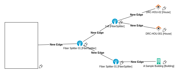 |
|---|
| Figure 24. Connections |
To proceed, we edit the content of the labels for the connections and elements, and we add a label to the rectangle used to represent the central office.
To edit the content of the connection labels, double-click anywhere on the connection, which will select it as shown in Figure 24. We can edit its content; in this case, we leave it empty. Repeat this procedure for all connections.
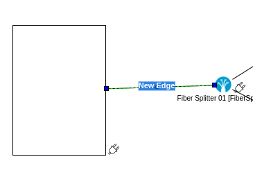 |
|---|
| Figure 24. Edit connection label |
To edit the labels of the elements, double-click on them, which will select them as shown in Figure 25. Edit the labels following the diagram in Figure 5.
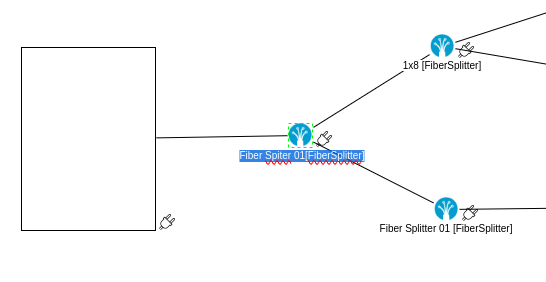 |
|---|
| Figure 25. Edit element label |
To add labels to the canvas, use the button  . This will create a new label that you can place in the desired location and adjust its dimensions, as shown in Figure 26.
 |
|---|
| Figure 26. New label |
Edit its content following the diagram, and finally, we obtain the final network diagram as shown in Figure 27.
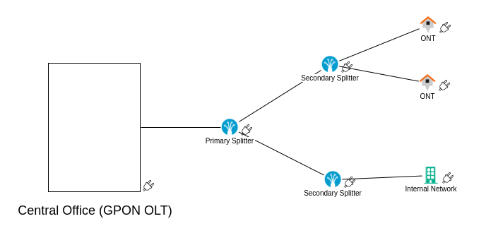 |
|---|
| Figure 27. Example |
Additional tools
Among the tools offered, we find the  button, which allows us to show or hide the grid on the canvas, as seen in Figure 27.
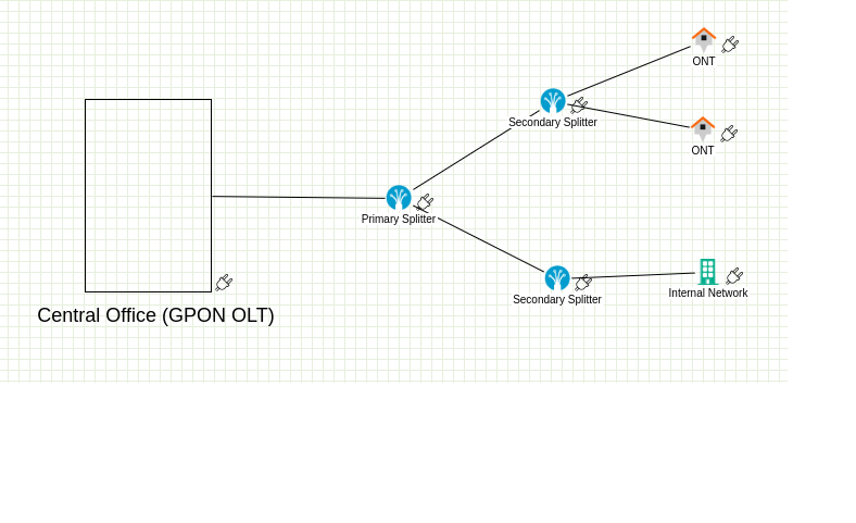 |
|---|
| Figure 27. Grid |
The button allows you to show or hide a thumbnail view of the entire canvas, as seen in Figure 28
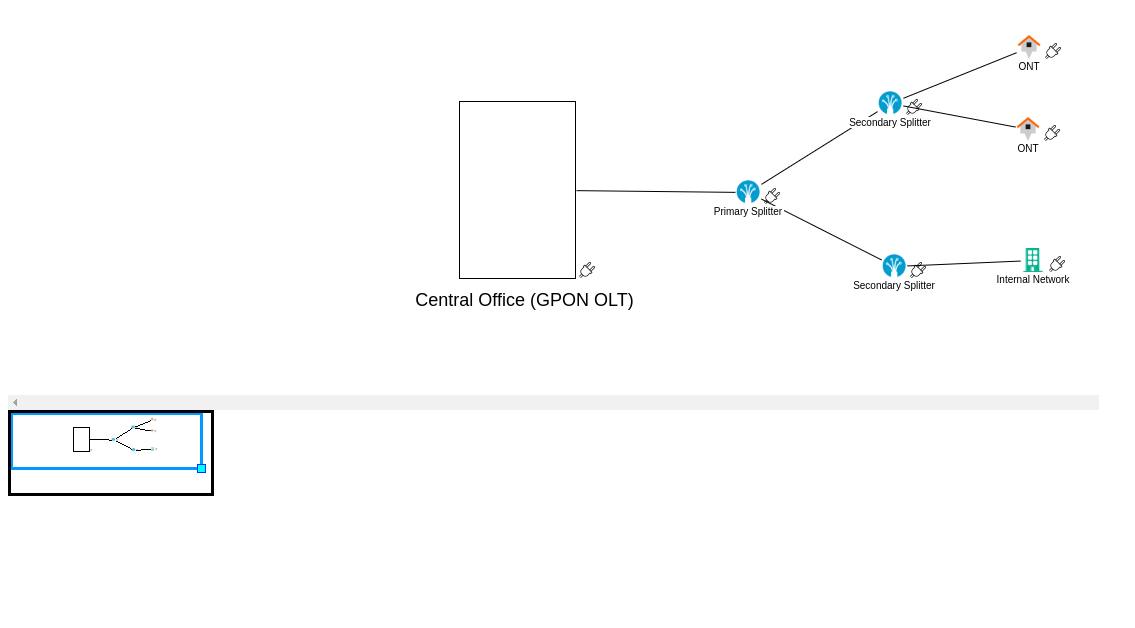 |
|---|
| Figure 28. Thumbnail |
You can assign a background image to the topology using the  button, which will display the window seen in Figure 29. This window allows you to clear the current background image and upload a new one.
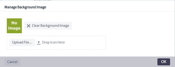 |
|---|
| Figure 29. Manage background |
Once the topology is finished, you can use the  button to export it as an image.
Topology Actions
You can use the button to view and select available topologies in the application, as shown in Figure 30.
 |
|---|
| Figure 30. Topologies view |
You can make copies of topologies using the  button. The copied topology will appear in the list of available topologies, as shown in Figure 31.
 |
|---|
| Figure 31. copy of the topology |
To delete a topology, select it and use the  button, which will open the confirmation window shown in Figure 32. Click OK to delete it or Cancel if you do not wish to proceed.
 |
|---|
| ***Figure 32.*delete topology window |
Project Manager
The Project Manager module allows you to manage all your projects (network planning, maintenance, network roll-out, etc.), their activities and associated network resources in one place. The current version of the module offers basic functionality, which will be extended in the future.
To access the project module, locate the icon  in the menu at the top of the screen. When clicked, a vertical menu will be displayed where the user can select the
 Project Manager option, which will direct the user to the interface shown in Figure 2.
 |
|---|
| Figure 1. Access to the projects module. |
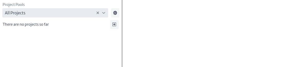 |
|---|
| Figure 2. Projects module. |
In Figure 2, a list of all existing projects should be displayed, as there are currently no projects in the inventory, the message There are no projects so far is displayed.
To create a project, you must first identify or create a pool. A pool is like a bag that can contain one or more projects (see more in Pools). To create a pool or modify existing pools, select the icon  which will open a new pop-up window like the one shown in Figure 3.
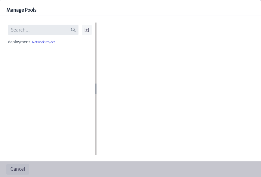 |
|---|
| Figure 3. Management of project pools. |
Figure 3 shows a list of all existing project pools. You can use the search bar to find pools matching specific terms. When you select a pool, the related information, such as name, description and list of contained projects, will appear on the right side of the window. Here, you can change the name or description of the pool by double-clicking on the property you want to change. In addition, you can delete the pool by clicking the button  , which will also delete the projects contained in the selected pool.
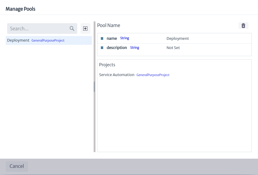 |
|---|
| Figure 4. Management of selected pool. |
To create a new pool, select the icon  shown in Figure 3. This will open a window like the one shown in Figure 5, where you can name, describe and select the type of pool to create. There are two types of project pools:
 GeneralPurposeProject and NetworkProject.
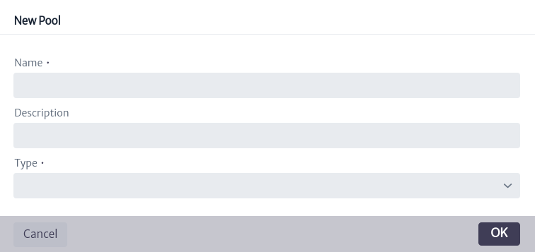 |
|---|
| Figure 5. Create a pool. |
To create a project, select the icon which opens a pop-up window like the one shown in Figure 6, where you must select an existing Project Pool, the project name and you can add a description to it.
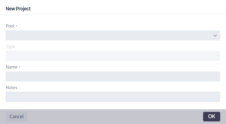 |
|---|
| Figure 6. Create a project. |
The created project is added to the list of projects shown in Figure 2. Selecting a specific project in Figure 7 will display the information related to that project, as indicated in Figure 8 and explained below.
- name. Project name.
- startDate. Project start date. Default is
Wed 31 Dec 1969. - status. Project status. This attribute is a list type attribute (for more information see chapter List Type Manager).
- Note. Additional information that the user adds about the project.
- projectManager. Person in charge of the project.
- creationDate. Date of creation of the project.
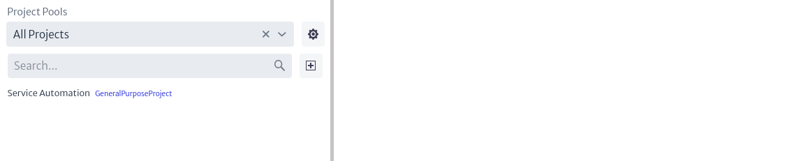 |
|---|
| Figure 7. List of projects. |
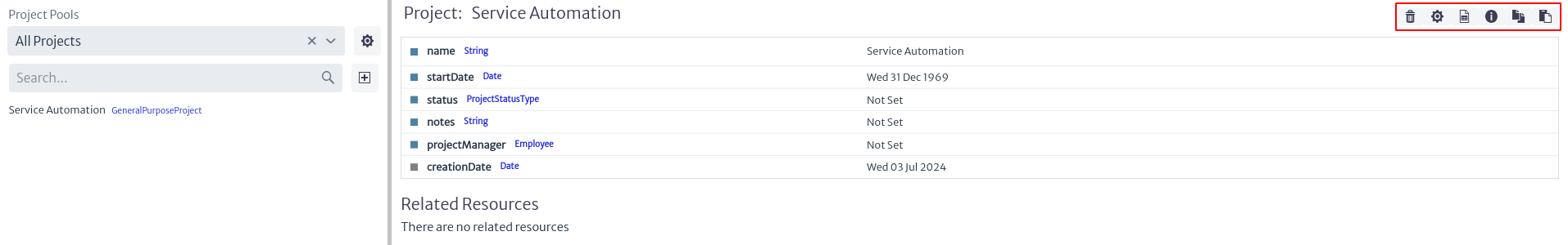 |
|---|
| Figure 8. Project information. |
In the upper right part of Figure 8, there are 6 buttons, which are detailed below.
 |
|---|
| Figure 9. Project options. |
-
The button
deletes a project. -
The icon
controls the project activities. When selecting this button, a window like the one shown in Figure 10 appears.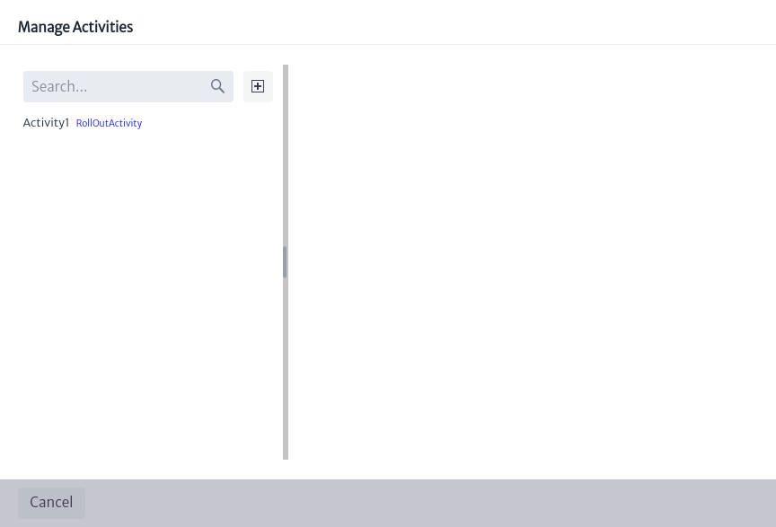
Figure 10. Project activity manager. To create a new project activity, select the
icon displayed in Figure 10. This will open the window illustrated in Figure 11, where you can add the name of the activity and select its type, which can be AuditActivity,DesignActivity,GeneralPurposeActivity,PlanningActivityorRollOutActivity.After creating the activity, all activities will be listed as shown in Figure 11. When selecting an activity, the associated information will be displayed on the right side of the screen. To modify any of the attributes, you can double-click on the attribute you want to change.
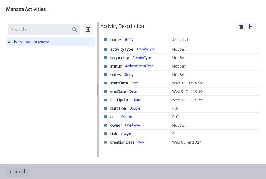
Figure 11. Project activities. -
name. Name of project activity.
-
activityType. Type of activity.
-
sequecing. Activity number.
-
status. Activity status.
-
Note. Note on the activity.
-
startDate. Start date of activity.
-
endDate. Date of completion of the activity.
-
lastUpdate. Date of last activity update
-
duration. Duration of the activity.
-
cost. Cost of the activity.
-
owner. Owner of the activity.
-
risk. Activity risk.
-
creationDate. Date of creation of the activity.
In addition, a project activity can be deleted by selecting the icon
shown in Figure 11. You can also check if there are any reports related to that activity by clicking on the button  .
.
-
-
The icon
allows you to visualize the reports available for the projects. -
The button
 displays information about the project object, i.e., its identifier, the class it belongs to and its content hierarchy.
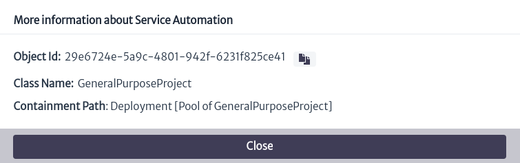
Figure 12. Project Object Information. -
The icon
 allows you to copy the project to another project pool. To do this, selecting the button opens the window shown in Figure 13, where you can select the pool to which you want to copy the project.
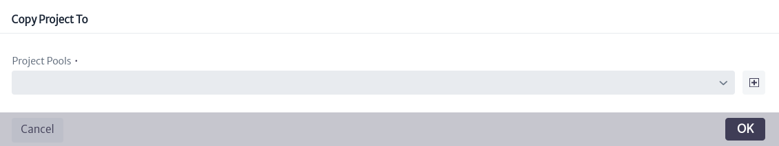
Figure 13. Copy project. -
The button
 moves the project to another project pool by selecting the new pool, as indicated in Figure 14.
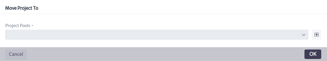
Figure 14. Move project.
In Figures 13 and 14, you have the option to create a new project pool in case you do not want to select an existing one, to do so click on the icon which opens the window presented in Figure 5.
In Figure 8, under the project information, there is the Related Resources section, which shows the list of objects related to the project. In this case, it is empty since there are no objects related to the project. To relate an object to an existing project, locate the Object Options Panel related to the object. In the Advanced Actions section, you will find the Relate to Project option, as illustrated in Figure 15.
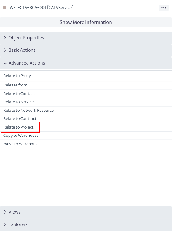 |
|---|
| Figure 15. Action to relate an object to a project. |
When selecting the commented option, a new window appears (Figure 16), where the user can type the name of the project or select it from the drop-down list by clicking on the icon  .
.
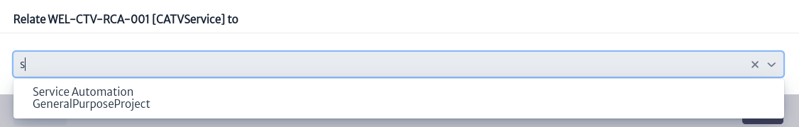 |
|---|
| Figure 16. Project selection. |
If you reload the project module and select the project again, it appears in the Related Resources section the related objects. To the right of each object there are 3 buttons.
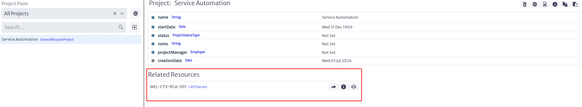 |
|---|
| Figure 17. Related resources to project. |
-
The button
 opens the Object Dashboard in a new window (For more information see the Navigation chapter).
 -
The button
 opens a window with the object's identifier, the class to which it belongs and its content hierarchy, as demonstrated in Figure 18.
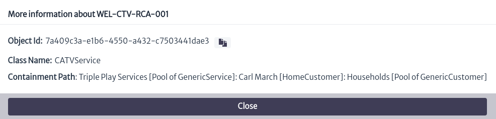
Figure 18. Object information. -
The icon
 removes the relationship between the object and the project.
Validators
Validators are flags that indicate the status, condition or certain characteristics of specific objects. These flags can take the form of percentages, status messages, among others. Validators are used to provide quick and easily interpretable information about the objects of the classes to which they are associated.
To access the validators module, locate in the top menu of the screen the Settings category, represented by the symbol  . When clicked, a second menu will be displayed. Select the
 Validator Definition option, which will open the validator module interface, as shown in Figure 2.
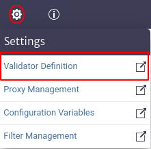 |
|---|
| Figure 1. Access to the validators module. |
 |
|---|
| Figure 2. Validators. |
As shown in Figure 2, in the initial interface of the module a list appears on the left side with all the existing validators. At the top, in the search box marked Classes, the validators can be filtered by the class they belong to. By selecting the  icon, a list of all classes will be displayed. Similarly, you can write the name of the class of interest in the search box, and the list will be updated according to what you enter in the field, as shown in Figure 3.
 |
|---|
| Figure 3. Search of validators by class. |
As mentioned above, the search only shows the validators belonging to a selected class, as shown in Figure 4.
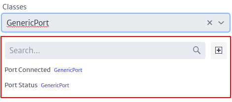 |
|---|
| Figure 4. Filter validators by class. |
Similarly, the module has a second search box, illustrated in Figure 5. This box allows searching for validators that match the terms entered, according to the list of validators already present.
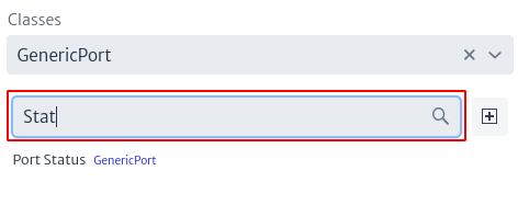 |
|---|
| Figure 5. Search for validators by name. |
To add a new validator, select the icon  indicated in Figure 2. This will open a pop-up window, similar to the one shown in Figure 6, where the user can select the class to which the validator belongs, enter its name and add a description.
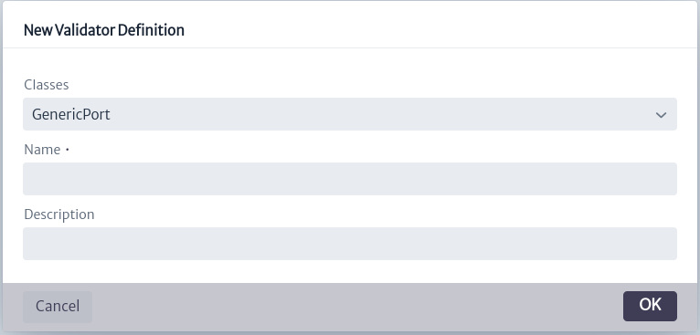 |
|---|
| Figure 6. Create a validator. |
When selecting a validator of interest, the script will be displayed on the right side of the screen, as in Figure 7.
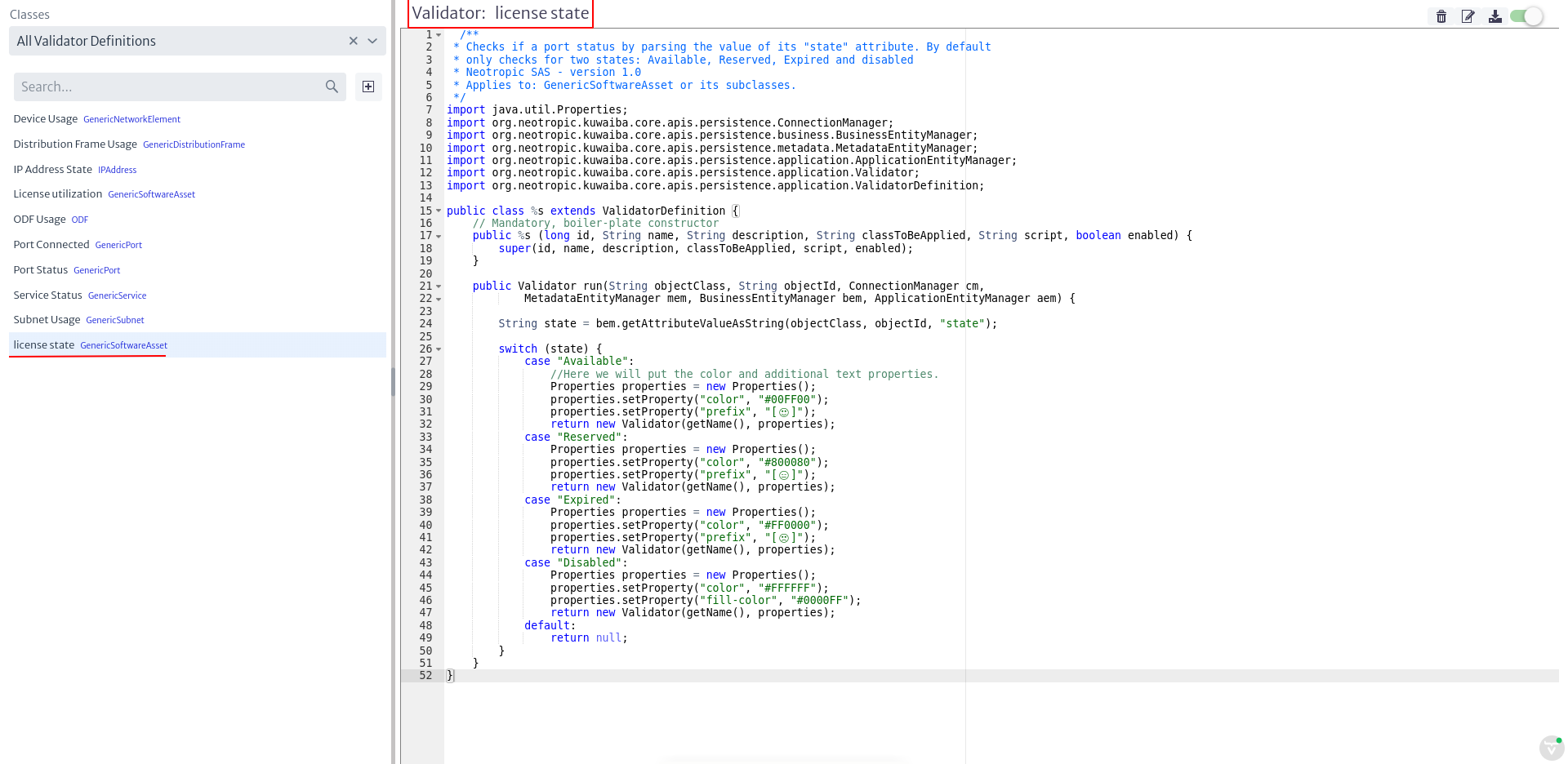 |
|---|
| Figure 7. Display of the selected validator. |
For the example in Figure 7, the validator license state was selected. The name of the validator is indicated in the red box. Just below, the content of the validator is shown, which will be explained in the subsection Validator Content. At the top right are four buttons, which are detailed in Figure 8.
 |
|---|
| Figure 8. Validator options. |
-
The icon
 deletes a validator.
 -
The icon
 allows modifying the name and description of the validator, displaying a window like the one shown in Figure 9.
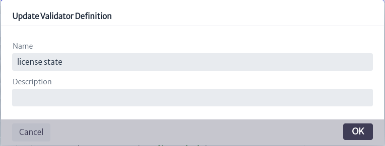
Figure 9. Validator properties update window. -
The icon
 saves the changes made in the validator script.
 -
The icon
 allows you to enable or disable the validator. A disabled validator will not be taken into account as an object validator.
Validator Content
A validator is represented as a class that is added to the classpath of the application.
Important. Validators are executed every time an object's information is abstracted, so it is recommendable not to add a very complex logic to the validator as it may generate significant performance impacts.
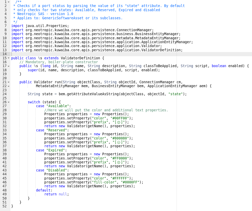 |
|---|
| Figure 10. Validator contents. |
Taking as an example the validator in Figure 7 (whose content is best seen in Figure 10), a validator follows the following rules:
-
All validators extend the
ValidatorDefinitionclass. This can be seen in line 15 of Figure 10. It must not be modified by the user. -
All validators have a constructor that should not be modified by the user, in other words, it is always the same.
-
It has a
runmethod, which injects the application entity managers (ApplicationEntityManager, BusinessEntityManager, MetadataEntityManager), the ConnectionManager and the object identifier and the class to which it belongs. The signature of this method must not be modified. The user can alter its content, since it is within this method where the validator value content is added. This injection allows using the methods of the entity managers to build the filter logic. The documentation can be found in Kuwaiba's documented Java API 1. -
There are four ways to set up a validator:
- Suffix: Adds a text after the object name. The property is called
suffix. - Prefix: Adds a text before the object name. The property is called
prefix. - Color: Changes the color of the text. The property is called
color. - Background color: Changes the background color. The property is called
fill-color.
To set the properties of the validator, make use of the Properties, as shown in line 29 of Figure 10. It works as a HashMap, where the key is the property you want to set and the value is the value you want to give it, for example:
Properties.setProperties("color", "#00FF00"). - Suffix: Adds a text after the object name. The property is called
In the Navigation module, the validators related to an object can be observed, since, as mentioned above, the validators are returned together with the information of a given object.
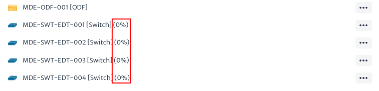 |
|---|
| Figure 11. Objects with validators. |
Figure 11 shows the validators, added as a suffix to the name of the objects, in red.
You can see some examples of validators in SourceForge2. Validator scripts start with VD in their name.
-
Kuwaiba Persistence API: https://kuwaiba.org/docs/dev/javadoc/current/ ↩
-
SourceForge Validator Scripts: https://sourceforge.net/p/kuwaiba/code/HEAD/tree/server/trunk/scripts/scripted-validator/ ↩
Filters
Filters, as the name implies, filter inventory objects according to a criterion based on a previously selected object.
To access the filter module, locate the icon  in the menu at the top of the screen. Then, a new horizontal menu will appear where you must select the Filter Management option, as shown in Figure 1.
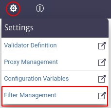 |
|---|
| Figure 1. Access to the filter module. |
When accessing the filters module, the initial interface is displayed, as shown in Figure 2, where all the filters existing in the application are listed. The red boxes next to the name of each filter refer to the classes to which the filters belong.
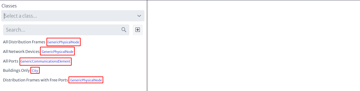 |
|---|
| Figure 2. Initial interface of the filter module. |
At the top of Figure 2, a search filter identified with Classes appears, where the user can search for filters that belong to a given class by entering or selecting the class, as shown in Figure 3. Marked in the red circle in the last mentioned figure is the symbol  , which displays a list of existing classes for the user to select the one of interest. Alternatively, you can type the name of the class in the search box and, as you type, the classes matching the search will appear.
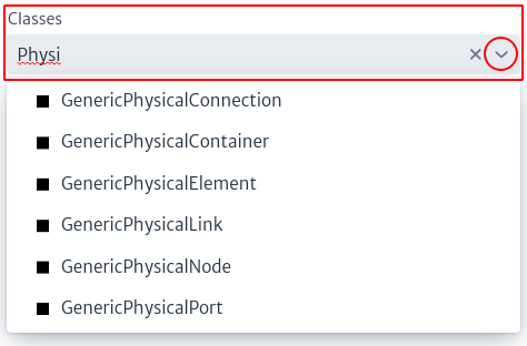 |
|---|
| Figure 3. Selection of the class of interest. |
When the user selects a class, the filters belonging to that class are displayed on the screen, as shown in Figure 4.
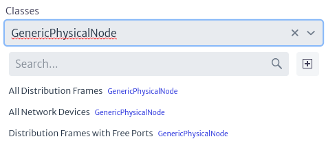 |
|---|
| Figure 4. Filters of a class. |
Additionally, there is a second search box, which allows you to search for filters by name match, as illustrated in Figure 5.
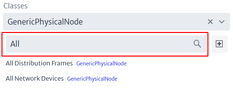 |
|---|
| Figure 5. Search filters by name. |
To create a new filter, select the icon  , which will open a new pop-up window where the user can enter the name and a description of the new filter. If you have previously used the filter search by classes, the pop-up window will already contain the class with which the search was performed, that is, the new filter created will be associated to the previously selected class, as shown in Figure 6, in this new window this value cannot be modified. Otherwise, if you have not selected a class in the filter in Figure 3, the new pop-up window to create a new filter will allow you to select the class to which the filter will belong, as shown in Figure 7.
Note. Filters belonging to abstract classes are applicable to the subclasses of that class.
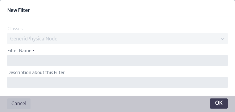 |
|---|
| Figure 6. Create filter with previously selected class. |
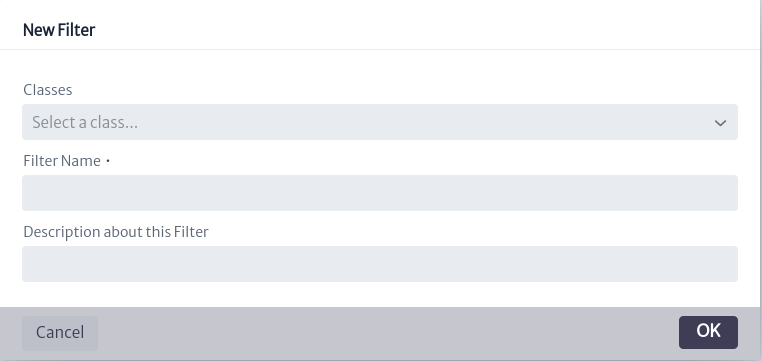 |
|---|
| Figure 7. Create filter without previously selected class. |
When you select a specific filter, the content of the filter appears on the right side of the screen. In addition, four buttons marked with a red box in Figure 8 are displayed on the upper right side of the screen.
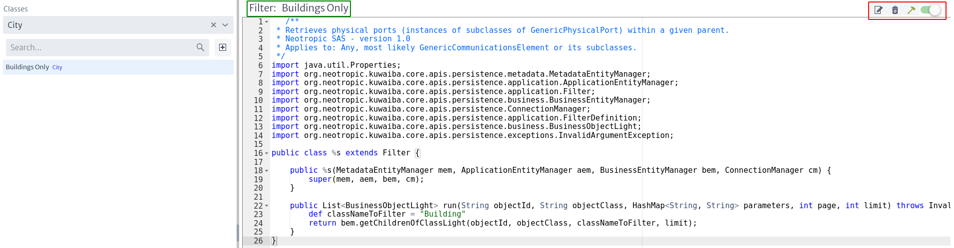 |
|---|
| Figure 8. Filter content. |
The Figure below shows a larger view of the four buttons mentioned above.
 |
|---|
| Figure 9. Filter options. |
-
The icon
 allows you to modify the filter name and description.
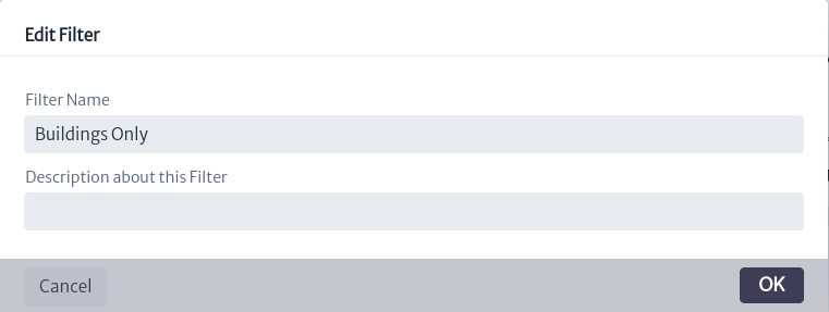
Figure 10. Edit a filter. -
The icon
 deletes the filter.
 -
The icon
 saves and compiles the filter (in case there are changes in the script).
 -
The icon
 allows the user to enable or disable a filter.
Filter Content
First of all, it should be noted that the content of a filter is represented in a class that is added to the classpath of the application, therefore, it is recommended that the logic of the script be simple, otherwise, it may have significant performance impacts.
The content of the filter is a Groovy1 script, which is briefly explained below.
Figure 8 presents the filter script, which contains the logic that defines the purpose of the filter.
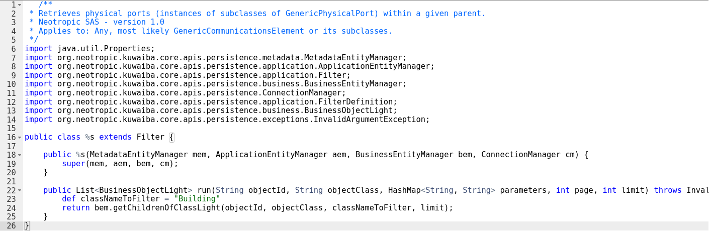 |
|---|
| Figure 11. Filter script. |
- All filters created must extend the Filter class, i.e. line 16 in Figure 11 must be exactly the same in all filters created.
- The filters have a constructor that injects the Entity Managers (BussinesEntityManager, ApplicationEntityManager and MetadataEntityManager) together with the ConnectionManger. This constructor should not be modified by the user.
- All filters contain a
runmethod that receives the class and object identifier, along with some filter parameters. The signature of this method must not be modified, but its contents can be altered. It is within this method that the user inserts the logic of what he wants the filter to do. It is here that you can make use of the methods of the various EntityManagers mentioned above. To do this, refer to the Kuwaiba Persistence API 2. Also, using the ConnectionManager you can perform cypher3 statements directly on the filter, although this practice is not recommended.
In the Navigation module, when selecting an object that has associated filters, a bar appears at the top, as shown in Figure 12. By default, this bar displays the message No Filter Selected. Clicking on the icon displays a list with all the available filters associated to the class. When one of these filters is selected, it is executed and the result is reflected in the objects, updating the initial list according to the filter result, as shown in Figure 13.
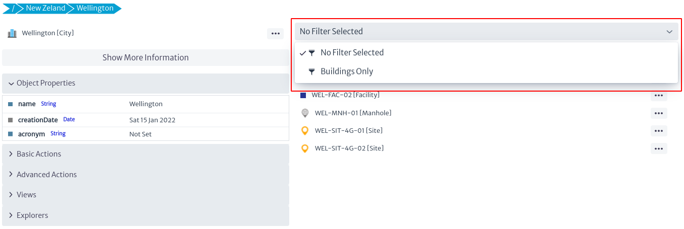 |
|---|
| Figure 12. Selected object. |
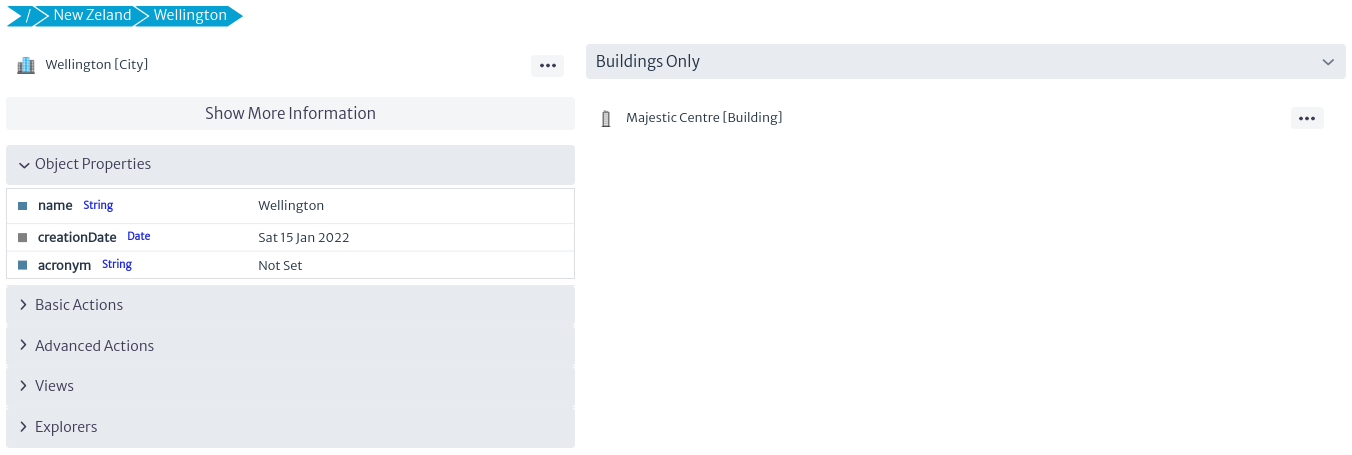 |
|---|
| Figure 13. Result of filter applied. |
Examples of filters can be found at https://sourceforge.net/p/kuwaiba/code/HEAD/tree/server/trunk/scripts/filters/. Filter scripts contain the prefix FT in their name.
-
Groovy language: http://www.groovy-lang.org/ ↩
-
Persistence API: https://kuwaiba.org/docs/dev/javadoc/current/ ↩
-
No4J graph query language: https://neo4j.com/docs/cypher-manual/3.5/introduction/ ↩
Configuration Variables
The configuration variables module in Figure 1 belongs to the Settings category and manages configuration variables pools and configuration variables.
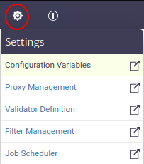 |
|---|
| Figure 1. Configuration variables module |
Configuration Variable Pool
A configuration variable pool is a group of configuration variables.
The steps to create a pool are as follows:
- Click on the button to manage pools Figure 2.
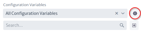 |
|---|
| Figure 2. Manage pools button |
- In the manage pools window click on the new pool button Figure 3.
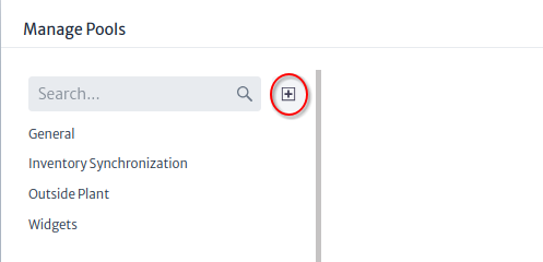 |
|---|
| Figure 3. Manage pools window |
- Enter a name and description for the new pool and click the OK button Figure 4.
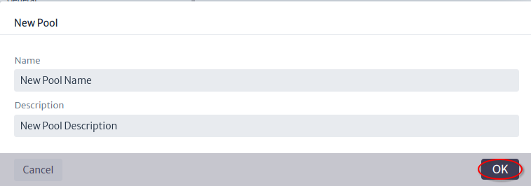 |
|---|
| Figure 4. New pool window |
- The pool was created and can be edited or deleted from the pool manages window Figure 5.
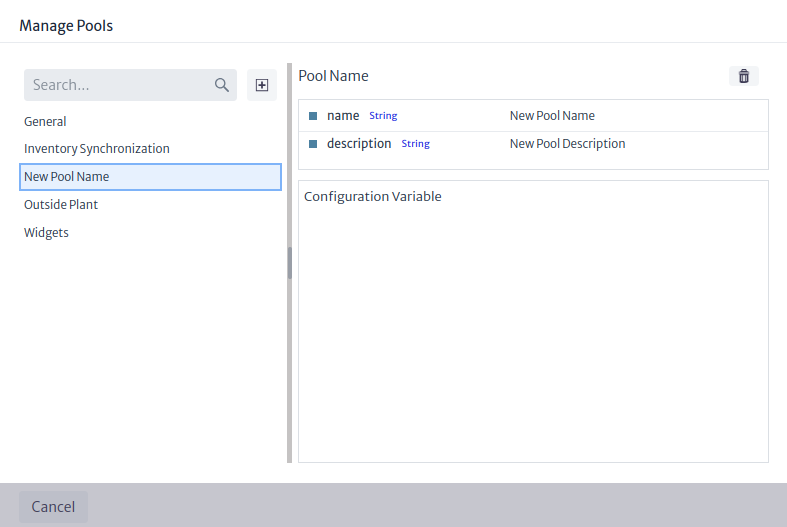 |
|---|
| Figure 5. Manage Pools Window |
Configuration Variable
A configuration variable is a global variable that can be used in any module or script and the value is accessed via name using the ApplicationEntityManager API.
The steps to create a configuration variable are as follows:
- Click on the new configuration variable button Figure 6.
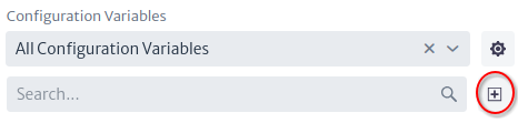 |
|---|
| Figure 6. New configuration variable button |
- Set the properties of the configuration variable Figure 7 and click the OK button.
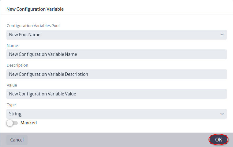 |
|---|
| Figure 7. New configuration variable window |
To manage the configuration variable, select the configuration variable pool or search by name, select the variable you want to edit or delete and use the property sheet as shown in Figure 8.
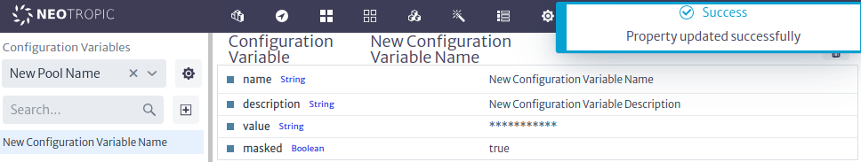 |
|---|
| Figure 8. Edit configuration variable |
Default Values
The default values of the configuration variables are listed below by module:
Outside Plant Management
The default values of the configuration variables used by the Outside Plant Management are listed below by pool:
-
General
general.maps.providercom.neotropic.kuwaiba.modules.commercial.ospman.providers.ol.osm.OsmProvidergeneral.maps.apiKeynullgeneral.maps.languageenglishgeneral.maps.provider.bmaps.imagerySetAerial
-
Widgets
widgets.simplemap.centerLatitude30.5632664widgets.simplemap.centerLongitude-46.6540234widgets.simplemap.zoom4
-
Outside Plant
module.ospman.colorForLabelswhitemodule.ospman.fillColorForEdgeLabelsorangemodule.ospman.fillColorForNodeLabelsbluemodule.ospman.fillColorForSelectedEdgeLabelspinkmodule.ospman.fillColorForSelectedNodeLabelsorangemodule.ospman.fontSizeForLabels12pxmodule.ospman.minZoomForLabels12
Synchronization Framework
The following is the default value of the configuration variable related to the Synchronization Framework module:
sync.bgp.localAsn16591
Proxy Management
Proxies are an integration mechanism that allows to adapt the data model between Kuwaiba and external applications. They act on behalf of the elements of the Kuwaiba inventory and represent an object structure within the application.
Figure 1 shows the structure of the module, where the proxies are organized in pools. A proxy pool can contain one or more proxies. In the example, proxy 3 is related to three inventory objects via the RELATED_TO_SPECIAL relationship, named hasProxy. Similarly, the router related to the proxy has two cards that are also associated with the same proxy. If at any time either card ceases to have a CHILD_OF relationship with the router, it will continue to belong to the proxy.
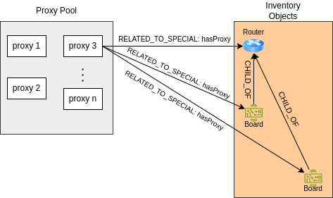 |
|---|
| Figure 1. Proxy management structure. |
To access the module, click on the configuration icon  located in the top menu of the screen. This will bring up a vertical menu where you can select the
 Proxy Management option, as seen in Figure 2.
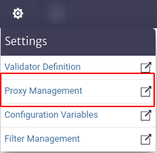 |
|---|
| Figure 2. Access to the proxy module. |
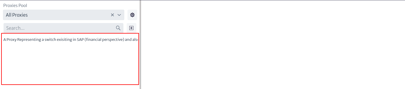 |
|---|
| Figure 3. Proxies module. |
As mentioned above, proxies are grouped into pools. To manage existing pools, select the icon  . This will open a pop-up window similar to the one illustrated in Figure 4, where on the left side is the list of all available proxy pools. When selecting one of them, the information corresponding to the pool will be displayed on the right side.
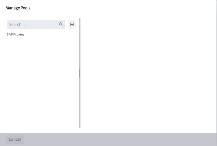 |
|---|
| Figure 4. Proxy pool management. |
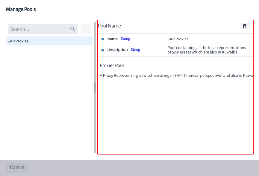 |
|---|
| Figure 5. Information from a pool of proxies. |
In Figure 5 you can see the detailed information of a proxy pool, which includes the name, description and a list of the proxies belonging to that pool. To delete the selected pool, click the icon  shown in the above Figure.
To create a proxy pool, I selected the button  presented in Figure 4, where a new window appears requesting the name and a description of the new pool, as shown in Figure 6.
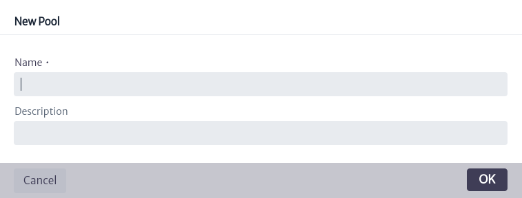 |
|---|
| Figure 6. Create new proxy pool. |
In the box marked in Figure 3, the list of all existing proxies is initially displayed. You can filter the results using the search boxes located at the top of the box. The first search box allows you to filter the displayed proxies by the pool they belong to, the All Proxies option will list all proxies. You can type the name of the pool and the options will appear in a drop-down list or, you can extend the list using the icon  , where all existing pools will appear for you to select one.
 |
|---|
| Figure 7. Search for proxies by proxy pool. |
The second search box, noted in Figure 8, allows you to filter the proxies in the current list by name.
 |
|---|
| Figure 8. Search for proxies by name. |
To create a new proxy, select the icon located in the main view of the module (Figure 3). When you do so, a window will appear asking for the new proxy's information, such as the pool it will belong to, the proxy's class and name.
 |
|---|
| Figure 9. Creation of new proxy. |
Note The class to which the new pool will belong is a subclass of
GenericProxy. Currently, there is onlySAPProxy, but the user can add more by modifying the data model. For more information see chapter Data Model Manager.
To view proxy information, select the proxy of interest from the list of proxies shown in Figure 3. The corresponding information will appear on the right side of the screen, as shown in Figure 10.
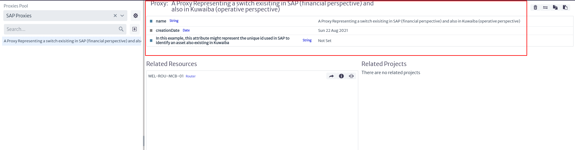 |
|---|
| Figure 10. Proxy information. |
The general information of the proxy is indicated in Figure 10, where the name, the creation date of the proxy and its attributes can be found. These values can be modified by double clicking on the value of the property to be modified and then press enter to save the changes.
Additionally, in the upper right part there are some actions, which are detailed below:
 |
|---|
| Figure 11. Actions associated with a proxy. |
-
To delete a proxy, I selected the button
. -
You can relate the current proxy to a specific project by clicking on the button
 , where a window like the one shown in Figure 12 appears, in which the user can choose the project to which the proxy will be related.
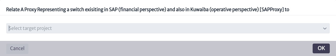
Figure 12. Link proxy to a project. -
To copy the proxy to another proxy pool, select
 where you can choose in which proxy pool you want to generate a copy of the current proxy.
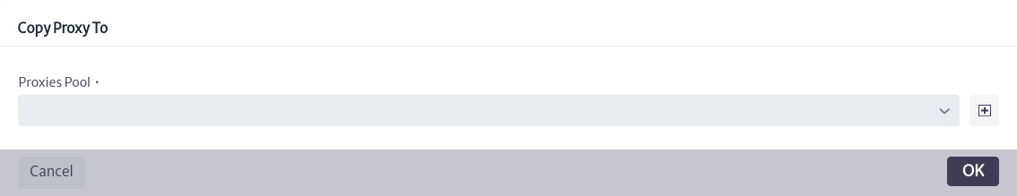
Figure 13. Copy proxy action. -
The button
 allows you to move the proxy to another existing proxy pool.
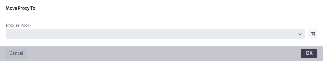
Figure 14. Move proxy action.
In the lower part of Figure 10, the inventory objects related to the selected proxy are listed, similar to how the projects associated with the proxy are displayed. In front of each object, three options are presented.
 |
|---|
| Figure 15. Projects and inventory objects related to the proxy. |
-
The icon
 opens a new tab showing the Object Options Panel related to the inventory object (See more in Object Options Panel).
 -
To view additional information about the inventory object, select the button
 which displays a window like the one shown below, indicating the object identifier, the class it belongs to and the object's containment path.
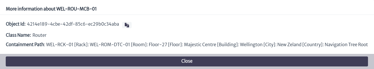
Figure 15. Additional Information on the object of the inventory. -
The icon
 removes the relationship between the current proxy and the object.
To relate an inventory object to an existing proxy, locate the object's Object Options Panel (which you can access through the Navigation module) and select the advanced action named Relate to Proxy, as indicated in Figure 16. A window will then open in which you can search for the proxy of interest. When you click the OK button, the proxy will be linked to the object.
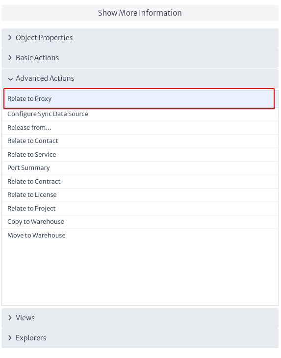 |
|---|
| Figure 16. Advanced action to relate to proxy. |
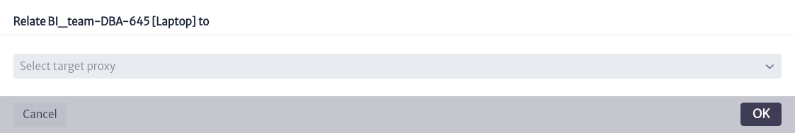 |
|---|
| Figure 17. Relate object to proxy. |
Synchronization Framework
The synchronization framework defines the components that allow Kuwaiba to obtain data from the actual network to keep the inventory up to date1.
To access the synchronization module, locate the  icon in the menu at the top, when you select it, a vertical menu will be displayed as shown in Figure 1, where you must select the
 Synchronization Framework option.
 |
|---|
| Figure 1. Access to the synchronization module. |
Figure 2 presents the interface of the module. At the top, there are three options, marked in the red box, which are described below as a series of steps to follow in order to use the module effectively.
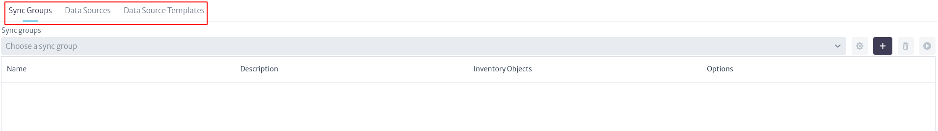 |
|---|
| Figure 2. Synchronization module. |
-
The
Data Source Templatesoption allows the user to view, create or delete templates for loading source data. Selecting this option displays the view seen in Figure 3.
Figure 3. Data Source Templates. To create a template, select the
 icon. When doing so, the information that allows the user to create a new template will appear, as illustrated in Figure 4. In this step, it is necessary to define the template name, description and properties.
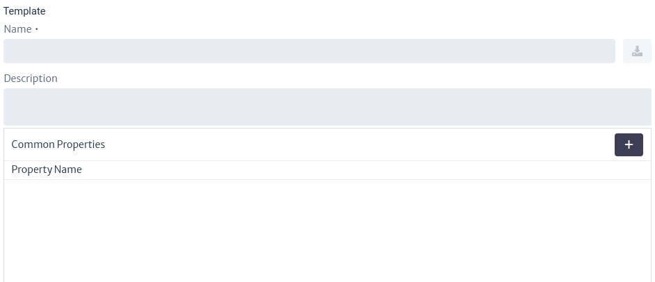
Figure 4. Create template. To add properties, select the icon
. Once the property name is set, press Enter to save the value. To delete a property, click on the icon  next to each added property. Finally, to save the template, select the icon
  .
.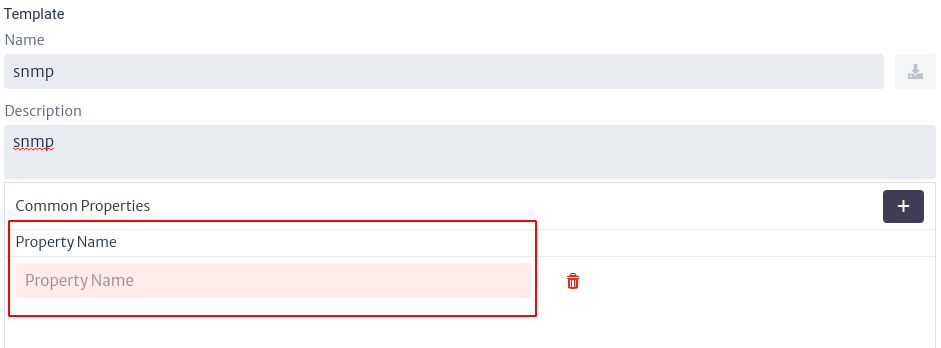
Figure 5. Create properties in template. The templates created are displayed in the list of templates, shown in Figure 3 (initially empty). This list is represented as a table including the name of the template, its description and the associated options. In this context, the only available option is indicated by the icon
, which allows you to delete the template. If you select a template from the list, you can view its contents and modify it, as illustrated in Figure 7.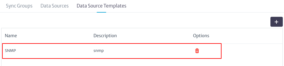
Figure 6. List of templates. 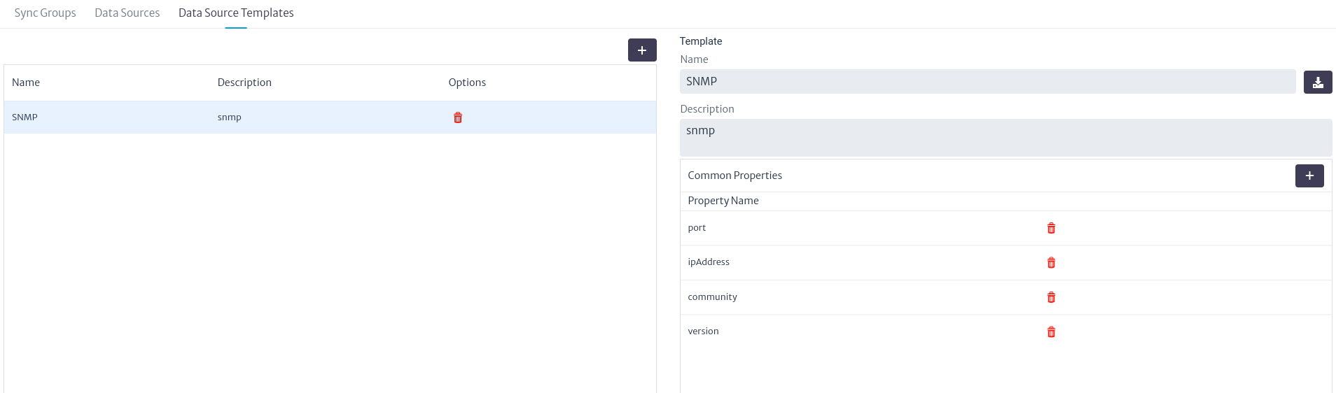
Figure 7. Update template.
Once you have defined your templates, you can proceed with the synchronization process by object group or by a particular object.
-
To define a synchronization process for a specific inventory object, locate and select the
Data Sourcesbutton. This will take you to the view shown in Figure 8, where you will find a table (initially empty) with the data sources created. The data sources contain the specific information to retrieve the data from a particular device.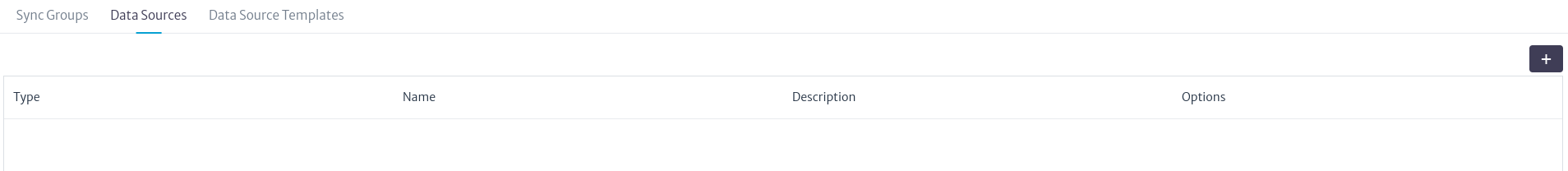
Figure 8. Data sources. To create a new data source, click on the
button. Subsequently, a search bar will appear where you can find the inventory object by its name or by the class it belongs to.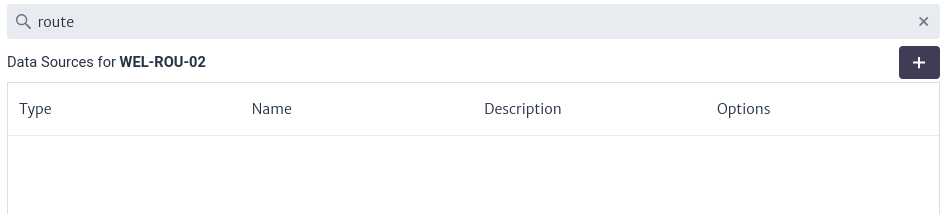
Figure 9. Data sources by object. After selecting an object, the data sources associated with that object will appear in the table mentioned above. Because the selected object has no data sources, the list appears empty. To add a new data source, select button the
again. On the right side of the screen, a form with the necessary information for its creation will appear. First, you must select an existing template. You can view the existing templates by clicking on  , which will display a list.
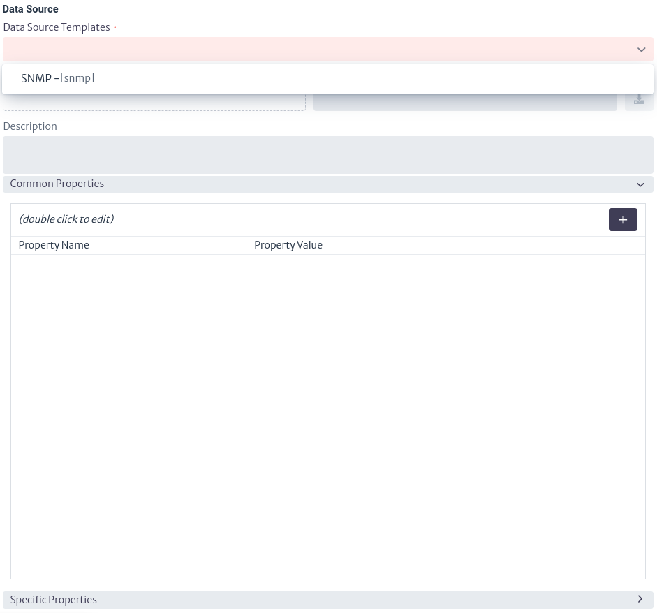
Figure 10. Select template. After selecting the template, the properties defined in it will be displayed. To assign a value to them, double click on the property and define the desired value. Then press the Enter key to set it.
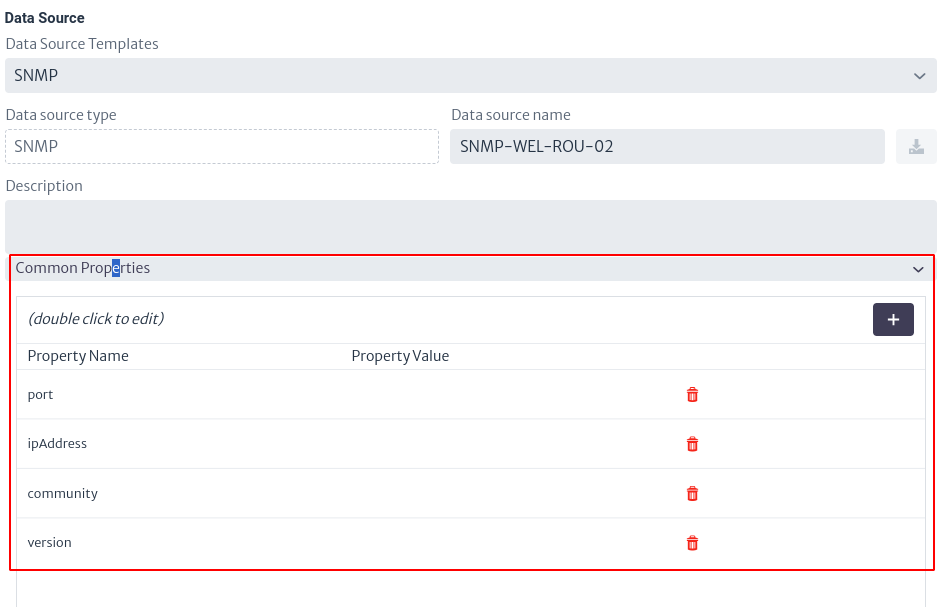
Figure 11. Configure common properties values. In addition, you can add specific properties for an object by selecting specific properties. Similar to creating properties in templates, select
to add them.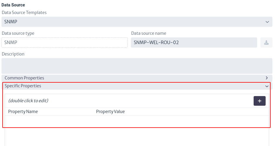
Figure 12. Configure specific properties values. Finally, to save the data source I selected
and the data source appears in the list mentioned in Figure 9.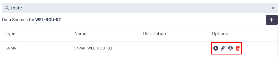
Figure 13. List of data sources. The table in Figure 13 has four columns.
- Type The type of data source (set by the template).
- Name The name of the data source.
- Description The description added to the data source.
- Options Different actions that can be performed for the data source. It has four options which are detailed below.
-
The icon
 executes the synchronization set for the selected object.
When this option is selected, a new window appears asking the user for the synchronization provider. As shown below.
executes the synchronization set for the selected object.
When this option is selected, a new window appears asking the user for the synchronization provider. As shown below.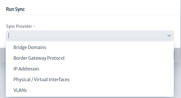
Figure 14. Select sync provider. The possible synchronization providers are listed in Figure 14: Bridge Domains, Border Gateway Protocol, IP Addresses, Physical/Virtual Interfaces and VLANs. In case you select the Border Gateway Protocol provider, you can modify the ASN (Autonomous System Number) by means of the configuration variable
sync.bgp.localAsn.Subsequently, the summary of the synchronization process performed appears, as illustrated in Figure 15.
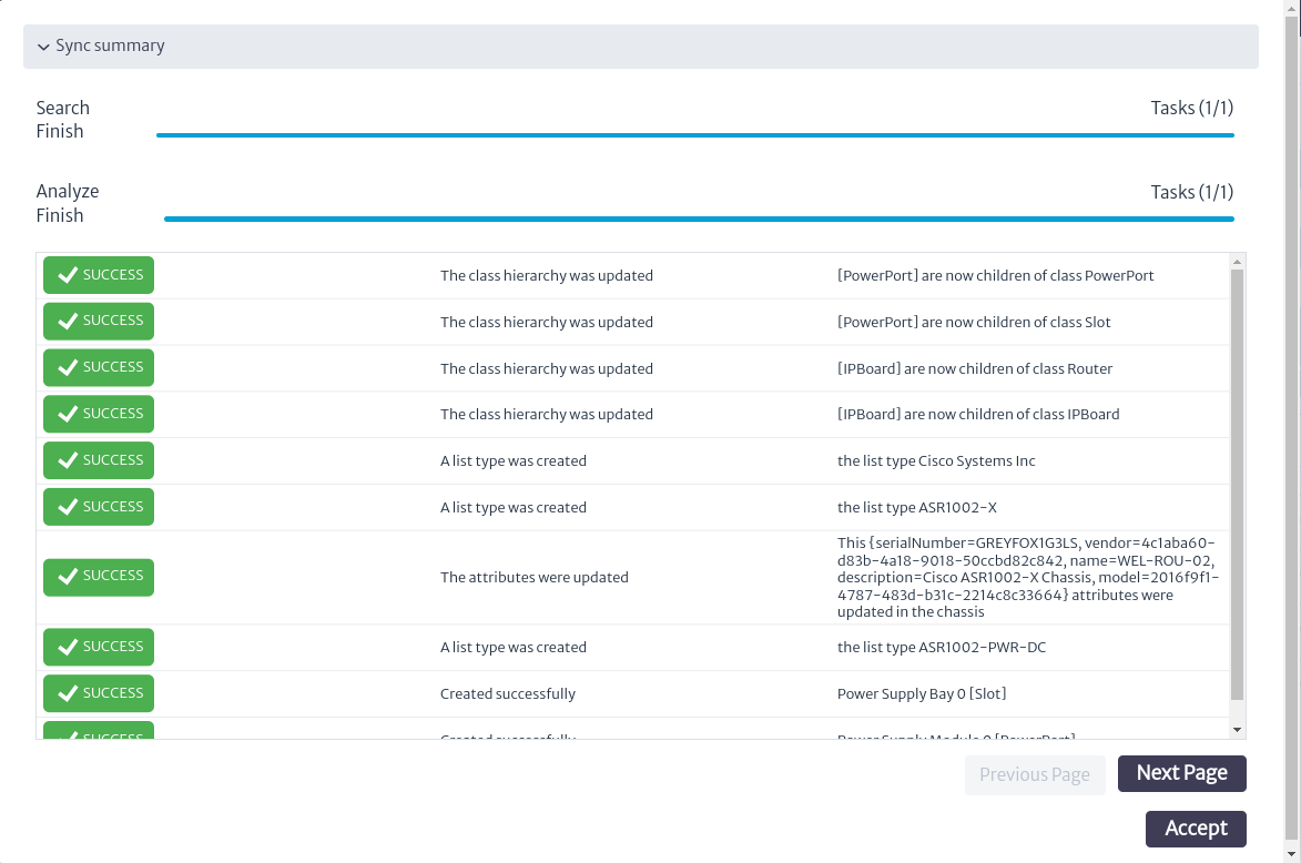
Figure 15. Execute data source. -
The icon
 allows you to add the data source to an existing synchronization group.
Figure 16. Add data source to group. -
The icon
 removes the data source from a synchronization group.
 -
The icon
removes the data source.
-
-
Synchronizations by group are managed in
Sync Groups, where you can search for the data sources of a previously created group or create a new synchronization group. Sync groups allow you to run a synchronization process for several inventory objects. For this, it is necessary to have data sources created, as explained above.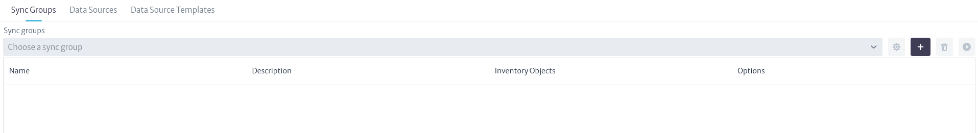
Figure 17. Synchronization groups. To create a new group select the
button, which opens a pop-up window like the one shown in Figure 18, where you can add the group name, a description and add data sources.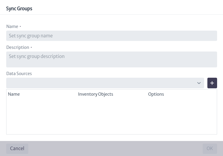
Figure 18. Create a synchronization group. To view the data sources associated with a group, use the search bar on the sync groups screen. You can search for the group of interest by typing the group name in the search bar or by selecting it from the drop-down list by clicking ![show_groups_icon]. When you select a group, the associated data sources will appear in the table in Figure 19. This table has four columns:
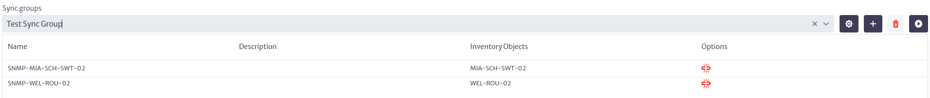
Figure 19. Data sources by group. - Name Name of data source.
- Description Description of the data source.
- Inventory Objects Inventory object associated with the data source.
- Options The actions that can be performed for each data source. It has only one option which is
 which removes the data source from the group.
To modify a group's information, select the icon
 , which will open the window shown in Figure 20. In this window, the user can modify the group name, description and associated data sources, adding or deleting them as needed.
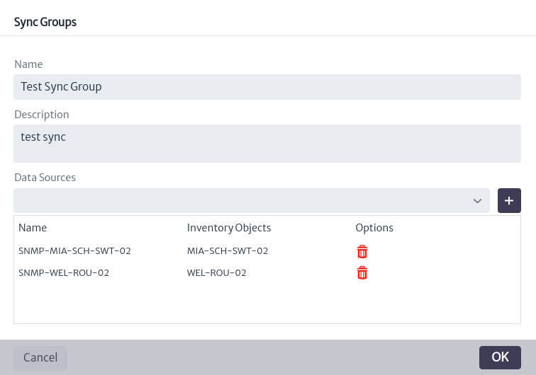
Figure 20. Update group. To delete a group, select the icon
 .
.Finally, you can execute the whole synchronization group by clicking on
which executes all the data sources associated to the group. In the same way as when running specific data sources, a window appears for the user to select the synchronization provider and at the end of the synchronization process, a summary of the results obtained is displayed.Figure 21. Select sync provider. 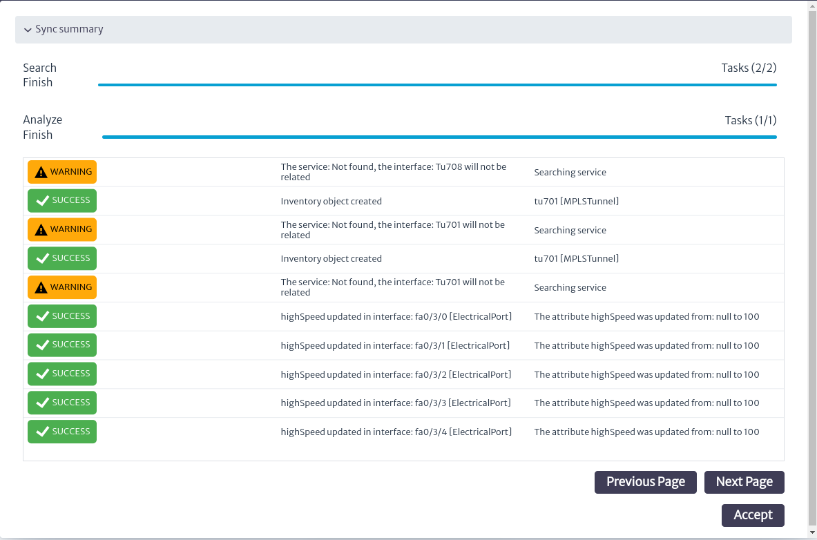
Figure 22. Execute sync group.
List of Parameters by Protocols
Currently, the synchronization module supports Simple Network Management Protocol (SNMP) and Secure Shell (SSH) protocols. The parameters that can be defined for the above protocols are shown below.
-
SNMP
Parameter Description ipAddress IP address of the system that will manage the SNMP devices. port Port for SNMP. version SNMP version. The possible values are: 2c,3. The default value is2c.community SNMP Version 2cattribute community. Default value public.authProtocol SNMP version 3attribute authentication protocol. Possible values:MD5,SHA.authPass SNMP version 3attribute authentication protocol pass phrase.securityLevel SNMP version 3attribute security level. Possible values:noAuthNoPriv,authNoPriv,authPriv.securityName SNMP version 3attribute security name.contextName SNMP version 3attribute context name.privacyProtocol SNMP version 3attribute privacy protocol. Possible values:DES,AES.privacyPass SNMP version 3attribute privacy protocol pass phrase. -
SSH
Parameter Description sshPort SSH port. sshUser Username used to log in to a remote server via SSH. sshPassword Password associated with the sshUser.
-
Synchronization Framework Overview: https://www.kuwaiba.org/docs/dev/sync/ ↩
Reports
In Kuwaiba, reports are HTML documents designed to provide detailed information about the objects that are part of the inventory. Their purpose is to inform and follow up on specific situations. As of version 1.1, users can create their own reports using groovy scripts, usually in three steps:
- Retrieve the data: Either by performing a query directly on the database or by using the high-level API provided by Kuwaiba. In the first case, the user will have to handle the raw nodes and relationships contained in the graph database and will most likely have to use Cypher. In the second case, he will have to use the documented Java API.
- Information processing: Consists of taking the data retrieved in step 1 and performing calculations, filtering and other processing to convert it into meaningful information.
- Formatting and visualization: This consists of creating a structure of tables, labels and/or graphs to present the information in a way that is clear and easy to read.
To access the reports module, locate in the menu presented at the top of the screen the Others section, represented with the list symbol  . When accessing this section, a vertical menu will be displayed where you can see the
 Reports module, as shown in Figure 1.
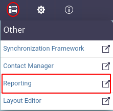 |
|---|
| Figure 1. Access to reporting module. |
There are two types of reports: class level reports and inventory level reports. Both are explained in the following subsections.
Class Level Reports
These reports are linked to the instances of a given class. From the reports module you can view the class level reports by clicking on the Class Level Reports option indicated in the red box in Figure 2, where all the existing class level reports are listed.
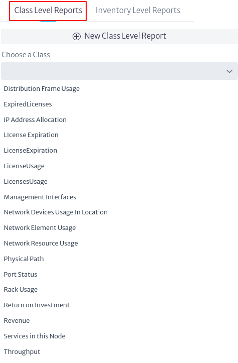 |
|---|
| Figura 2. Class level reports. |
To filter the reports by class, use the search bar indicated with Choose a Class in Figure 3. Here you can view all available classes by clicking on the  button and select one, either by searching directly in the drop-down list or by entering the class name. When selecting a specific class, such as
 Rack, only the reports corresponding to that class will appear, as shown in Figure 4.
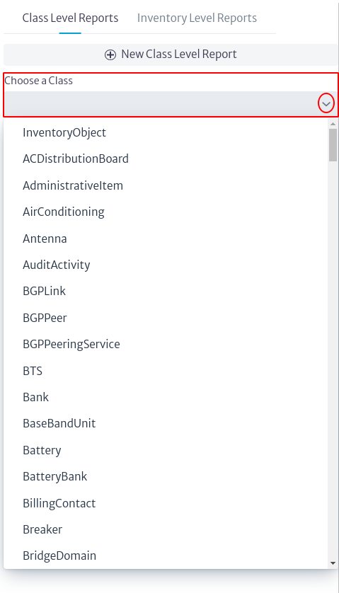 |
|---|
| Figure 3. Class selection. |
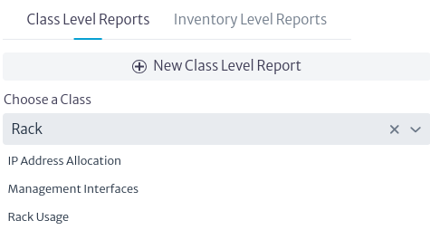 |
|---|
| Figure 4. Reports by class. |
To create a new report, select the  button shown in Figure 2. Clicking on this button will open a new window (Figure 5) where you can choose the class to which the report belongs, enter the name, a description and choose the type of report, which in this case is available only in HTML format.
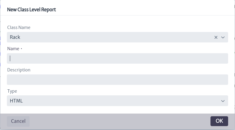 |
|---|
| Figure 5. Create class level report. |
Note. If you have previously filtered the reports by class before creating a new one, when you open the creation window, the Class Name field will default to the class that was selected in the filter.
Important. In the Type field of Figure 5, when displaying the list of possible types,
CSV,
To view and modify the contents of a specific report, select it. The contents of the report are displayed on the right side of the screen, as shown in Figure 6.
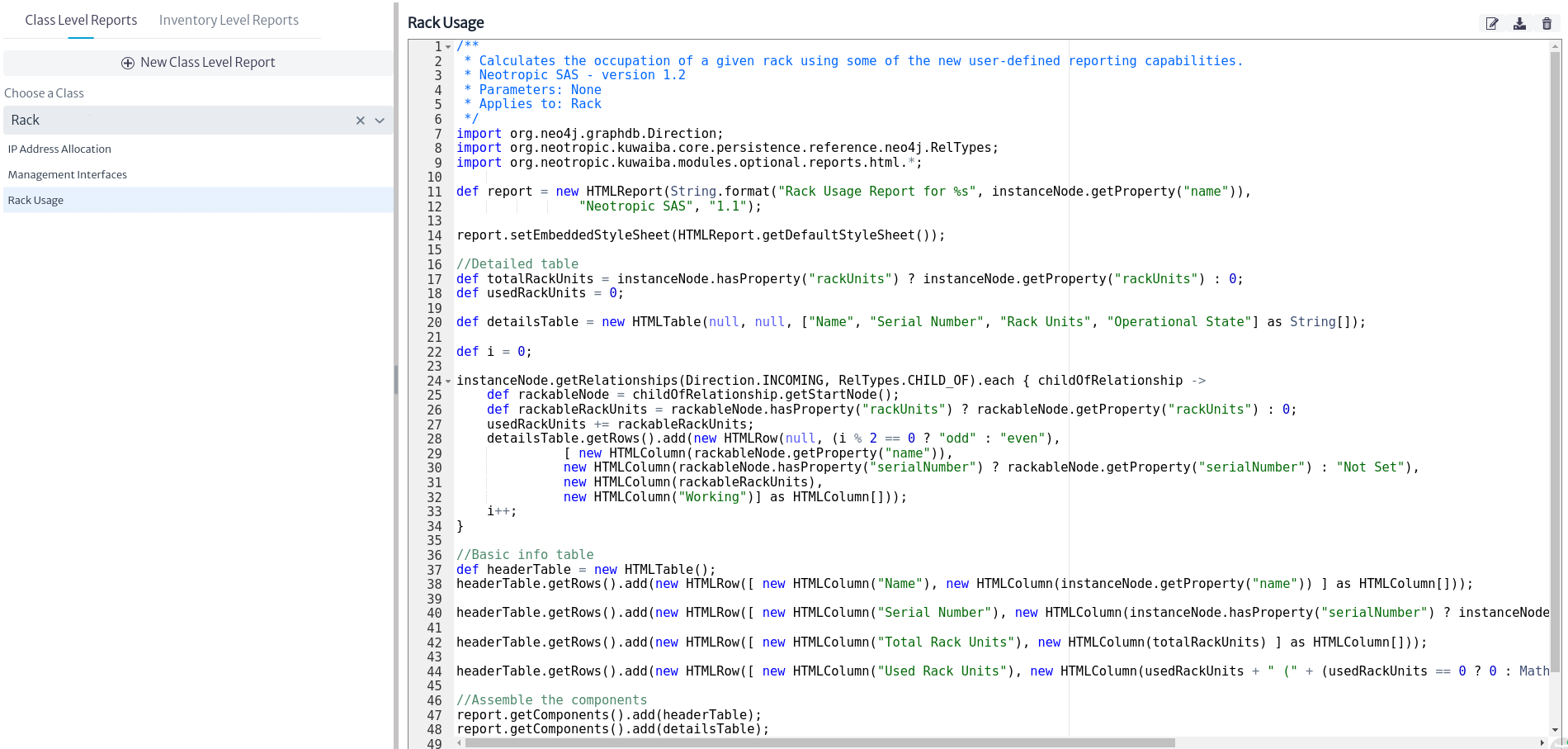 |
|---|
| Figure 6. Report content. |
The right side of Figure 6 shows the Groovy script used for the specific report, which can be edited directly from this window.
In the upper right part of Figure 6, three buttons can be seen. This image is expanded in Figure 7.
 |
|---|
| Figure 7. Report options. |
-
The icon
 allows the user to modify the properties of the selected report. Clicking on it opens a new window as shown below, where the user can change the name of the report, modify its description, and enable or disable the report.
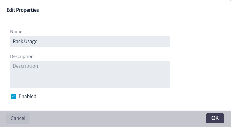
Figure 8. Edit report properties. Important. The
Enabledbutton allows you to enable or disable the report, which determines whether it can be executed or not. A report can only be run if it is enabled. When a report is created, it is enabled by default. -
The icon
 allows you to save the changes made to the script. If the user has modified the Groovy script of the report, it is necessary to select this button for the changes to be saved.
 -
The icon
 deletes a report.
A class-level report is designed to apply to all inventory objects that belong to a specific class. To run this type of report, you can run it from any inventory object that is part of that class. For example, if we select an inventory object that belongs to the Rack class, from the Navigation module (detailed in the Navigation chapter), we search for a Rack. In the object's options panel, we find the basic actions available, where the option called Reports is included, as shown in Figure 9.
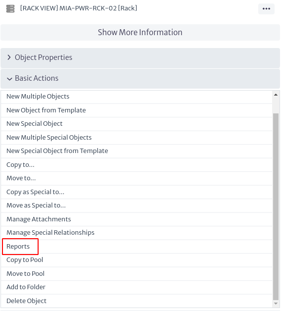 |
|---|
| Figure 9. Reports option in the object's options panel. |
When selecting the Reports option in Figure 9, a new window appears with the reports associated to the Rack class (reports that can be executed from this object, as shown in Figure 10).
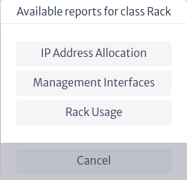 |
|---|
| Figure 10. Available reports. |
When a report is selected, a new tab opens in the browser with the HTML output of the report.
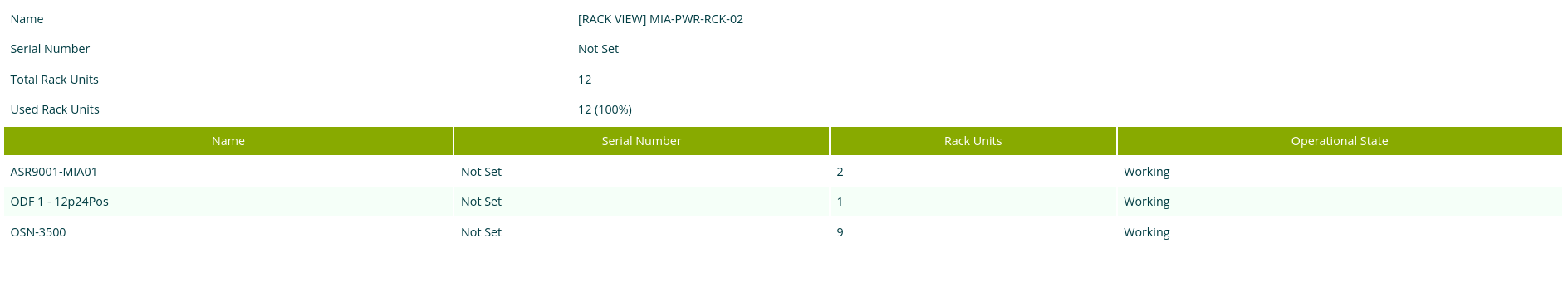 |
|---|
| Figure 11. Report result. |
Note: Reports belonging to abstract classes are applicable to their subclasses. For example, if a report is created for the
GenericLocationclass, it will be available for its subclasses such asBuilding,House,Neighborhood, among others.
Inventory Level Reports
These reports are not linked to inventory objects. Instead, they are used to display general purpose information, such as "All support contracts about to expire" or "All inventory objects with operational status Defective". For these reports, custom parameters can be defined, unlike class-level reports that only have the object that starts the report as a parameter. Parameters are always captured as strings, and it is necessary to parse and ensure that they match the correct format at the start of the report.
To view the existing inventory level reports, select the Inventory Levels Reports option that appears in the reports module, as shown in Figure 12. This will list all existing inventory level reports.
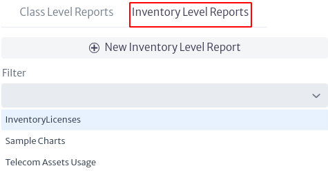 |
|---|
| Figure 12. Inventory level reports. |
You can filter the reports by name, in case you need to search for a particular report, in the filter field shown in Figure 13. If you select the symbol, all the reports listed will appear and, as you type in the search bar, the results shown in the list will be limited to your search.
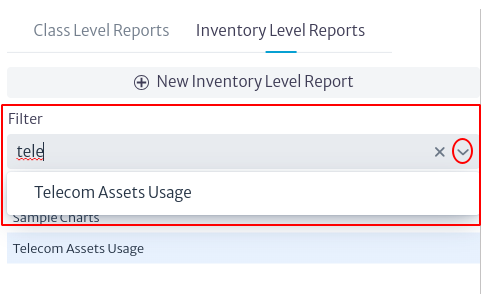 |
|---|
| Figure 13. Inventory level report filtering. |
You can create inventory level reports by clicking on the  button, which will open a new window where you can enter the name, a description and choose the type of report, which in this case is available only in HTML format.
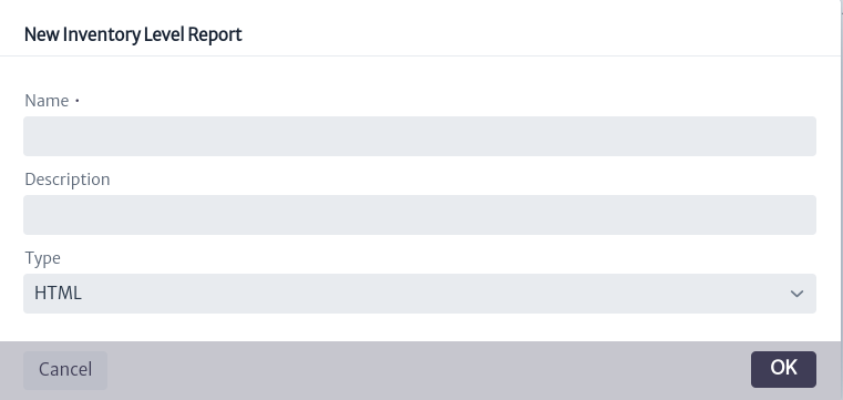 |
|---|
| Figure 14. Inventory level report filtering. |
Important. In the Type field of Figure 14, when displaying the list of possible types,
CSV,
To view and modify the contents of a specific report, select it. The contents of the report are displayed on the right side of the screen, as shown in Figure 15.
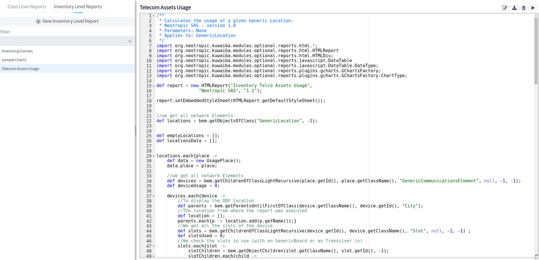 |
|---|
| Figure 15. Content of an inventory level report. |
The right side of Figure 15 shows the Groovy script used for the specific report, which can be edited directly from this window.
In the upper right part of Figure 15, there are four buttons, detailed below.
 |
|---|
| Figure 16. Inventory level reporting options. |
-
As in the previous case, the
button allows the user to modify the properties of the selected report. Clicking on it opens a new window as shown below, where the user can rename the report, modify its description, enable or disable the report and add or remove parameters.
Figure 17. Edit report properties. Important. The
Enabledbutton allows you to enable or disable the report, which determines whether it can be run or not. A report can only be run if it is enabled. When a report is created, it is enabled by default. -
The
icon allows you to save the changes made to the script. If the user has modified the Groovy script of the report, it is necessary to select this button for the changes to be saved. -
The icon
deletes a report. -
The icon
 runs the report and opens a new tab in the browser with the HTML report output.
How to Create Scripts
Creating complex scripts requires some knowledge about the Persistence API and the database structure. It’s out of the scope of this document to deeply explore these topics, but this section will give you a starting point. More documentation and examples will be published in the coming releases; for now, use the reports provided in the directory scripts in the client installation bundle as reference.
-
Kuwaiba uses Groovy as scripting language. Its syntax is very similar to Java’s, but it’s optionally typed. We recommend you to use an external editor that supports Groovy syntax recognition such as Notepad++ (Windows) or GEdit (Linux/MacOS) to write your scripts, then copy the text to the corresponding field in the report properties.
-
All scripts must return an HTMLReport object. This class and the others that are used to build the report are located in the package org.neotropic.kuwaiba.modules.optional.reports.html. There are wrappers for the most common HTML tags, and constructing a report consists of nesting instances of these classes in the right order.
-
The following variables are injected in the script and can be used at any moment:
Variable Name Type Note instanceNode Neo4jNode Only applicable to class level reports. It’s the node in the database that holds the information of the object that triggered the report. graphDb Neo4j GraphDatabase The reference to the connection handler. This gives complete access to the database. Use with caution. className String Only applicable to class level reports. The class of the object that triggered the report. objectId Long Only applicable to class level reports. The id of the object that triggered the report. parameters HashMap[String, String] Only applicable to inventory level reports. The list of parameters provided during the execution of the report. -
There are some built-in reports that could serve as reference on how to retrieve and manipulate the information from the database. They are a temporary solution and will be converted to actual scripts in future releases, but they can help you get started on how to use the Persistence API.
-
Sample Reports can be found in https://sourceforge.net/p/kuwaiba/code/HEAD/tree/server/trunk/scripts/reports/, where report-related scripts have the prefix
RPin their name.
Basic Concepts
To create a report, it's important to understand how they work. Reports are built modularly by adding HTML tags, each of which displays information and applies its own logic
To build a report, the first step is to create the instance
def report = new HTMLReport(String.format("Report's name","", "1.0"))
Next step is choose an HTML tag to display information, the options are:
-
Text: Text is an HTML tag where is possible show a information, error or warning message. To create a message is:
def message = new HTMLMessage(cssAttributes, null, text)If want to add a variable in message use String.format(), for example:
def message = new HTMLMessage(cssAttributes, null, String.format("put your text %s",variable))Where: cssAttributes represents the ccs styles applied to the text separated by semicolons(;), for example:
def cssAttributes = "color:black; font-weight: normal; font-size: 2em " -
Table: Table is an HTML tag where is possible show a information in format table with rows and columns. To create a table is
def table = new HTMLMTable()To add values to table use the method
table.getRows().add(), but are two possibilities when the number of rows is known: the table is created by defining the name of the columns and the value of the row at the same time.In the case when the number of rows is known, the table is created by defining the name of the columns and the value of the row at the same time. For example:
generalInfoTable.getRows().add(
  new HTMLRow(cssAttribute, null,
      [
          new HTMLColumn(cssAttribute, null, text),
          new HTMLColumn(value)
      ] as HTMLColumn[]));
Note
- The first new HTMLColumn represent the name of column and new HTMLColumn is the value
- It is mandatory to cast the content to HTMLColumn
- cssAttributes represents the ccs styles applied
When the number of rows is not known, first define the name of the columns:
table = new HTMLTable(null, null, ["COLUMN1", "COLUMN2", "COLUMN3"] as String[])Note:
- It is mandatory to cast the content to String
After, add row's value:
table.getRows().add(
  new HTMLRow(null, null,
      [
        new HTMLColumn(cssattributes,null,value)
      ] as HTMLColumn[]));
Note
- The first new HTMLColumn represent the name of column and new HTMLColumn is the value
- It is mandatory to cast the content to HTMLColumn
- cssAttributes represents the ccs styles applied
Charts: Charts are an HTML element that allow you to visualize data using pie, line, or column graphs. These charts are created from the data stored in a data table, so it's essential to create the table first.
def dataTable = new DataTable([DataType.STRING, DataType.NUMBER ] as DataType[], ["COLUMN1", "COLUMN2"] as String[])
Note
It is mandatory to cast the content to DataType
To add values to the datatable, the column correspond the name of the column and value is the number:
dataTable.addRow(["COLUMN", value] as String[])
Note
It is mandatory to cast the content to String
To create the chart, it is necessary use the GChartsFactory
def chartsFactory = new GChartsFactory(report)
def htmlDivPieChart = chartsFactory.createHTMLDivWrapperChart(ChartType.PIECHART, "divPieChart", name , dataTable);
Notes
- It posible change the styles of htmlDivPieChart using :
htmlDivPieChart.setStyle("cssStyle").- Is possible use types of chart: ChartType.PIECHART, ChartType.COLUMNCHART and ChartType.LINECHART.
Finally step is add the HMTL tag's to report and return it:
report.getComponents().add(HMTLTag)
return report
After choosing the HTML tag to display a text, you must query the inventory information to display. There are two ways to query the information: use Cypher to query directly in Ne4oj or use the Persistence API.
The Persistence API is extensive and contains many methods; however, the most commonly used ones are listed below.
| Methods | Description | Return |
|---|---|---|
| getAttributeValueAsString( classObject, IdObject, NameAttributes ) | Returns the value as string of an attribute | String |
| getSpecialAttribute( classObject, IdObject , nameRelantionship ) | Returns relationship of given object | BusinessObjectLight |
| getObject( classObject, IdObject ) | Returns the given object | BusinessObject |
| getParent( classObject, IdObject) | Returns the object's parent | BusinessObjectLight |
| getObjectChildren( classObject, IdObject, -1) | Returns the children of given object | BusinessObjectLight |
| getObjectsOfClassLight(classToFind, null, -1, -1) | Returns all objects belong a class | BusinessObjectLight |
Note
- Business Object refers a object with all attributes meanwhile Business Object Light refers a object with only attributes: class name, object id and nam
- If the object is a Business Object, it is possible to get any of its attributes:
object.getAttributes().get(attributeName)
- If the object is a Business Object Light, only get the following attributes:
objectLight.getName()
objectLight.getClassName()
objectLight.getId()
Learning By Example
Case 1
Example showing in a table the cities in the inventory and to which state they belong
-
Create the inventory report in the module of report as show in Figure 14
-
Import the module
import org.neotropic.kuwaiba.modules.optional.reports.html.*
- Define the name and CSS style of report
def report = new HTMLReport("Cities in inventory" , "Neotropic SAS", "1.0")
report.setEmbeddedStyleSheet(HTMLReport.getDefaultStyleSheet())
- Use the method getObjectsOfClassLight to search the all cities in the Inventory and save in a variable
def cities = bem.getObjectsOfClassLight("City", null, -1, -1)
- Create the table with the column name
def citiesTable = new HTMLTable(null, null, ["City","State"] as String[])
- Go through all the cities in the array and query each one for her parent
cities.each { city ->
    def state = bem.getParent( city.getClassName(), city.getId()))
- Add to table the data
citiesTable.getRows().add(new HTMLRow([
        new HTMLColumn( city.getName()),
        new HTMLColumn(counrty),
    ] as HTMLColumn[]))
}
- Add the table to report and return it
report.getComponents().add(citiesTable)
return report
9.The report must look like this
import org.neotropic.kuwaiba.modules.optional.reports.html.*

def report = new HTMLReport("City in inventory" , "Neotropic SAS", "1.0")
report.setEmbeddedStyleSheet(HTMLReport.getDefaultStyleSheet())

def cities = bem.getObjectsOfClassLight("City", null, -1, -1)
def citiesTable = new HTMLTable(null, null, ["City","State"] as String[])

cities.each { city ->
    def state = bem.getParent( city.getClassName(), city.getId())

    citiesTable.getRows().add(new HTMLRow([
        new HTMLColumn( city.getName()),
        new HTMLColumn(state),
    ] as HTMLColumn[]))
}

report.getComponents().add(citiesTable)
return report
- The result of the report will be
 |
|---|
| Figure 17. Report Result |
Case 2
For this example, a title is added to case 1
- Create a message
def title = new HTMLMessage("color:black; font-weight: normal; font-size: 2em; ", null, String.format("Cities in Inventory"))
Note
In this case the css style are set as string
- Create a div containing the title
def divTitle = new HTMLDiv("div",title)
Note
It is possible to set css styles to the div,
divTitle.setStyle("width: 100vw;display: flex; justify-content: center; align-items: center;padding:4px")
- Add div to report
report.getComponents().add(divTitle)
- The report must look like this
import org.neotropic.kuwaiba.modules.optional.reports.html.*

def report = new HTMLReport("Cities in Inventory" , "Neotropic SAS", "1.0")
report.setEmbeddedStyleSheet(HTMLReport.getDefaultStyleSheet())

def cities = bem.getObjectsOfClassLight("City", null, -1, -1)
def citiesTable = new HTMLTable(null, null, ["City","State"] as String[])

cities.each { city ->
    def state = bem.getParent( city.getClassName(), city.getId())

    citiesTable.getRows().add(new HTMLRow([
        new HTMLColumn( city.getName()),
        new HTMLColumn(state),
    ] as HTMLColumn[]))
}
def title = new HTMLMessage("color:black; font-weight: normal; font-size: 2em; ", null, String.format("Cities in Inventory"))
def divTitle = new HTMLDiv("div",title)
divTitle.setStyle("width: 100vw;display: flex; justify-content: center; align-items: center;padding:4px")

report.getComponents().add(divTitle)
report.getComponents().add(citiesTable)
return report
- The result of the report will be
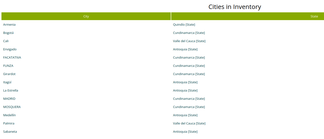 |
|---|
| Figure 18. Title Report Result |
Case 3
For this case, a bar chart is added to case 2 where the number of cities per state is displayed.
- Add the imports
import org.neotropic.kuwaiba.modules.optional.reports.javascript.DataTable
import org.neotropic.kuwaiba.modules.optional.reports.javascript.DataTable.DataType
import org.neotropic.kuwaiba.modules.optional.reports.plugins.gcharts.GChartsFactory
import org.neotropic.kuwaiba.modules.optional.reports.plugins.gcharts.GChartsFactory.ChartType
- Create the dataTable
def dataTable = new DataTable([DataType.STRING, DataType.NUMBER ] as DataType[], ["State", "Cities Number"] as String[])
- Define the variables where the number of cities per state is stored
def quindio = 0
def antioquia = 0
def valleCauca = 0
def cundinamarca = 0
- Implement the logic to check how many cities there are per state
 switch(state.getName()) {
        case "Antioquia":
            antioquia++
            break
        case "Quindío":
            quindio++
            break
        case "Cundinamarca":
            cundinamarca++
            break
         case "Valle del Cauca":
            valleCauca++
            break
        default:
            break
    }
- Add the value rows to dataTable
dataTable.addRow(["Antioquia",antioquia] as String[])
dataTable.addRow(["Quindio",quindio] as String[])
dataTable.addRow(["Cundinamarca",cundinamarca] as String[])
dataTable.addRow(["Valle del Cauca",valleCauca] as String[])
- Create the chartsFactory
def chartsFactory = new GChartsFactory(report)
- Generate the bar chart
def htmlDivColumnChart = chartsFactory.createHTMLDivWrapperChart(ChartType.COLUMNCHART, "divColumnChart", "Bar Chart Cities Per State", dataTable);
- Add the chart to report
report.getComponents().add(htmlDivColumnChart)
- The final code is
import org.neotropic.kuwaiba.modules.optional.reports.html.*
import org.neotropic.kuwaiba.modules.optional.reports.javascript.DataTable
import org.neotropic.kuwaiba.modules.optional.reports.javascript.DataTable.DataType
import org.neotropic.kuwaiba.modules.optional.reports.plugins.gcharts.GChartsFactory
import org.neotropic.kuwaiba.modules.optional.reports.plugins.gcharts.GChartsFactory.ChartType;

def report = new HTMLReport("Cities in Inventory" , "Neotropic SAS", "1.0")
report.setEmbeddedStyleSheet(HTMLReport.getDefaultStyleSheet())

def cities = bem.getObjectsOfClassLight("City", null, -1, -1)
def citiesTable = new HTMLTable(null, null, ["City", "State"] as String[])

def dataTable = new DataTable([DataType.STRING, DataType.NUMBER ] as DataType[], ["State", "Cities Number"] as String[])

def quindio = 0
def antioquia = 0
def valleCauca = 0
def cundinamarca = 0

cities.each { city ->
    def state = bem.getParent( city.getClassName(), city.getId())

    switch(state.getName()) {
        case "Antioquia":
            antioquia++
            break
        case "Quindío":
            quindio++
            break
        case "Cundinamarca":
            cundinamarca++
            break
         case "Valle del Cauca":
            valleCauca++
            break
        default:
            break
    }


    citiesTable.getRows().add(new HTMLRow([
        new HTMLColumn( city.getName()),
        new HTMLColumn(state),
    ] as HTMLColumn[]))
}

dataTable.addRow(["Antioquia", antioquia] as String[])
dataTable.addRow(["Quindio", quindio] as String[])
dataTable.addRow(["Cundinamarca", cundinamarca] as String[])
dataTable.addRow(["Valle del Cauca", valleCauca] as String[])

def chartsFactory = new GChartsFactory(report)
def htmlDivColumnChart = chartsFactory.createHTMLDivWrapperChart(ChartType.COLUMNCHART, "divColumnChart", "Bar chart Cities Per State", dataTable);

def title = new HTMLMessage("color:black; font-weight: normal; font-size: 2em; ", null, String.format("Cities in Inventory"))
def divTitle = new HTMLDiv("div",title)
divTitle.setStyle("width: 100vw;display: flex; justify-content: center; align-items: center;padding:4px")

report.getComponents().add(divTitle)
report.getComponents().add(citiesTable)
report.getComponents().add(htmlDivColumnChart)


return report
- The result is
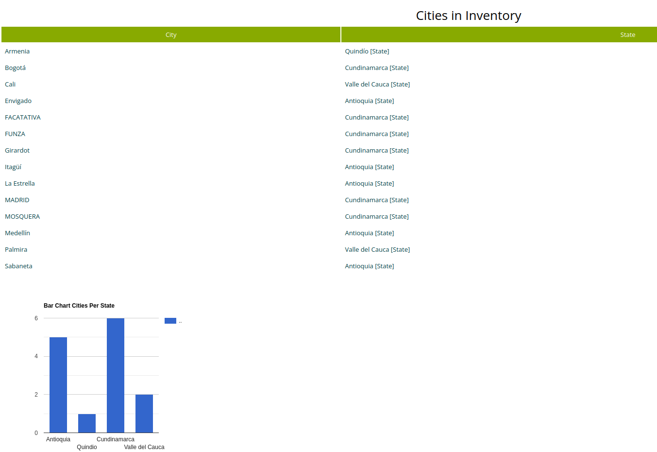 |
|---|
| Figure 19. Report With Column Chart |
Layout Editor
The Layout editor is a module that allows us to design the physical view of the elements hosted in a Rack and is used in the Rack view.
Figure 1 illustrates the module’s structure. When creating a layout in the application and linking it to a listType item, this is done through the HAS_LAYOUT relationship. The type of the listType is determined by the class it is associated with via the INSTANCE_OF relationship. In the example, the listType is of type EquipmentModel. Similarly, when creating a customShape, a corresponding listType with the same name is automatically created and linked through the HAS_LAYOUT relationship. ListTypes associated with customShapes are, by default, of type CustomShape.
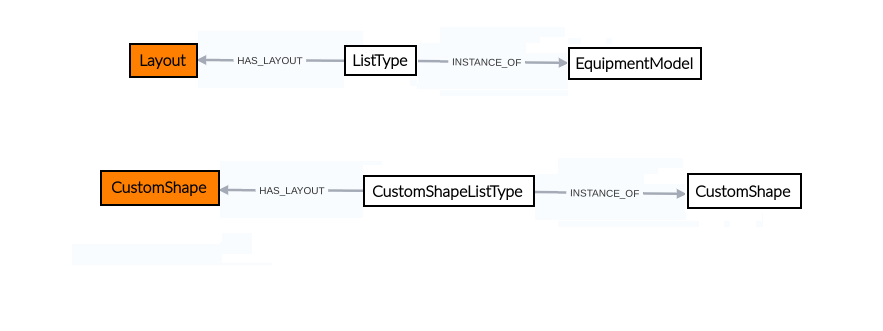 |
|---|
| Figure 1. Layout editor structure |
This module is part of the Other category, as shown in Figure 2.
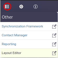 |
|---|
| Figure 2. Layout editor module |
Once opened, we will see the main window of the module, as shown in Figure 3. From here we can see the canvas to create layouts.
 |
|---|
| Figure 3. Queries manager main window |
To design layouts, the module offers various tools, which can be found in the toolbar located at the top of the canvas, as shown in Figure 4.
 |
|---|
| Figure 4. Layout designer tools |
You will also find the properties panel on the right side of the canvas, which allows you to interact with the topology objects, as shown in Figure 5.
 |
|---|
| Figure 5. Properties panel |
Creating A Layout
As an example, let's recreate the design of the GPON OLT P1201-08 from TPLINK used in a GPON network as shown in Figure 6. In this network, we have the central office where our OLT is located. A primary splitter is used to connect the ONTs located in customers' homes. In this case, we will focus on the design of the OLT hosted in the rack. If you want to create full representations of a network, please refer to the Topology Designer module for more details.
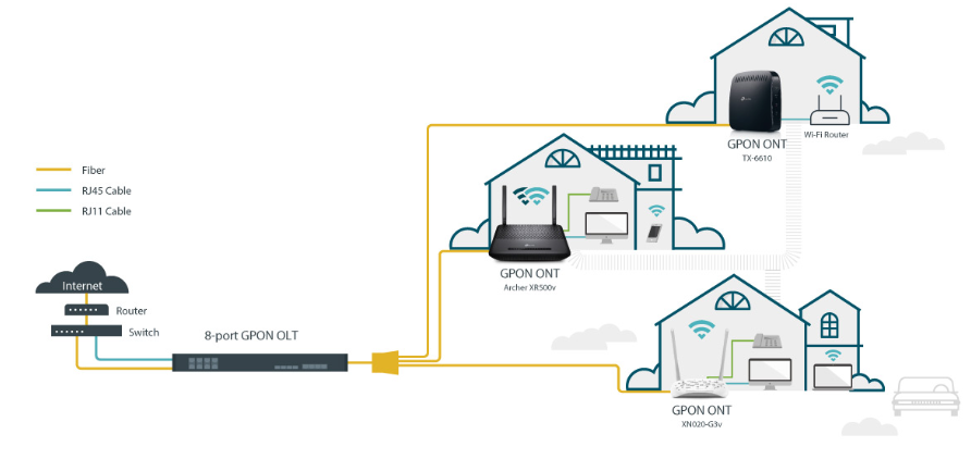 |
|---|
| Figure 6. Red GPON diagram |
To start, you must create a new layout using the  button. The window shown in Figure 7 will open. Enter the name and description, then click OK.
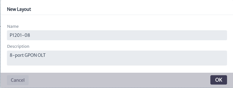 |
|---|
| Figure 7. Window create layout |
When you create a layout, you can see and edit its properties in View Properties in the properties panel, as shown in Figure 8.
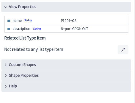 |
|---|
| Figure 8. View properties |
Once the layout is created, we proceed to add the elements on the canvas, as shown in Figure 9. The canvas has 14 delimited spaces to represent the rack units in order to facilitate the placement and sizing of the elements.
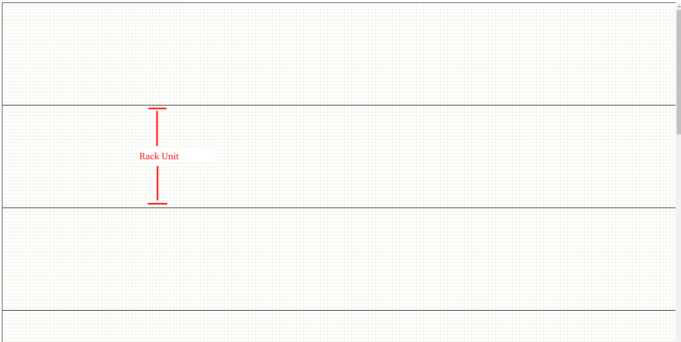 |
|---|
| Figure 9. Canvas division |
Custom Shapes
To start designing the GPON OLT P1201-08 shown in Figure 10, we can use the custom shapes available in the application. Custom shapes are templates of common elements such as electrical ports, internet ports, etc. To access them, click on Custom Shapes in the properties panel shown in Figure 11.
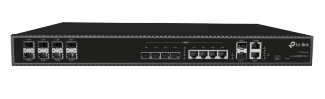 |
|---|
| Figure 10. GPON OLT P1201-08 |
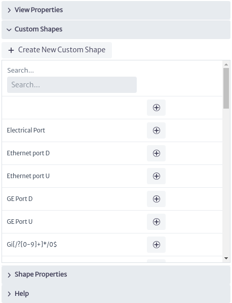 |
|---|
| Figure 11. Custom Shapes |
By default, a wide variety of templates are available; however, you can create your own templates according to your needs. In this case, we will create the templates. Use the button shown in Figure 11. The window in Figure 12 will open. Enter a name and click OK.
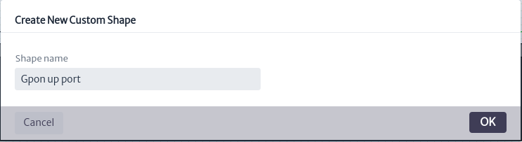 |
|---|
| Figure 12. Create custom shape window |
The created template will appear in the list of available templates as shown in Figure 13; however, at this moment it is not possible to use it because it is empty.
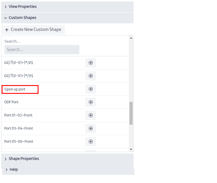 |
|---|
| Figure 13. New Custom shape |
To create its content, we need to open it using the button located in the design toolbar shown in Figure 4. When used, the custom shapes selection window will open. We search for the created template and Click on it as shown in Figure 14.
 |
|---|
| Figure 14. Select custom shape window |
When doing so, you will notice that several tools on the toolbar seen in Figure 4 will be enabled, as shown in Figure 15.
 |
|---|
| Figure 15. Enabled layout designer tools |
Next, we will proceed to create the custom shapes that will represent the GPON ports of our OLT. To do this, we use the shapes provided by the module, as shown in Figure 16. We have rectangles, circles and labels available; in our case, we will add a rectangle using as shown in Figure 17.
 |
|---|
| Figure 16. Add shapes actions |
 |
|---|
| Figure 17. Add shape |
By clicking on the shape we added will enable tools  that allows you to remove the selected shape from the canvas and
  that allows you to create a copy of the element. In the properties panel it will show the actions available to customize the properties of the shapes according to our needs. Among these actions, you can modify the background color, outline color, font color, font size, width and height, and more, as shown in Figure 18.
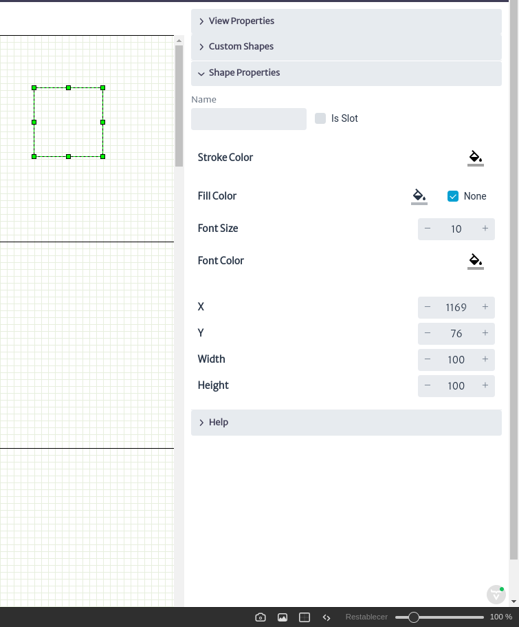 |
|---|
| Figure 18. Shape properties |
In addition to this, you can see guides appear to change the dimensions of the shape. When you hover over the element, it will change as shown in Figure 19. Click and drag to adjust it to the desired size. You can also use the tools highlighted in the properties panel to adjust the width, height, and position of the shapes.
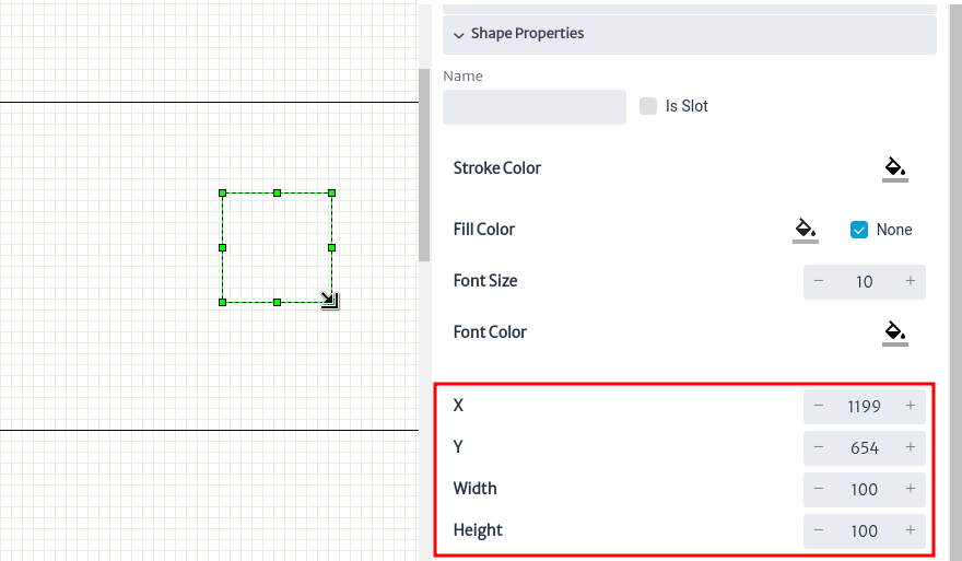 |
|---|
| Figure 19. Change shape size |
After finishing modeling the OLT port as shown in Figure 20, you can use the button  to save your design.
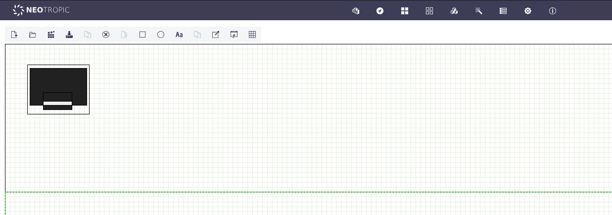 |
|---|
| *Figure 20. OLT GPON port * |
Import/Export Layout/Custom Shape
With the template for the upper ports ready, we can now proceed to create the template for the lower ports. To do this, we can use the recently created template as a base by exporting its design using the button  . This will generate an XML document for download, as shown in Figure 21.
 |
|---|
| Figure 21. Export shape |
The generated XML file contains tags that represent the custom shape, as shown in Figure 22. We can modify it to create a new template. To do this, change the value of the name attribute in the layout tag from Gpon up port to Gpon down port, as seen in the second line of Figure 22.
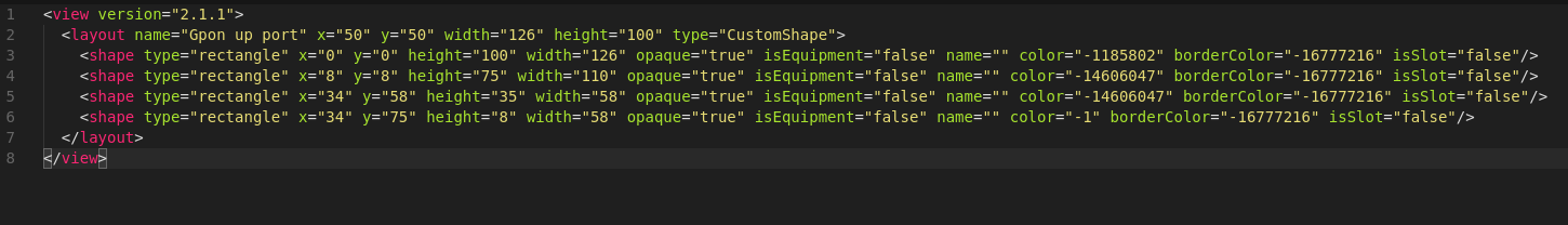 |
|---|
| Figure 22. XML shape file |
Once the file is modified, use the button  to open the window for importing layouts, as shown in Figure 23. Press Upload File, select the previously modified view file, and click OK.
 |
|---|
| Figure 23. Import layout/shape window |
You will be notified that the custom shape was imported successfully, as shown in Figure 24. It will appear in the list of available custom shapes, as seen in Figure 25.
 |
|---|
| Figure 24. Imported shape |
 |
|---|
| Figure 25. Shape imported available |
Once the template is modified to represent the lower ports of the OLT, save the changes. The result can be seen in Figure 26.
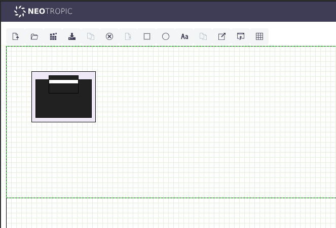 |
|---|
| Figure 26. Gpon down port |
Once the custom shapes for the OLT ports are completed, proceed with its design by opening the previously created layout. To do this, click the button  , which will open the layout selection window as shown in Figure 27. Click on the layout to open it.
 |
|---|
| Figure 27. OPen layout window |
Once opened, we start by creating the chassis for our OLT in the desired rack slot, represented by the divisions on the canvas as shown in Figure 28. For our example, we use the second space on the canvas, which represents the second slot of the rack.
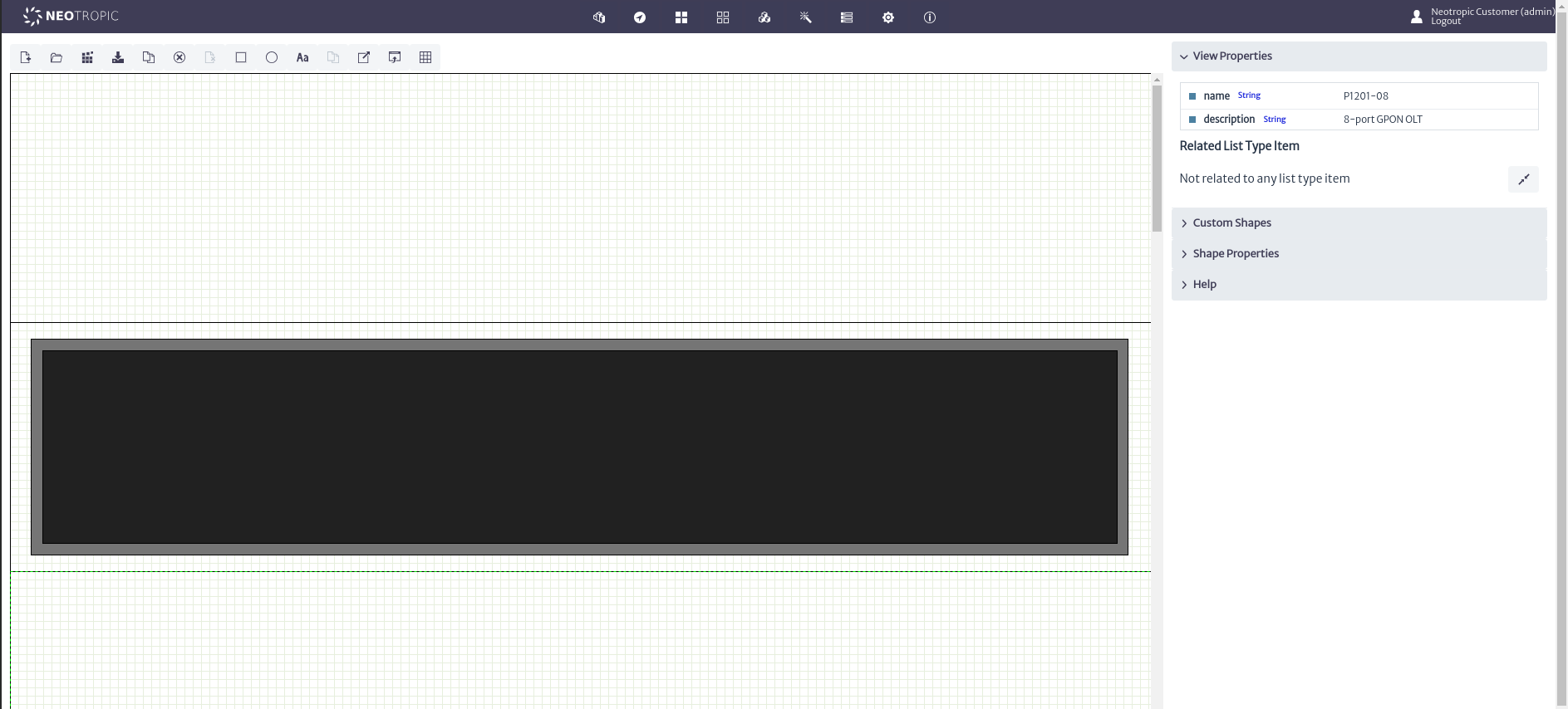 |
|---|
| Figure 28. Olt Chasis |
Next, we proceed to place the OLT ports according to the design in Figure 10, where we find the upstream Gigabit ports, management ports, GPON ports, etc. We will use the custom shapes previously created and those available in the application. To do this, use the button for the custom shape you want to use, to add elements to the layout as shown in Figure 29.
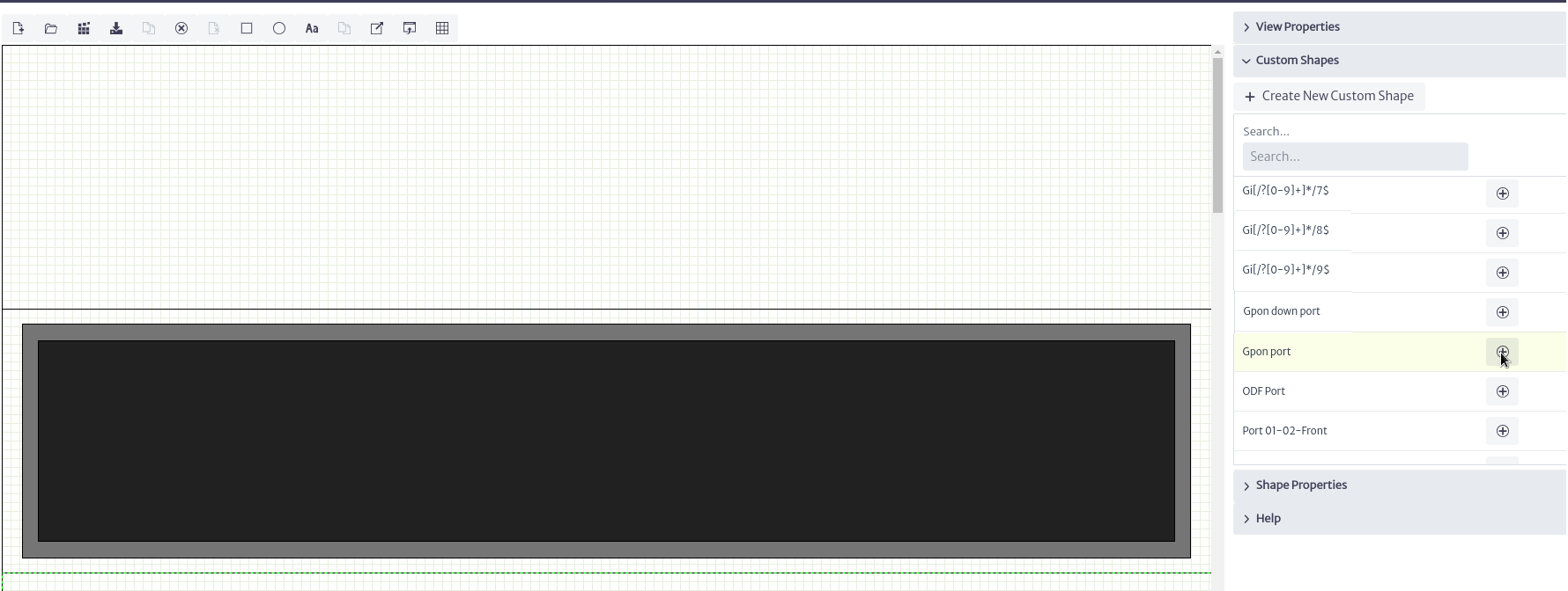 |
|---|
| Figure 29. Add custom shape |
When adding the ports, assign the names of the custom shapes, placing the odd-numbered elements on the top and the even-numbered elements on the bottom, as shown in Figure 30.
Note Pay close attention to the names assigned to the elements, as these will be used in the rack views for connection assignment, explained in detail in the Rack View section.
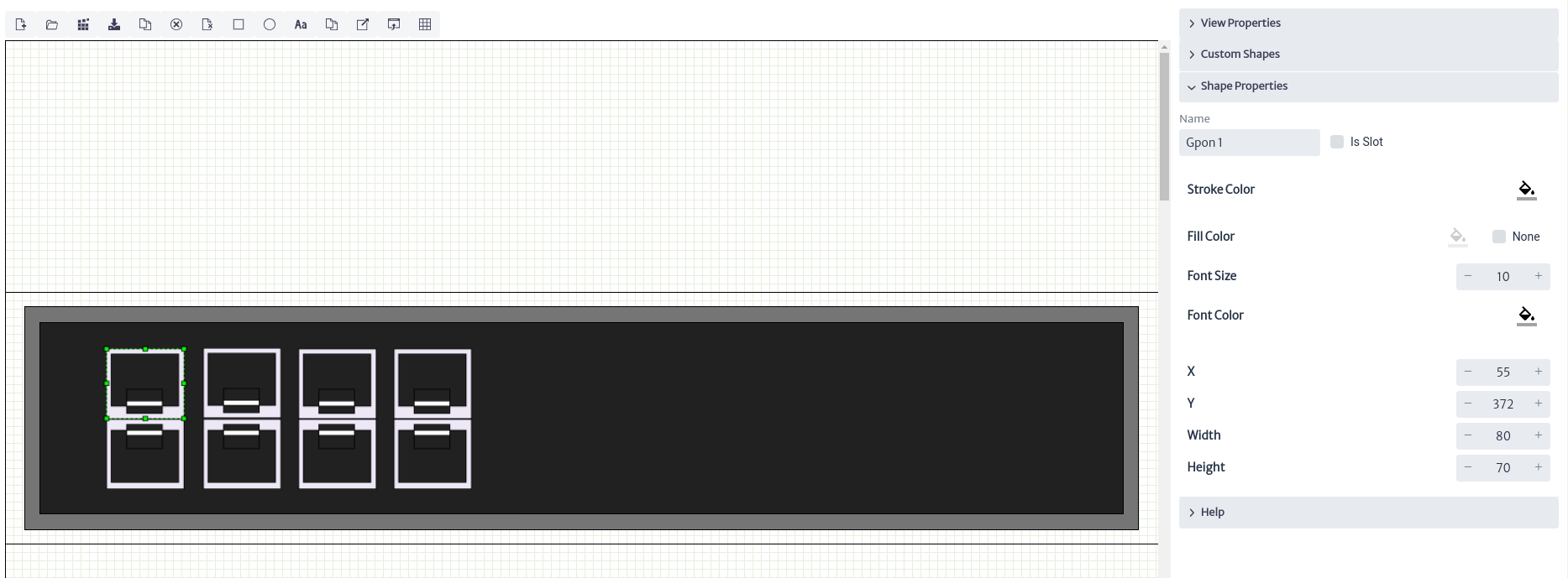 |
|---|
| Figure 30. Add GPON ports |
At the end, you will get something similar to what is shown in Figure 31.
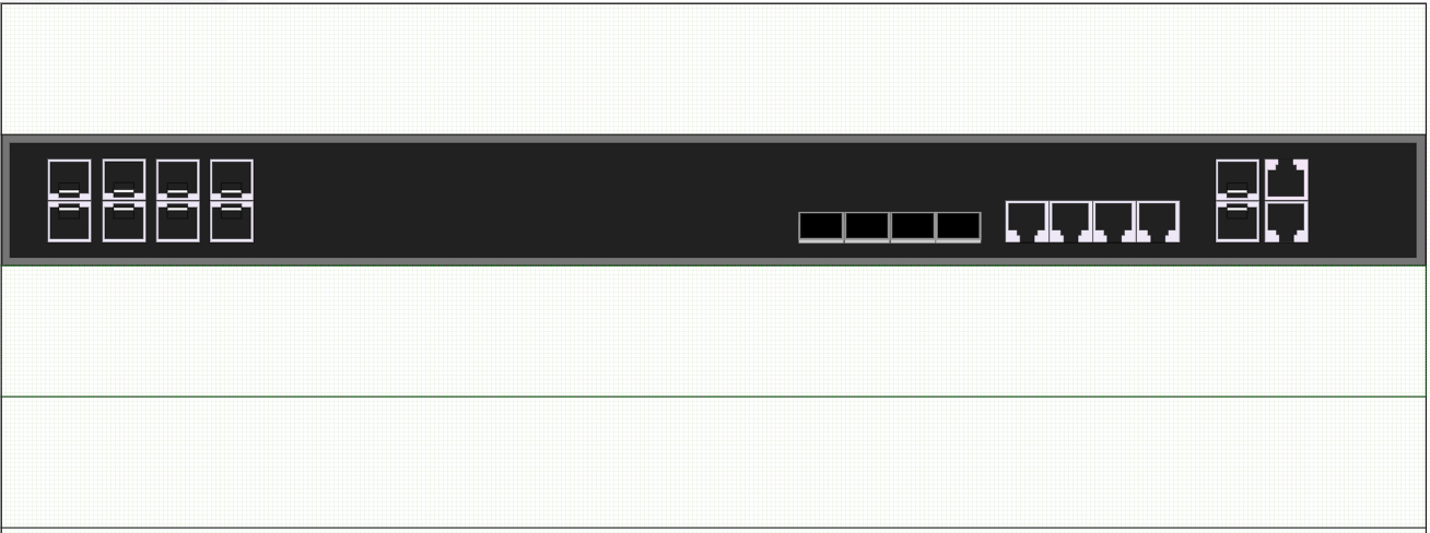 |
|---|
| Figure 31. OLT P1201-08 |
Rack View
Finally, to visualize how the designed device would be contained in the rack, use the Rack View. To view the layout in this view, you must link it to an inventory object. To do this, we use the List Types, a type of attribute for objects in the application such as model, supplier, etc. We will assign the design to a list type using the set list type item button, as shown in Figure 32.
 |
|---|
| Figure 32. Set list type item |
A window will open to associate a list type with a layout, as shown in Figure 33. In this window, select EquipmentModel in List Type, which represents the type of attribute, in this case, the model of an inventory object. In List Type Items, which represents the model, select Tp link P1201-08, which was created earlier in EquipmentModel. Visit List Types for more details on how to create new List Types.
 |
|---|
| Figure 33. Related list type item to layout |
Once the design has been assigned to the list type, go to the Navigation module and search for one of the Rack available in the application, in which we will create a new OLT and assign the model Tp link P1201-08, as shown in Figure 34-35. For instructions on how to create elements, visit Navigation section.
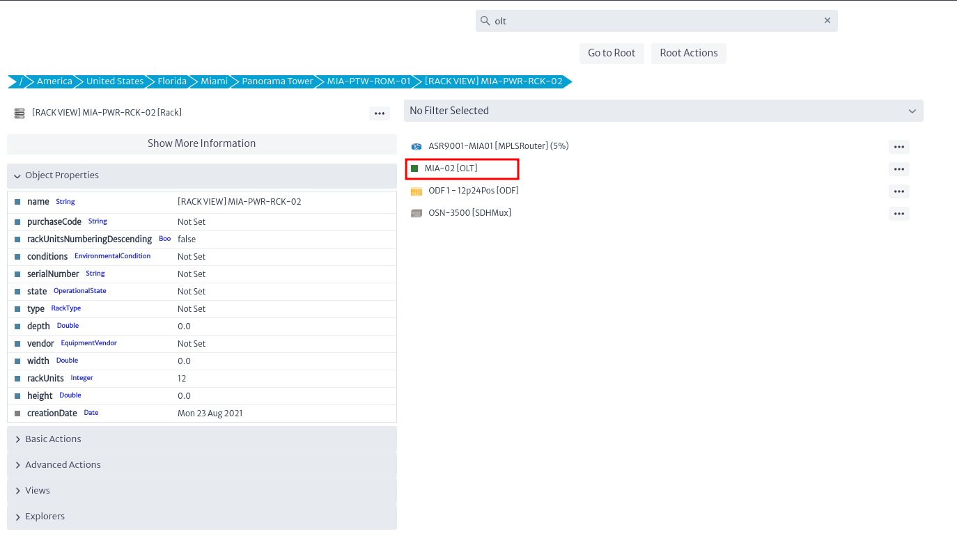 |
|---|
| Figure 34. New OLT |
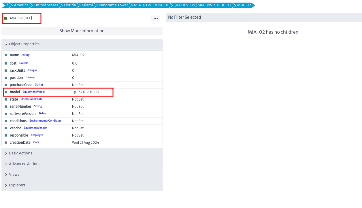 |
|---|
| Figure 35. New OLT model |
Next, to visualize the physical view of the distribution of the elements, go to the menu view and select Rack View, as shown in Figure 36.
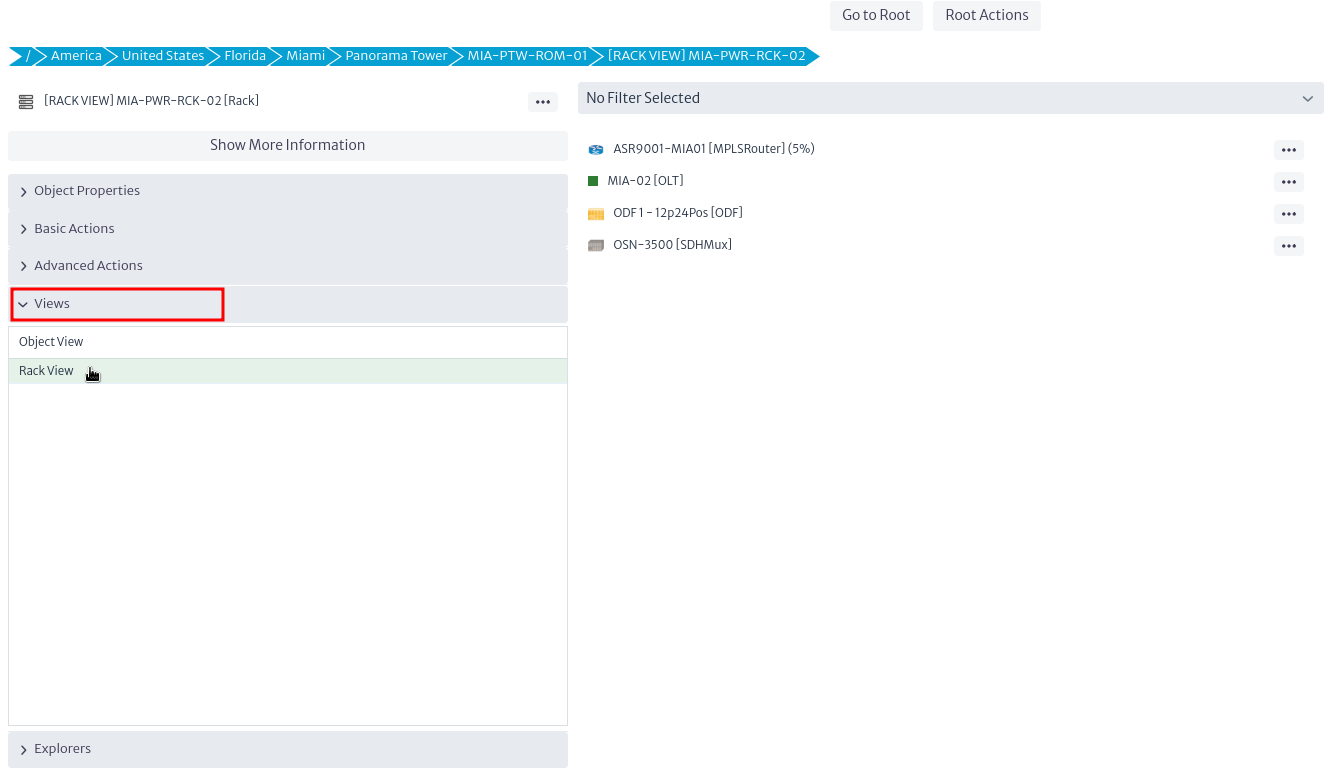 |
|---|
| Figure 36. Rack view option |
Upon doing this, the window in Figure 37 will open, where you can see how the elements are placed in the Rack. The distribution of the elements depends on the position and rack units assigned. Visit Rack View for more details on these configurations.
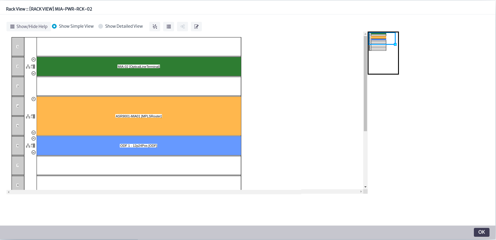 |
|---|
| Figure 37. Rack view window |
In the previous figure, you can see the elements assigned to the rack. However, this view only allows you to observe the rack slot assigned to the elements and the number of slots they occupy. As shown, the OLT is represented in green in the first unit of the Rack. The Rack View offers a more detailed view of the elements. To access this, select the Show Detailed View option, which will display the designs assigned that have been created in the Layout Editorr, as shown in Figure 38.
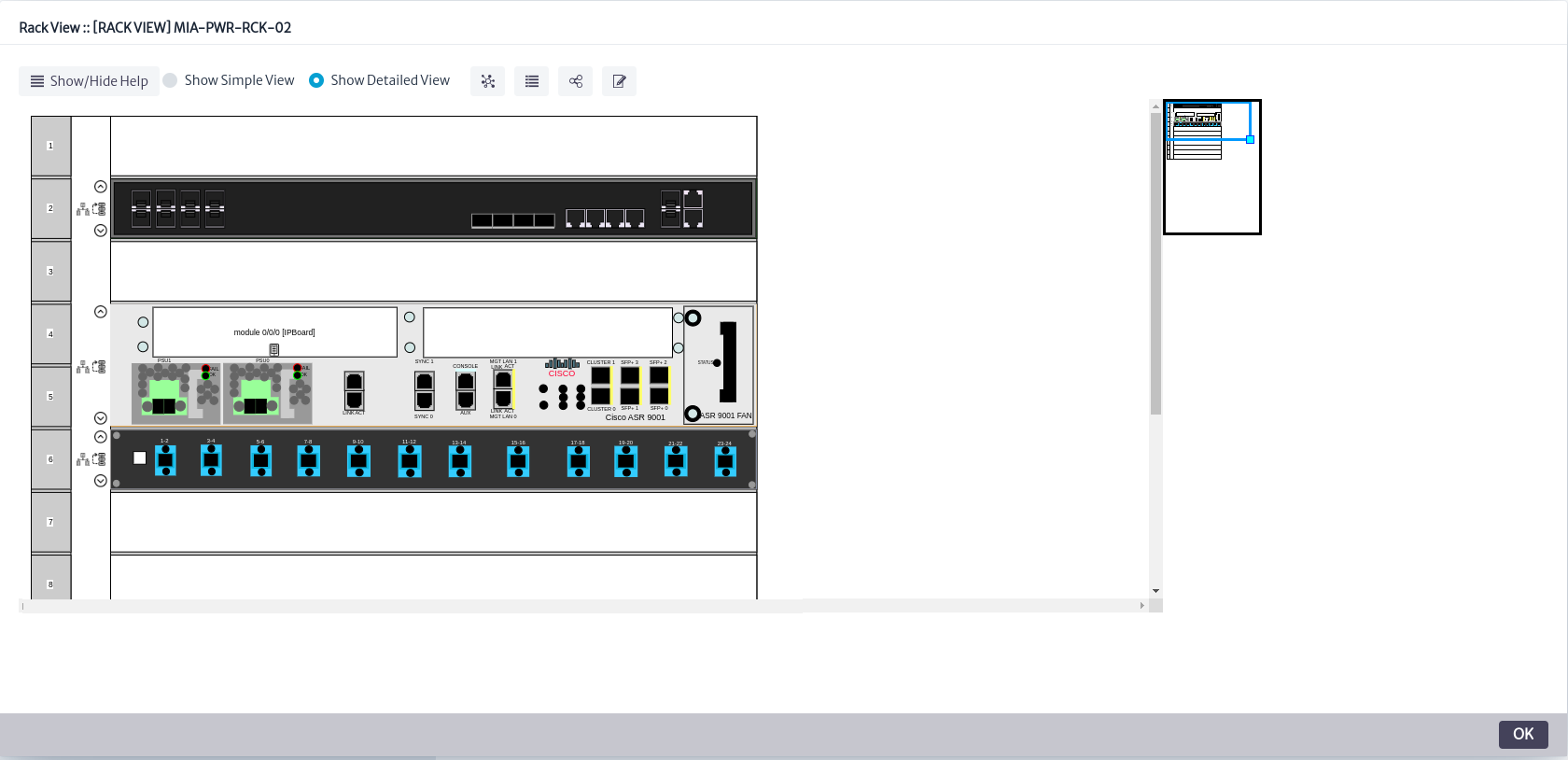 |
|---|
| Figure 38. Detailed view |
With this, we have completed the design of the OLT in the application. Additional functions and configurations available in the Rack View can be consulted in the Rack View section.
Contact Manager
The Contact Management Module enables the creation and administration of individuals or organizations within the application, which may or may not be linked to any type of inventory item. This feature streamlines access to support, sales, manufacturers, contractors, and other relevant information directly from inventory elements.
Figure 1 illustrates the module’s structure. In the application, each created contact must be assigned a type and linked to a company. In this example, the contact is classified as a technician, represented by the INSTANCE_OF relationship, and is associated with a company through the RELATED_TO_SPECIAL relationship, named contacts, indicating that the individual is a contact for that company. The application supports various types of companies; in this case, the company is categorized as a TelecommunicationsOperator, also represented by the INSTANCE_OF relationship. Contacts are linked to inventory objects using the RELATED_TO_SPECIAL relationship, labeled hasContact, to indicate that a specific object has an assigned contact.
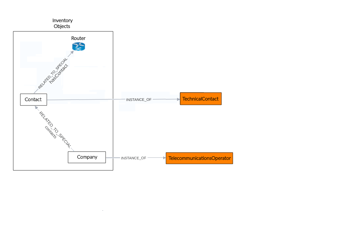 |
|---|
| Figure 1. Contact manager structure |
This module is part of the Other category, as shown in Figure 2.
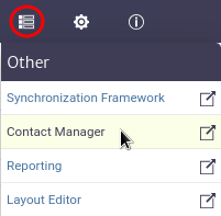 |
|---|
| Figure 2. Contact module |
Once opened we will see the main window of the module, as shown in Figure 3. From here we can see the contacts currently created in the application.
 |
|---|
| Figure 3. Queries manager main window |
A contact or organization is made up of the following properties:
| Property | Description |
|---|---|
| Company | The organization or company the contact is affiliated with. |
| Type | The general type of the contact in the application (e.g., billing, commercial, technical). |
| Name | The full name of the contact. |
| Email 1 / 2 | The primary email address for official communication and secondary email address for backup or specific purposes.. |
| Cellphone | The contact’s mobile phone number. |
| Role | The specific position or function of the contact within the company. |
| Skype | The contact’s Skype ID for virtual meetings or messaging. |
| Fax | The contact’s fax number for sending or receiving documents. |
| Telephone 1 / 2 | The primary and secondary landline phone number. |
| Availability | The contact’s availability for communication. |
| Language | The preferred language for communication with the contact. |
To create a contact in the application, click the  button, located in the main module window. This action will open the contact creation window shown in Figure 4. In this window, you will need to enter the name, contact type, and company, then click OK.
Note You can add custom types and companies in the app according to your needs. These steps will be explained in detail later.
 |
|---|
| Figure 4. Add contact window |
When a new contact is created, it will appear in the list of available contacts. Additionally, you can use the filters in the list to search by company, contact type, name, and email addresses as needed, as shown in Figure 5. If you wish to clear the filters and view all contacts again, use the button located in the main module window.
 |
|---|
| Figure 5. List of contacts |
Once the contact is created, you can add the required information by selecting it from the list and clicking the button to update its properties. This will open the update window shown in Figure 6. Double-click the property you wish to edit, make your changes, and press Enter to update. When you’re done, click Close.
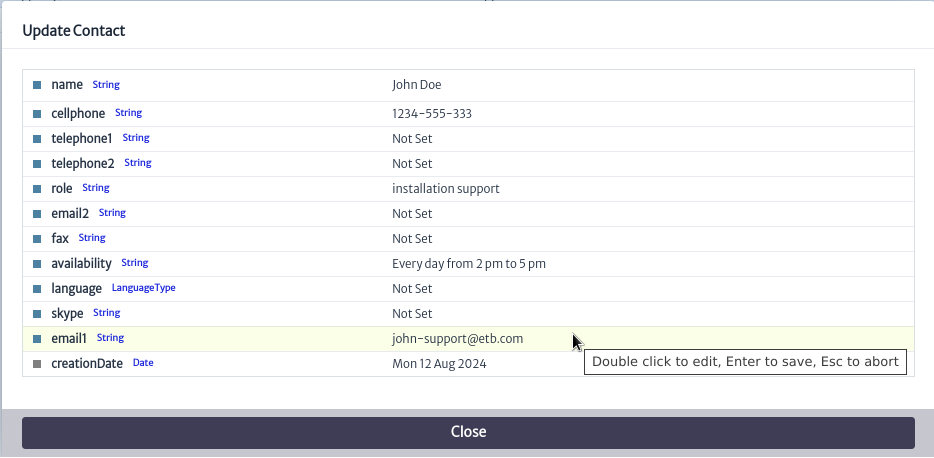 |
|---|
| Figure 6. Update contact properties |
Similarly, if you want to delete a contact, select it and click the button. This will open the contact deletion window shown in Figure 7. Click OK to delete the contact or Cancel if you do not wish to proceed.
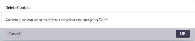 |
|---|
| Figure 7. Delete contacts window |
Manage Resources
To link contacts with any type of inventory item, whether administrative, logical, or physical, go to the Navigation module and search for the item you want to link. For this example, we will use a router. Locate the Advanced Actions menu and select the Relate to Contact option as shown in Figure 8. For more information on how to navigate inventory objects, consult the Navigation module section
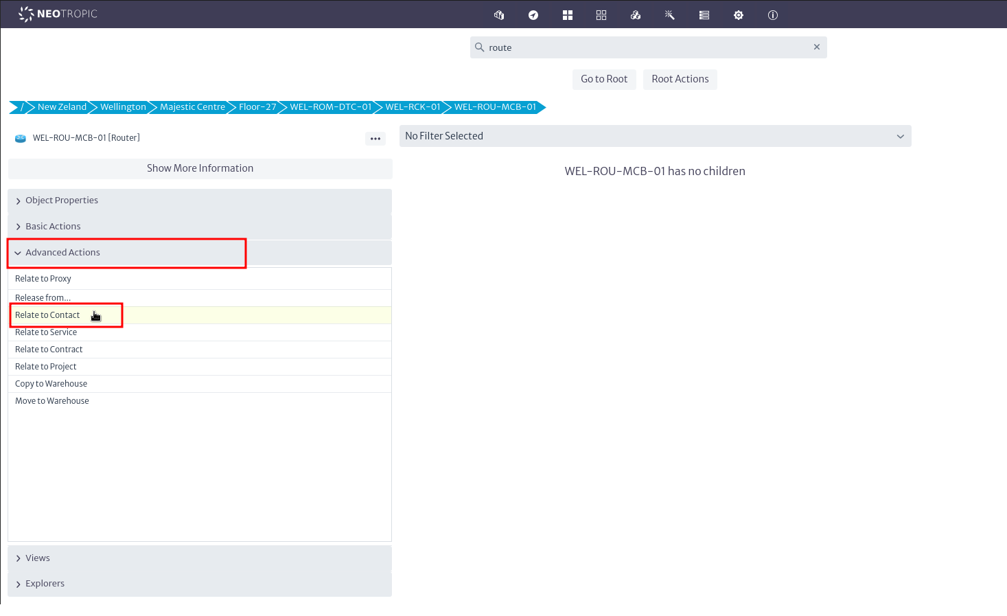 |
|---|
| Figure 8. Relate to Contact |
The window will open to relate the object as seen in Figure 9, enter the contact name, select it and press OK.
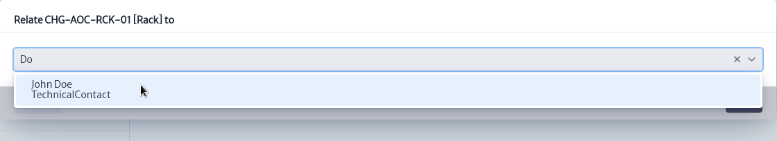 |
|---|
| Figure 9. Select contact |
You will be notified that the object was related correctly as seen in Figure 10.
 |
|---|
| Figure 10. Successful related |
Once the item is linked, you can verify the contacts associated with it. To do this, go to the Explorers menu and select the Relationships option as shown in Figure 11.
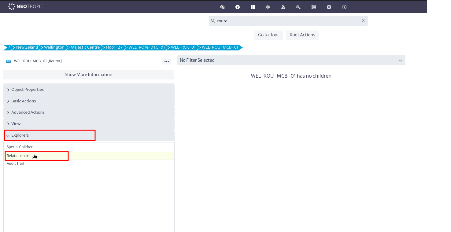 |
|---|
| Figure 11. Explorers |
The relationships window will open showing all the relationships that the object has in the application, as seen in Figure 12.
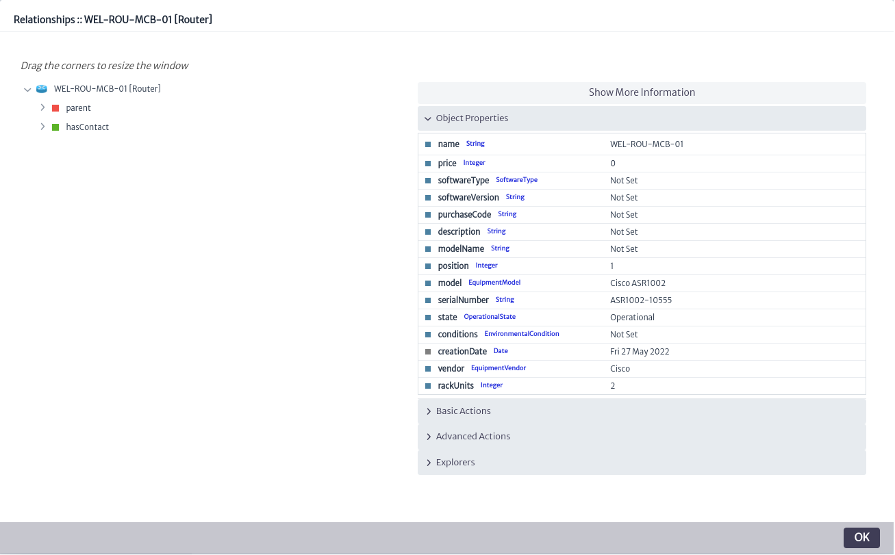 |
|---|
| Figure 12. Relationships window |
Relationships with contacts can be found under hasContact. By selecting the contact, you can view all of its details. In this example, we assigned another contact to the item, as shown in Figure 13. It is possible to link multiple contacts to a single item, which is useful for representing various contact roles, such as sales representatives, technicians, etc.
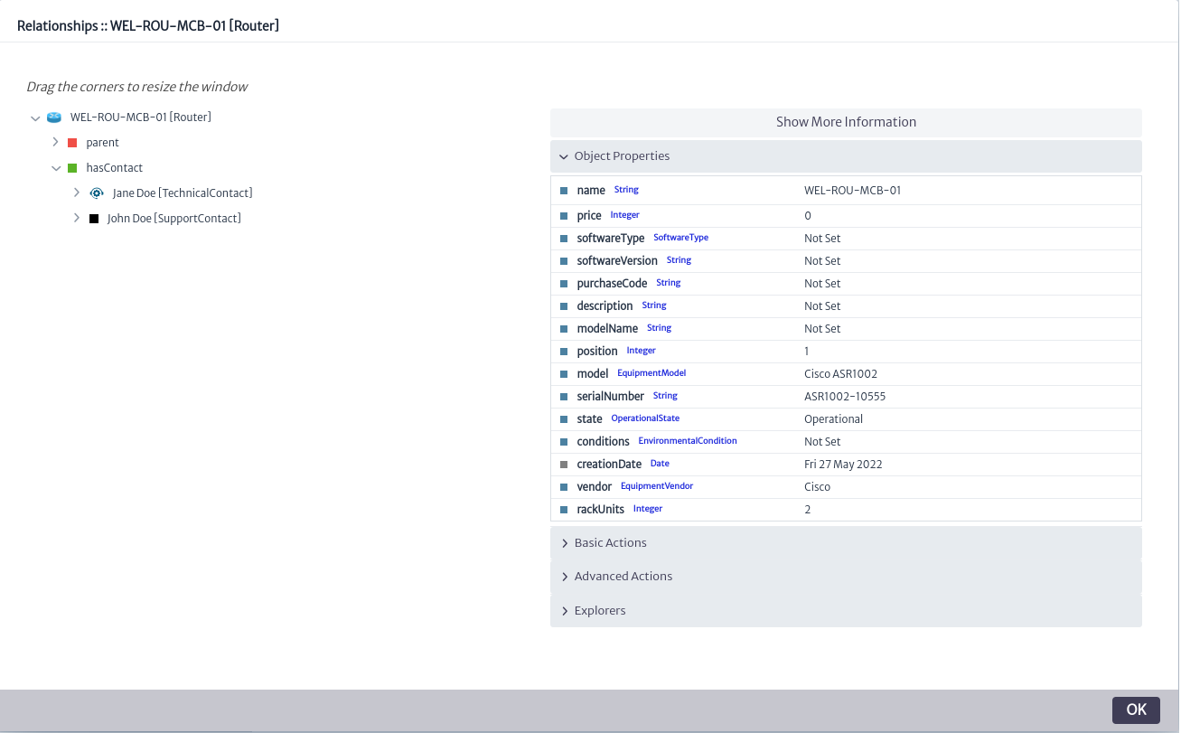 |
|---|
| Figure 13. Related contacts |
Similarly, from the Contacts module, you can view and manage the items associated with a contact. In the main module window, select the desired contact and click the  button. This will open the resource management window, as shown in Figure 14.
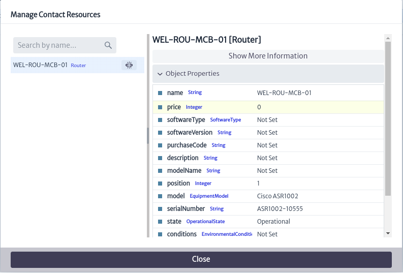 |
|---|
| Figure 14. Manage contacts resources window |
From here, you can view and search among the inventory items associated with the contact. You can also unassign items from the contact by clicking the button next to the item you wish to unassign. This will open a confirmation window, as shown in Figure 15. Click OK to unassign the item or Cancel if you do not wish to proceed.
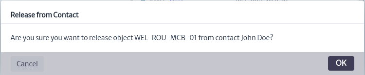 |
|---|
| Figure 15. Release confirmation window |
It will be confirmed that the item has been unassigned from the contact, as shown in Figure 16.
 |
|---|
| Figure 16. Successful release |
Add Contact Types and Companies
You can add your own contact types and companies, which allows the system to be tailored to your organization's specific needs. To do this, go to the Data Manager Module. Once there, to modify the class hierarchy related to contacts, search for the superclass GenericContact.
GenericContact is the superclass used to define all contacts in the application, as shown in Figure 17. From here, you can add, modify, or delete subclasses that represent the available contact types in the application.
 |
|---|
| Figure 17. Manage contact superclass |
For our example, we added the type Support Contact, as shown in Figure 18. For more details on creating and modifying the application hierarchy, please refer to the Data manager section.
 |
|---|
| Figure 18. New contact type |
Similarly, the GenericCustomer superclass is used to define customer types in the application, representing the companies assigned to contacts. To create new options, navigate to the Service Manager module. Once in the module, you can create new customers as shown in Figure 19. For more details on creating new customers, please refer to the Service Manager section.
 |
|---|
| Figure 19. New customer |
Reports
In addition to viewing contacts assigned to an item through the Navigation or Contacts module, you can also generate reports on contacts assigned to inventory items to obtain information related to support, sales, etc. In this example, we will create a report that displays information about contacts assigned to items located in a room. To do this, go to the Reports module. Once there, create a class-level report for the Room class, as shown in Figure 20. For more information on creating reports and the different types of reports, please refer to the Report module section.
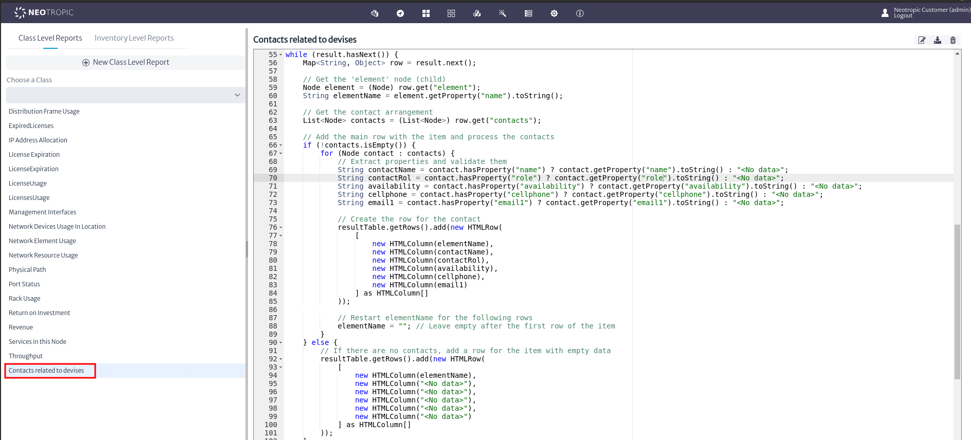 |
|---|
| Figure 20. Created report |
Once the report for the Room class is created, go to the Navigation module and search for a class of this type. In this case, navigate to the room containing the router to which we previously assigned contacts. In the Basic Actions menu, use the Reports option as shown in Figure 21.
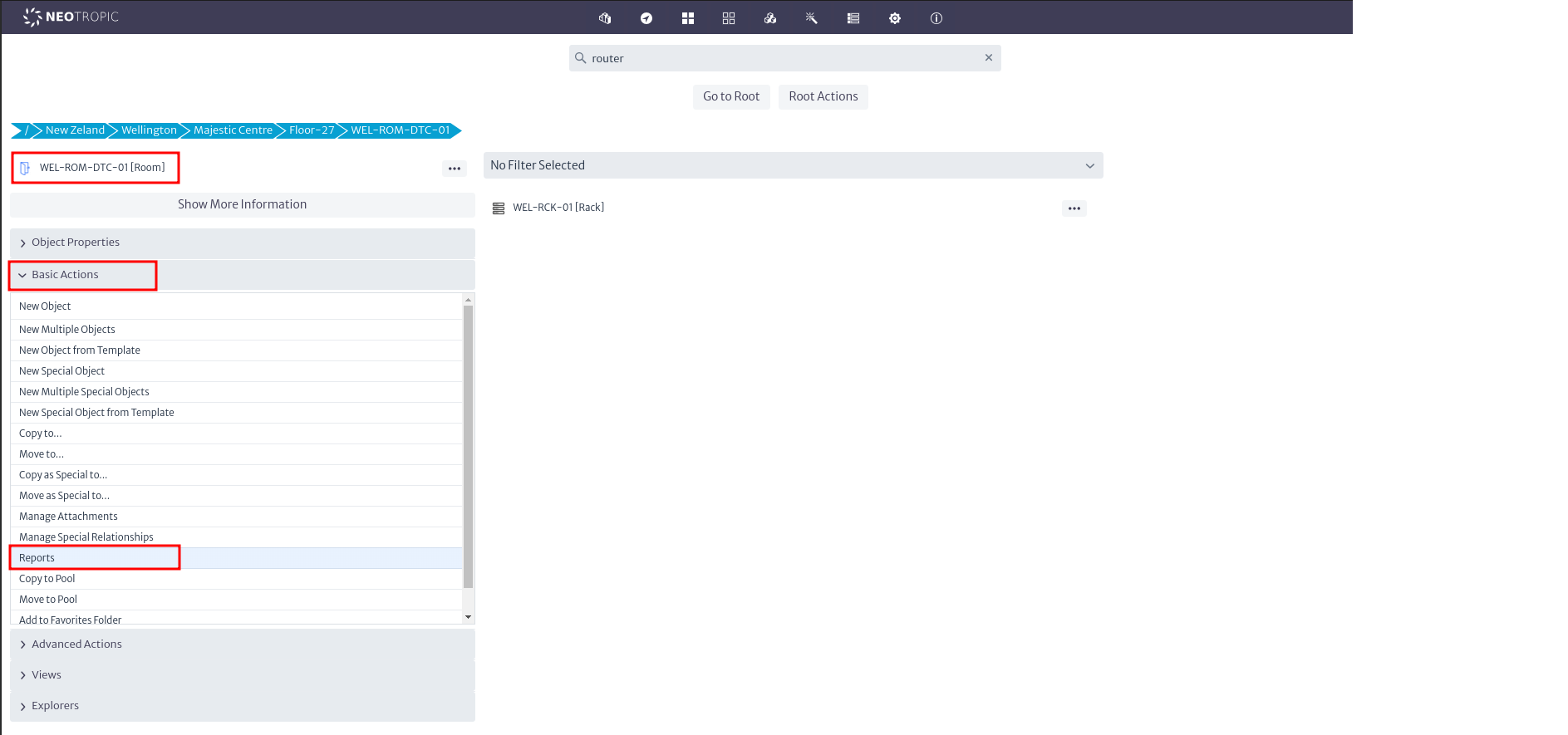 |
|---|
| Figure 21. Report option |
By doing so, you will see the available reports for the Room class, including the report previously created for this class, as shown in Figure 22.
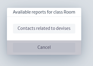 |
|---|
| Figure 22. Available reports for class Room |
When the report is selected, a new tab will open with the report corresponding to the selected room. In this report, you will see the objects within the room that have assigned contacts, along with their information, as shown in Figure 23. You can find this report as an example in the following repository.
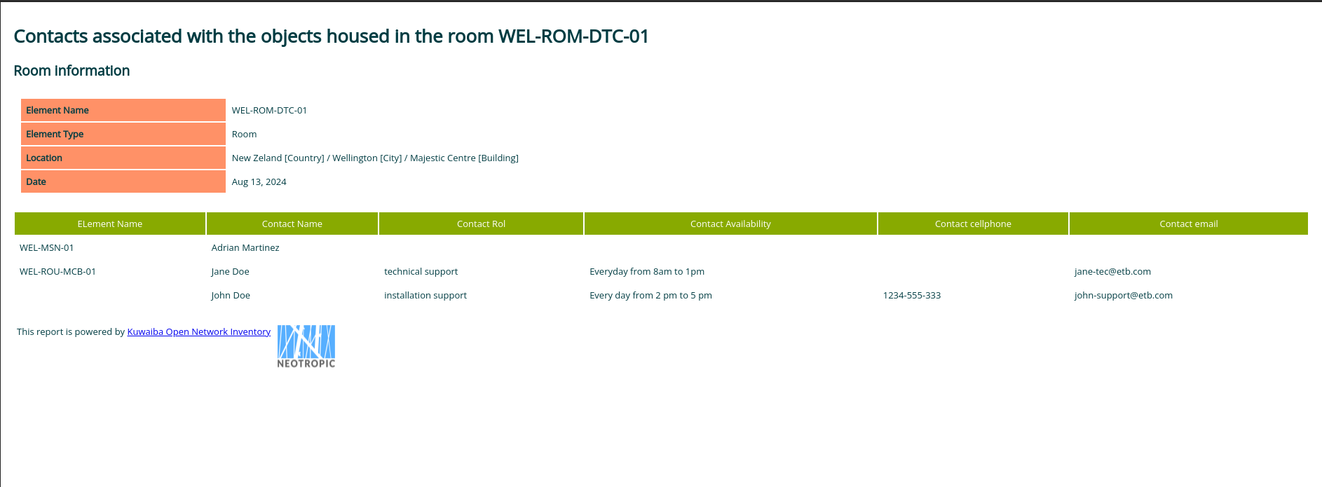 |
|---|
| Figure 23. Report generated |
Appendix A. Naming Multiple Objects
A naming pattern is used to dynamically create the names of new objects or new special objects
using the actions New Multiple and New Special Multiple, respectively, using on a simple syntax.
The naming pattern is composed by static and dynamic sections. In the static section, any string
of characters can be placed, with the exception of the characters [ and ], while in the dynamic
part only the pre-defined functions listed below can be placed.
[sequence(a,z)]Generates an alphabetic ascending lowercase sequence that begins in the parameter a (a-z) to the parameter z (a-z)[sequence(A,Z)]Generates an alphabetic ascending uppercase sequence that begins in the parameter A (A-Z) to the parameter Z (A-Z)[sequence(n,m)]Function that generates a numeric ascending sequence that begin ins the parameter n (0...) to the parameter m (0...)[value(Object Id,Object Class Name,Attribute Name)]Places the value of an object’s attribute, given the object id, object class name and the attribute name.
Examples of naming patterns are: router-[sequence(1,3)]-[sequence(a,c)], [value(1111,name)]-[sequence(A,Z)], the first pattern generates six (23) different names, while the second, twenty six (126) different names.
Depending on the combination of patterns, only a limited number of names can be generated. If the number of possible names is less than the number of objects to be created provided by the user, the objects or special objects will not be created.
Create Multiple Mirror Ports
[mirror(a,b)]Generates pairs of ports according to the specified quantity, starting from parameter a (0...) to parameter b (b > a...).[multiple-mirror(a,b)]Generates ports for a fiber optic splitter. It creates one input port 001-IN and output ports from parameter a (0...) to parameter b (b > a...).
Examples of mirrors are : [mirror(1,10)] this command will create 20 ports, 10 front ports and 10 back ports, 001-front, 001-back... 010-front, 010-back, the created ports will be connected as mirror ports.
[multiple-mirror(2,5)] this command will create one input port 001-IN and four output ports, 002-OUT(001-IN) to 005-OUT(001-IN), the created ports will be connected as a fiber optic splitter.